Disguise
|
|
|
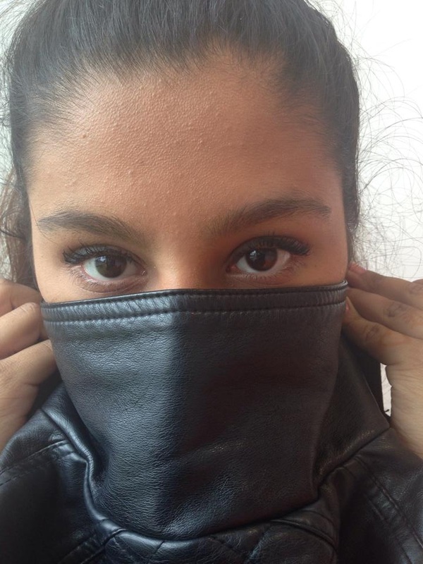
MY STARTING POINT:
|
Research
Franz Falckenhaus
|
Franz Falckenhaus was born in 1975 Bartosyze Poland. His collage work is based on digital and always composed from vintage illustrations and images mixed with paper products. He combines self-made elements (such as backgrounds, shadows and drawings) with chosen photos that go well with what he has made to assemble into art. Even though he never had any formal art training he developed an interest in film, photography and collage.
I really like Franz Falckenhaus' work because it it quite different to anyone else's work. I like the fact that he uses his own self-made backgrounds shadows and drawings, i think that it just makes his work a little bit mor unique and special. |
|
John Stezaker
|
|
John Stezaker was born 1949 in Worcester England. He attended the the Slade School of Art in London and he graduated with a higher diploma in fine art.
He makes collages to give old images a brand new meaning, he does this by cutting and folding images to make new unique images that are slightly distorted. The images he uses are found from magazines postcards and books. In his Marriage series he uses a range of images of film stars to create hybrid 'icons', mixing male and female identity into unified characters. I also really like John Stezaker's work because it gives outdated photos a chance to live again. |
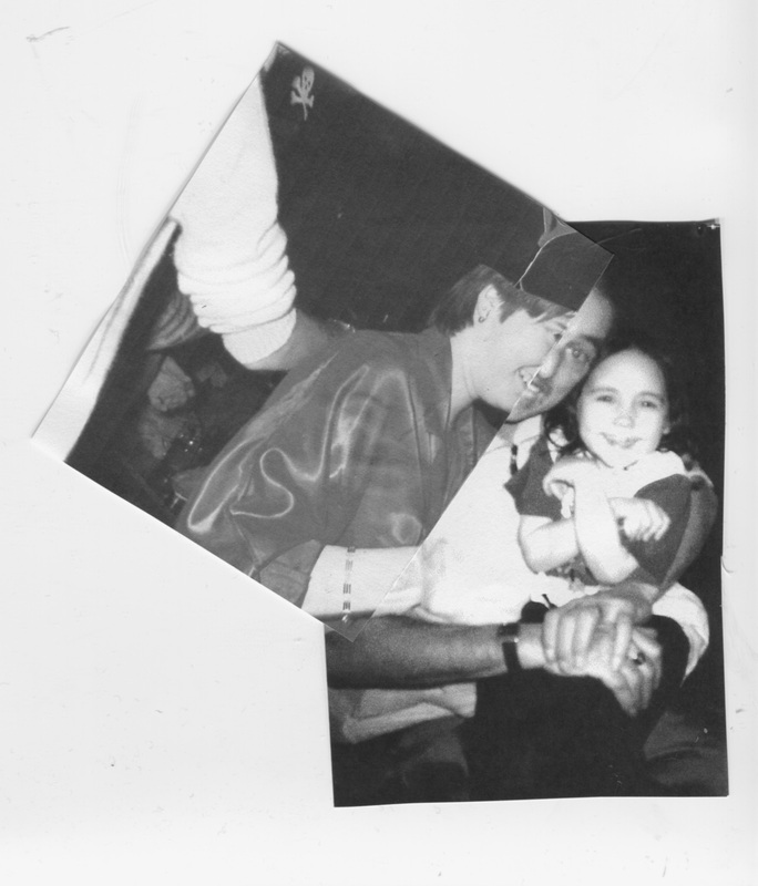
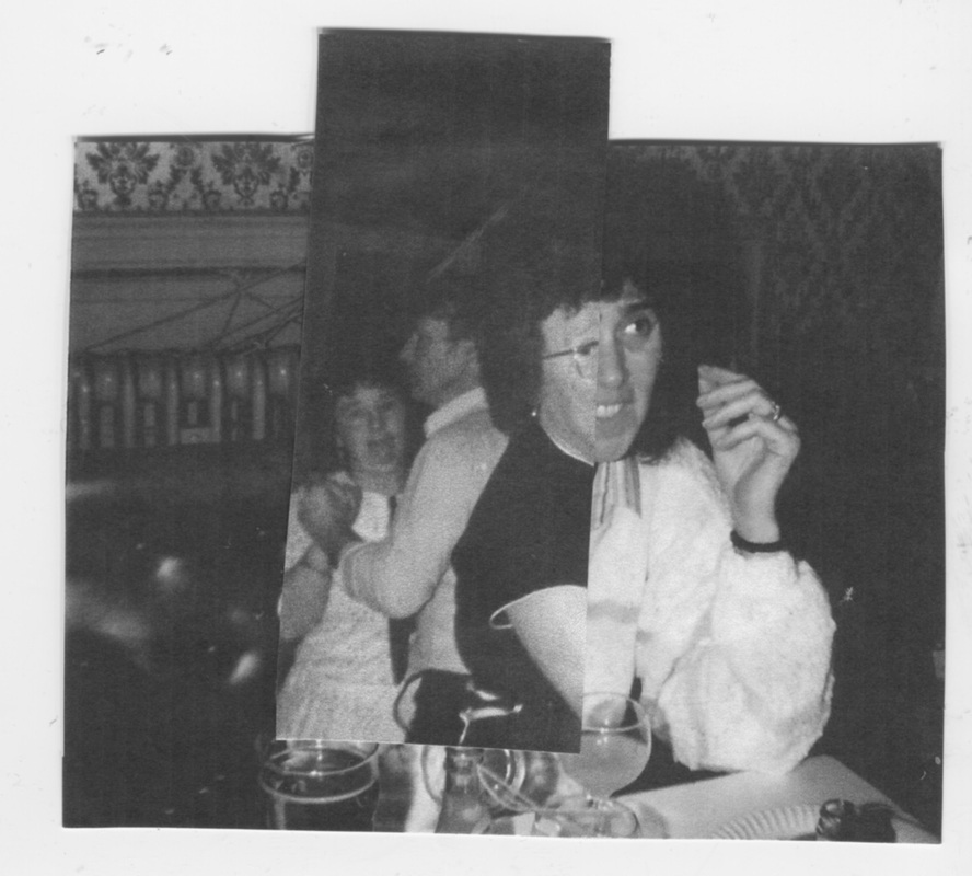
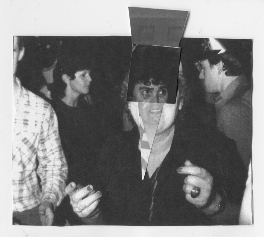
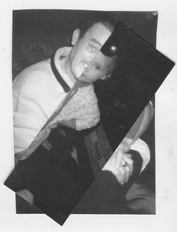
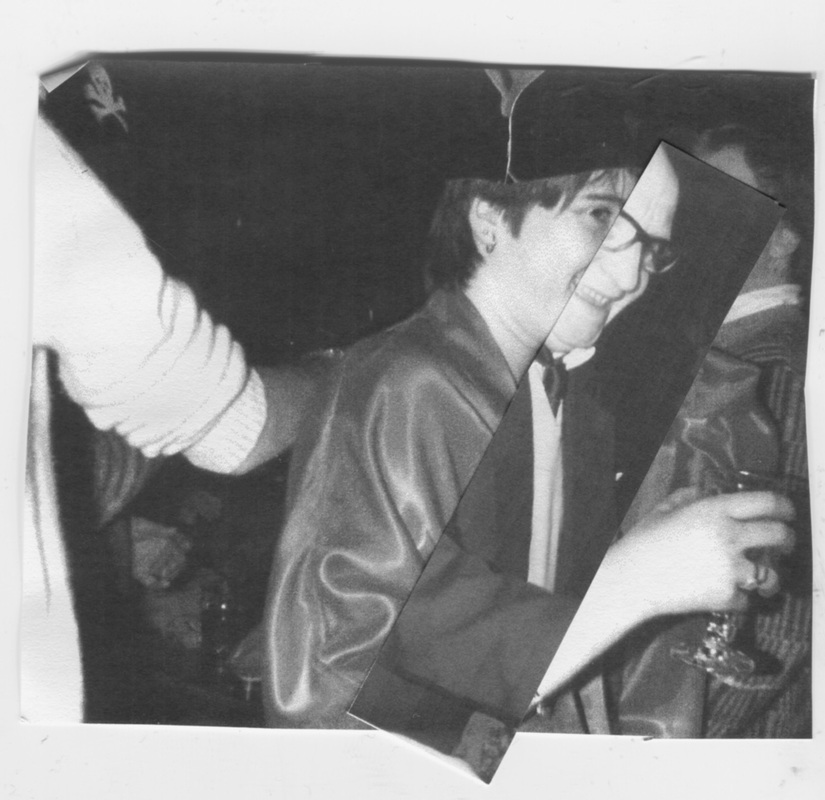
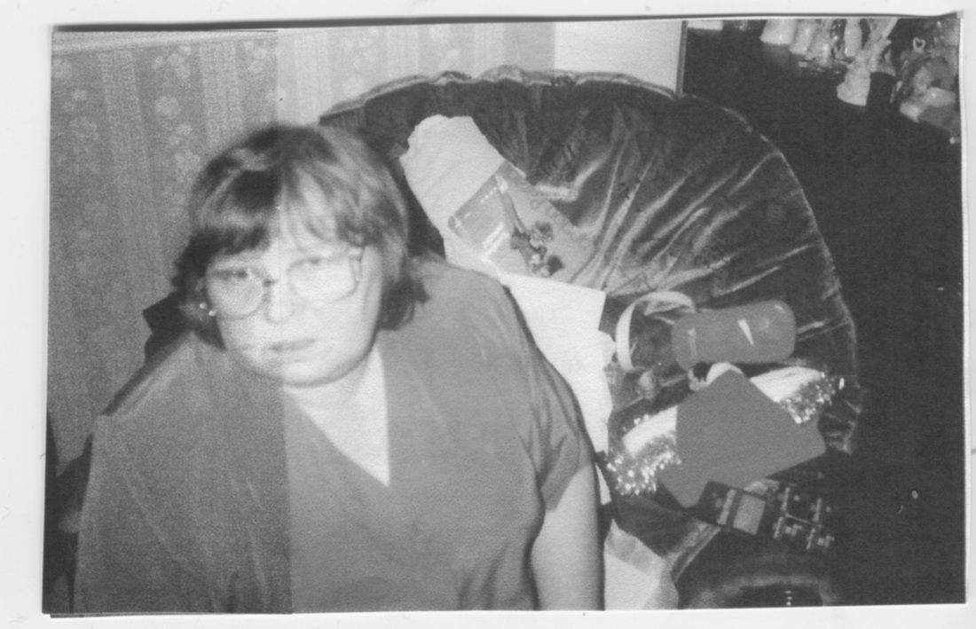
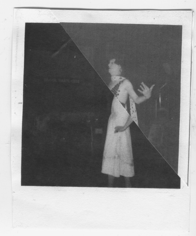
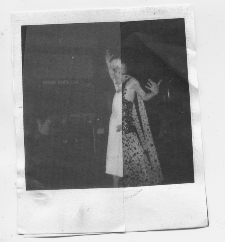
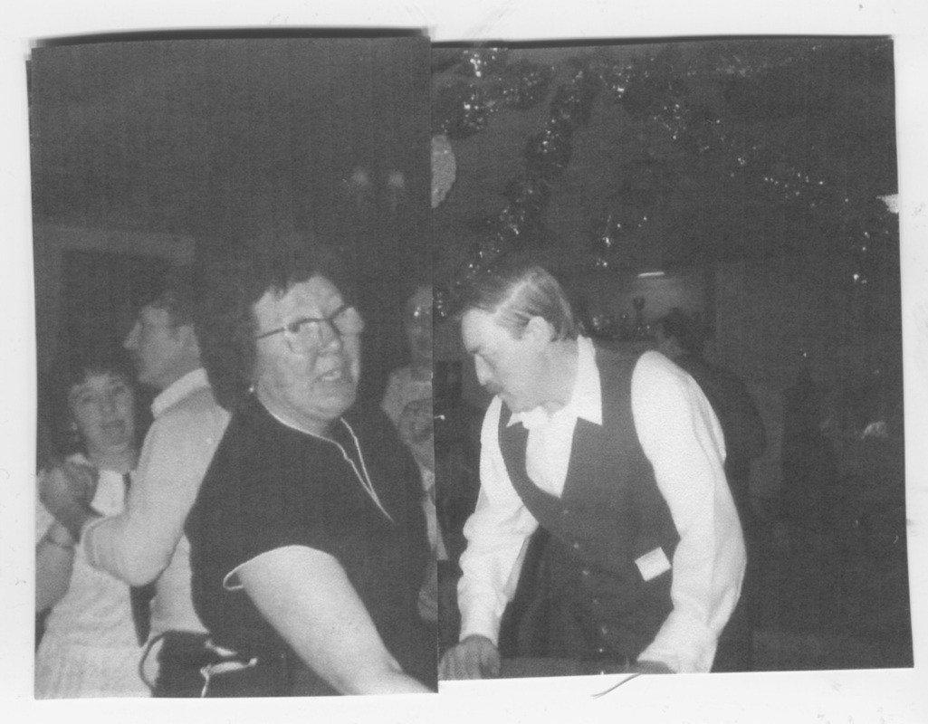
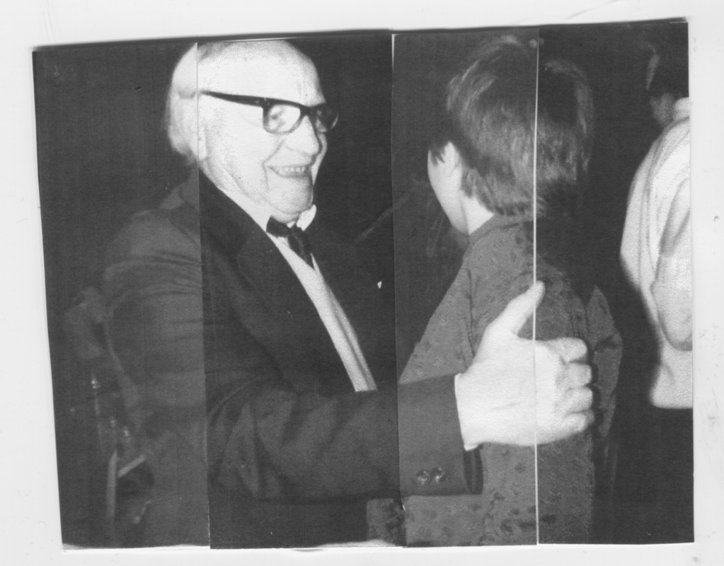
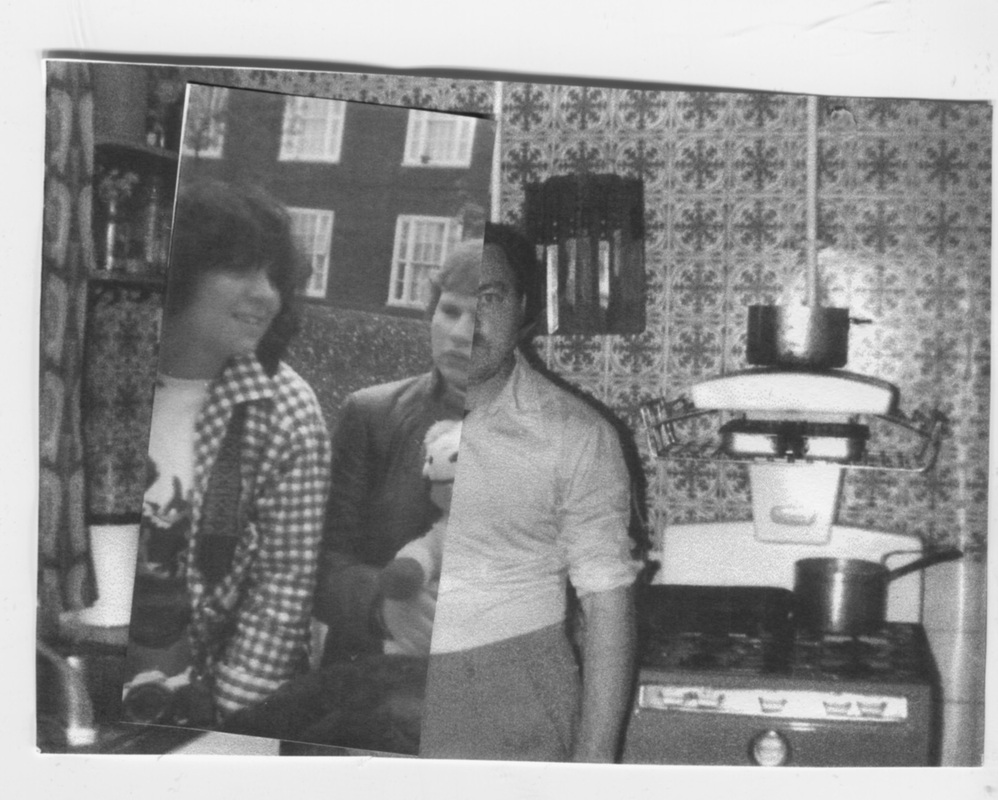
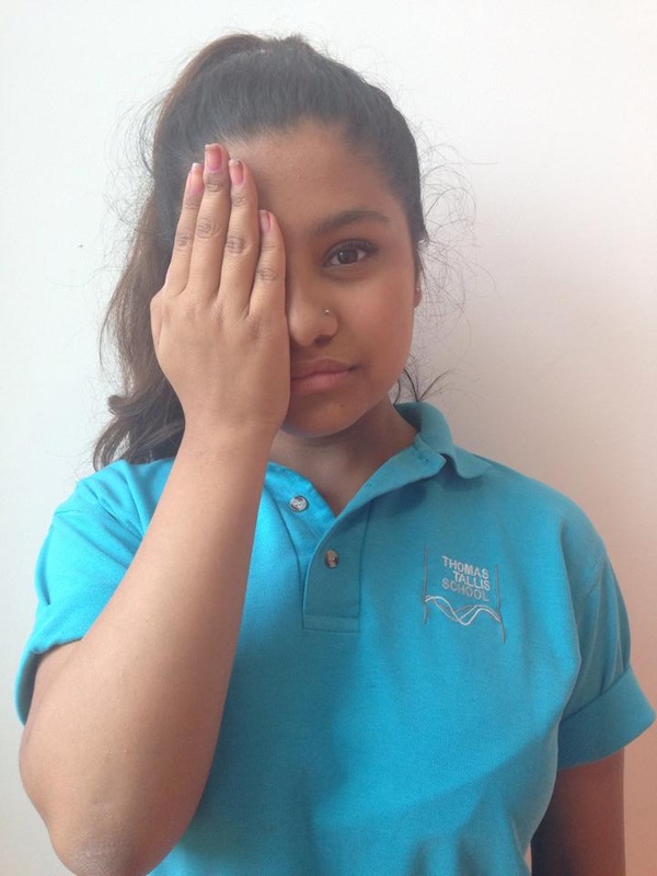
This is my first set of images. I have used some old images of my family and family friends. I photocopied the images (so I wouldn't ruin the original ones) and cut parts of them up. For this set I only used the old images and did't take any new photos to merge together with the old ones. I am really happy with the way my images turned out because every image has been changed to look something like John Stezaker's work and I think I have done it well. With these images I would cut off some of the extra edges because it makes the images look a little bit messy and it doesn't make it look like the a proper photo. If I do this experiment again I will try to get some new photos to mix with new ones because I think that that will be a chance to maybe see how different they look from when the images were taken. Also I think that the images would look better if they were photocopied in colour because as they were done in black and white you can't see the different types of colours that i mixed while making them.
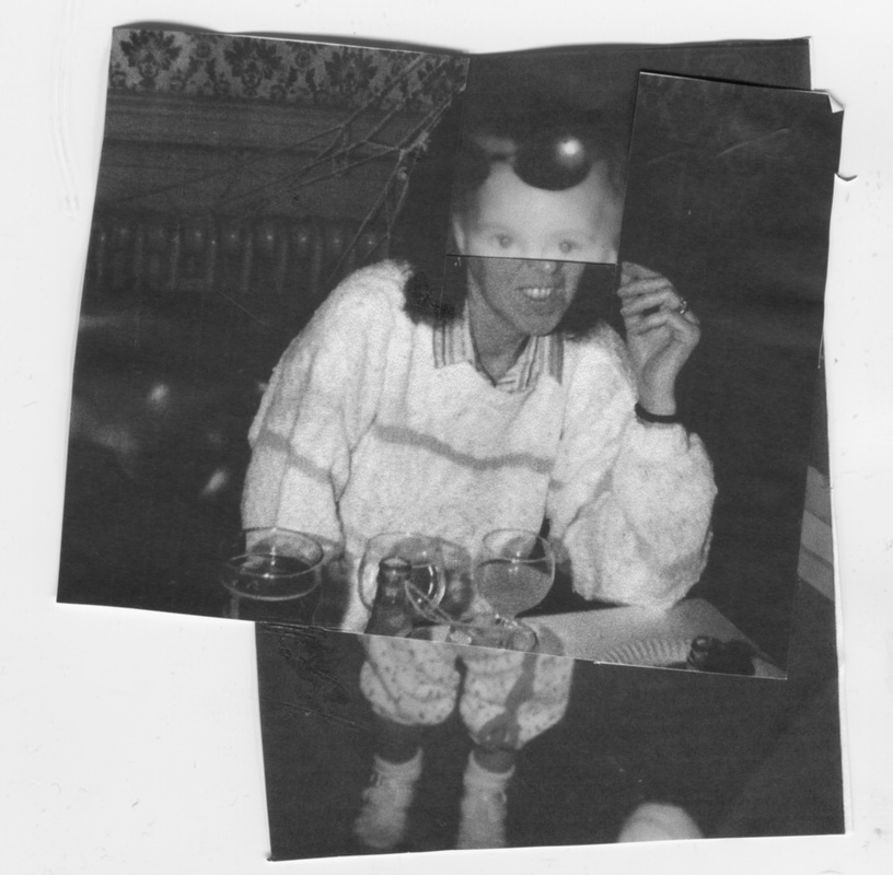
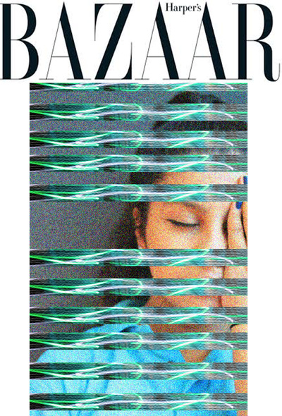
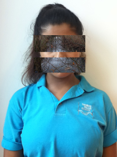
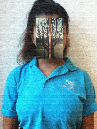
This was my first photoshop experiment, trying to re-create work like Franz Falkenhaus. I think that the images have turned out quite well because they clearly show disguise, because in most of the photos the eyes are covered and in 4 of them I have covered near enough the whole face. I think that my favourite image is the one with the car covering the eyes because the car photo that I have used shows a burgundy coloured car and the image of it is out of focus. My least favourite image is the one with the two vertical strips because you can see part of the lips and the nose where the image has been split.Also I used the same image for 5 of the photos because I didn't really have enough images that I liked to work with. When I do this experiment again, I think I will use photos of other people, maybe of some family members, I will use photos of other things rather than just trees and i will try to disguise the person in the image differently, other than just covering the face I might cover some of the body or take photos with the hands and arms and try to cover those.
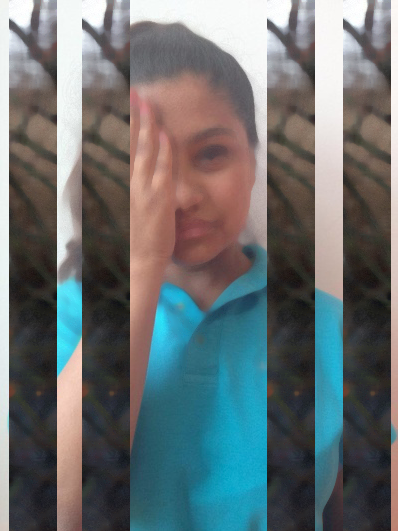
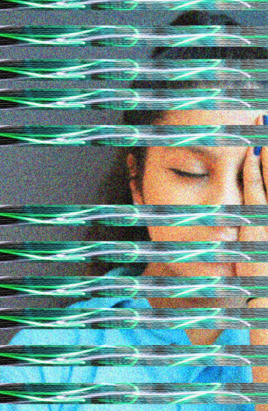
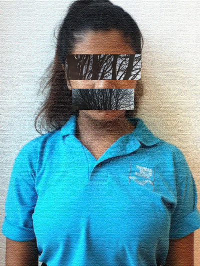
This is a set of photos I have created using inspiration from my last set of photoshop images and Franz Falkenhaus. I think that these photos are better than the last set I created because these images are almost completely covering the face. My favourite ones are the three at the bottom because I think that the base image is very nice and the top layer of images make the images look more interesting. In the middle in the bottom row, I think that the flowery image looks strange but good against the effect on the base image. I don't really like the images at the top because I think that there is too much space left where I have tried to show a little bit of the face. Also I don't really like the image that I used as a base because it covered the face and thats generally what I was trying to do so the images have come out a little bit wrong.
Hattie Stewart
|
Hattie Stewart is a London based illustrator and considered a professional doodler. Her style extends throughout magazines and into fashion. She has worked with designers such as House Of Holland, Marc By Mark Jacobs, and Adidas. She has also exhibited in places such as L.A, Bangkok, London and Berlin. Recently she has just completed a new project, doodling on 14 vintage playboy magazines, which they posted up on their Facebook page!
When she was growing up she began to copy images from The Dandy and The Beano Comics before deciding that she wants to do something with fashion illustration at the age of 13. I really like Hattie Stewarts work because it is very unique and fun, I think that her work would make you want to try and do it yourself and spend many hours trying to get your work as perfect as hers. |
|
Ana Strumpf
|
|
Ana Strumf is an artist similar to Hattie Stewart. These illustrations were made in 2013 on the covers of fashion magazines using Sharpies and decor colour pens. each cover is completely different to another one. Ana graduated in Fashion at the Anhembi-Morumbi University in 2003.
Ana has also worked as an interior designer and a product designer, she also developed a signature range for the Brazilian Design Store MICASA, she also developed Home Decor products for the Walt Disney Company. I also really like Ana's work because I think it fits in and suits the magazines covers she doodles on top of. I think this because her designs are not very childish (having drawings of hearts and dramatic cartoon eyes) they are more detailed and blend in quite well with the actual cover, making it confusing weather it has been drawn on or printed that way. I think one of the reasons why her designs look less childish to me could be because she only draws over magazines like Vogue and Elle. |
This is a set of images that I have taken to transform into work inspired by Hattie Stewart and Ana Strumph.
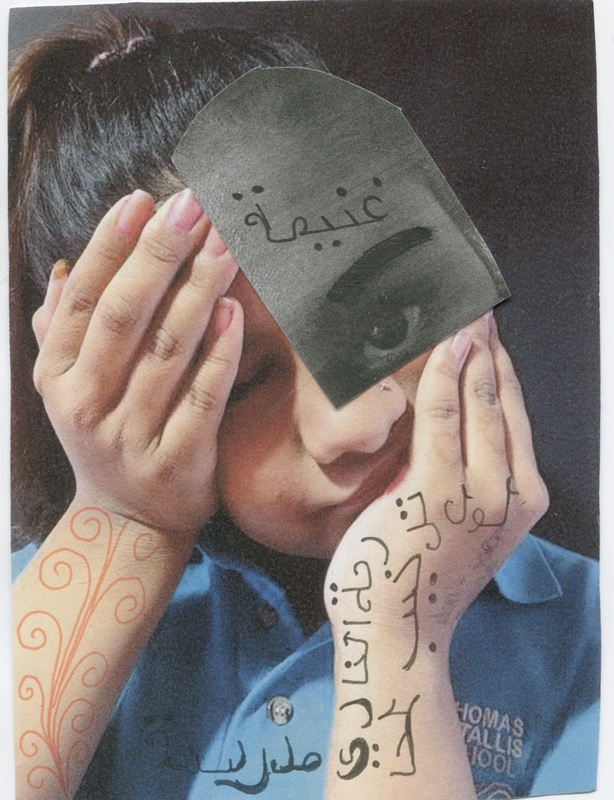
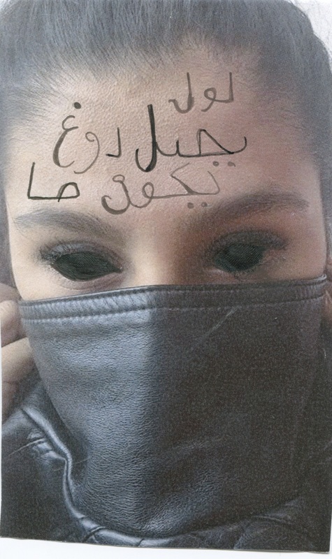
This is the same set of images from before but i have used inspriation from Hattie Stewart ( and John Stezaker) and Ana Strumph to create these images. I think that these images are good because they have elements of her work but they are not exactly the same as her work. For example, I have added some sentences in Arabic to my images because i think that it gives the images something to wonder about. I have also stuck part a black and white part of the original colour image to bring in elements of John Stezaker. I am really happy with the way these images turned out.
This experiment would have been much better if I had used actual magazine covers instead of my own photos.
This experiment would have been much better if I had used actual magazine covers instead of my own photos.
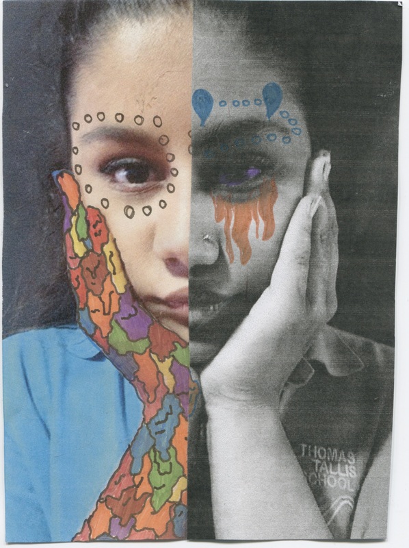
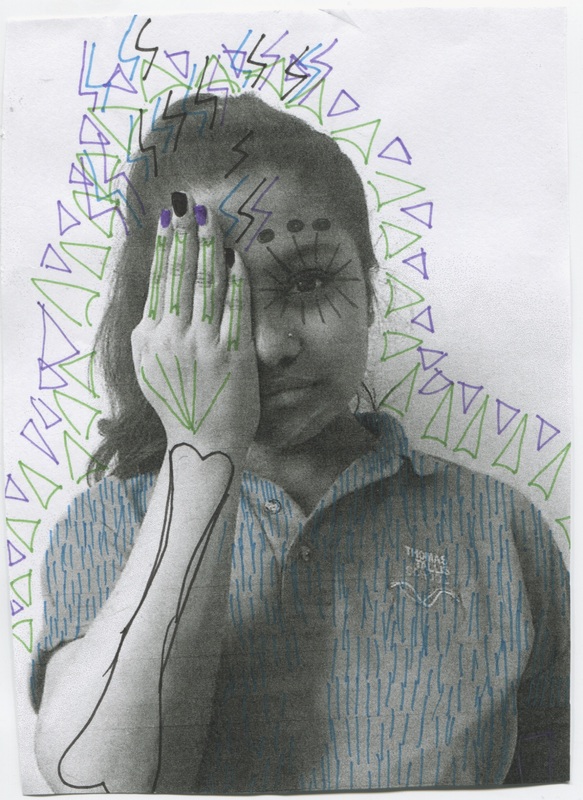
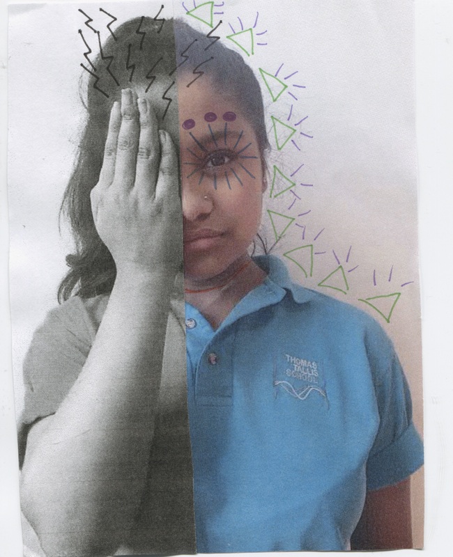
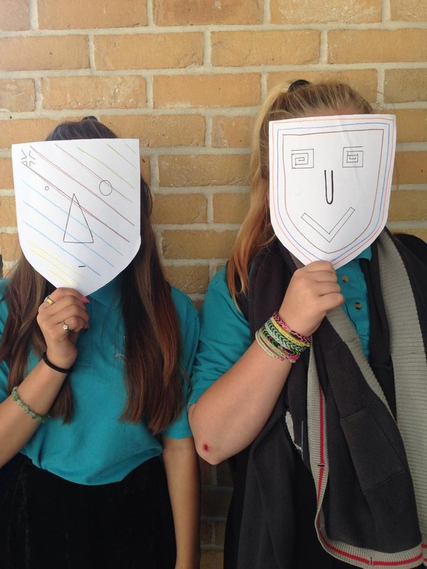
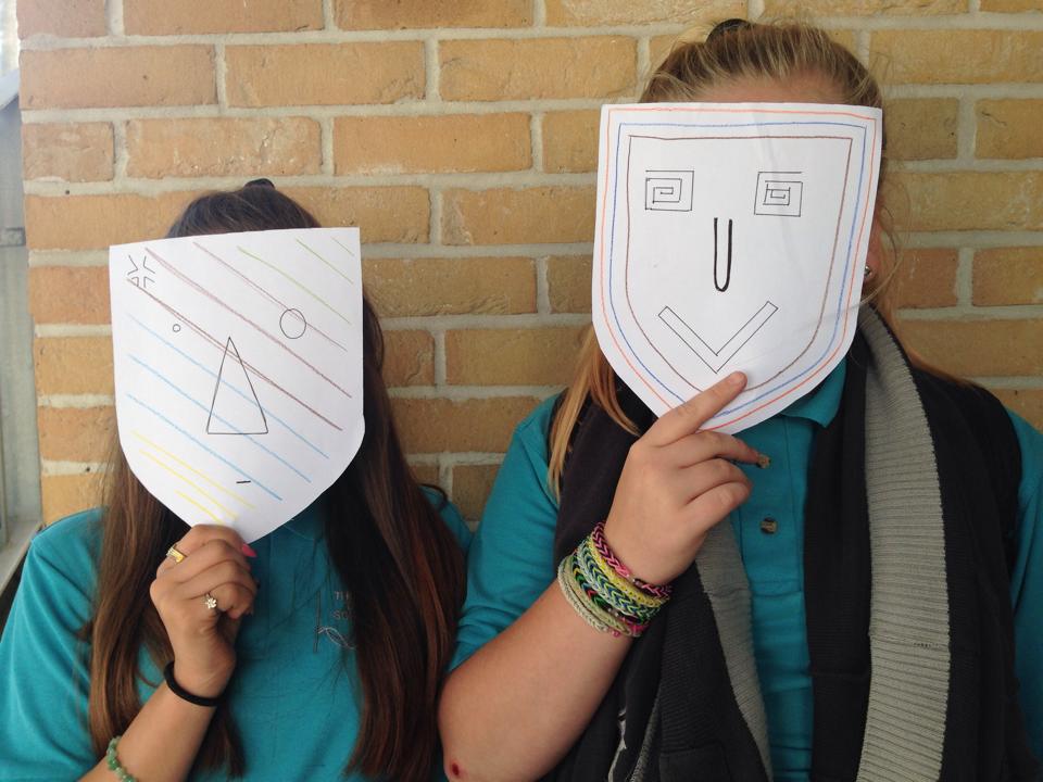
Here I have re-created the disguise images inspired by Ana Strumph and Hattie Stewart. I think that these images turned out a little bit better because I already had a rough idea of what I wanted the images to look like and what went well in places because of my last experiment. The 'doodle' I think looks best is the one with the coloured 'dribble' effect on only one hand. I think that this image is the best because the hand sort of stands out the most and I really like the lines on the face because I think it makes it look detailed yet simple. This image could have turned out better if I had chosen a photo that had two hands in it so I could do the 'dribble' on both hands. The image that I don't really like is the image that has skull like features drawn into it, I don't really like this one because I think that it looks too messy and I hadn't really tried to do this type of drawing before so I wasn't sure how it would turn out.
Inge Morath And Saul Steinberg
|
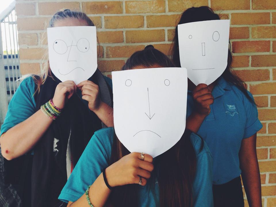
Saul Steinberg was a Romanian illustrator who worked with and for New Yorker Magazine. The Masquerade project was a collaboration between him and Inge Morath, his Austrian photographer pal. These photos were created in the late 1950s and early 1960s by having people they knew put on paper bag masks and pose for the camera. The resulting photos are now published in a book called 'Saul Steinberg Masquerade'. The images have been taken in everyday places such as in a home, in a car , at the dinner table etc.
I find this work really interesting because I have never seen anything like this before done professionally. I think that this is going to be fun to recreate because I will get to decide how the person in the photos look (their mood because of the drawing of the face). |
|
Ralph Meatyard
|
|
Ralph Meatyard (1925-1972) was an American photographer from Normal, Illinois. In his last 10 years he dedicated most of his photos to his 'Dolls And Masks' series. He photographed his children wearing the masks in landscapes that make you feel a little bit creeped out. These images were put into something called 'The Family Album Of Lucybelle Crater', this was produced just before he died in 1972 of cancer. The photographs in the book/album are of 'Lucybelle Crater', A name adapted by Ralph adapted from a character in a Flannery O'Connor short story. 'Lucybelle' is played by his wife Madelyn, wearing a 'dime-stone hag mask', paired with family members and friends wearing masks that make them look older. He clearly wanted the identity of each person in every photograph not to be known. In the last photograph that was taken in this series, Meatyard and his wife traded clothes and masks and it was taken in the same garden that the first photo was taken in.
|
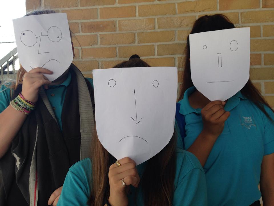
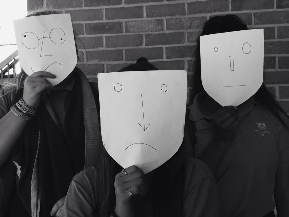
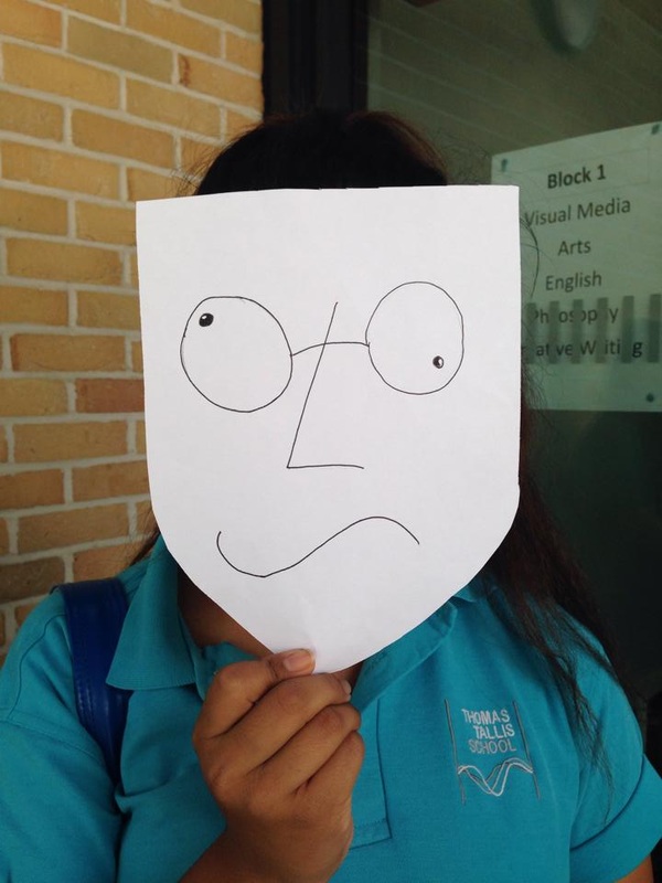
This is one of my first experiments using things that actually cover the face. With these photos the person in the photo had to hold the mask onto their face which makes the model unable to pose like they would in a normal photo. When I repeat this experiment I will attach straps to the back of the masks so the model doesn't have to hold them, I also think this will make the photo look more neat and tidy because the arms and hands will be free to pose for the photo. I think my best photo is the one in black and white(although I already have that image twice edited differently). I think that this is my best photo is the black and white one because the faces on the masks seem to match with the feeling you get from the black and white filter.
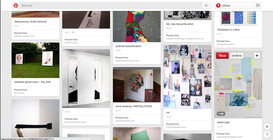
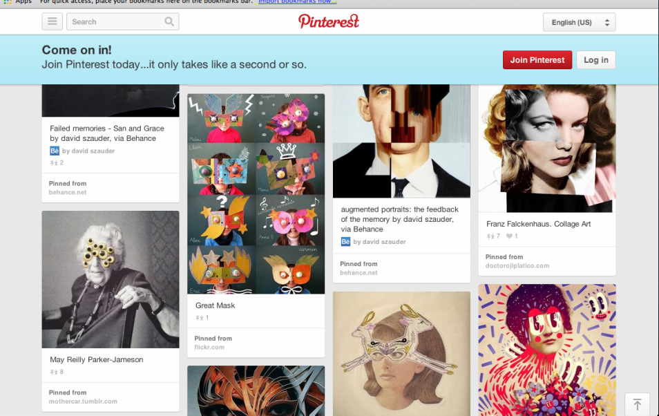
I researched display strategies on the Tallis arts Pinterest page. This is a screenshot of the page that has a couple of displays that I like. I think the displays to the left of the screenshot and ones that I would like to do because the look simple but quite good because the photos are all bunched together loosely, so their not really squashed. I also like those ones because you can just use tape to make it look effective. However, I think that using a bright yellow tape wouldn't look good with my photos because my images are in black and white and it would look better with a black, white or grey tape because those colours are simmilar to the tones in my images.
Final Piece 1

|

|
These two images are going to be part of my final piece. I have chosen these two photos of the twelve I have made because they both look similar and both represent John Stezaker's work because they are photos of people who's faces have been distorted to make the people in the photo look almost unrecognisable. Although they are in black and white, I still think that they look just as good as they would if they were in colour, in my opinion the black and white images make the person look even more unrecognisable because of all of the tones and contrast that black and white images highlight.
Final Piece 2
I have chosen to use these three images oppose to all six because I think that these three can be linked together more than the others. They can be linked together because they all cover the face and they are all images of trees/bushes. I think that even though the image in the middle doesn't have the same layout it look good because it shows the image of the tree cut in half and you can clearly see what it would look like if it was still stuck together. I also think that this work is almost a clear representation of Franz Falkenhaus work.
To display these images I have put them in three identical frames and all the photos that are in the frames are all the same size and in the same place on the frames. I want to put the photos in a line when they are being presented and i want them to be in the order that they are in above.
To display these images I have put them in three identical frames and all the photos that are in the frames are all the same size and in the same place on the frames. I want to put the photos in a line when they are being presented and i want them to be in the order that they are in above.
Final Evaluation
For the externally set task I had chosen to start with 'Disguise'. I chose this because I had looked at some examples of other peoples work from older years and I really liked that you could completely change the way the person looked in the image so their identity would be hidden.
To create my images I used a range of supplies: To create my images inspired by John Stezaker I used photocopied old images of family members and friends, scissors and glue to distort the way the people in the image looked. To create my second image set of images I used photos that i had taken on my iPhone and then put them into photoshop and used the same type of cut and paste method but digitally. The third set of images were produced the same way but I then added them to a magazine template I tried to create myself by using white backgrounds and magazine names. To create my images inspired by Hattie Stewart and Ana Strumph I printed out images taken on my iPhone and used coloured fine line pens and then I scaned them into my website. For my final set I used some plain white masks with faces drawn onto them and then i got my friends to hold them up to their faces so they were hidden. .
To find artists I had to use the Tallis Arts pinterest and I looked on their disguise board. When I had used all of the artists that I found on pinterest I google searched 'disguise photographers/artists' and i found a few that way. I think that the artists i used really influenced my work because i really enjoyed their work and i really enjoyed making their work in my own way.
My first final piece is inspired by John Stekazer, because i really liked that he changes the way two people look at once. I think that my work could have been even better if i had chosen to take new pictures and mix them together with the older ones, as it can show how people have changed in looks etc. My second final piece is more inspired by Franz Falkenhaus but also John Stekazer. I think that this is more inspired by Franz Falkenhaus because his work looks more digital than the John Stekazer's. I really like the final outcome because i feel like the person is hidden (or disguised) so it meets the main aim of this project. This could have been made better by having something more interesting covering the face.
