Contrast
Chiaroscuro- "The treatment of light and shade in drawing and painting"
"An effect of contrasted light and shadow"
The word originates from the italian language and it means light/dark.
Chiaroscuro is mainly used in art but similar effects have been used in photography and media. In art it is the use of strong contrasts between light and dark. Chiaroscuro is used in cinematography to create low-key and high-contrasting areas of dark and light in film. Classic examples of this would be, Nosferatu (1922), The Hunchback Of Notre Dame (1939) and The Devil And Daniel Webster (1941). Chiaroscuro in photography started with portraiture, it is most famous by Rembrandt lighting (introduced by a painter of the same name). The concept of chiaroscuro when taking pictures is, make sure you recognise the light and when it happens and put it into a scene that has impact and good composition. Chiaroscuro is also a way (in filmmaking) to determine the mood of a scene. With this technique you can create a mysterious and dark mood, just by the way the light is shown around the subject.
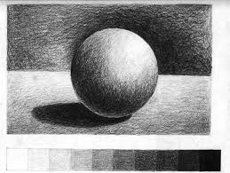 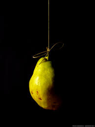 |
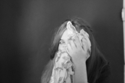
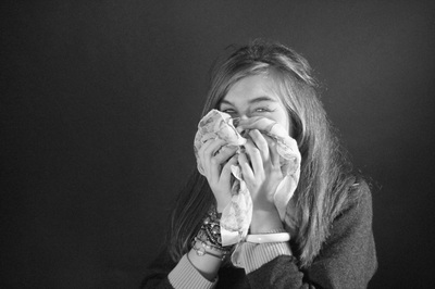
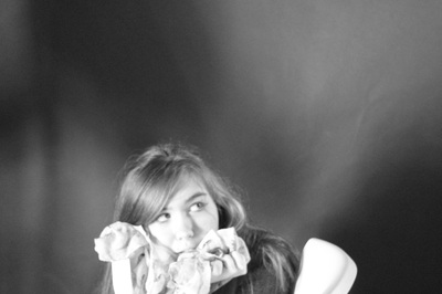
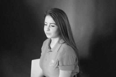
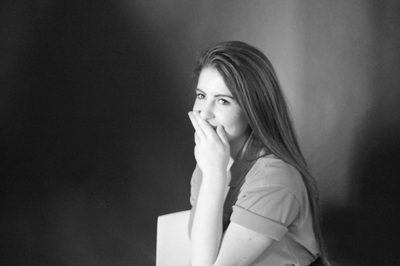
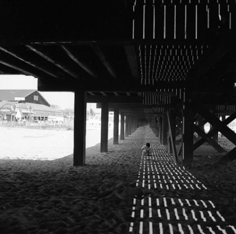
The first image on the left is an example of chiaroscuro in drawing. The image clearly shows where the darkest areas and the lightest areas are. The second image on the left is an example of chiaroscuro in photography. The image clearly shows where the light and dark areas are. This is a good example because there is only light shining on the subject and no light on the background. |
|
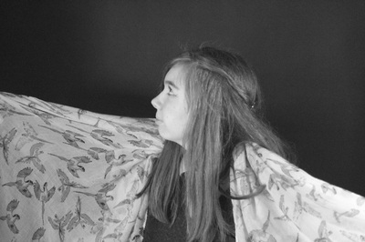
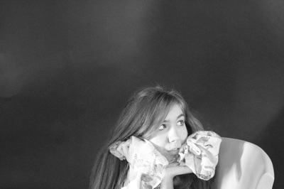
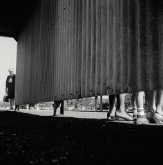
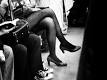
The images to the right of this text show examples of chiaroscuro in (on the left) art and in (of the right) photography. They both show mood and mystery. In the image on the right, I think that the light was being held above the models head so not much of her is highlighted. This creates a sense of mystery because you can only see the outline of her features, no details. In the image on the left only the character directly in the middle (which I think is a surgeon or a scientist) is lit up. This could be because the image is telling a story that could be a little bit scary so the artist is trying to portray that by only highlighting the one character. This could have been done to make the viewer feel that the doctor is doing something he shouldnt be doing |
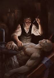 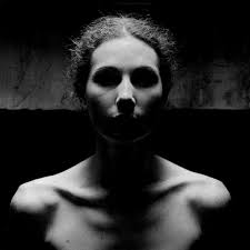 |
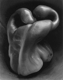
Image By Edward Weston
'Pepper No. 30' (1930)
|
"Pepper No 30, is one of the best known photographs taken by Edward Weston. It Depicts a solitary green pepper in rich black and white tones, with strong illumination from above"
This image was taken in 1930, it was one of many images taken of shells, vegetables and fruits, that he named 'Still-lifes'. This particular image of the pepper was taken in a large tin funnel, that he had found in which he had placed the pepper in the open end and took that image. By placing the pepper in the funnel, it allowed Edward to light the pepper in a certain way that made the pepper look 3D. I think that this image shows chiaroscuro very well because you can clearly see where the light is hitting the pepper the most and where the light isn't hitting the pepper that much. I think that the light is coming from the right hand side because that is the side that is most highlighted. |
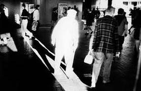
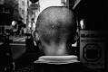
Image By Trent Park
|
This is an image taken by Trent Park. This image also shows chiaroscuro well because the man in the middle is the brightest part of the whole image. You can clearly see the contrast of the the light and dark areas. I think that the man could be standing where an open doorway was on a sunny day. Even though the background isn't completely dark, the image still looks good because there are many different tones in it. Also you can see the man's trousers in the background are highlighted by the bright light. |
|
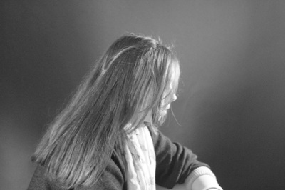
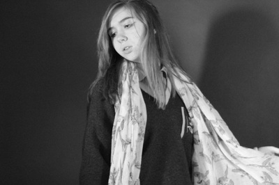
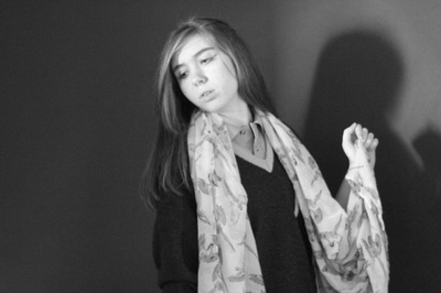
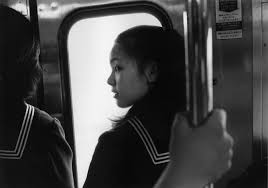
Image By Sally Mann
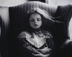
|
This is an image by Sally Mann. This image shows the contrasts between light and dark tones well. Chiaroscuro could have been used to create a mysterious mood or atmosphere, which might make you wonder and want to know more about the image. I think hat this image could have been taken using natural light because in the background you can see a little bit of a room that is light and not dark. Also the girl's face is lit up as well as her clothes. |
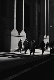
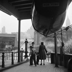
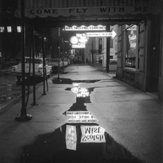
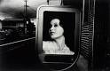
Image by Raymond Depardon
"Wall Street Financial District " 1999
|
This is an image taken by Raymond Depardon. I think that this image shows chiaroscuro well because it has quite a sharp contrast between light and dark. By using chiaroscuro in this way it could make the viewer want to know more about where the image has been taken. In this image you can clearly see what direction the light coming from and how much light there is. I think that this image could have been taken as the people were walking down a back alley down onto a main street where cars were probably driving past, creating the light that highlights the figures. |
|
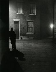
Image by Bill Brandt
"London" 1937
|
This is an image taken by Bill Brandt. This is another image that clearly shows chiaroscuro, this presents chiaroscuro because the contrast between light and dark are clearly visible. I think that this image was taken at night because the light is closer to the left side of the image suggesting that the light could be coming from a car or it could be coming from one of the street lamps. I think that when you look at this image your eyes could be drawn to the person in the image because you cannot see any their face. Because of the time this was taken it could suggest that that person in the picture could be doing military training for the war. |
Experimenting With Chiaroscuro
Using a digital camera
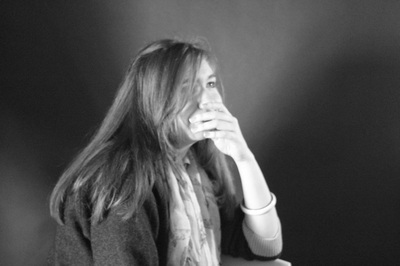
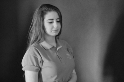
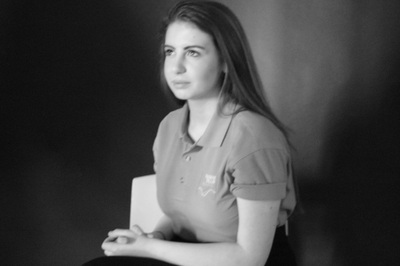
This is a set of images that have been taken using a digital camera, a black backdrop and some studio lights. These images were take with a black and white filter. I think that the third image is the best one because there is hardly any light on the background, it is more focused on the person. Also there are many tones of white, grey, and black which makes the image more interesting and makes it look better. I also think the this last image is good because there is hardly any light on the background and I like that you can see the shadow of the person.
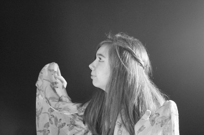
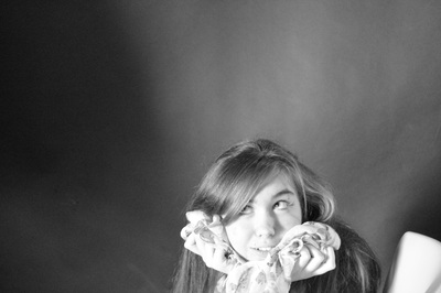
Examples of chiaroscuro by Me
Taken using an iPhone and a torch
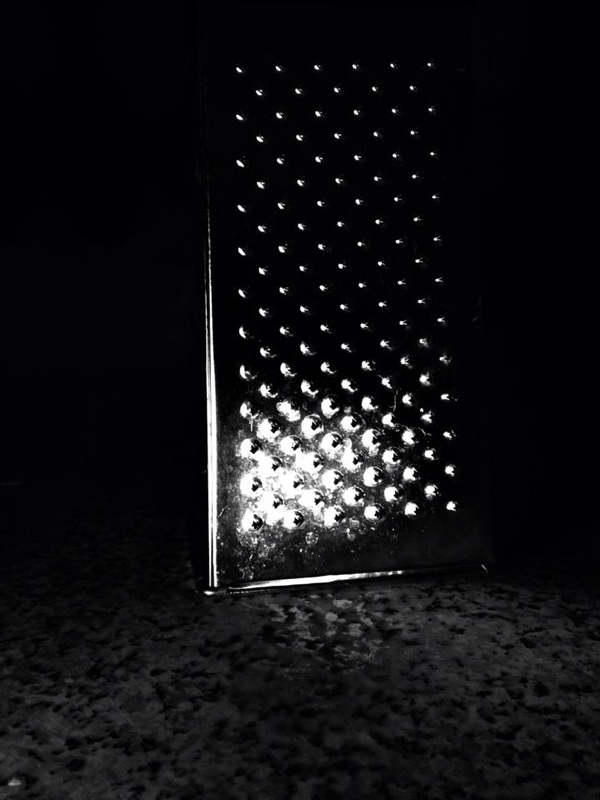
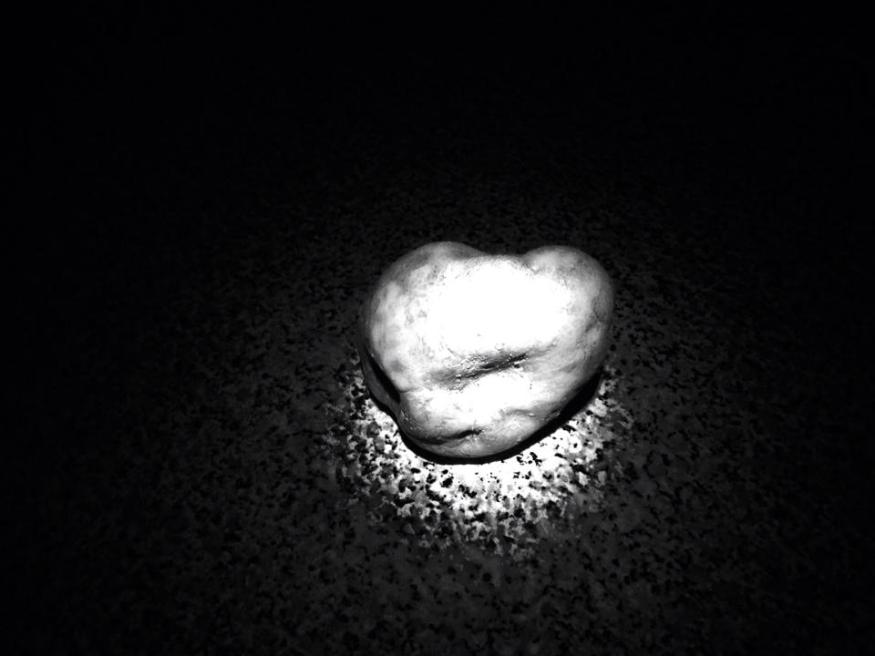
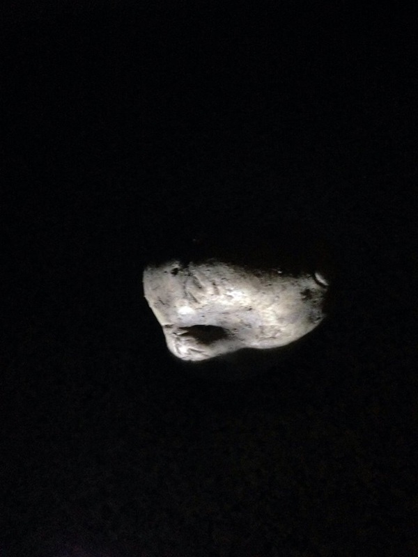
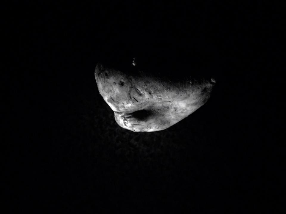
These are some images that I have taken at home using the iPhone camera app (using the effect "tone"), a grater and a potato along with a torch to light the subject. These images were taken in a kitchen, with the light turned off and when it was dark outside. My favourite image is the third one because only half of the subject is shown, it is similar to the image in the chiaroscuro example. My least favourite image is the second one because the light wasn't pointed directly on the subject it was on the surface that the subject was put on, It may have looked better if the surface underneath the subject was white because then you wouldn't have noticed the light that was hitting the surface that much.
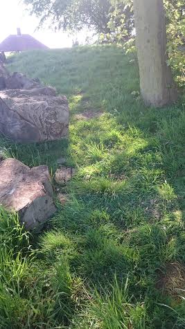
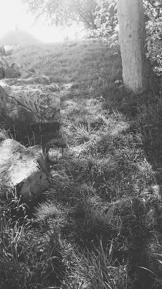
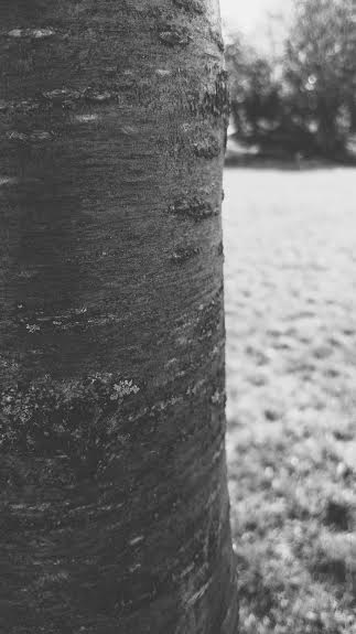
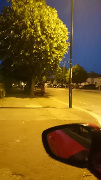
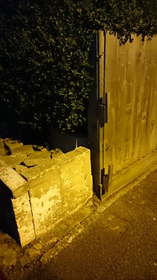
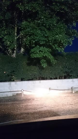
Example of Chiaroscuro Using Natural Light
Taken Using an iPhone
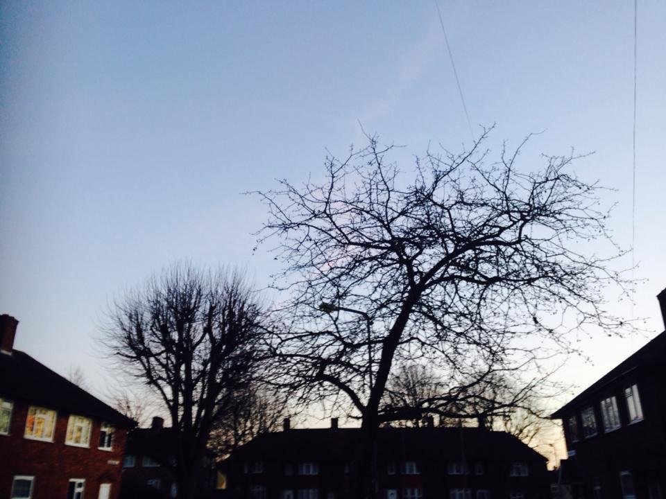
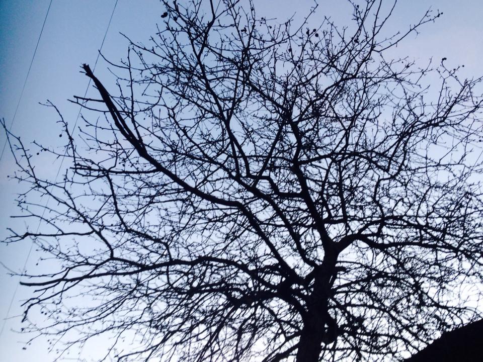
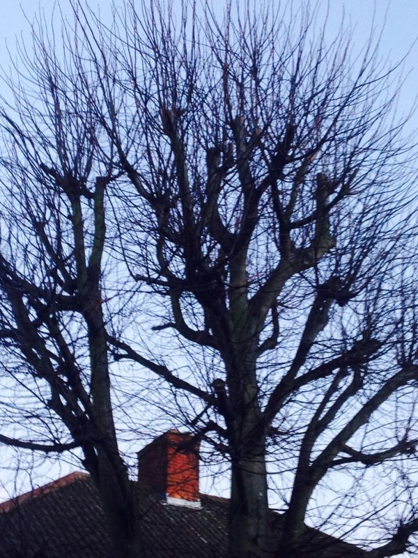
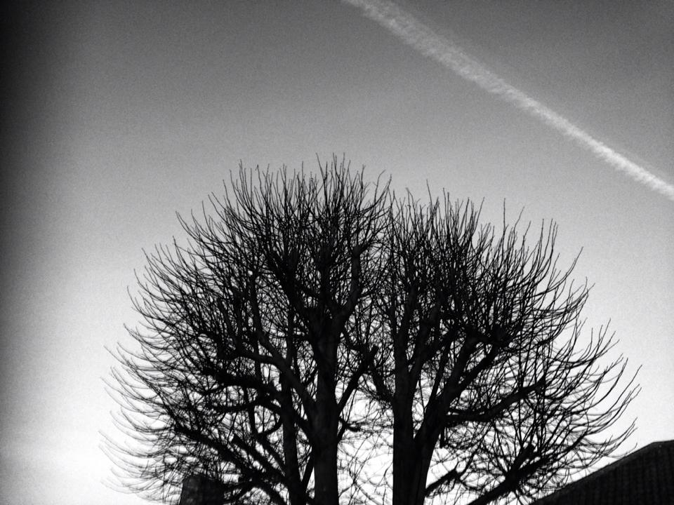
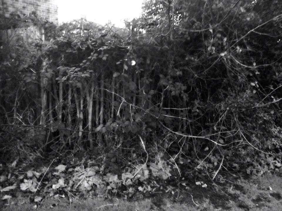
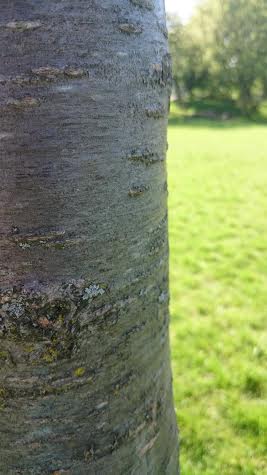
This is a set of images that I have taken that are examples of chiaroscuro using natural daylight. The task was to create some images that show contrast using natural lighting. I wasn't exactly sure what to take images of so I walked around where I live and took images of things I had seen while walking around. I took images of trees because I thought there would be many different tones in the images. My favourite image is the last one because it has a range of different shades from grey, white, and black. I also really like the first image because the branches on the trees really stand out against the blue sky and I really like the way the buildings look because the one on the left has quite a bit of light shining on it, the building in the middle has barely any light on it so it is almost completely black but you can see where the light was reflecting on the windows if the house, and the house on the right is also nearly black but the windows are bright because the light is reflecting off of the windows. If I were to take these images again, I would make sure I know or make sure I have an idea of what I want to take some images of because these images could have been a lot more interesting if there were other things in them.
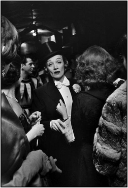
Image by Elliot Erwitt
NYC MARLENE DIETRICH AT THE APRIL PARIS BALL AT THE WALDORF ASTORIA HOTEL 1959
|
This is an image taken by Elliot Erwitt at The Waldorf Astoria Hotel 1959.
This image clearly shows chiaroscuro because there is a dramatic tone in black and white/grey, and you can see where the lights hit the main subject (from above). When I look at this image my eyes first, focus on the lady in the middle mainly because she is highlighted by the clothes she is wearing and the light shining on her, but then my eyes go to focus on the people that are surrounding her, wondering who they are. This ball was to be the last one at the Waldorf hotel and focused on the Parisian circus of the 18th century. Marline Dietrich (in the image to the right) was dressed as a ringmaster, wearing trousers and a waist coat with a top hat. She then went on to sing two songs; "Louise" and "Mimi". |
|
Research
Vivian Maier
|
Vivian Maier worked as a nanny for forty years of her life and photographed during her spare time. She used a twin lens format camera. When she was taking images she only had an opportunity to take about 12 shots per roll, so she really had to think about what she was taking images of.
When her work was discovered, many undeveloped rolls of film were found so she hadn't seen all of her work, which honestly is a shame because she has taken so many beautiful images. While the majority of her work is in black and white, they still all make you want to know more about the image or even know more about the photographer. |
|


Daido Moriyama
|
|
Daido Moriyama has been photographing for over 50 years. He uses a Ricoh compact film camera, he said:
"Any camera is fine. It is only the means of taking a photo" He enjoys shooting images walking around cities because the possibilities are endless:
"Every city, no matter how it looks, is a work of art. Fifty years have lapsed and with the thousands of photographs I have taken, I still find photography amazing. There are still millions of things and people that are worthy to be shot" |

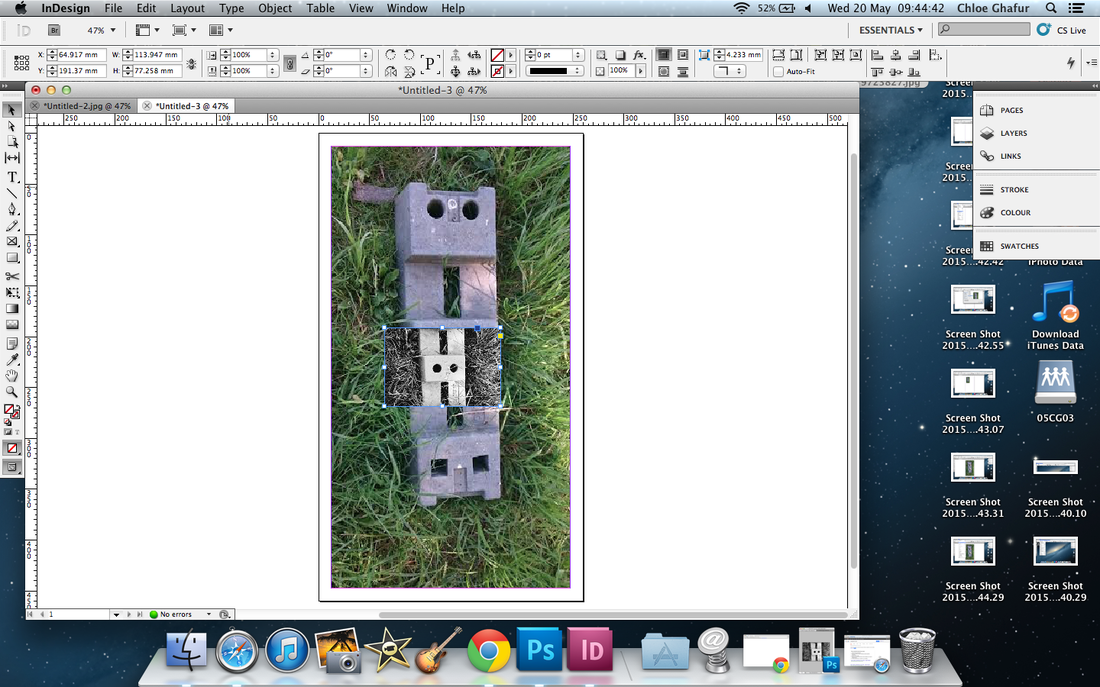
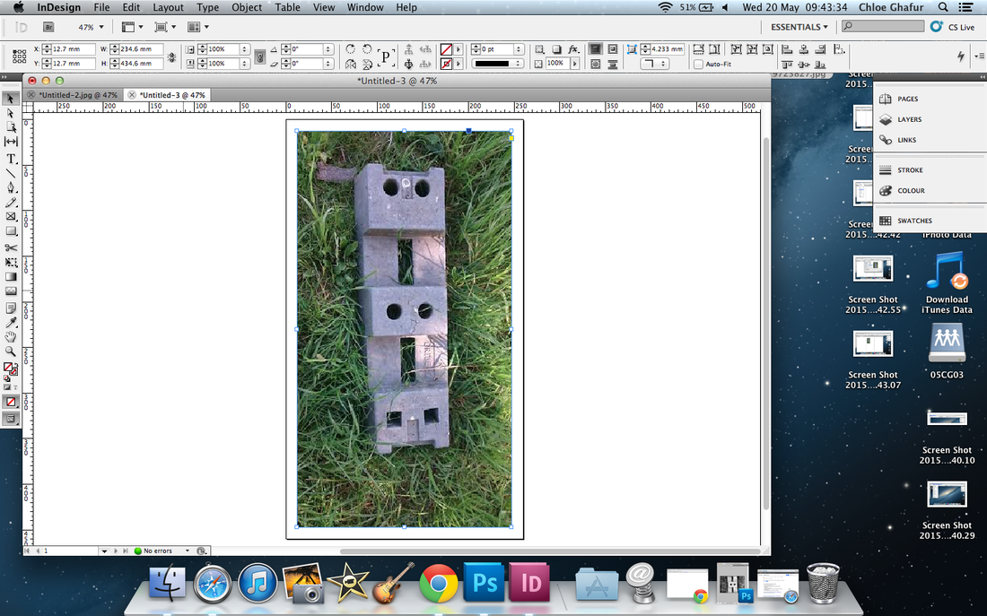
Experiment 1
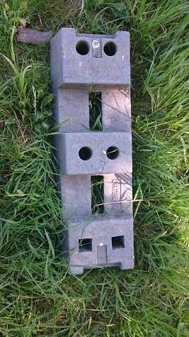
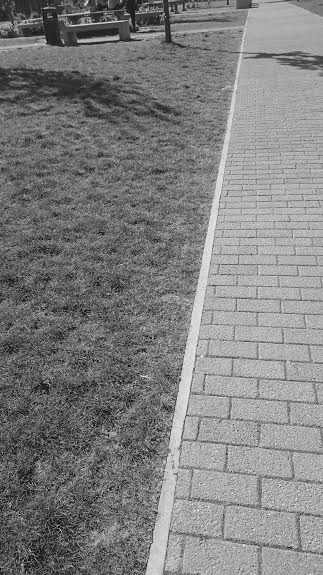
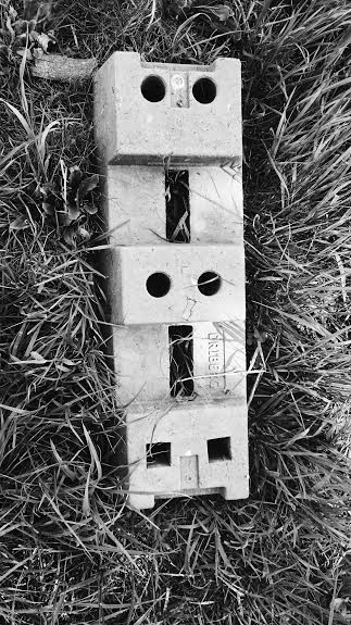
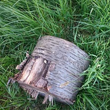
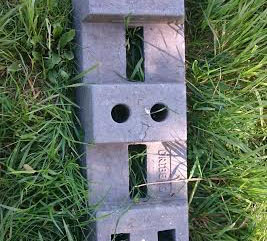
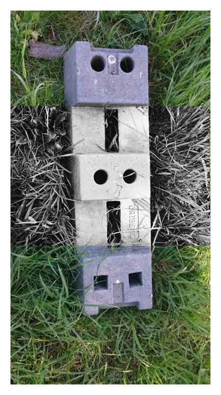
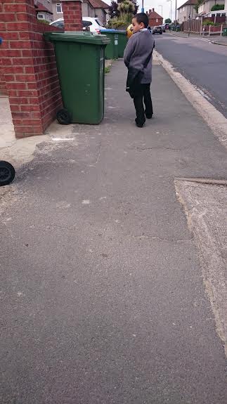
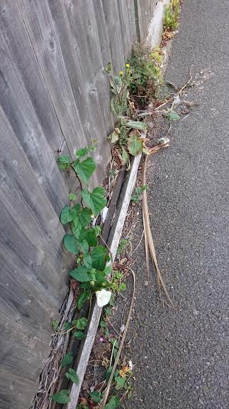
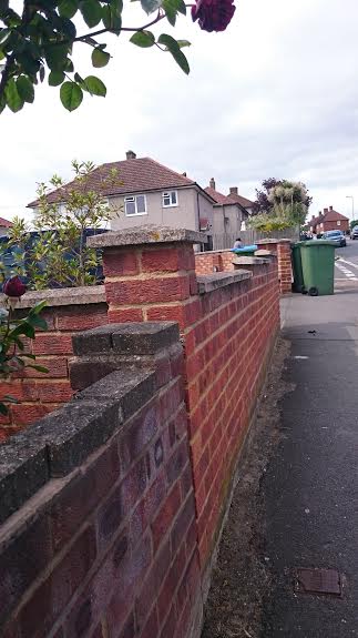
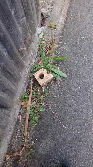
These are some images I have taken using my phone (Sony Xperia Z3) outside in school. These images are straight from the camera and have had no editing done to them at this stage. My favourite image here is the first image because you wouldn't necessarily find a concrete block in a field. I also think that the contrast between the surfaces is particularly interesting because the concrete looks to be quite smooth but the grass looks as if it would be quite sharp. I think that when this image is converted into black and white there will be a dramatic contrast of colour, noticeably on the grey concrete and green grass. My inspiration to take these images came from both, Vivian Maier and Daido Moriyama. All I did was walk around the field and take images of what I thought was interesting and what would make a good photo, like both photographers mentioned before.
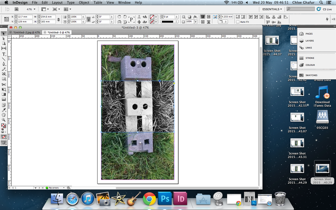
First Edit
Filters on a phone app
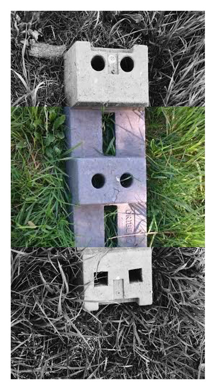
This is near enough the same set of images that I had taken before but they have been edited using an app I downloaded onto my phone. The filters are called B1, X1, and B5, I also paired this with changing the contrast to a range of higher and lower ones depending on how much light was initially in the original image. I am really pleased with the way the images have turned out but I think that they could be made a little bit shorter because currently they are really small.
Second Edit
Cropping in Photoshop
For this edit I have selected three images too crop into a square. I have done this to try and make the image look more interesting and I think that the original image/edited images could be cropped a little bit to make them shorter because the device that I have used is very large therefore the images that are produced from it are large too. I think that by cropping them it could make the viewer wonder a little bit more about the image. For example these images were taken at my school but someone who hadn't seen these at school could think they were taken in the woods (the first and third image) and possibly a worksite (the second image).
Third Edit
Photo manipulation using Indesign and Photoshop
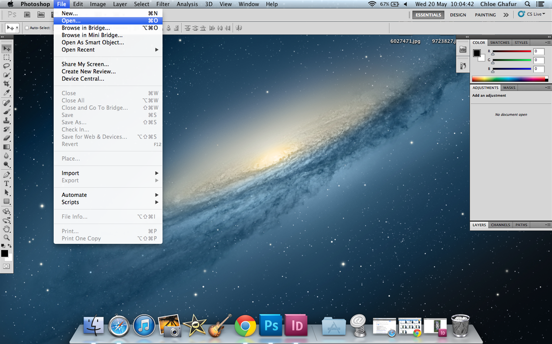
Open photoshop and click open.
Save the cropped image. Then move onto using InDesign.
|
Select the image you want to edit.
|
Load the image, and crop to desired size.
|
Open Indesign and click on file>new>
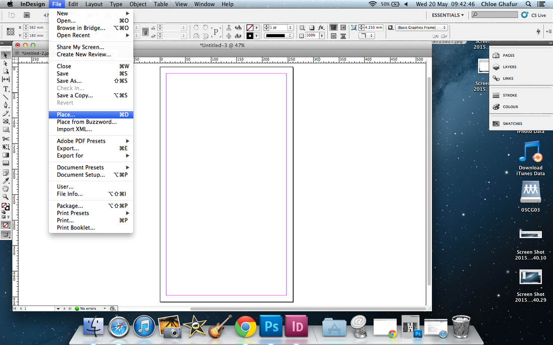
Go to file>place and choose the image you want to manipulate
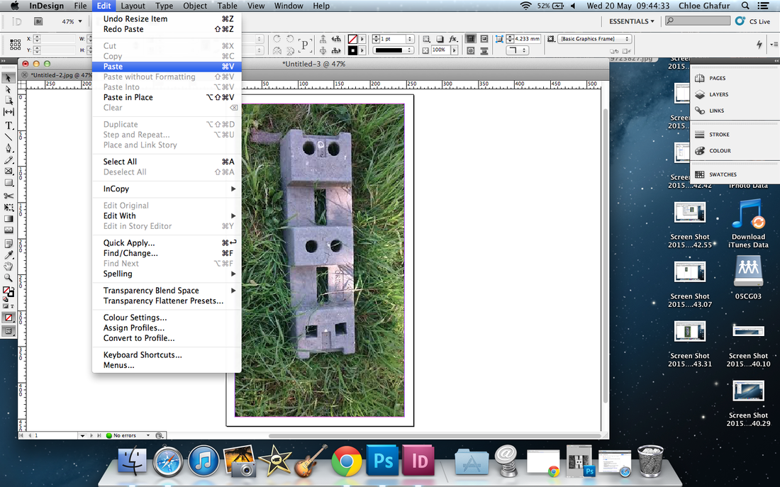
Then go to edit>paste and paste in the image you edited in photoshop earlier
|
Choose the correct dimensions for the image you want to manipulate
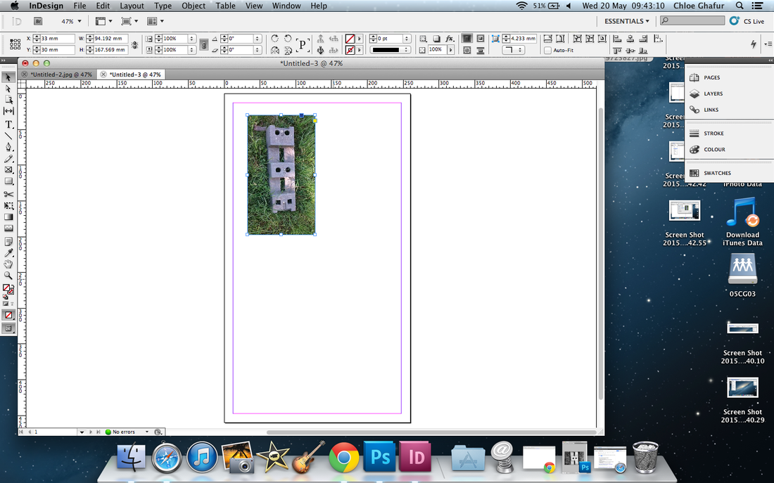
The image will appear small, but you just drag the corners out until it fills the pink rectangle
Again use the corners of the image to resize the smaller image, but make sure it is lined up properly
|
Then this should pop up
The image should look like this
This is what the final image should look similar to. Then save and edit further if you would like to.
|
Final Product
|
|
These are two images that I have edited using Photoshop using Indesign. My sister first taught me how to do this at home because I couldn't work out how to make this on Photoshop, so she introduced me to InDesign. I really like how these images turned out, but the quality isn't that good on them. This could be because they were taken on a phone and emailed to myself, or this could be because I didn't put the right image dimensions into InDesign.
The process of making these wasn't very hard, it was just a little bit frustrating because I had to crop the exact same sized image to go in the middle of each image. I think that in the first image above, the black and white section in the middle needed to be a little bit longer because it doesn't look like it actually fits properly. Also in the second image the coloured section is too zoomed in so the image itself looks very distorted and even more pixelated than it already did.
This could be more interesting if I had used more than one filter on the one image, for example, I could have a 1/4 of it black and white, 1/4 of it the original colours, 1/4 of it faded colours and maybe 1/4 of it bright and bold.
Fourth Edit
using photoshop

These are some images I have changed slightly in photoshop. I did this by: opening the original image, then opening a texture. With the texture I had to go onto adjustments and adjust the hue/saturation to greyscale. Then I could move the saturation bar left or right and by doing this, I could achieve a colour change mainly on the grass. I think that these images have made what can seem like a hard task when using masks very easy just by changing the hue and saturation.
Experiment 2
These are some images I have taken outside of school using the same device as I did with the previous images. I took these images, again inspired by Daido Moriyama, on my way home from picking my little brother from school. These images do not look as bright as the other ones because they had been taken at around 3:40-4:00 whereas the other ones were taken at about 9:30-10:00 in the morning. These images could have been better if they were taken later at night, I think the next set of images I take will be taken outside at night or late afternoon because I feel that only taking images during the day will hold my project back from developing. Also I think I should download some apps to use to edit/take the images with because again I feel that only using photoshop will hold my project back.
First Edit
Using Photoshop
Open photoshop and make a file of 1000x1000
Name this if you want then press ok
Then open up the required image and resize to fit into the box
|
You should get a square around this size
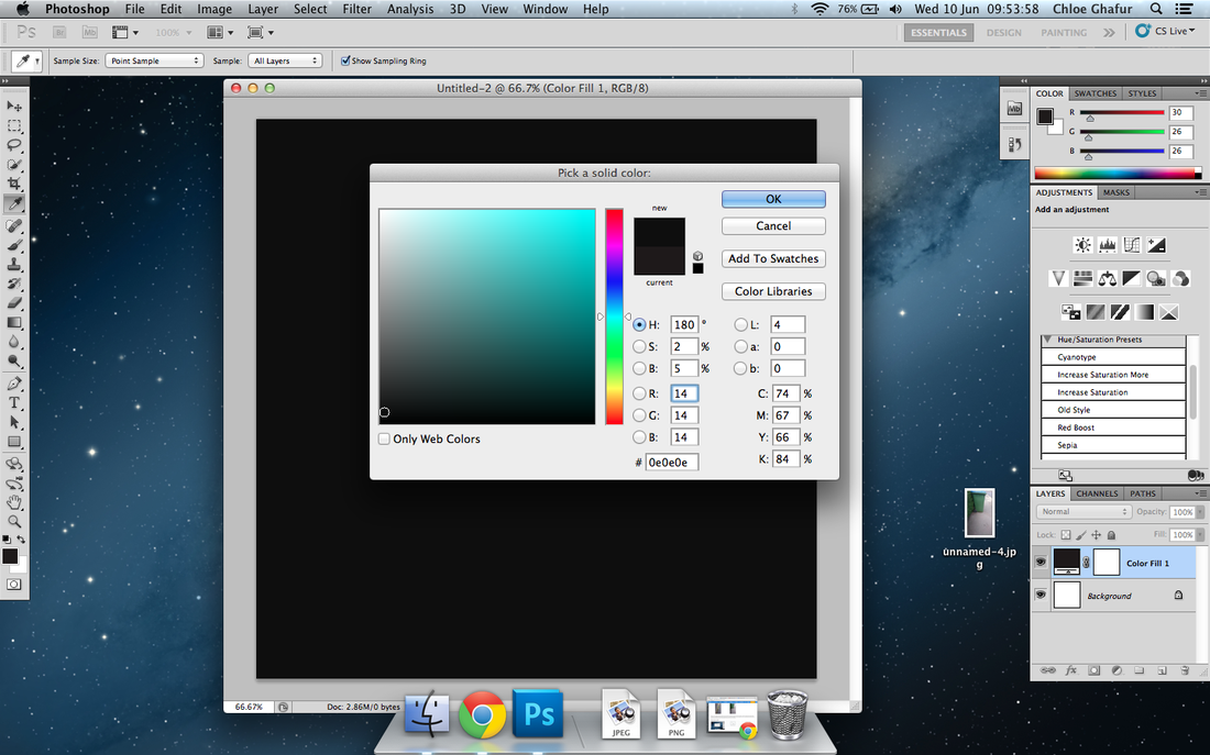
Change background to black or any colour of choice
When I got to the previous stage, I found the step after this really hard and the image I originally wanted to use wouldn't fit in the size base I had, so I decided to stop working on this part of my project and move onto another one.
|
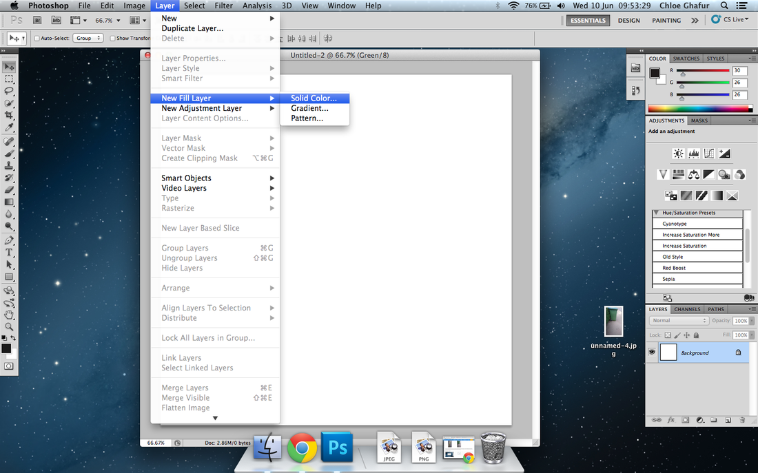
Then go to to Layer>New Fill Layer>Solid Colour
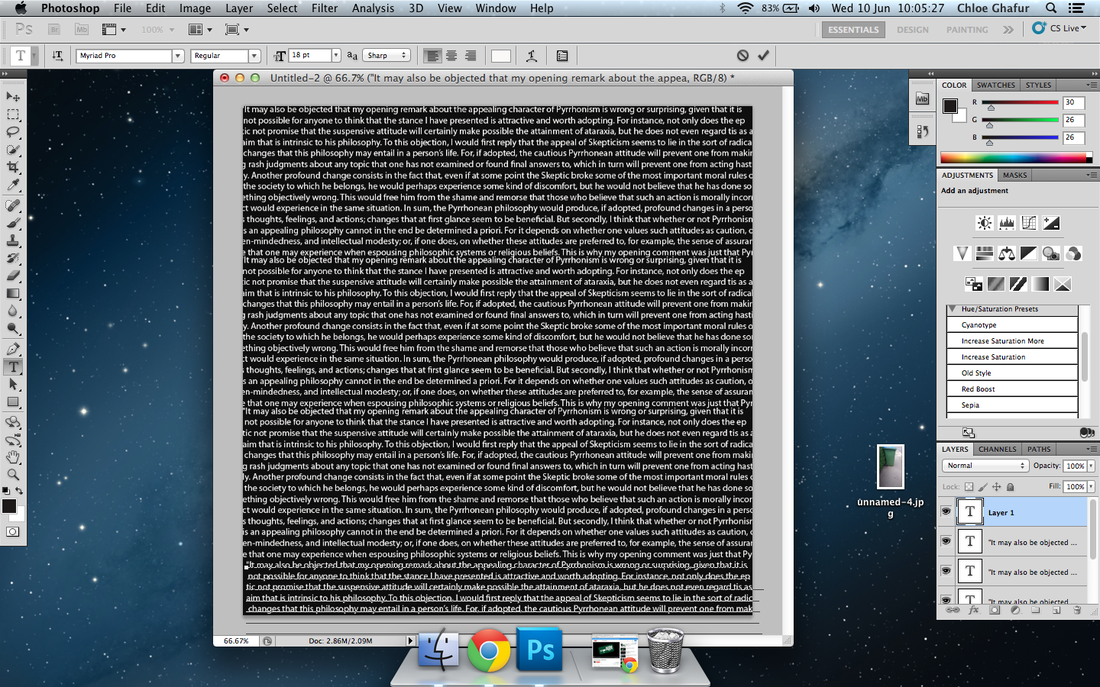
Then insert text, it should be in capitals but can be in lower case. You can either write it out yourself or use copy and paste.
|
Second Edit
Using Photoshop
|
|
|
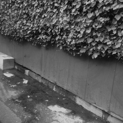
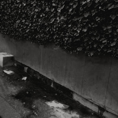
To create this effect on this image I used a tutorial from http://abduzeedo.com/quick-tips-instagram-your-images-using-photoshop .
These images were made using the same tutorial, so I don't know why one is darker than the other but I do kind of like it because it makes the comparison between both images more interesting. Here is what I have done to achieve this:
1) Open an image in Photoshop and name it Nashville -so you don't get confused
2) Then create a new layer (Layer>New>Layer). Go to the top right hand corner and change the RGB. Change Red: 247 Green:217 Blue:173. Leave the opacity to 100% and change blending to "Multiply".
3) Go back to the Nashville layer, and go to Image>Adjustments>Curves. Go into green channel and change the output to 37, then go to blue and change it to 113.
4) Go to image>Adjustments>Levels -change middle to 1.36 and input to 236.
5) Go to Image>Adjustments>Brightness/Contrast -change brightness to 6 and contrast to 51.
6) Go to curves Image>Adjustments>Curves -go to green channel and change input to 13 and blue channel and change input to 88.
7) Then give depth but going to Image>Adjustments>Brightness/Contrast -brightness to -6 and contrast to 33.
8) Go to curves Image>Adjustments>Curves -red channel output to 4 and green output to 14 then merge all layers.
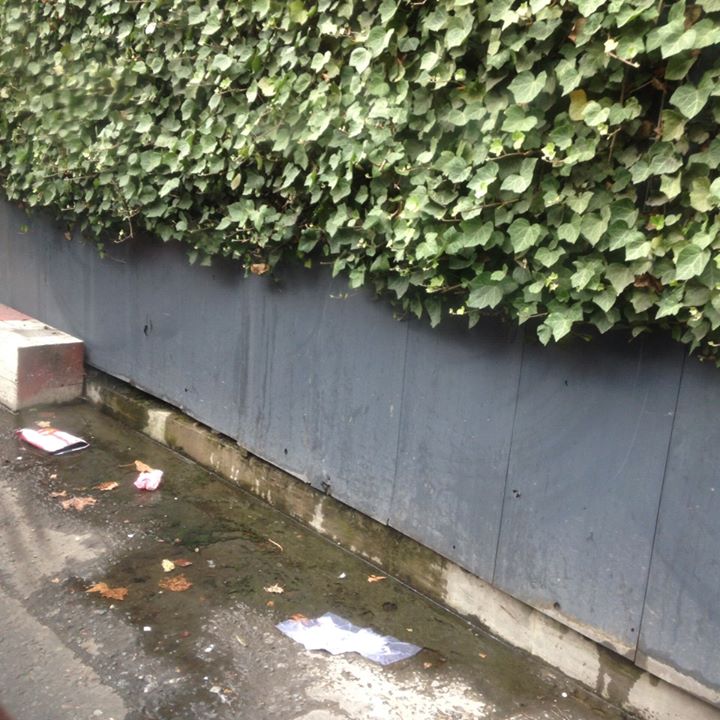
Additionally in the last image I changed the brightness and contrast -brightness to 86 and contrast to -45
I prefer the last image when it is lighter rather than darker because I think it looks more like the first image how I originally wanted it to turn out like. However the darker image looks more warm and has more of a range of tones in it. The lighter version of this image highlights more features mainly on the floor (the cement by the wall and the small drain on the bottom left of the image.
These images were made using the same tutorial, so I don't know why one is darker than the other but I do kind of like it because it makes the comparison between both images more interesting. Here is what I have done to achieve this:
1) Open an image in Photoshop and name it Nashville -so you don't get confused
2) Then create a new layer (Layer>New>Layer). Go to the top right hand corner and change the RGB. Change Red: 247 Green:217 Blue:173. Leave the opacity to 100% and change blending to "Multiply".
3) Go back to the Nashville layer, and go to Image>Adjustments>Curves. Go into green channel and change the output to 37, then go to blue and change it to 113.
4) Go to image>Adjustments>Levels -change middle to 1.36 and input to 236.
5) Go to Image>Adjustments>Brightness/Contrast -change brightness to 6 and contrast to 51.
6) Go to curves Image>Adjustments>Curves -go to green channel and change input to 13 and blue channel and change input to 88.
7) Then give depth but going to Image>Adjustments>Brightness/Contrast -brightness to -6 and contrast to 33.
8) Go to curves Image>Adjustments>Curves -red channel output to 4 and green output to 14 then merge all layers.
Additionally in the last image I changed the brightness and contrast -brightness to 86 and contrast to -45
I prefer the last image when it is lighter rather than darker because I think it looks more like the first image how I originally wanted it to turn out like. However the darker image looks more warm and has more of a range of tones in it. The lighter version of this image highlights more features mainly on the floor (the cement by the wall and the small drain on the bottom left of the image.
Third Edit
Using Photoshop
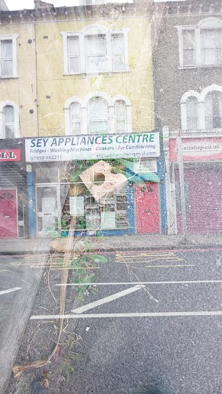
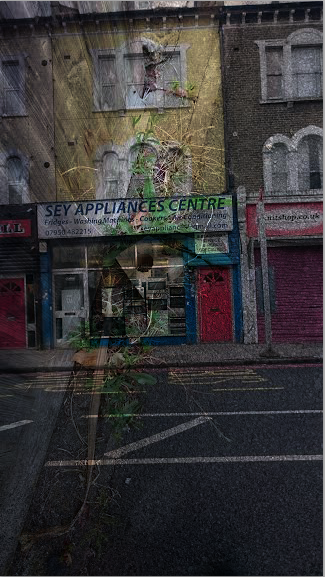
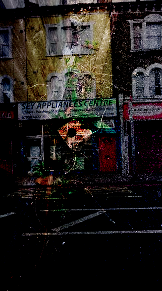
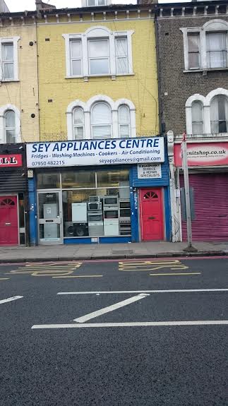
These are five images I have made using photoshop, crop, copy and paste. All i did to achieve this was choose the image i wanted to use an element from, crop that specific part out and copy and paste it onto a blank image base. I think that these images ave turned out very well and I think that they are good quality. These images could have been better by getting the spacing correct in all of them (so making them look like the last image). I also think that i could have made a few more images by using the same method but covering the whole background (similar to the first image).
Fourth Edit
Double exposure using photoshop
Here I have used photoshop to create a double exposure. It was very easy and I personally think it looks interesting. I really like the way these images have been presented too, the effects on the images seem to go from very light (left) to very dark (right). I think this could show how things change over time, although I never meant this to happen, I think it could potentially tell a story.
Experiment 3
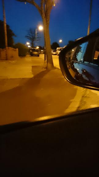
These are some images that I have taken outside of school mainly at night but also during the day. A few of these images were taken in the car while it was moving, to give it a blurred effect and the rest were taken while the car was not moving (at stop lights or when destination was reached). I think these image look very messy, but messy could be a good look if used and presented properly with other images similar or opposite. If I were to take these images again I would try to make the image look more interesting, thought out and well composed. I would also use a proper camera opposed to my phone.


Out of all of the images I had taken with this set, these are my favourite. These are my favourite because they are very bright and look good when they are in black and white, and because there are a lot of things in my opinion to look at. To make these images black and white I used photoshop, I opened the image and went into Image>Adjustments>Hue/Saturation, I changed the Saturation to -100 and I changed the Lightness to -21.
Experiment Four
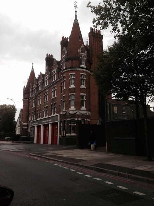
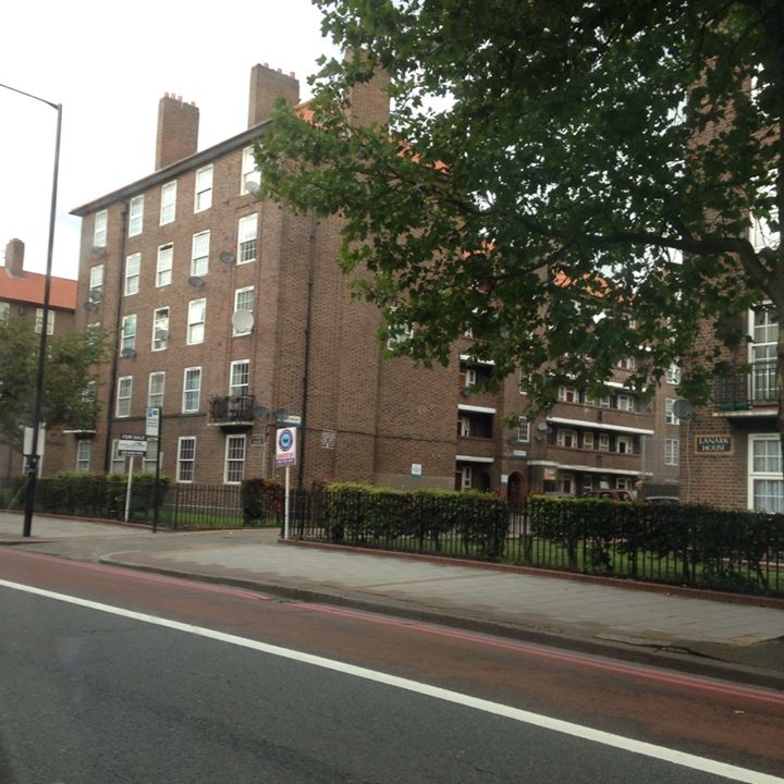
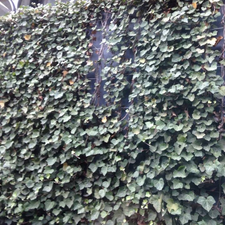
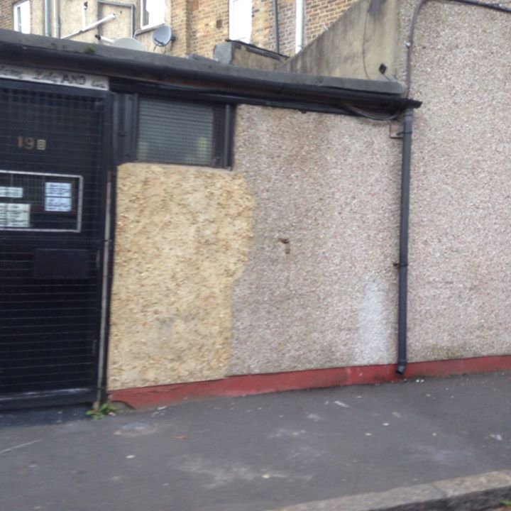
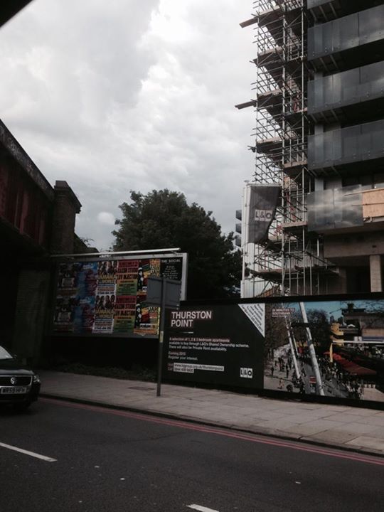
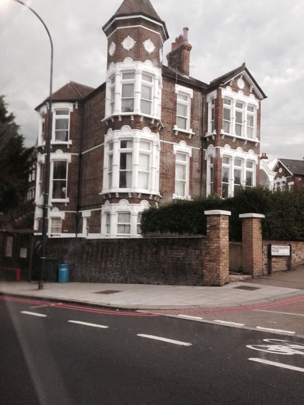
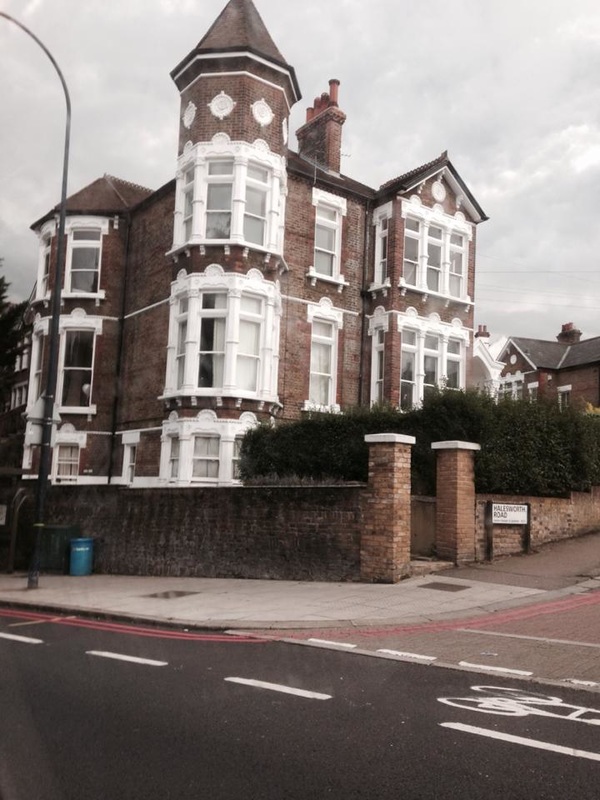
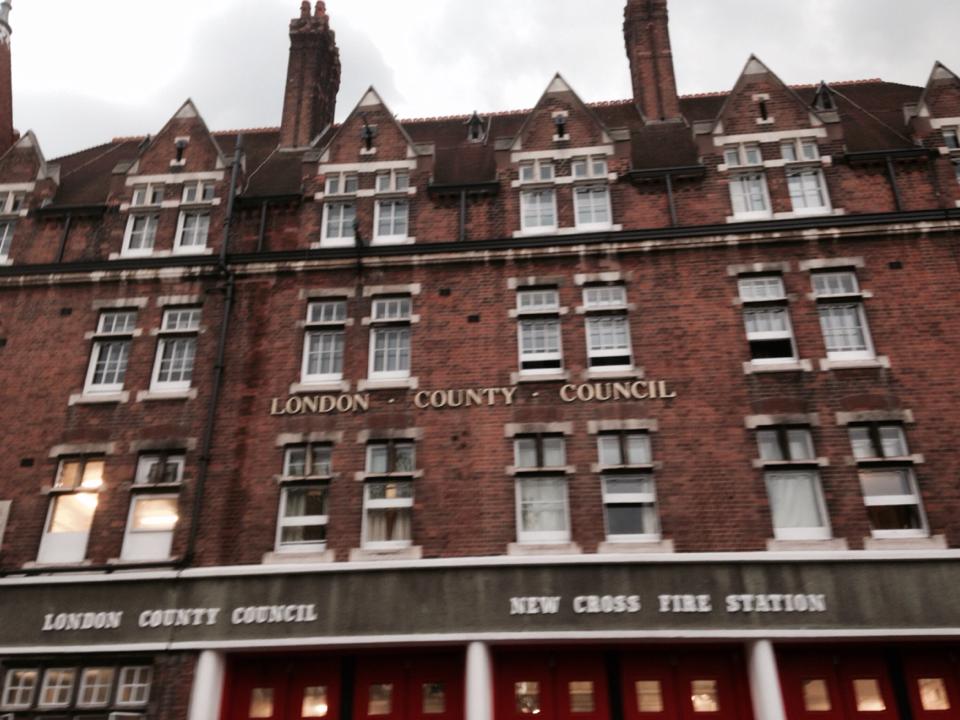
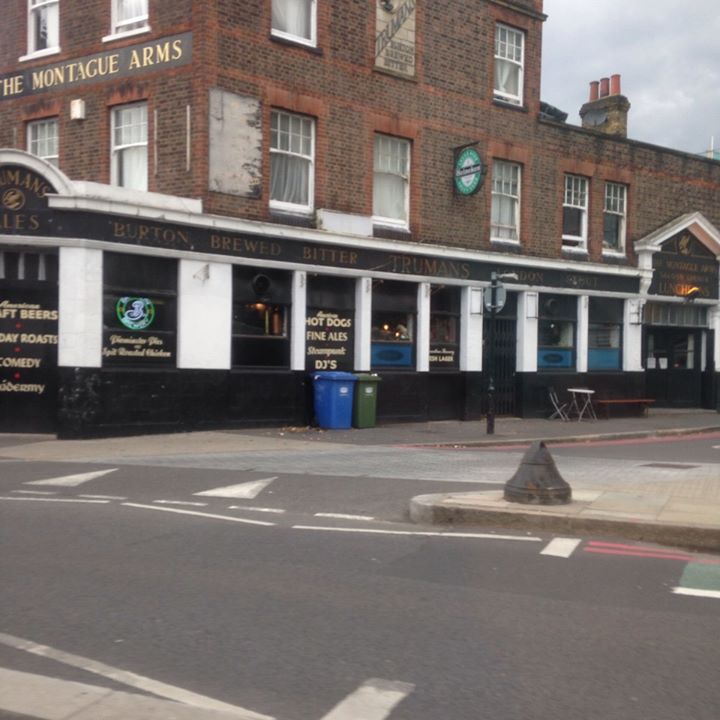
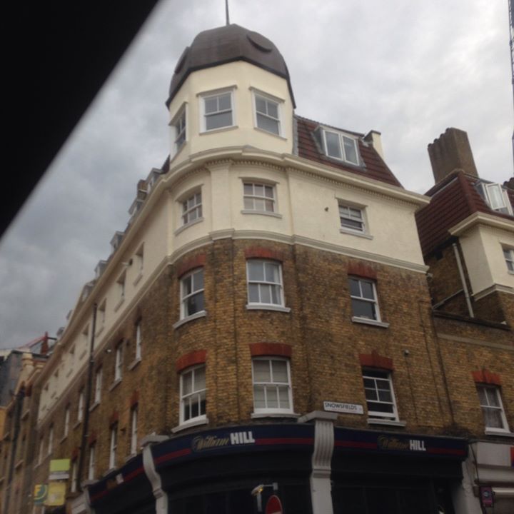
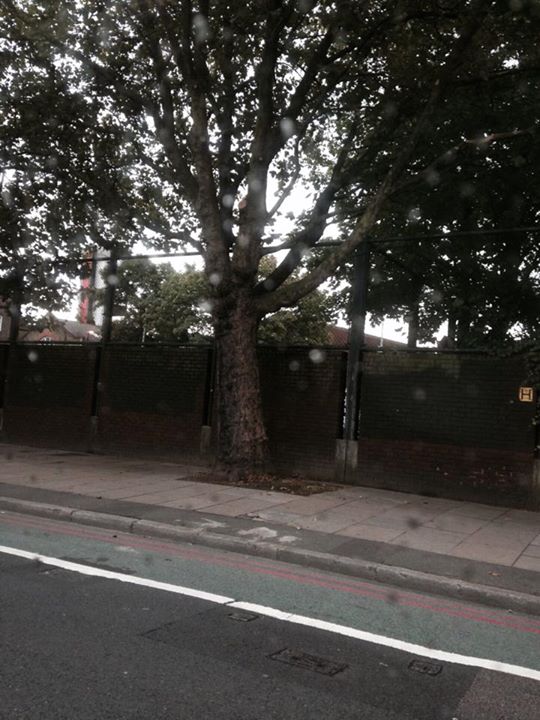
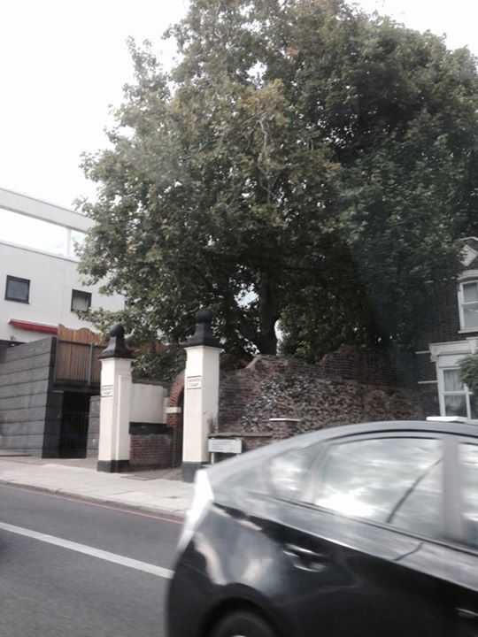
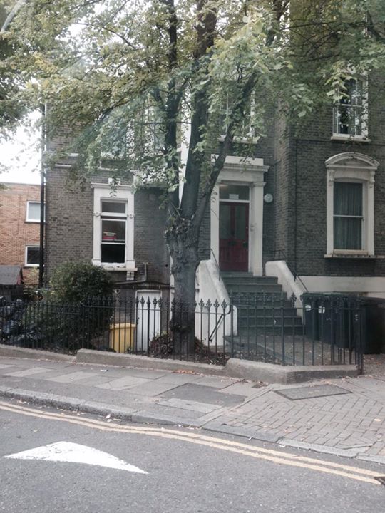
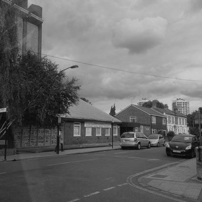
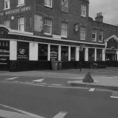
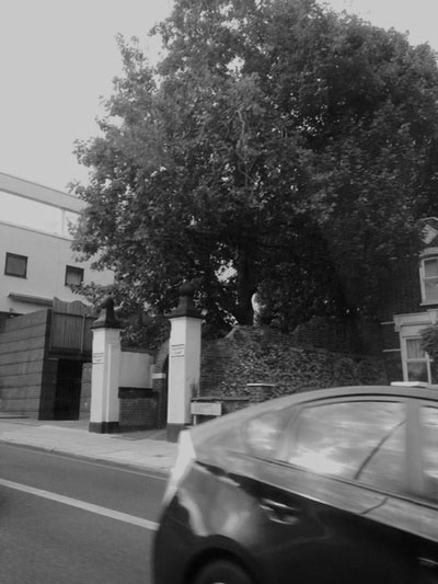
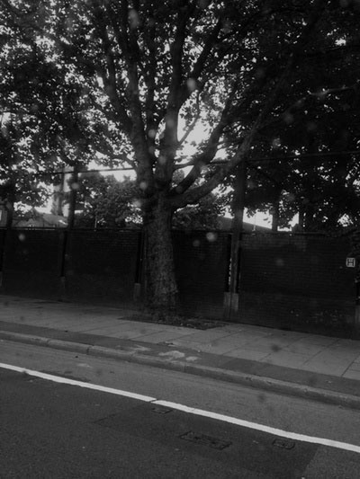
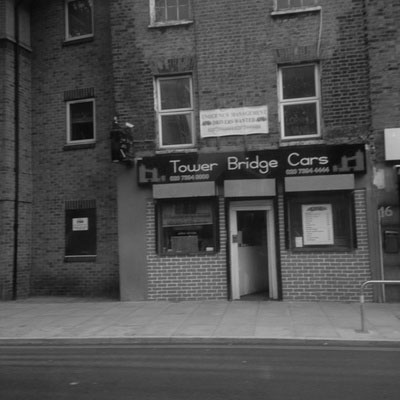
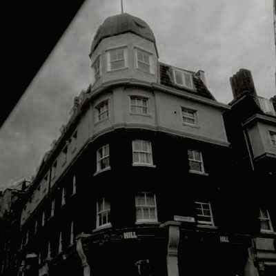
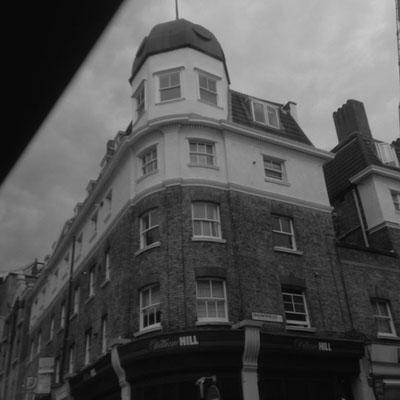
This is a set of images that I had taken whilst I was on my way to St Thomas Hospital. I wanted to focus these images on architecture because I think that when they are transformed into black and white the contrast will look interesting. My favourite image is the first one on the last row, this is my favourite image because it is quite busy yet 'clean', it is also one of the images that are not really blurry. Some of these images are blurred and I think that this makes the images look a little bit less planned (so as if I just saw the subject and decided on the spot to take the image), I think that if I had used a proper camera, opposed to an iPhone, the images would have looked much better.

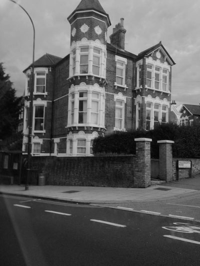
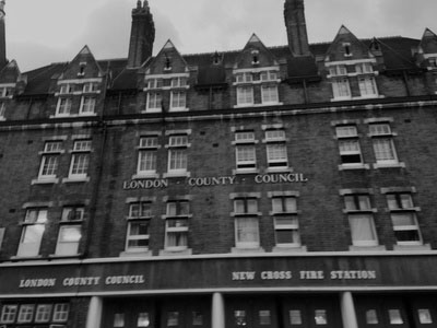


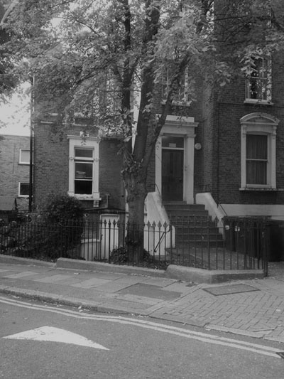
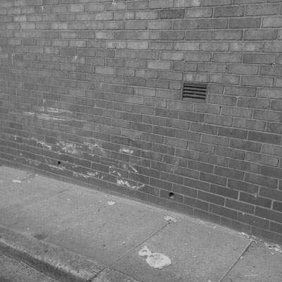
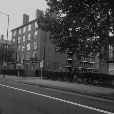
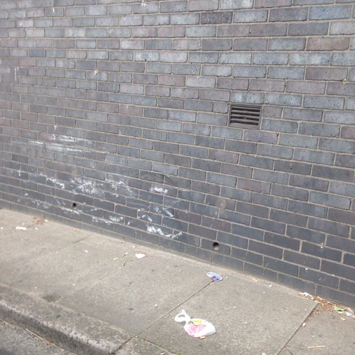
Here I have taken the last set of images I had taken, and turned them into black and white images. I think that they look better in black and white because it makes the images look like they were taken a long time ago and it brings out the different tones in the entire image. I think that the better images are the ones with buildings in because there is actually something to look at and something to focus on whereas the images of walls have nothing but bricks to look at.
To create this black and white (greyscale) look, I used photoshop and I had to open the image, go to Image>Adjustments>Hue/Saturation and I changed the saturation to -100 and I changed the Lightness to -21.
To create this black and white (greyscale) look, I used photoshop and I had to open the image, go to Image>Adjustments>Hue/Saturation and I changed the saturation to -100 and I changed the Lightness to -21.
|

|
|
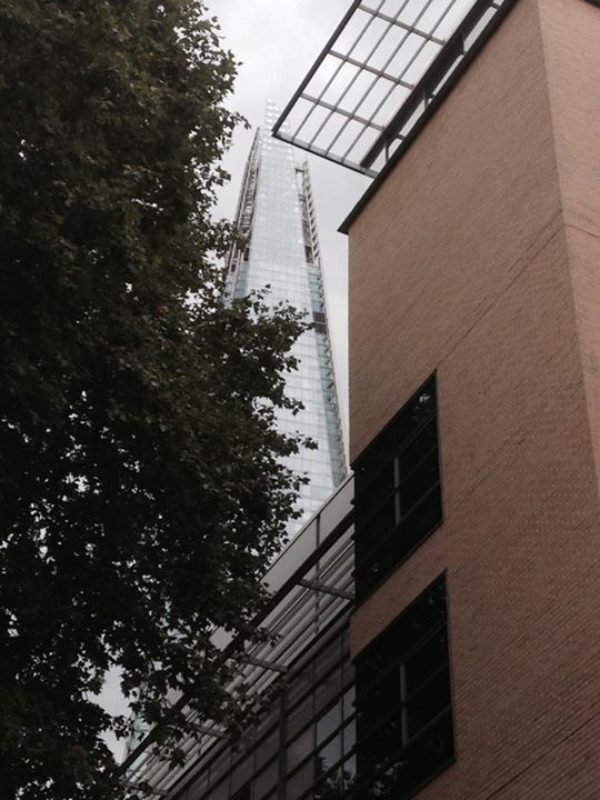
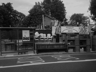
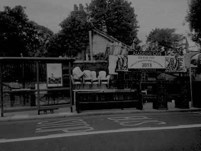
Now from this set this is one of my favourite images because there is a lot going on, but it doesn't look really messy. There are a lot of things to look at in this image but I think the main focus is not in the middle, but to the right of the image where all of the things are.
I like that in this image there are trees in the background and there is also things to look at and focus on in the foreground. I also think that this image looks better in black and white because it makes it look older and a little more interesting. |
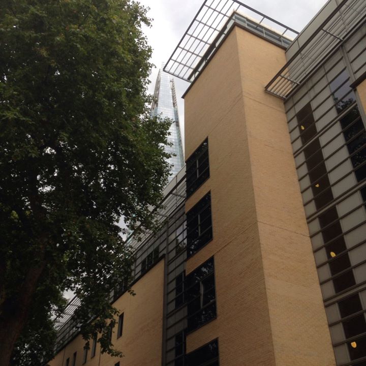
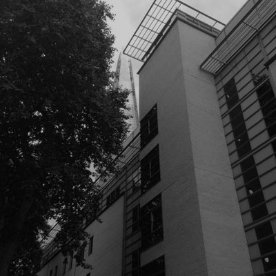
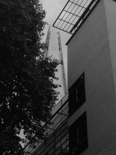
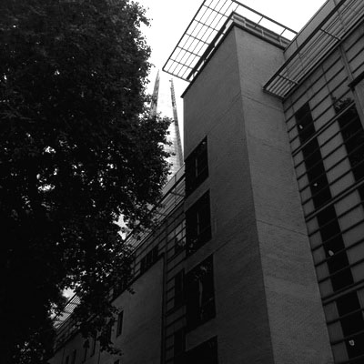
This image is still one of my favourite images because now it is in black and white you can really see the contrast inbetween the tree and the building but not really the glass in the background. I think that the composition of the image looks better that when it is in colour because the grey and black colours sort of even the tone of the image, therefore not having such a dramatic contrast, allowing you to focus more on different parts of the image. Compared to the last image, this one doesn't look old, although my main aim wasn't to make them look old, some just look that way and this isn't one. Although I think that this is still a good image, I prefer it in colour because there is more contrast in colour (the green of the trees, the brown of the building, the black on the window seals on the building and the clear/grey look of the shard).
|
Here I have made the images black and grey but they are much darker than the last time I made them dark. I think these images are better than the last ones because they look, in my opinion, more dramatic because of the high contrast of black, grey and white.
Final Pieces

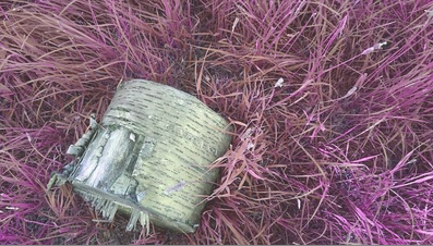
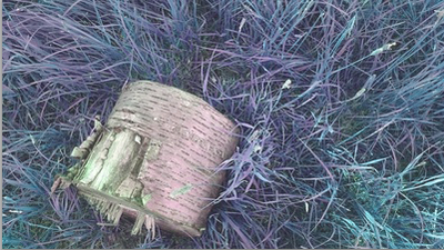
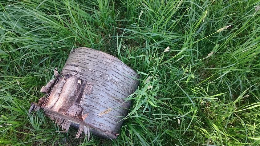
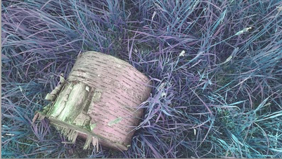
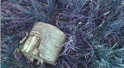
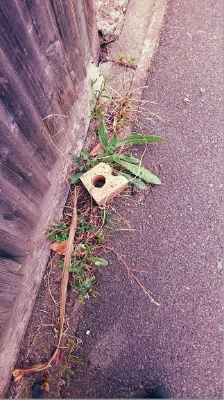
I have chosen these images for one of my final pieces because I really like the way that these turned out. I like them because they look very unusual and different, also I really like the image in general even before it was edited. I want these images for my final piece because I think they show a contrast between the black and white log and the colour change on the grass.
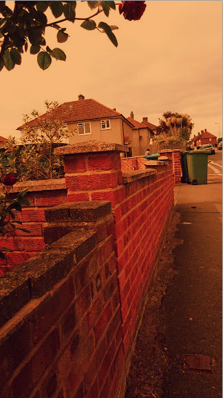
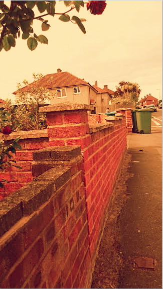
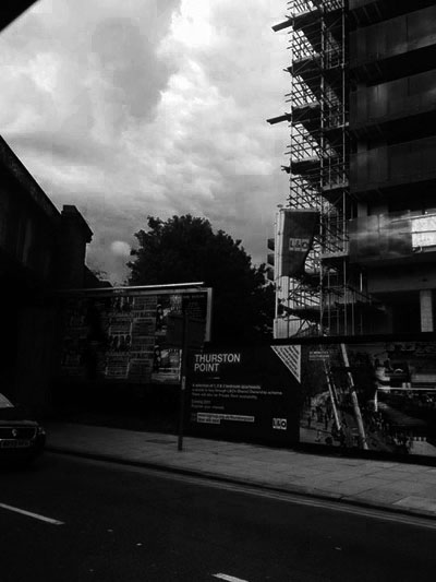
I have also chosen these images for my final piece because they show a heavy contrast between the two buildings, e.g the first image has a very dark building with a very white sky and the second image has a kind of gradient happening with the colours of the building (white at the top, then grey, then black). I think this makes a good final piece because it demonstrates contrast in more than one way.
