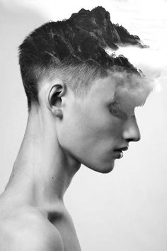
Abstraction
Abstraction in photography-
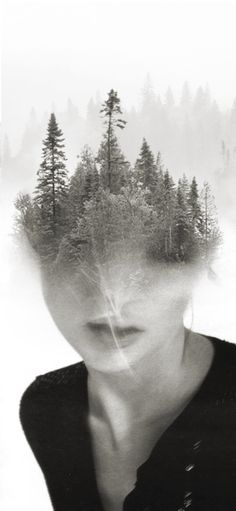
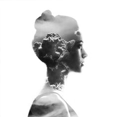
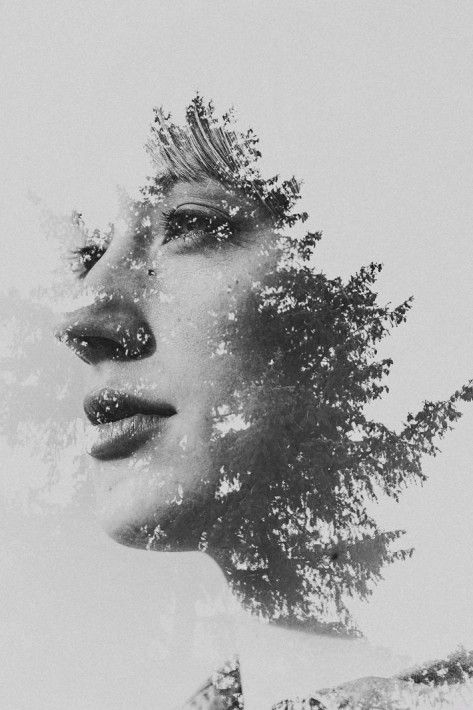
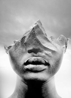
Abstraction photography concentrates on the formal elements, shape, form, colour, pattern and texture. The subject in the photo is often only a small portion of what the thing is, it should concentrate more on the elements than making the image look good with a large focus area.
Abstraction in art-
Abstraction in art is a trend in panting and sculpture in the twentieth century. Abstract art breaks away from traditional representation of physical objects.
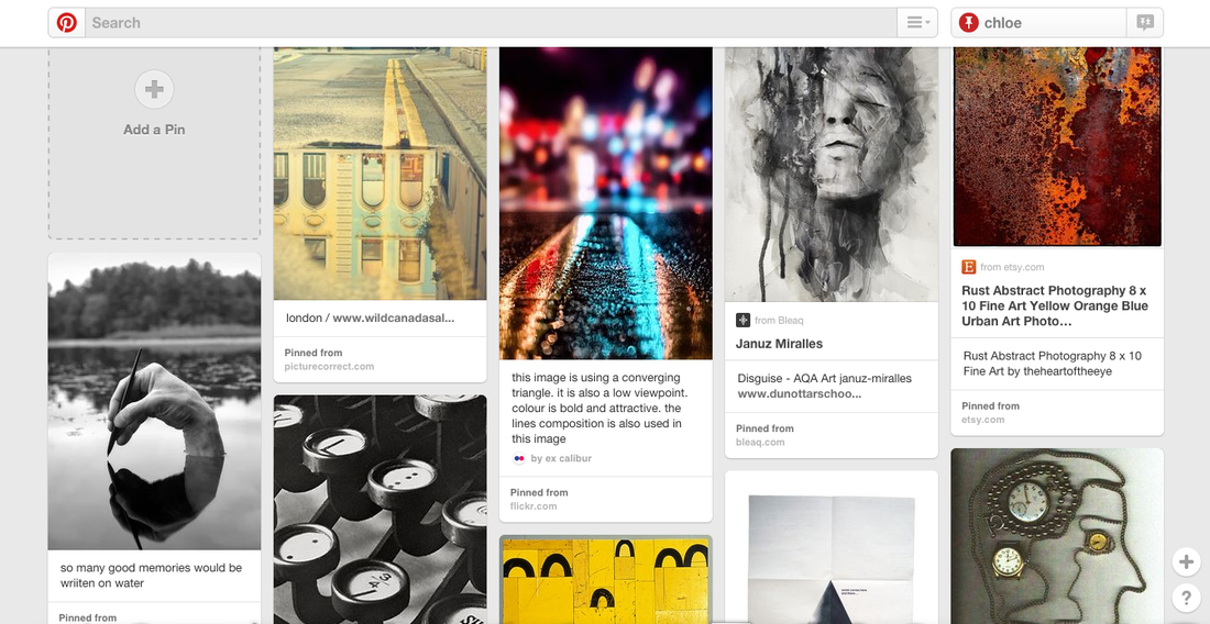
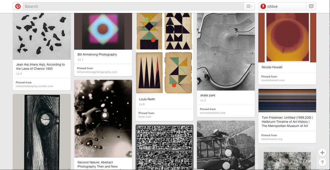
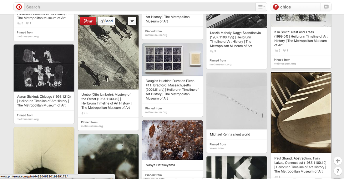
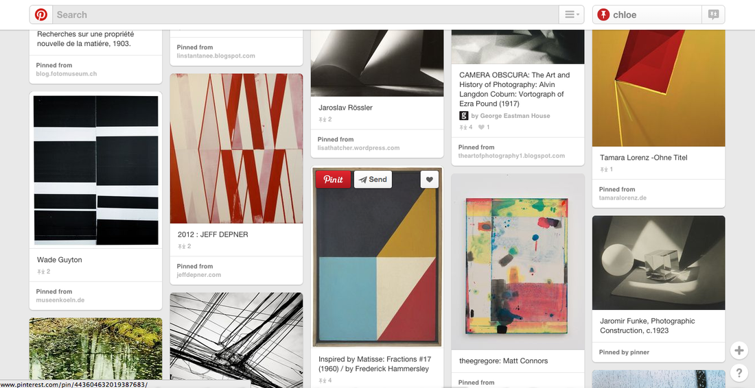
This is a screenshot of a Pinterest board I have created, it has a range of images that show abstraction. My favourite images are the first two. I like the first one because it has a lot of colour and tone and I like that only a portion of the house is being shown because you are not drawn in too much by the subject, it is more about the colours and tone in the image. I also like the second image because it is full of colour and texture. There are a lot of bright colours on a black or on a darker background, and I also like the background because it is blurred out and the foreground has a texture that can only be described as raindrops on a surface. In this image there is not really any subject in in which makes it even more abstract because there isnt really anything for you to focus on.
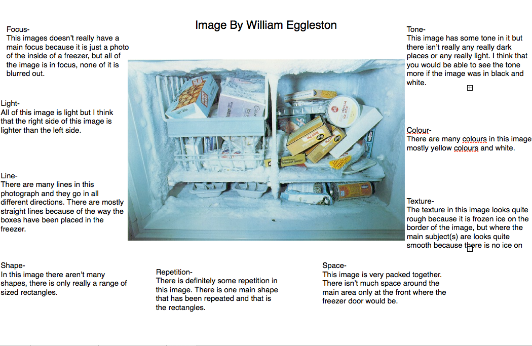
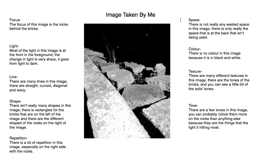
The Formal Elements
LINE- "Line is the path made from a moving object." The lines can change from being straight to being curved when the line ends, or the line could start off horizontal and end being straight.
SHAPE- "Shape is an area enclosed by a line, it could be shaded in or just an outline"
FORM- "Form is a 3D shape, such as sphere, cube or cone"
TONE- "Tone is the lightness or darkness of something. This could be shade or how a colour appears."
TEXTURE- "Texture is to do with the surface quality of something. There are 2 types of texture, actual texture and visual texture."
PATTERN- "Pattern is a design that is created by repeating shapes, lines, tones and colours."
COLOUR- "Red, yellow and blue are primary colours, which means that they cannot be mixed using any other colour. In theory, all other colours can be made using these three colours"
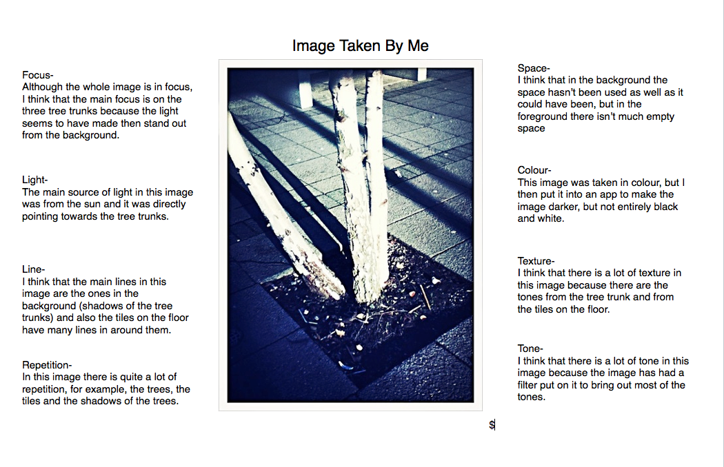
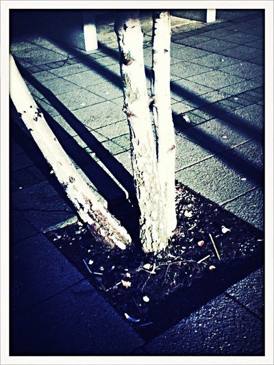
FOCUS- "The part(s) of the photograph has the photographer concentrated more on?"
SHAPE- "Shape is an area enclosed by a line, it could be shaded in or just an outline"
FORM- "Form is a 3D shape, such as sphere, cube or cone"
TONE- "Tone is the lightness or darkness of something. This could be shade or how a colour appears."
TEXTURE- "Texture is to do with the surface quality of something. There are 2 types of texture, actual texture and visual texture."
PATTERN- "Pattern is a design that is created by repeating shapes, lines, tones and colours."
COLOUR- "Red, yellow and blue are primary colours, which means that they cannot be mixed using any other colour. In theory, all other colours can be made using these three colours"
FOCUS- "The part(s) of the photograph has the photographer concentrated more on?"
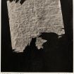
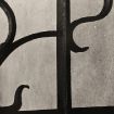
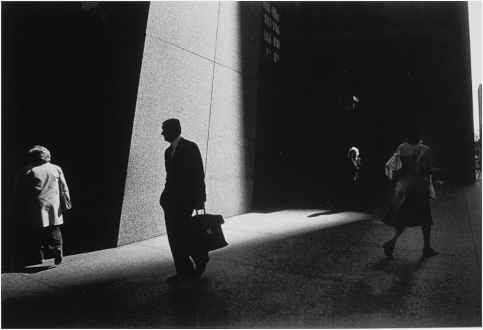
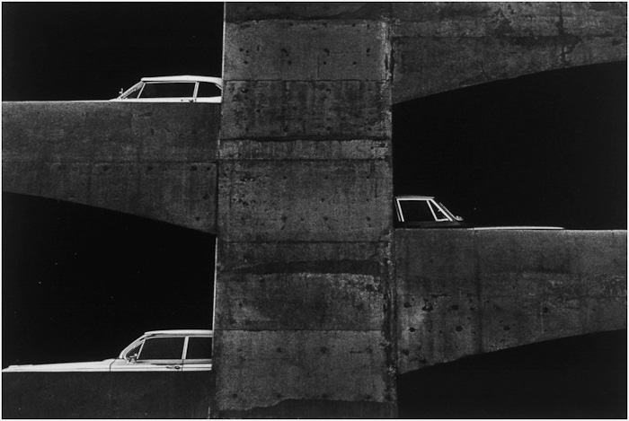
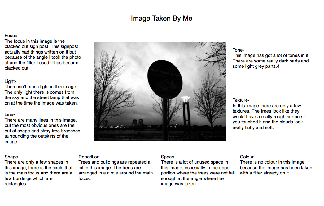
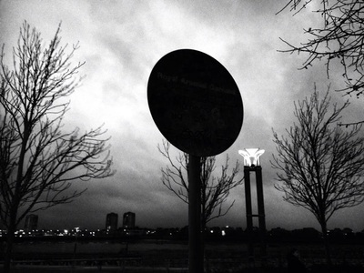
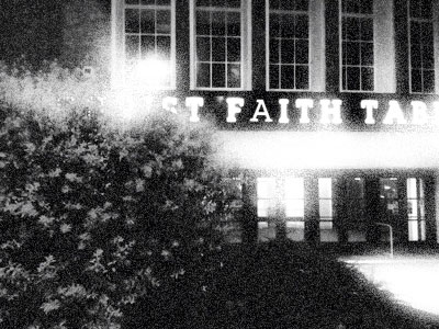
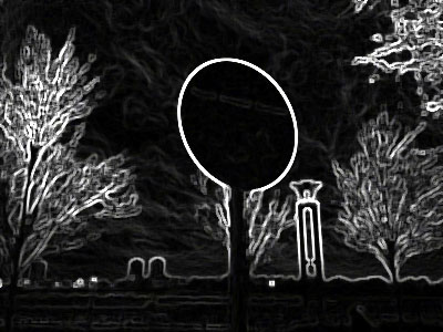
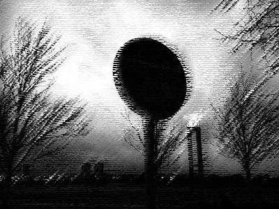
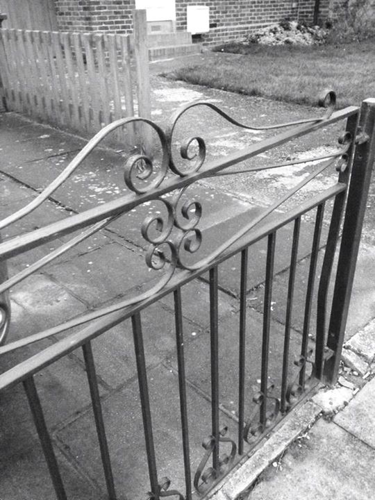
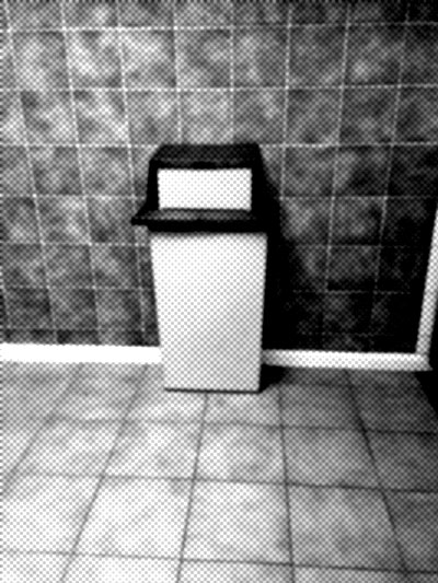
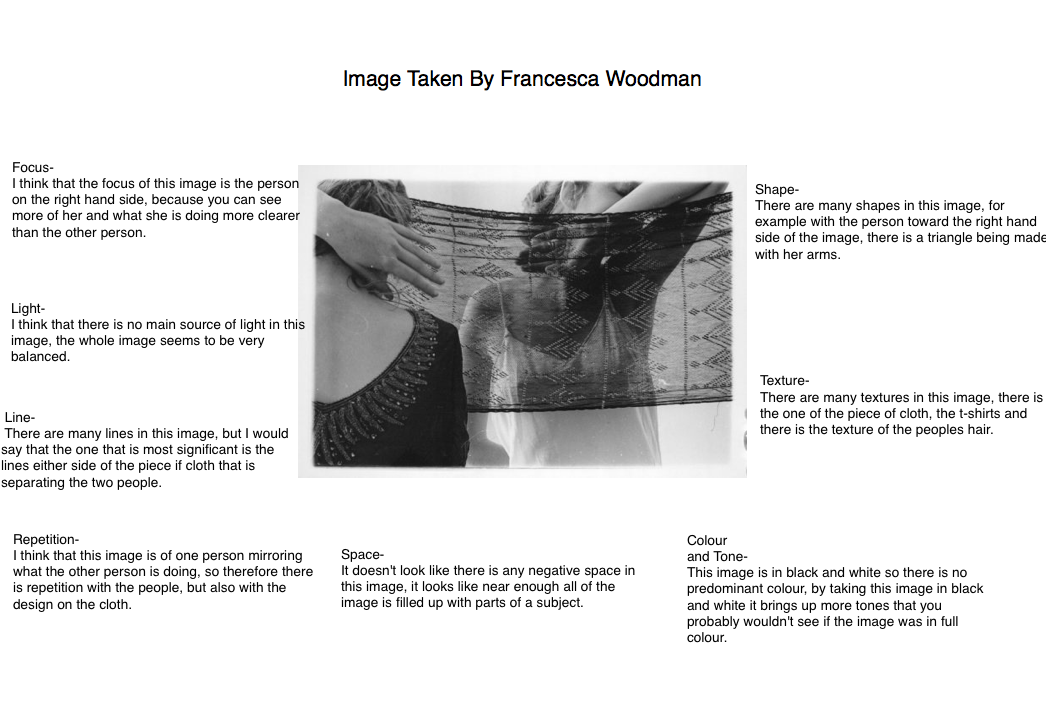
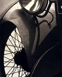
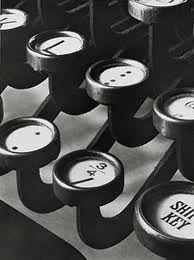
Evaluation Of An Image
Research
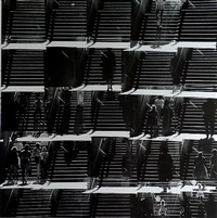
Aaron Siskind
|
Aaron Siskind (December 4 1903 - February 8 1991) was an American abstract expressionist photographer. He focuses on nature and architecture. Aaron became interested in photography when he got his first camera as a going away present for his honeymoon. He started his photography career as a documentarian in the New York Photo League in 1932. In the early 19340's, Siskind's work shifted to abstraction and metaphoric. During this change he made some new abstract expressionist friends, that include: Franz Kline, Barnet Newman, Adolf Gottieb and Mark Rothko.
In 1951, Siskind was invited to join The Faculty Of The Institute Of Design in Chicago, he was invited by Harry Callahan. When Harry left Aaron became the head of the photography programme in 1961. |
|
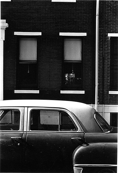
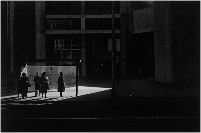
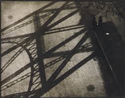
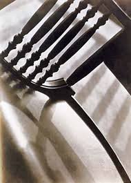
Ray Metzker
|
|
Ray Metzker (september 10 1931- october 9 2014) he was a student of Harry Callahan and Aaron Siskind at the Institute of Design in Chicago. He became a major American photographer known for both his work in Cityscape and Landscape. He taught for many years in Philadelphia College of Art and he also spent some years teaching in the University of Mexico.
When Metzker takes a set of images, he names them depending on the location of the images or the technique he used to take the image. When he received his graduate degree in 1959, he travelled to Europe and ignored photographing the landmarks, instead focusing on elemental concerns, solitary pedestrians and urban sunlight. |
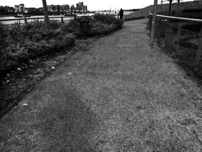
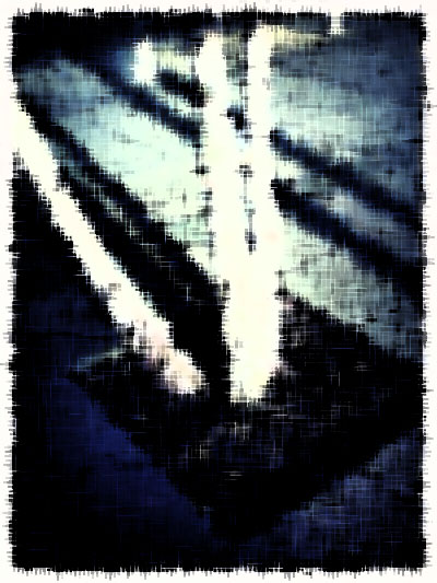
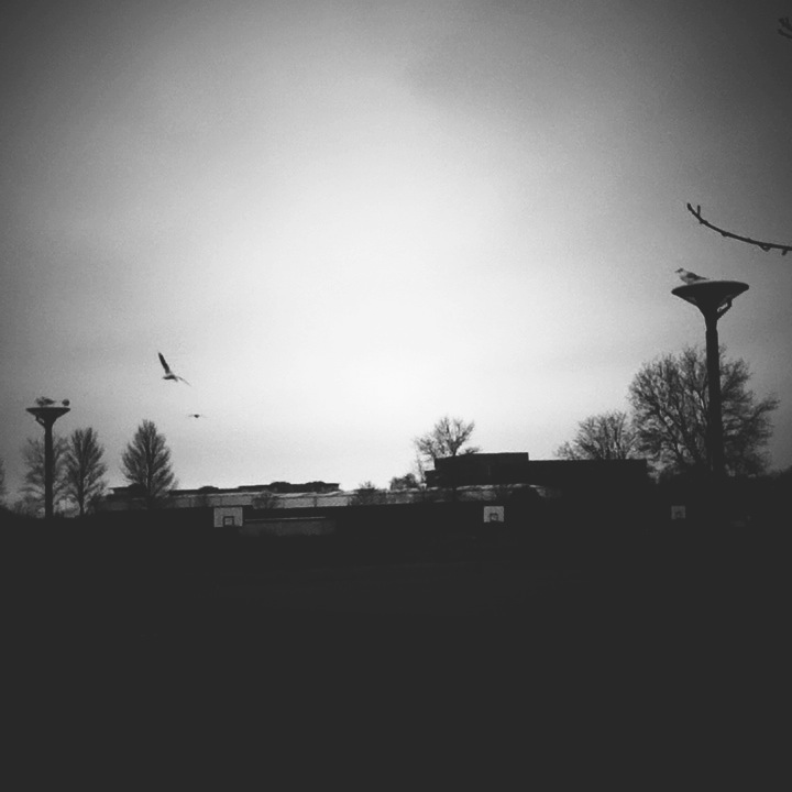
My First Set Of Images
Taken at/around Woolwich
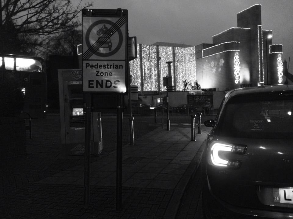
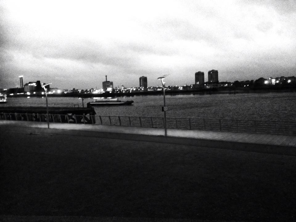
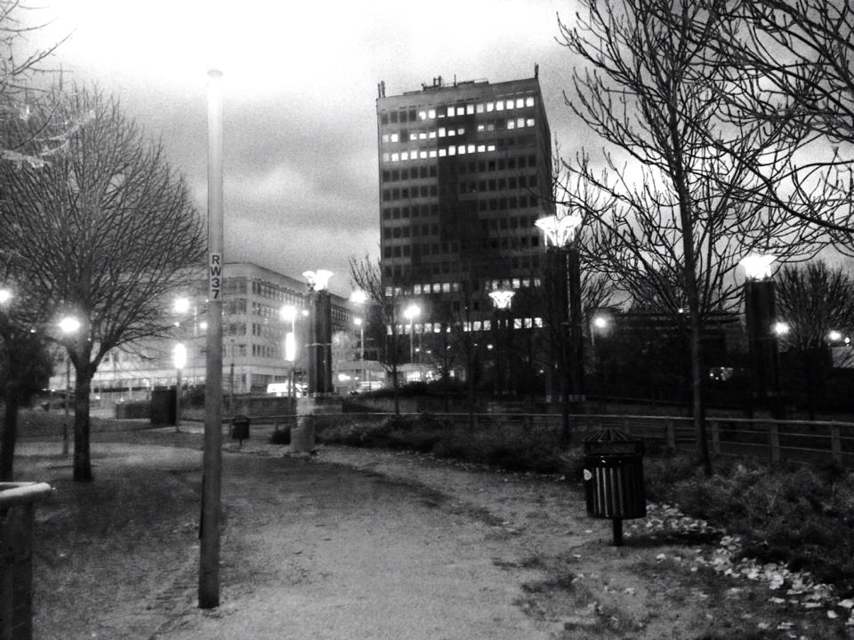
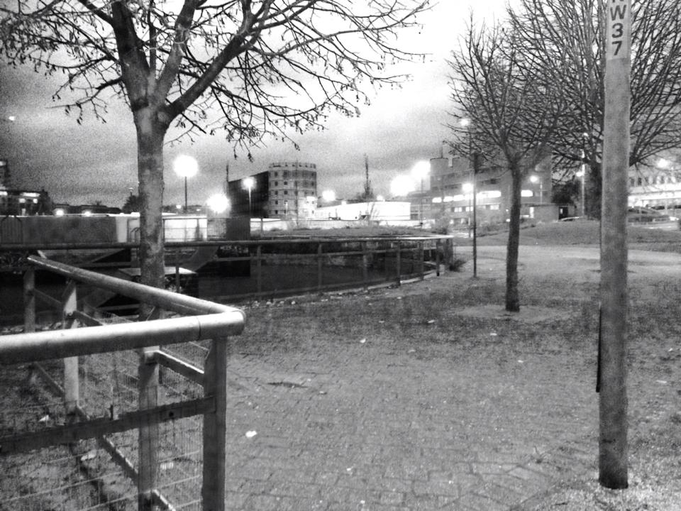
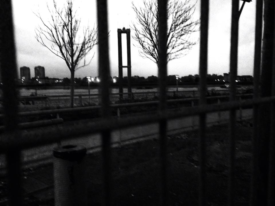
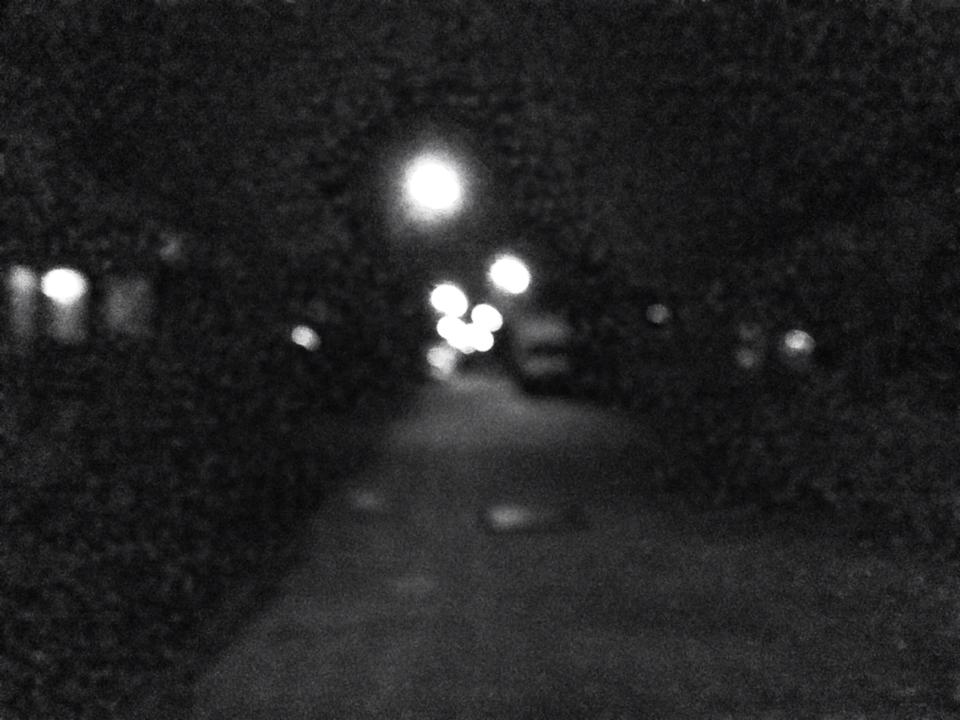
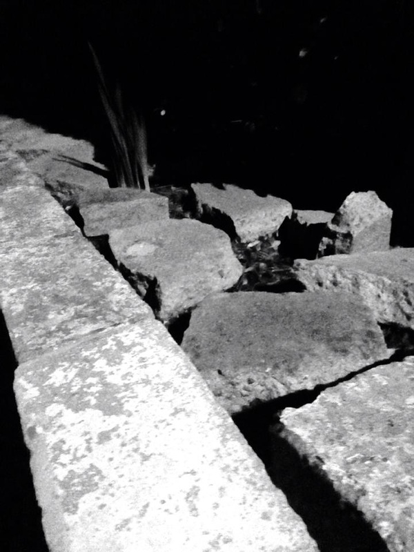
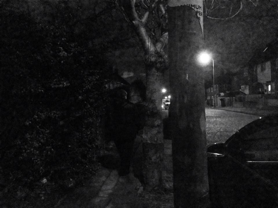
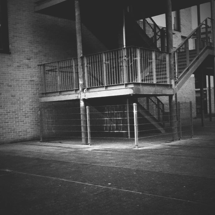
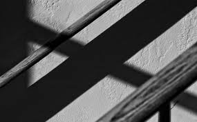
This is the first set of images I have taken that are inspired by Ray Metzker. When I was taking these photos, I was more focused on trying to get dark and light tones and what the image would look like in black and white, rather than what the image was actually of. I think that some of these images could relate to his because his images are in black and white or they have really dark tones in them. When I was taking the images I think that I should have focused on shadows and taking images of people, because then I would my image would be a little bit more similar and people would be able to say that the images are influenced by Ray Metzker.
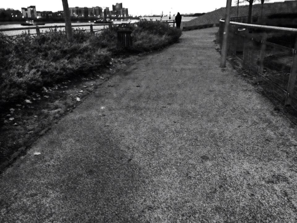
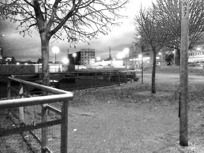
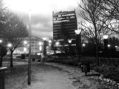
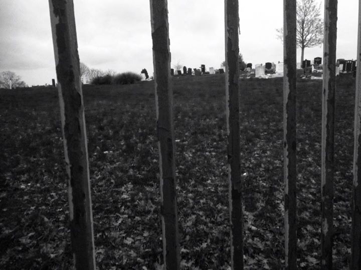
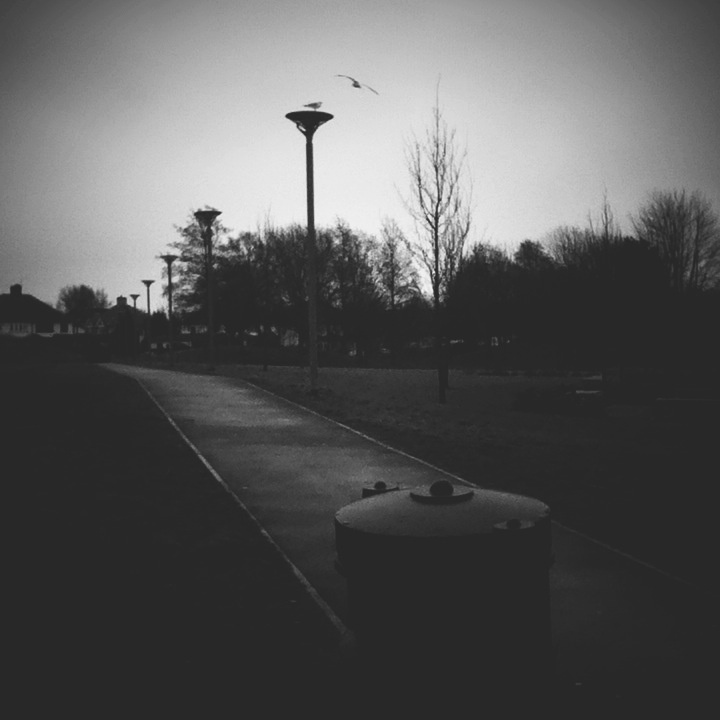
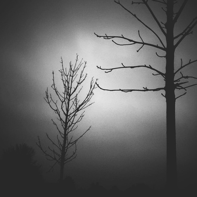
Pathways
|
|
I think that these images could actually be a final piece because they all show pathways. These images all have different tones in them and they all have repetition in them. All of these images have trees or bushes in them and they are repeated a few times in each image. These images could be a final piece because they are all of the same thing and they are all in black and white. My favourite image in this set is the one in the top left corner. This is my favourite because I like the way the trees were arranged and I also like the way the lights are in the background, because they look a little bit blurred out. This image was taken on an iPhone and I used the filters that come on the original camera app, the filters I used were: Mono and Tonal. |
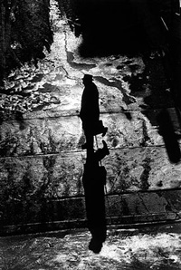
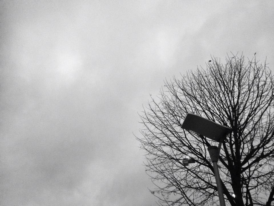
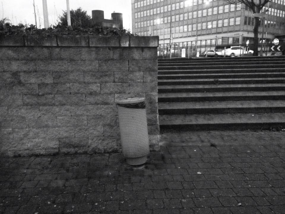
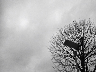
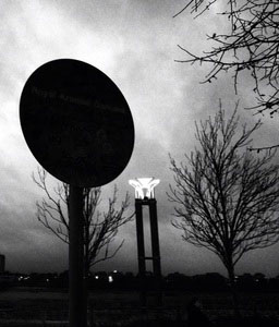
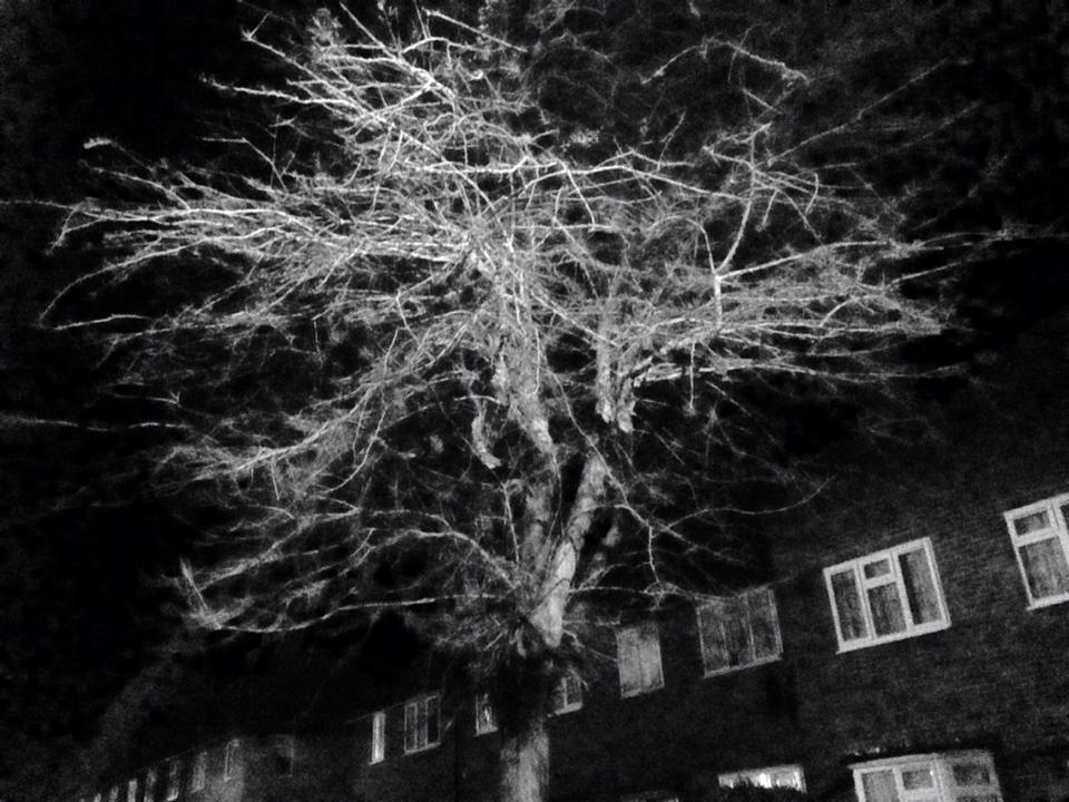
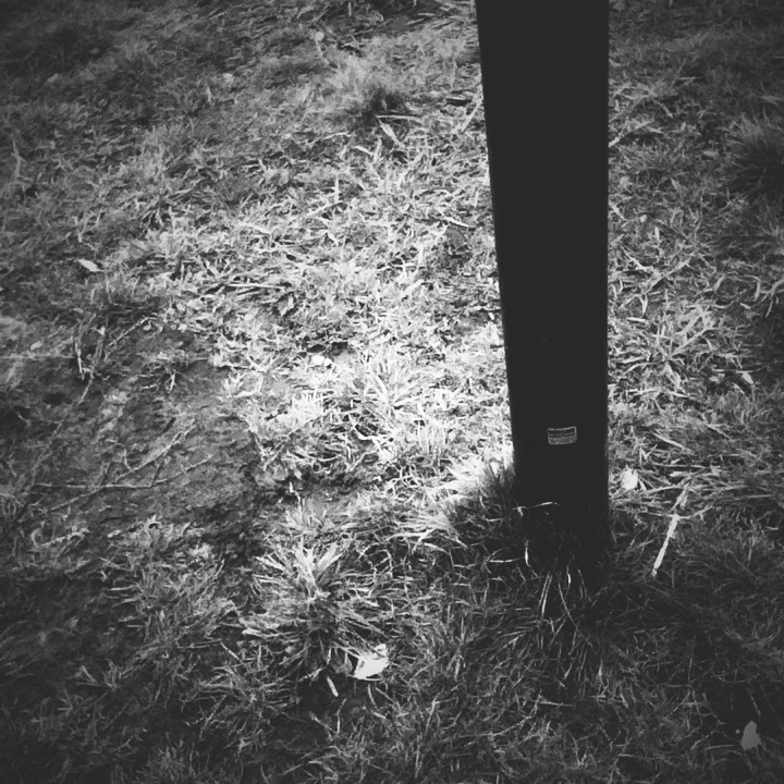
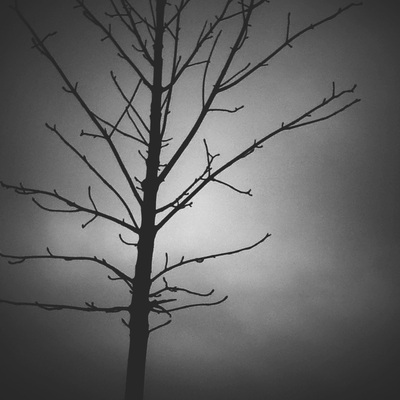
Loneliness
|
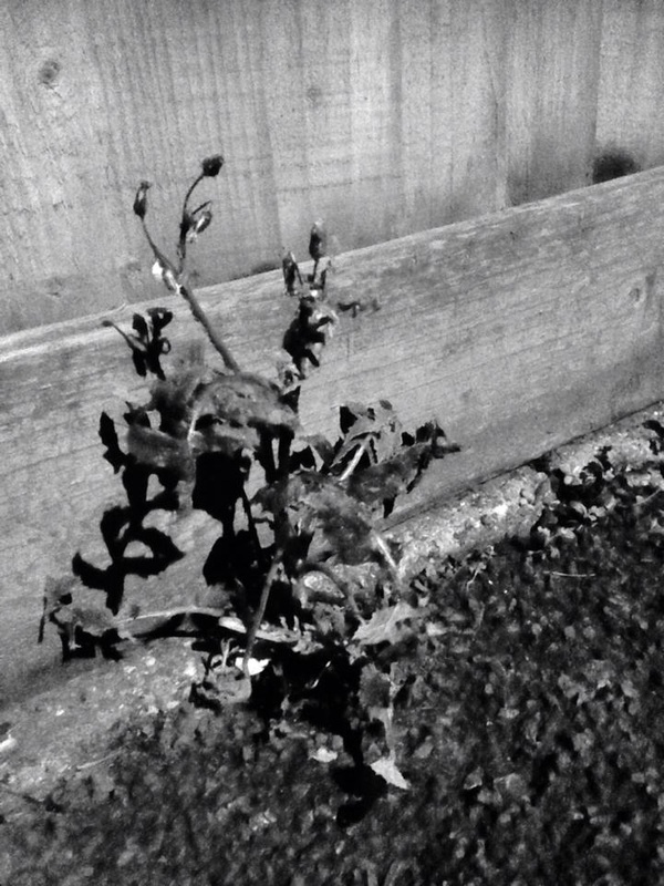
I also think that these images could be another final piece because they are all of one thing that looks lonely. I think that this would work as a final piece because these images are in black and white, which could give us the feeling of sadness and because there is only really one thing in each image that I wanted to be the focus. My favourite image is the one in the bottom left hand corner because the image is really simple but it looks really good. These images were also taken on an iPhone with the Mono and Tone filters. I really like the background in the image too, I like the different type of grey in that builds up the clouds. I think that the fact that the tree and the camera are the only thing in the image makes it look more lonely, so it fits into this theme well. |
|

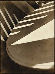
Photoshop Experiments 1
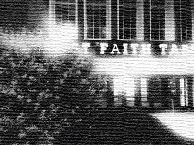
Here I have taken two of my images and edited them in photoshop. The only thing I did to these images was crop them to see how the original image would have looked if I had taken it in a different way. I think that the images do look a little bit more interesting then the original image because they you can only see a small fraction of each image, opposed to the whole image., which could make you wonder where the image was taken.
Photoshop Experiment 2
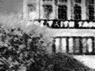
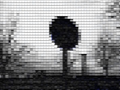
This is another set of images I have altered in Photoshop. With these images I have just added some filters to make the image look more interesting. On the top row I used the filters; Diffused Glow, Texuriser, and Chalk and Charcoal, and on the second row I used the filters; Patchwork, Glowing Edges and Rough Pastels. I think that these images look more interesting. My favourite image is the first one on the first row because I think that the filter has changed the whole images because there looks like there is more light because it has been highlighted by the 'Diffused Glow'. On the second row I think that the last image is the best because it looks a little but natural, as if when I took the image I accidentally shook the camera but it also looks like the original image was not taken that way so it has been used to change the way the image looks.
My Second Set Of Images
Taken in/around school
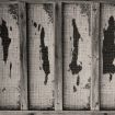
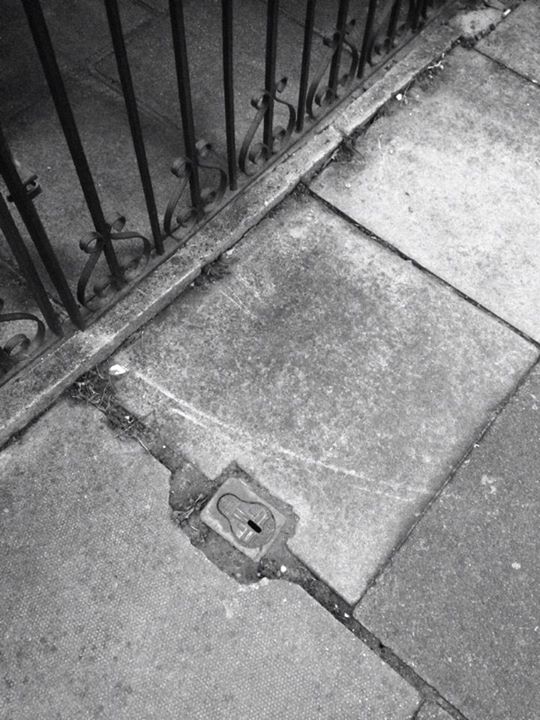
For my second set of images I want to try and focus on taking images inspired by Aaron Siskind. I want to take some images of small things, such as sections of newspapers and railings as he did. I also want these images to be in black and white because I feel that if they are in colour there is to much to focus on with the colours, where as when an image is in black and white you can focus on whats in the actual image, because you will not be drawn to a specific bright colour, that will draw your attention away from the subject.
This is a set of images I have taken in school that I have tried to link to Aaron Siskind's images. I think that these images would look similar to his images if they were cropped smaller so only a small part of the image is revealed. All of the subjects in these images are in the middle. I think that these images would look better if the subjects were not so zoomed out, so if the whole image is just of a section of one of the things that I have taken an image of. When I retake images similar to these ones I will make sure that I take them more close up because then you will be able to link them more easily to Aaron Siskind. Also with these images they are not in black and white like I wanted them to be, this is because I didn't know how to take images directly in black and white on the schools iPods.
Photoshop Experiment 1

Photoshop Experiment 2


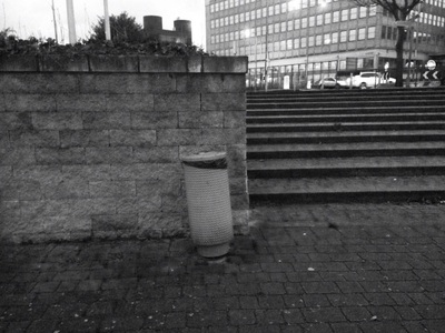
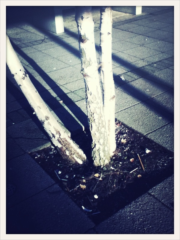
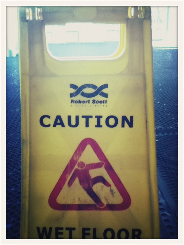
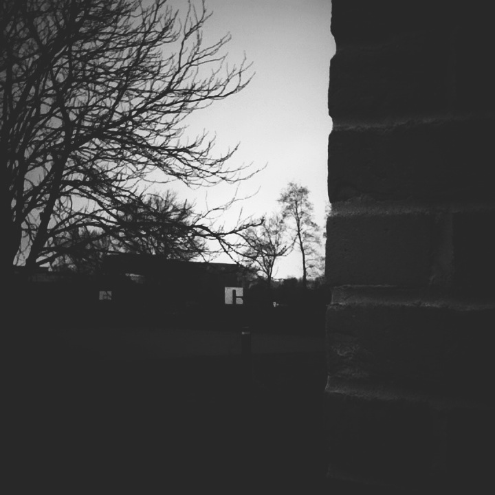
My Third Set Of Images
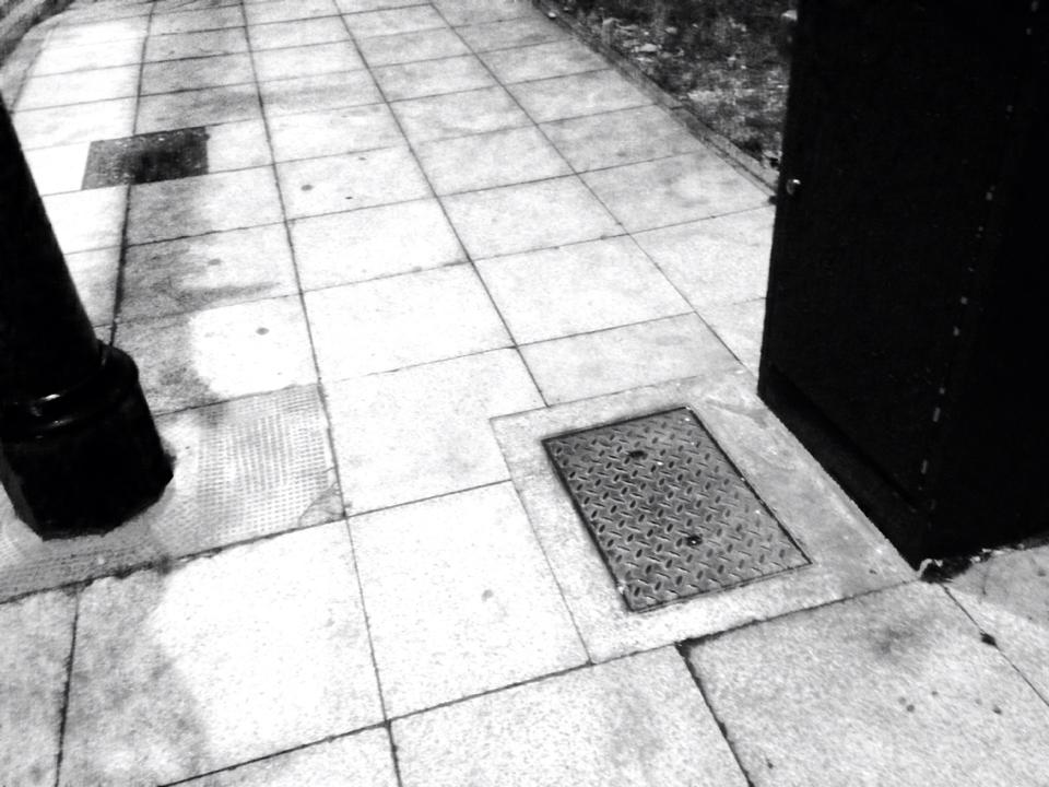
Taken in shops/around where I live
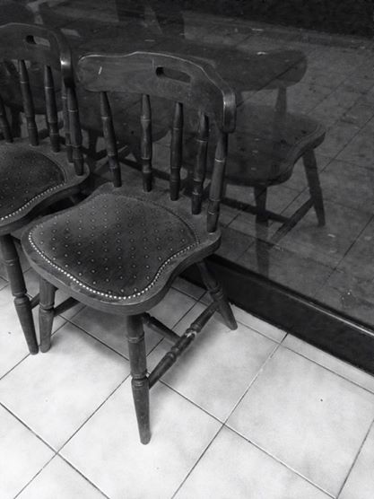
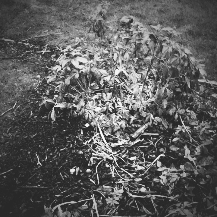
This is a set of images I have taken around where I live and in shops around where I live. I think that these images could have been better if I had used the same filter on all of the images and if they were all in landscape because then you would be able to see what the images are more clearly. My favourite image is the one of the chair. This is my favourite because it is very simple and there isn't much around it to draw your eyes away from the chair. For these image I have tried to change up the filters but as I said before, I don't think it was a good idea because not all of the images match.
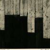
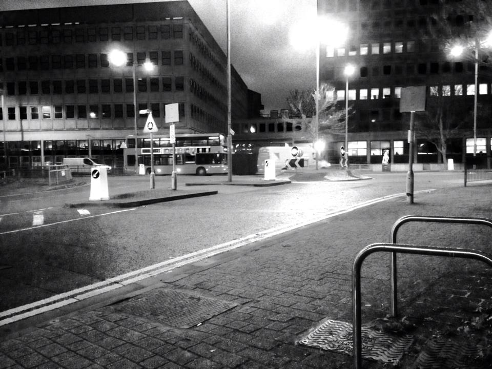
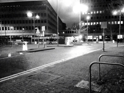
My Fourth Set Of Images
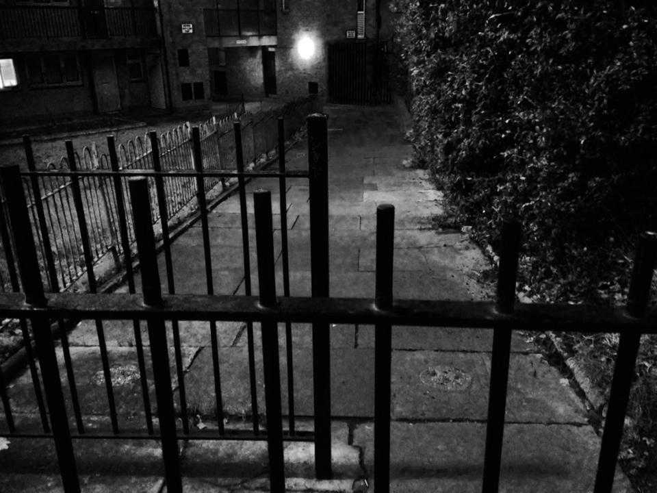
Taken around where I live
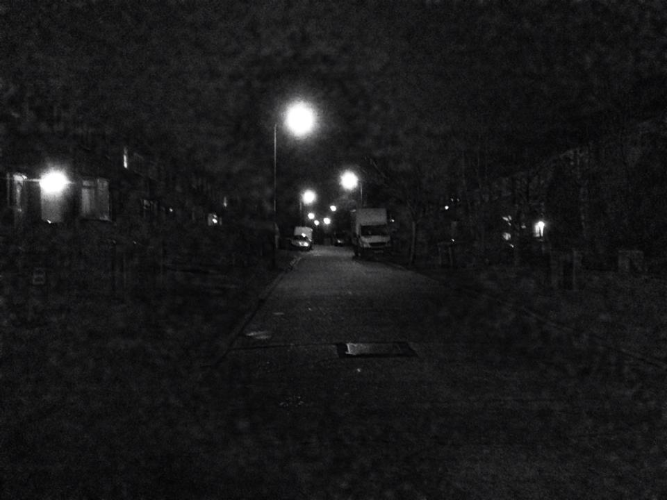
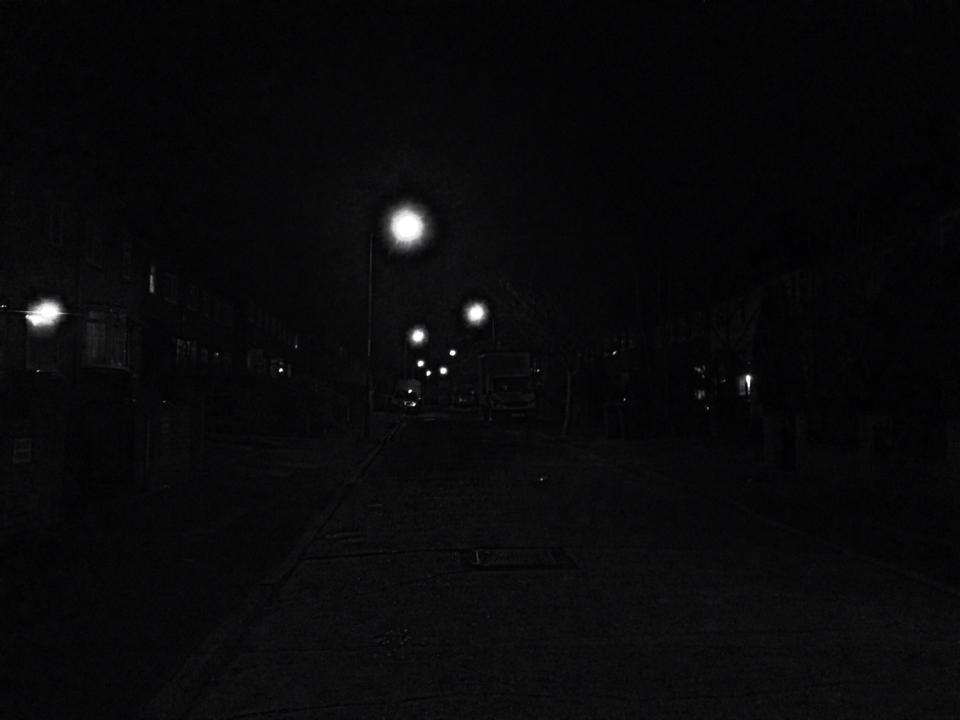
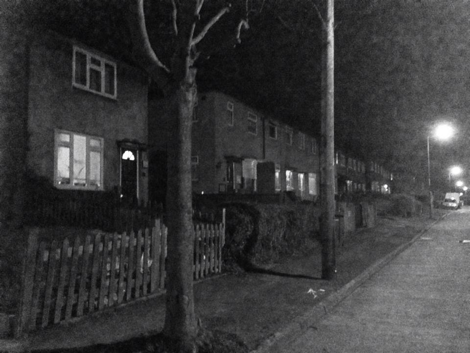
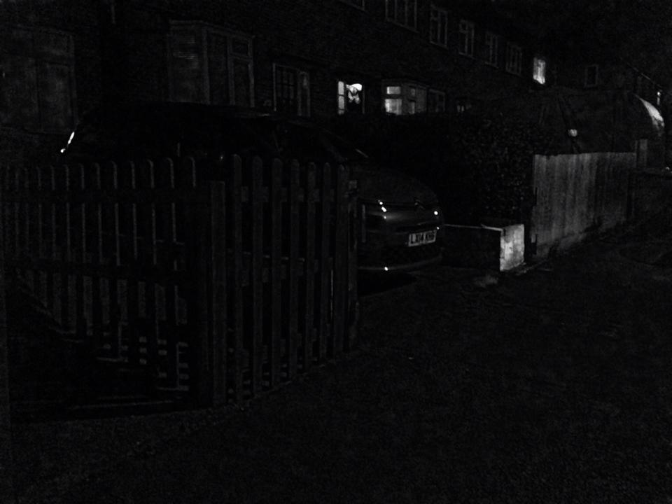
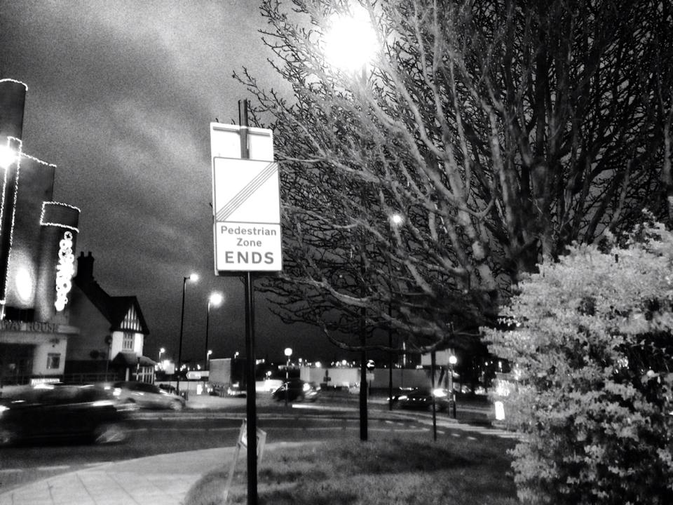
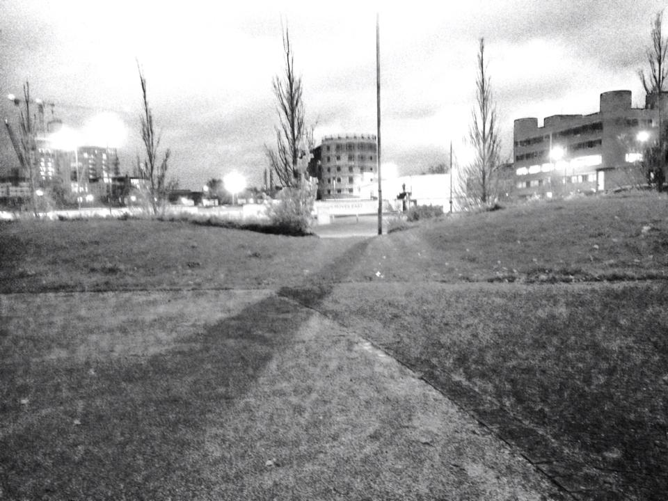
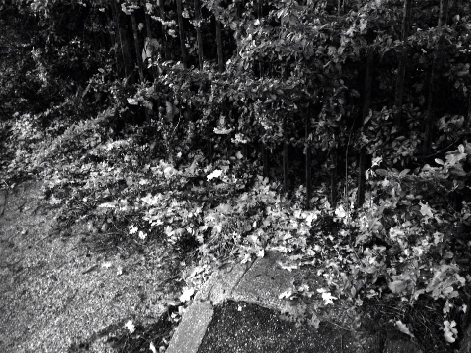
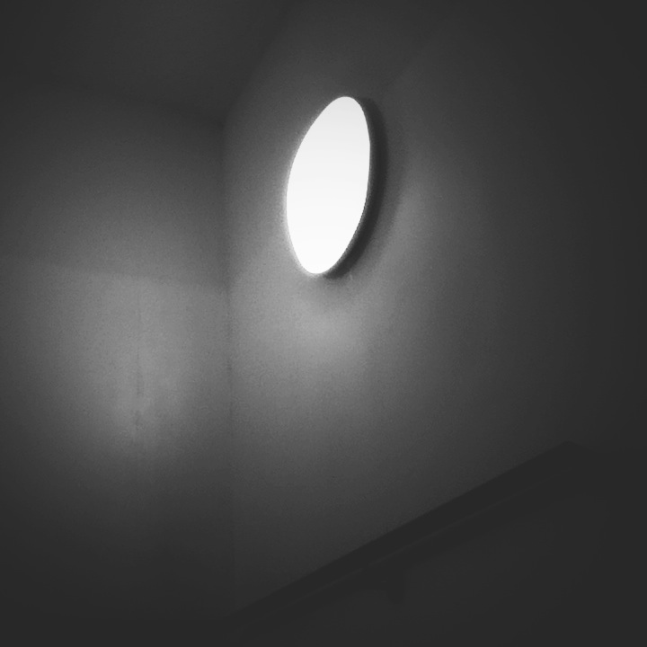
This is a set of images that I have taken at home. All of these images have been taken around where I live, I think that some of these images are too dark, so you can't really see what is in them. My favourite image is the second one, this is my favourite because it looks like a one-point-perspective picture, where everything is coming out of the middle. I think that the last image is not very good because you can't really see what it is and where it is because it is too dark. These images were mainly inspired by Ray Metzker, If I were to take these images again I would take them a little bit earlier than I did because it was really dark when I took them.
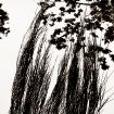
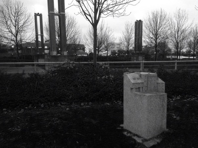
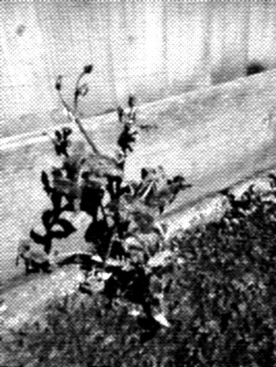
My Fifth Set Of Images
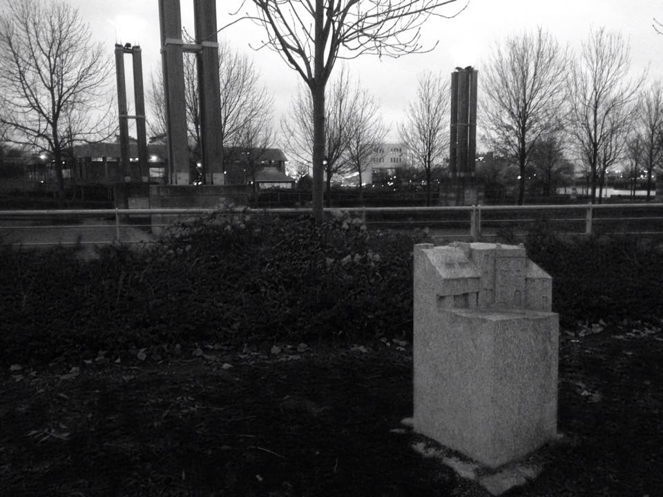
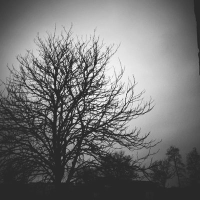
Taken around the school


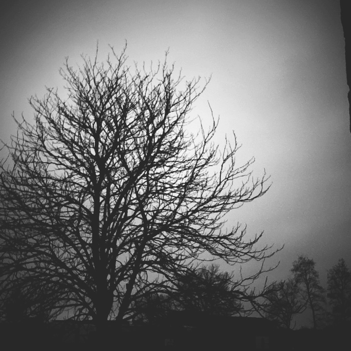
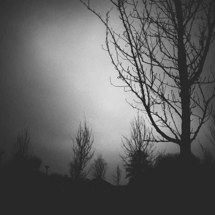
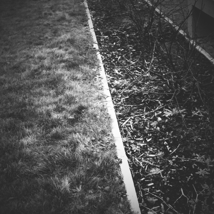
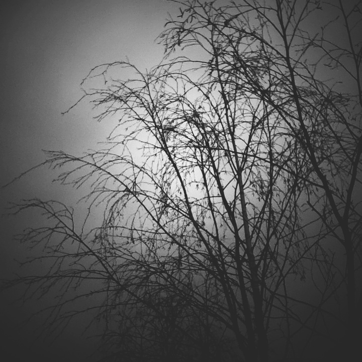
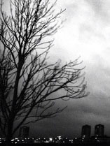
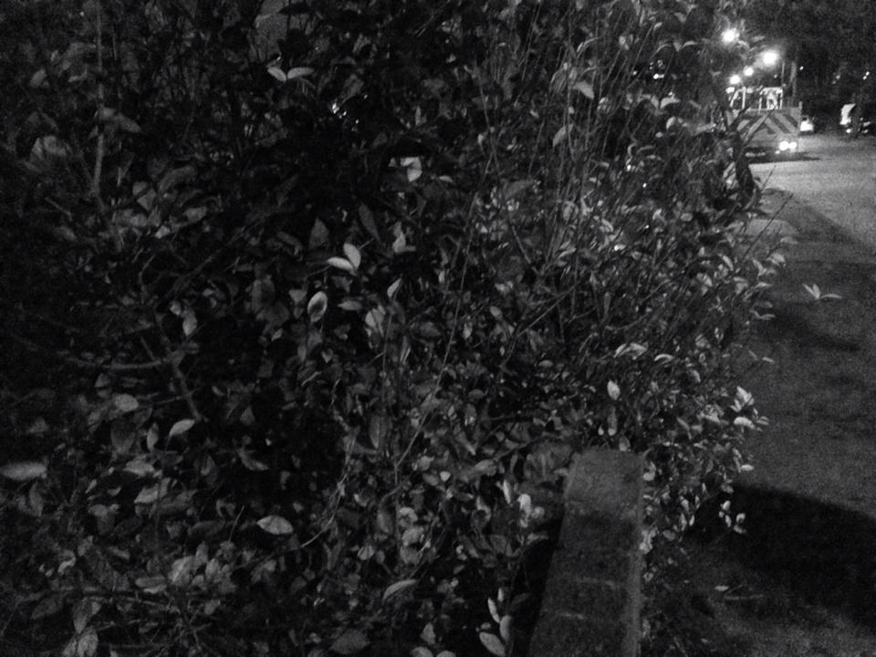
This is a set of images that i have taken in school that were slightly inspired by Aaron Siskind. I think that some of these images could link to his work, especially the ones that have trees and bushed in them because they show similar textures to his work. My favourite image is the fourth one on the first row because it look like the trees are the only thing that matters at the moment the image was taken and they look like they could be in a forest or a place where there is a lot of fog because the clouds look like they are going to be closing in on the trees and making them disappear. If I were to take these images again, I would try to include some people in them because all of the images I have taken don't have any people in them.
Final Piece Prep
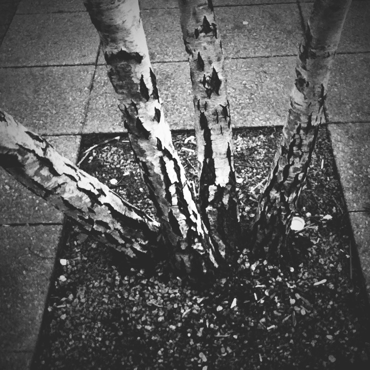
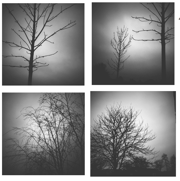
Separated
|
I think that these images could be together as a set or as a final piece because they are all of the same subject and they are all in black and white. I think that these could be separated even more by having the first and the third one and the second and the fourth one because they match. The first and the third one match because they both look very bare and tall. The second and the fourth one match because they are very busy trees that have a lot of branches and they resemble a type of bush. My favourite image is the third one because it shows two trees that are separated from each other and the branches and twigs on the trees seem to be separated from each other too. I also like this image because it looks like there is a burst of light directly in the middle of the image that has faded out in to a darker shade of grey. |
    |
|
I think that these images would go well together because all of the images have one thing in common, they include one main thing and in this order, they are going from the lightest picture to the darkest picture. |
   |
Research
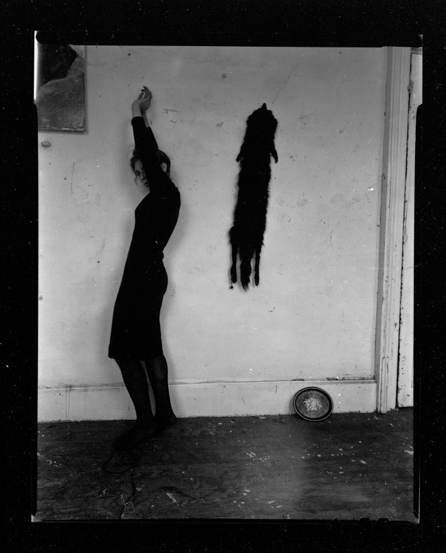
Francesca Woodman
|
|
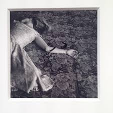
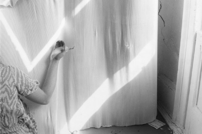
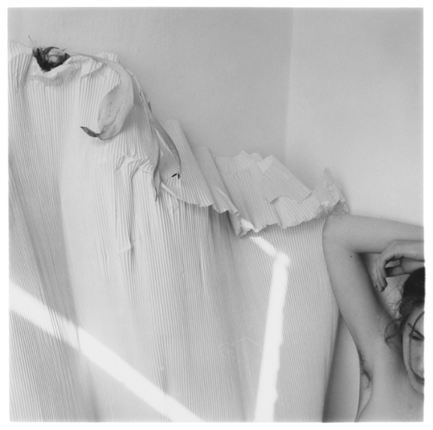
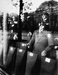
Francesca Woodman has been taking photographs since she was thirteen years old, between the ages thirteen and twenty-two, she took many photographs that display influences such as symbolism and surrealism.
She mainly takes photographs of herself and they could be exploring 'issues of gender and self, looking at the representation of the body in its surroundings. Over the seven years she was actively taking images she produced over 800 works. This includes her set entitles ZigZags. The set of images called 'ZigZags' include images of herself and other women, demonstrating where zig zags are in their bodies and in the surroundings. Francesca was influenced by Goth fiction, surrealism and The Myth Of Apollo and Daphne (as seen in the images where she is entangled in tree roots and where she is using her arms as trees), she was also inspired by the book: Nadja by Andre Brenton. In 1979, while being interviewed she said; "I want words to have the same relationship with my images as the photographs have with the texts". |
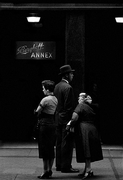
Paul Strand
|
|
Paul Strand was an american artist who had a long and advantageous career with his camera. In 1920, he experimented with Charles Sheeler and then he pushed further and manages to describe the movement of the city, in the short film entitled, Manhatta. In the 1930's he became seriously involved and interested in documentary and documentation, so from the 1940's Until he died, he was committed to making high quality books filled with photographs. |
Next Set Of Experiments..
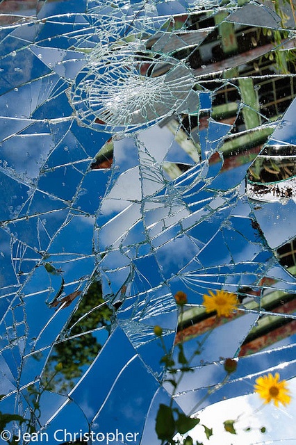 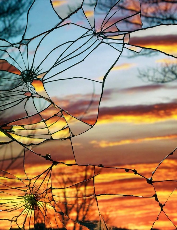 |
For my next set of images, I would like to try to take images similar to these, but excluding the sunset and maybe doing them in black and white. I think that by taking images in a broken glass, it will contrast very well from what images I have already taken.
I may also be able to do this on Photoshop, by taking a normal image and developing it on the programme to look fragmented. |
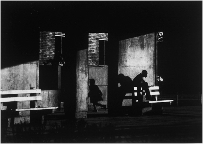
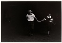
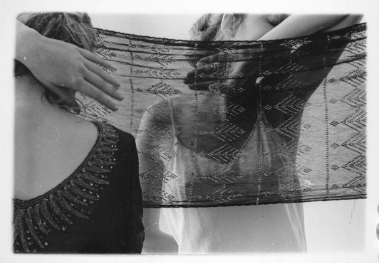
Another idea for another set of images could be to take regular photographs of a landscape or photograph of nature themed things (such as trees or bushes or animals) and then a photograph of a person/people, then try to merge them together in photoshop. I would like to try hiding the persons face through only using their silhouette instead of showing their features, and I would like to try something similar to the second and third image below, by making the features visible yet hidden.
I would also like to develop the images I have taken before by re-taking the same or similar images but adding people into them, For example taking images like Ray Metzker and then mixing them with images like Brassai, to create images taken at night of scenery but ones that include people in them.
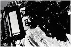
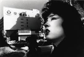
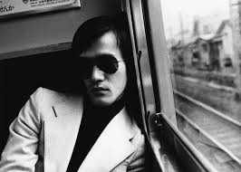
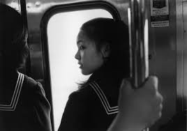
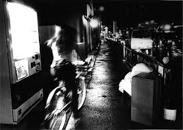
Daido Moriyama
|
|
Daido Moriyama is a japanese photographer, born in Ikeda Osaka, and studied photography before moving to Tokyo in 1961 to work for Eikoh Hosoe. He also is one of Japans leading figures in photography.
'Nippon gekijo shashinco' is a collection of photographs that showed the 'darker sides' of urban living and the less noticed parts of the city. He attempted to how life in areas was affected by the industrial parts of that area. His photography has been influenced by William Klien, Andy Warhol, Eikoh Hosoe and Jack Kerouca's On The Road. 'His black and white photographs express a fascination with cultural contradiction of age old modern traditions that persist with modern society. |
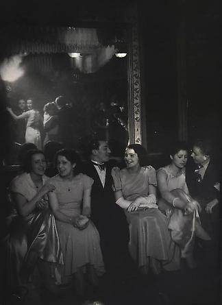
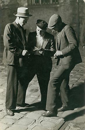
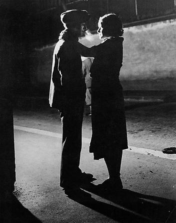
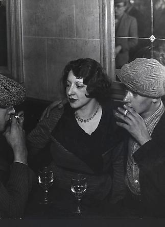
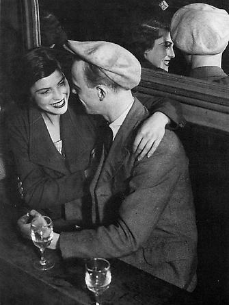
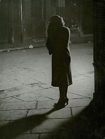
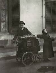
Brassai
|
Brassai was a Hungarian photographer, sculptor, writer and filmmaker who rose to international fame in 20th century france. When he was a young man, Brassai studied painting and sculpture at the Hungarian Academy of Fine Arts in Budapest. He served in the Astro Hungarian army until the first world war ended. In 1924 , he settled in paris, where he became acquainted with Pablo Picasso, Joan Miro and Salvador Pali
In 1933, he captured the essence of the city in his photographs that were published into 'Paris de nuit' (paris by night), his first book. His book gained much success and resulted in being called 'the eye of paris' in an essay by Henry Miller, for his devotion to the city. At night he would go out in the deserted streets of the city and photograph those who only came out at night- such as Street Cleaners and Rag Pickers. His work was used in magazines such as Harpers Bazaar and Picture Post. |
|
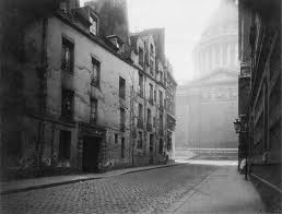
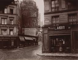
Eugene Atget
|
|
Eugene Atget was born in Libourne, near Bordeaux in 19857. When he was young he was a sailer, but he soon turned to the stage. At forty he quit acting and tried painting for a while but he soon found out that he was a good photographer, and then he started his life's work.
He photographed for thirty years before he died, he photographed 'Vieux Pairs' (Old Paris) in 1898. Atget called his photographs "documents", of architecture and urban views. He managed to support himself by selling his photographs to painters as studies. He used a large format camera, an outdated cumbersome outfit, through streets and gardens of paris. |
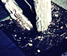
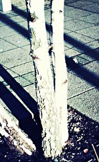
First Final Piece
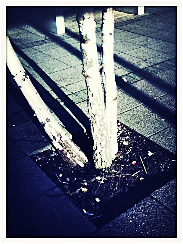
These images work well together because they are of the same things. The top two images look like I have taken the first one then walked on a little bit and taken the second one, because I think that the tree on the right hand side of the second image is the same tree as the one in the first image. The bottom two images could be seen as the growing progress of the first trees. The images are near enough the same, because the third image has only one tree in it and the fourth image has the main tree then the trees in the background. These images are abstract because they could be showing a trees journey of growing and what you can eventually become.
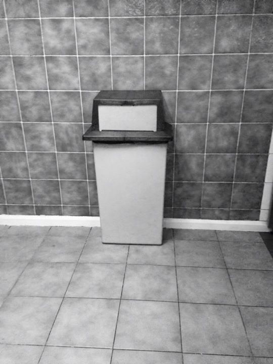
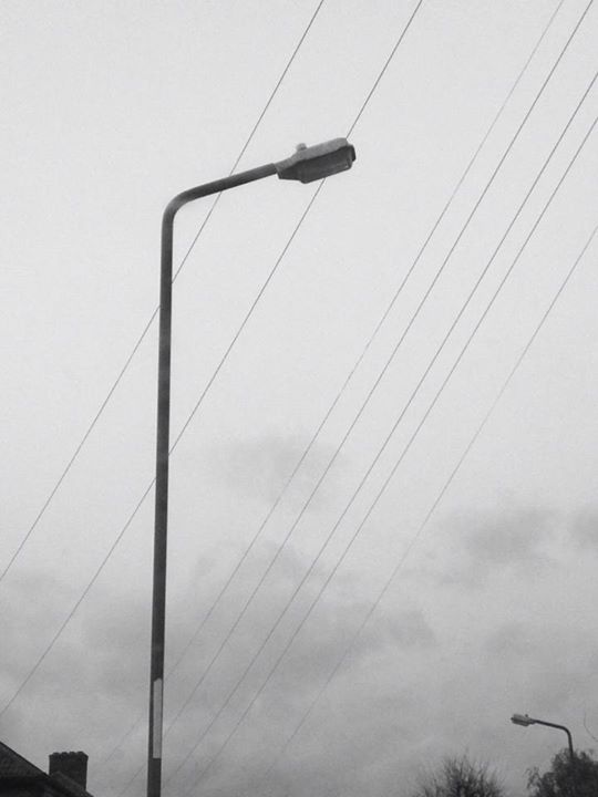
Second Final Piece
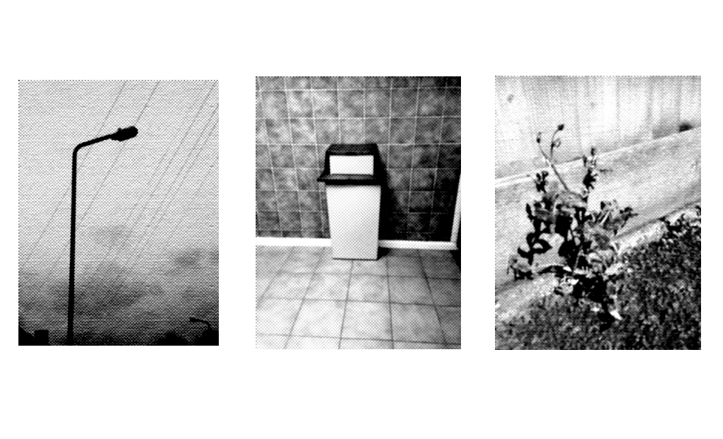
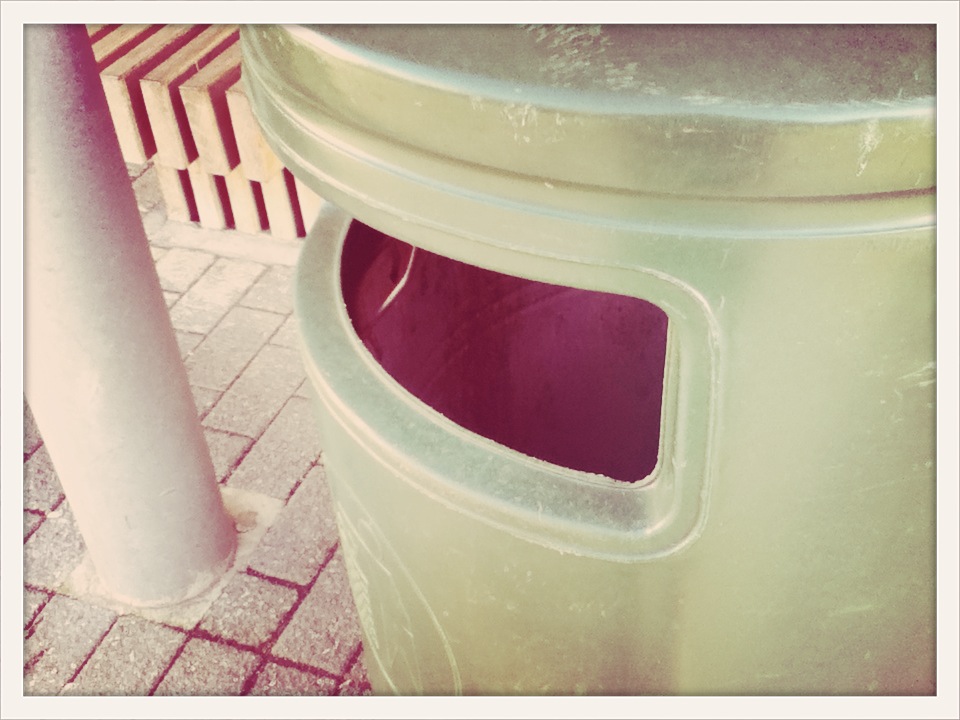
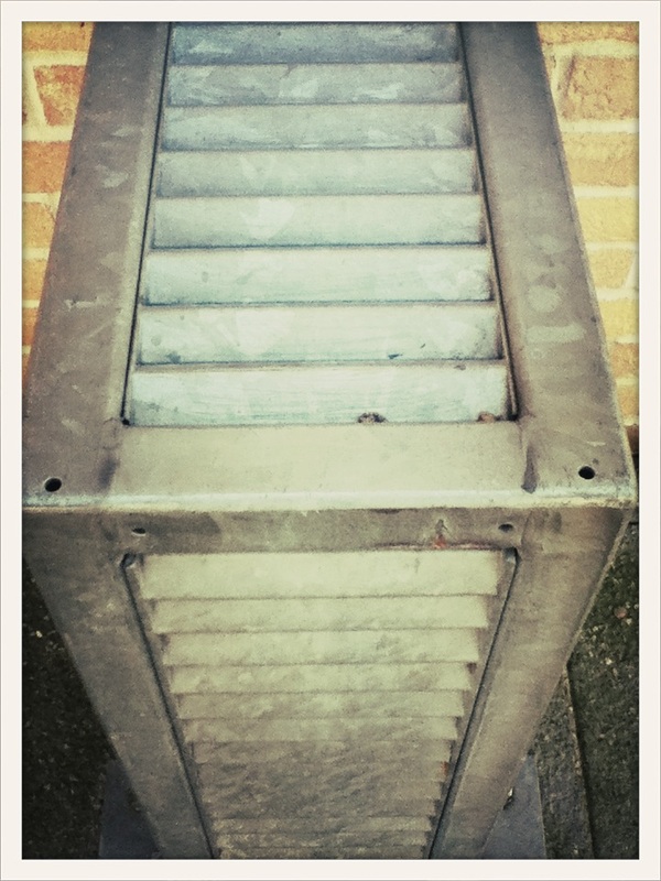
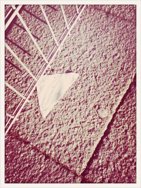
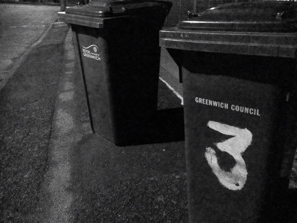
These images are going to be another one of my final pieces, laid out something like this or something similar to this. I think that these images work well because they are all of one specific thing, a lamp post, a bin and a flower. I think that all of these images look like they have similar amounts of space around them. These images are abstract because they match because of the content, but they are taken at completely different places at different times, the first two images are from the same set but they were taken at different times and the last image is from a completely different set taken a few days or a week after the other ones.
Final Evaluation
For this personal project I was only able to produce two final pieces as I didn't really manage the time I had to complete the project very well. Overall, I ended up having five sets of images inspired by Aaron Siskind and Ray Metzker along side various Photoshop experiments. I thought I would have more time to take more images so I also did additional research on Paul Strand, Eugene Atget, Brassai, Franchesca Woodman and Daido Moriyama.
To start this project, I wrote a short definition of 'Abstraction in photography' then i wrote a definition of 'Abstraction in art'. I then made a Pinterest board that was based off of the images that I found when I searched 'Abstraction Photography'. After I had done that, I listed the formal elements and wrote a very short definition of each element (for reference when I am evaluating images). After evaluating an image taken by William Eggleston I decided it was time to start looking for artists. I went onto Pinterest and again searched 'Abstraction Photography' and images by Aaron Siskind and Ray Metzker came up. When I had researched some of their work, I chose to focus on taking images inspired by Ray Metzker. I went to Woolwich and started taking images around there and they all come together to form my first set of images. My second set was taken inside school, my third and fourth set were taken in school and my final set was taken inside school. The images that were taken in school were not as successful as the ones outside school because there isnt really anything in school to focus the images on.
For my final pieces I chose four images from a set that I had taken in school, because they were all of the same subject (trees). Then I chose three images that were taken at different times and belong to different sets. I chose these ones because they are also all similar, they only have one thing as the main subject.
I think that these are good images to have as i final piece because in the first one, all of the images are of trees, they are all the same size and the all have the same effect on the,. The second piece i have is three images that are all based on one thing and are all in black and white.
