Absurd
"wildly unreasonable, illogical, or inappropriate."
Adjective:
"utterly or obviously senseless, illogical, or untrue;contrary to all reason or common sense;laughably foolish or false:
an absurd explanation."
Synonyms: "irrational, silly, ludicrous, nonsensical."
Antonyms: "logical, sensible."


|
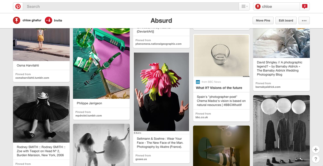
This image is absurd because it replaces the use of actual people with wire figures that resemble parts of a human's body (arms, neck, legs etc.). The wire figure's head is a ball or balloon and this is absurd because they have no face which is a little creepy. This could possibly make you want to know more about why the image was taken or who the photographer is or what the reason behind the image is. 
The image looks like it was take in a place like this (a photography studio in an attic) or it could have been taken in an old garage. I think this because the floor looks a little like concrete or floor boards similar to the ones in attics or garages.
|
|
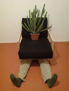
This is an image by Erwin Wurm it is obviously of a person who is sitting beneath a chair with a cactus on top of it. This image seems to be absurd because you would expect to see someone sitting on a chair with a cactus somewhere around the room, not a cactus sitting on a chair which is sitting on the person that should be sitting on the chair. This image looks like it was taken in a corridor of a building, I think this because I don't think that there would be orange floors in anyones room or houses. I also think this because the chair looks like it would have come from someones office, not from someones house. This theory could possibly make it seem more absurd because this person could have been working one minute then he next they could have completely given up and are wishing they're at home, at by sitting behind a chair with a houseplant on it could make it seem like they're at home. |
|


This is a set of images that I had taken in school using one of the cameras provided. These images were take very quickly mainly outside the buildings. If I were to take images similar to these again I would make sure that only what I wanted was in the frame because for the first three images there is a lot of things I didn't want In it such as people walking in the background and the building around the images. I would also aim to take more images. My favourite image is the fourth one. This is my favourite image because there is nothing in the background and the only focus of the image is the person who is hiding under the box on their head. I also really like the first image. I like this image because although it has a great deal of things in the background (the building, windows, bushes etc) it looks good. It could be better if the building was not in the background, but I generally wanted the bushes to be there so it looked like he was hiding behind it as well as being behind the mask.


This is another set of images I have taken that I think represent absurd. I have chosen to use these things as I didn't think that they were particularly normal things that you would see on day-to-day basis in the places they are in. If I were to take these images again I would make sure that the camera is in focus and that everything I want to be in the image, is in there. I also need to work on the placement of where things will go in the images, because the composition of these image are not that good. The second to last image is absurd because as you can see the drawing doesn't fit in with the posters on the wall surrounding it. This is absurd because the drawing does not match the style of the things around it.


Here I have tried to re-create the previous set of absurd images. I have mainly tried to hide things. My favourite image is the second one, this is my favourite because it doesn't look like it was 'staged' like the other images. To make this image, I put a little baby's chair on top of my brother's head when he was sitting playing on his iPad. This is also my favourite because because there isn't really anything to distract you from the main subject except the change in colour from the red of the chair to the white of the wall. If I were to take the fifth image again I would make sure that there is no glare on the poster and that there is no (or almost no) shadow from where I was standing and taking the image. I could also make sure that the white bits of metal from my bed are not in the image along with the black parts from the bedding.


This is another set of images I have taken in school, these images are meant to show people hiding. I think most of these images show that but there are a couple that don't. For example I think that the image with the wet floor sign would show someone hiding or trying not to be noticed (shown by them facing the other way) if it was cropped to a smaller size and the first image on the last row doesn't show it because you can clearly see the people standing or walking normally; not trying to hide any part of their body. If I were to take these images again I would definitely use a proper camera instead of my phone because the quality isn't great.


Here I have cropped the images so there is not as much going on in all of the images. The image of the wet floor sign and the feet, in my opinion, looks so much better now you cannot fully see the person. It kind of looks like she is hiding or the she is trying to not be seen now you cannot see the face. My favourite image is the second one on the first row, this is my favourite because you can clearly see that the person is hiding and they have mostly hidden themselves well. The fifth image could be changed by trying harder to not have anyone in the background and trying to only maybe have the hand/arm in there so the umbrella can be held.
Will Ashford


These are some images that Will Ashford has created that use reading book pages and a writing utensil (paint, pencils, pens etc). I have chosen this artist and these images as they are absurd because they single out words or phrases from the page. I like these because they are simple but look really good and most drawings relate to what writing is on the page.
First Final Piece
Inspired by Will Ashford


These are images of my first final piece. These are inspired by Will Ashford but they are also very different because I haven't drawn any images (other than squares and circles) and I haven't really highlighted many words. I think that the images inside the frames go well together because one is in full colour with an image that has been taken relating to words on the pages ("I've never felt less like flaunting in my whole life" with an images of a girls legs/skirt) and the other is black and white with an image that also relates to something on the pages (it's an image of muddy shoes).
David Shrigley


David Shrigley is a british visual artist, he works within photography, drawing, painting, sculpture, music and animation. He is recently known for his 'not so cuddly' football mascot for a Scottish football team.
The images above are his images taken including signs. I think that these images are good because David Shrigley has a good sense of humour and knows what is or isn't funny and know what is and isn't appropriate. think that these images are absurd because you wouldn't normally see signs that say things like those. I like the second image because people don't advertise lost pigeons or describe what pigeons look like.
David Shrigley has said that "The photographs I make now are not really anything to do with documentation. I just want to make interesting photographs." this suggests that he just takes photographs for his own and others enjoyment.


This is a set of 10 images I have taken at home using the signs I've made. These signs were inspired by David Shrigley. I printed out three blank signs, one said 'warning', another said 'security' and the last said 'be careful watch your step'. I made the warning sign say 'alien approaching', the security sign say '(security) are watching everything you do' and I changed the last word of the be careful sign to say 'life (be careful watch your life)'. I then made two additional signs, that were handwritten, that said 'circus through here' and 'people are the worst thing to happen to anyone'.
I think that these images would've been more successful if I had taken a few of them outside my house, instead of having them all taken inside and around my house. The image that I think was most successful and to me made the most sense, because it was of posters of people, although it would have been much better if there had actually been people in the image. This image could be re-taken at a place where there are lots of people or re-taken when some people are standing in a group talking. I think that this image is slightly ironic because some people claim that bands saved their lives, and that is definitely a good thing, but the sign says that people (people are in bands and such) are the worst thing to happen.
The images that have the circus signs could have been better if the sign was stuck onto an outside door so that it look like you are going into a circus. What would have been even better would be if the sign was stuck onto the opening of a tent because most circus acts take place inside of tents. A good idea for this sign could be to empty the cupboard that was used in the last circus image, and make a small circus inside it, using small figures and to be able to see it through the frosted plastic that covers the doors, and also add the circus sign with it.


Here is another set of images I have taken that include signs. I made completely new signs because I didn't really like the ones from the last set of images because they looked messy. I think that these images are so much better than the others because they have been taken outside and the signs actually fit in with the images a lot more than the others. As these images were taken when it was starting to get dark you can't really see all of the things in the image, so I think that they need to be made brighter so they can be seen properly.


Here I have made these images brighter so that everything in the image can be seen. I think that these look so much better now they are brighter because you can see what is actually in the image. I am generally really pleased with the way these images turned out because they look similar to David Shrigley's work, because the signs are absurd and they don't look like what you would normally expect signs to look like which is what his work it like. The signs are also in weird places yet they fit in. For example, the sign that says 'You may not be safe' fits in with its image because it is of fireworks, and fireworks are not necessarily safe.
Face Distortion
Seung-Hwan Oh


This is some of Seung-Hwan Oh's work which I will use as inspiration for my face distortion work. This will help me come up with ways to use chemicals in order to change the way someones image looks. As Seung-Hwan Oh is a microbiologist, he can put fungus that he has grown onto the films and get them to distort and devour the film. I think that this is an effective way of changing the images because they are unique as I haven't seen anyone change the images like this before.
First Experiment


Here is a set of images I have produced using negative versions of portraits in a dark room. I have decided to change to doing work in the darkroom because I felt like I needed to use a different method rather than using just a camera or just my phone.
To make these I took an some portraits and changed them in photoshop into negatives. As they were changed into negatives, they could be transferred onto photo paper. These images were exposed in between 3 and 5 seconds and developed in many different times ranging from 20 to 50 seconds. With some of these images I have added bleach, PVA glue, spray glue, food colouring and ink, and I have found that using bleach and glue along with something to scratch the surface with works really well.
When I do this experiment again, I will have the image exposed for 5 seconds and in the developers for around 20-30 seconds. When they are dry I will then add bleach to the surface (I may add glue to some of them) and I will scratch the surface to make the person unrecognisable.
  |
These are two images that worked well and didn't work well. The image on the left, is an image that worked well because it's the right colour and its developed just right so the image can be seen but it's not too dark. The image on the right didn't work well because something much have been covering the bottom fight corner of the image so it wasn't evenly in the developer causing the image to be lighter and darker in different areas. I personally like that the image has got different tones in it because it makes it look different and more interesting than the others.
|
Making My Final Piece
Initial Images Before Any Edits


To produce these images, I took images of four people and chose to distort their faces similar to Seung-Hwan Oh and my other experiments. I chose to do this because I didn't like and wasn't comfortable taking the other absurd images. I think that these images have turned out good because the faces have been hidden (covered) other than the second one which has a pattern on it where the developer was being moved. I think these are successful because they are absurd, they are absurd because when you take a portrait of someone you wouldn't usually be making them look different. These images would be better if they were a lot darker so there is more of a contrast of the black and white. I think they all would match if the first image was in black and white so the blue doesn't have all the attention on it because it may stand out.
First Change in Photoshop
Making The Image Darker


These are the same images that are above but I have changed the contrast in photoshop to make them darker. These images look better now that they have been made darker because they make them look older than they did before. My favourite is the first image because I like that the blue stands out against the black and grey. I also like that the blue didn't spread around to the other side of the image, it only stayed on one side.
Second Change in Photoshop
Changing into black and white and adding more contrast


These are also the same images from above, but I have made them extremely dark. I like that they are darker but I don't like that the blue has disappeared in the first image. Because they have been made darker they look even older than they did before. I really like that there are dark lines all around the images where other pieces of paper have been accidentally put over it while it was being developed, it makes them look more interesting because there is more to look at around the image, this also gives it an older more worn feel to the overall image.
Final Evaluation
To begin with I found out what the word 'Absurd' meant from the dictionary and put it at the beginning of my page. I did this to remind myself exactly what my images should represent. I also found out the antonyms so I knew what my images shouldn't be. After that I made myself a Pinterest board names absurd and added images that I thought went well with the theme absurd. Using the Pinterest board, I chose two images to evaluate; explaining why they were absurd. I chose an image by Erwin Wurm and an unknown artist. I chose these because the really seemed to stand out to me. Honestly, for my first few sets of images I didn't have any artist to be inspired from, I mainly used Pinterest to get inspiration for all of my images but there is no artist research there because most images that I found and liked were from unknown artists. The first artist I found and actually researched was Will Ashford. I researched him for the 'signs' part of this project. I liked his work because it was very simple yet looked really good. I cut up a book that I had lying around at home to do some experiments relating to his work, but ended up creating two final pieces that were similar in content but I put mine in a frame that made my work look better than it did on its own. After that I looked at David Shrigley who created images that include signs. His work inspired me to create some hand-written and digital ones.
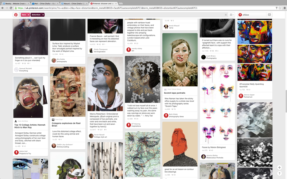
Then I moved onto 'Face Distortion' and to get inspiration I went onto Pinterest and typed 'face distortion' into the search bar and took a screenshot of what came up. I then got an idea from my teacher to make portraits in the dark room but to make them different by adding different chemicals onto them. My inspiration was from Seung-Hwan Oh.
My first set of images were taken in school around the field area. I think that these images are not good but not awful, so they are really helpful because it let me know what I didn't want my images to look like. I also felt the same way about my second and third set of images because they were not as good as they could have been. I think this was because I didn't know what I wanted them to look like properly and because I was not confident at all about what I was doing. However when it came to re-creating Will Ashford's work I think I was a little more confident because I knew what I was doing and what I had to create. I also felt more comfortable when I was taking my second set of David Shrigley inspired images because I knew what I was doing after one set because at first I put the signs around my house but realising that the images didn't turn out as good as they could have, I made some new ones and decided to photograph parts of my Nan's garden as a few weeks prior to the images, we had a firework show there and it hadn't been cleaned up. When I put the images on my page, I realised that they were way too dark for them to be seen properly, so I had to take them into Photoshop and change the brightness and contrast to allow them to be seen as they were intended. Finally, I was really comfortable doing my final set of images because it was something I had had a go at before (using different materials) and because it was something I really wanted to do. I also decided to do some work in the dark room because whenever I had taken an image they didn't turn out how I wanted them to and they were not really absurd enough. To create them I had to take some portraits of people and then go into photoshop and change them into negatives. Then using the negatives I used an enlarger to transfer the image onto some photographic paper ready to develop them with chemicals. When they had been developed and when they were dry I put other chemicals (mainly bleach and glue) onto them to change the way the person looks in the image allowing them to be almost unrecognisable.
I have produced three final pieces, two are inspired by Will Ashford and is inspired by different artists relating to face distortion. I think that my final pieces went well because they are of something I was good at and they are related to the main title of this project, Absurd.
