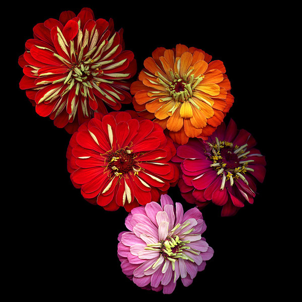
Repetition
I have chosen to research repetition. I have chosen to research repetition because I think it will be interesting to create images using many of the same thing (colours, shapes, objects etc) and using photo developers like photoshop and illustrator to create the 'patterns'. Doing some basic research on photographers, I really like the way the images turn out, especially the ones that are made using photoshop/illustrator because they look neater. I really like how colourful Brittany Wright's images are because it makes them stand out compared to other photographers. Then again I also like the work that Marcos Bernardes creates because it is extremely different to the bright images taken by Brittany Wright.
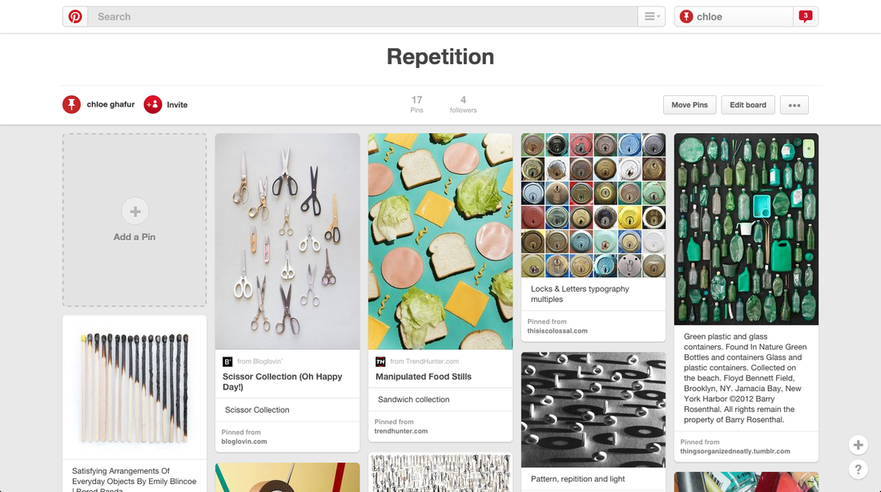
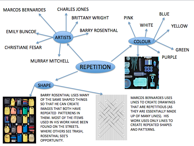
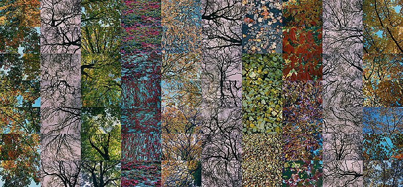
This is a small mind map I spent a few minutes making based off of basic research I have done relating to the theme 'repetition'. This mind map explores photographers, the shapes used in images, and potential colour themes. This will help me understand what I want to or what I can produce, using the colours and shapes mentioned.
Barry Rosenthal
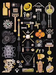
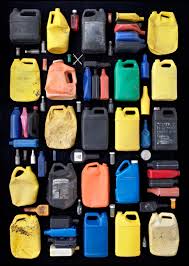
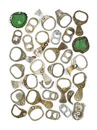
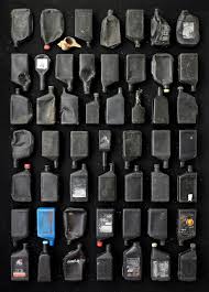
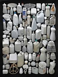
Barry Rosenthal is a Brooklyn, New York based photographer. He collects items that he finds around New York Harbour and arranges them then takes images of them. He has called his images the 'Found in Nature' series. He also describes his collecting as an addiction. 'Found in Nature' started in 2007 as an 'offshoot of his botanical work'. His work has evolved from pint-sized collections to a substantial amount of 'trash' , that he turns into art that represents 'ocean borne trash'.
|
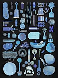
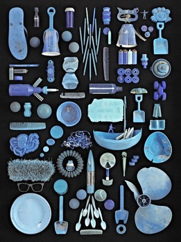
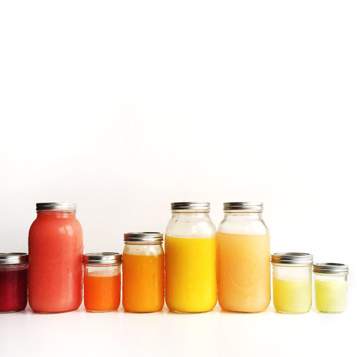
This is an image taken by Barry Rosenthal, as a part of his 'Found in Nature' series.
This particular image has a blue/teal/purple theme to it, as there are many different shades of those colours. This image is made up of 'trash' that Rosenthal would had found around New York. This shows repetition because similar colours and shapes are repeated almost constantly throughout the image. On his website Rosenthal says that this image is: "Groupings of random and unrelated objects tied together by a similar colour hue. It seems unbelievable that so many objects share the same hue." He also goes on to say that he had many more blue objects but refrained from using the ones that seemed more magenta, purple or green. Doing some more research about this piece, I have found that he had called it 'Blue Ocean'. It's called that because it is made up of objects found at New York Harbour, Brooklyn, and it seems like it was inspired by the sea. |
Brittany Wright
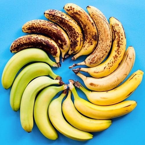


Britany Wright is a 'photographer and food enthusiast' based in Seattle,Washington. She photographs foods put together in a gradient sequence. These images have been called #FoodGradients. Her images have been featured many places including Buzzfeed and New York Magazine. She is inspired by abstract artists, not food photography. Her goal is to get people more familiar with what they eat by documenting how it changes. She gets most of her inspiration when she is at the market, where she buys her 'ingredients' because the food environment inspires her. Some of her commissioned work is very different to her ordinary work because it has different backgrounds (wood, colours etc).
|
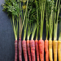
This is an image taken by Brittany Wright as a part of her #FoodGradients series. This image is effective because there is limited 'wasted space' and the use of colour has been used to create a sharp gradient between red, orange and yellow. The only part of this image that doesn't work well is the stems in my opinion. Although this doesn't effect the way the image looks generally, the second red carrot's stem could've been turned around to make them all green. I think that this can be considered a naturalistic and an abstract image because it has a natural form and an abstract one (the way the whole image is laid out, in a almost straight line but having the colour of the carrots fading). |
|
Basic Ideas
1. I like the idea of using food for repetition (because there is always fruit and vegetables available to take images of) but I think arranging them as a gradient will be hard to do with a limited amount of supplies. I also don't like the white background as much as the black ones. I want to create a set of images using a darker background (similar to Barry Rosenthal) and having all different coloured and mixed up fruits and vegetables in it.
2. Another idea could be to use any (clean) rubbish (like empty packaging, drink bottles etc) and mixing them with fruit and vegetables to create a complete mix of Rosenthal and Wrights work.
2. Another idea could be to use any (clean) rubbish (like empty packaging, drink bottles etc) and mixing them with fruit and vegetables to create a complete mix of Rosenthal and Wrights work.
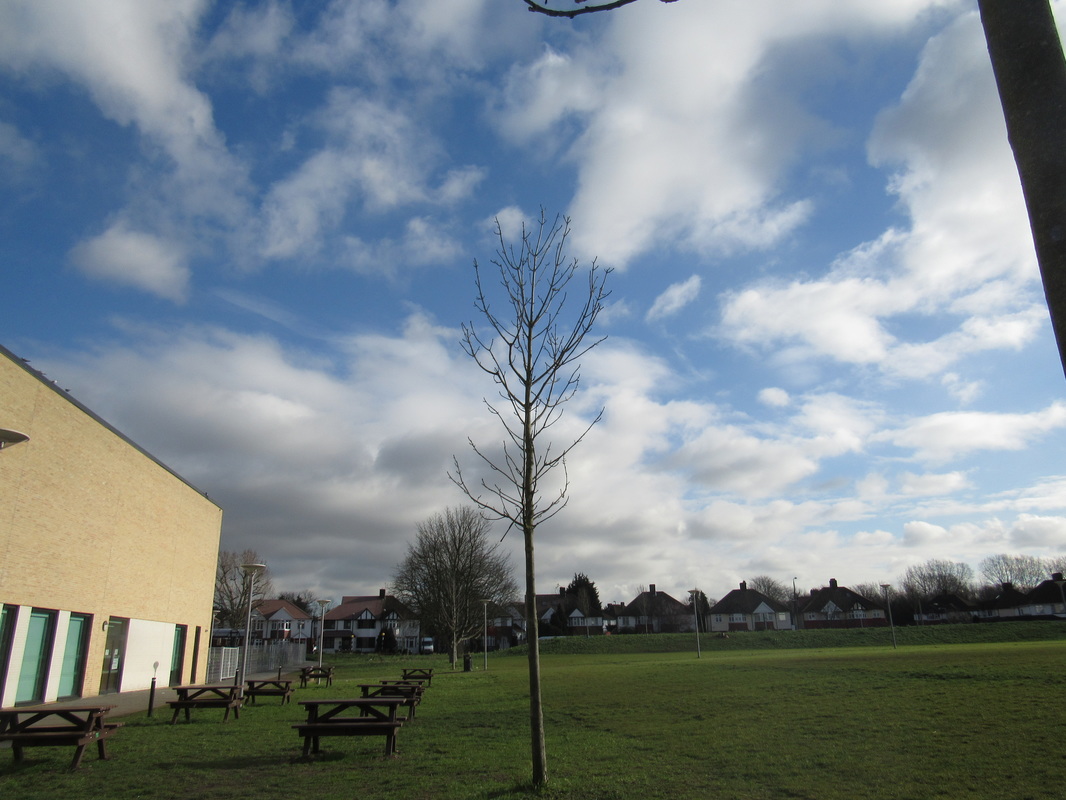
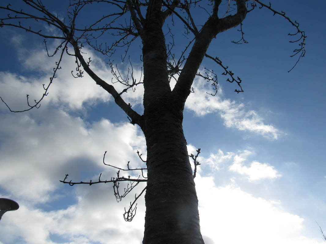
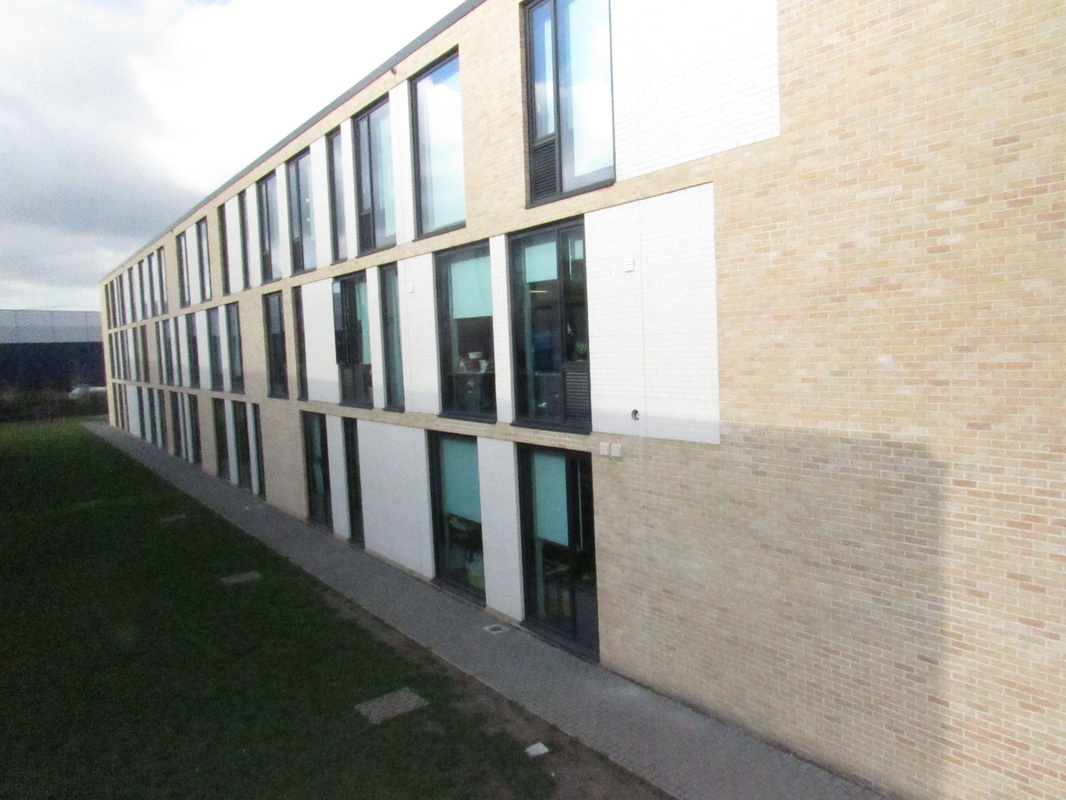
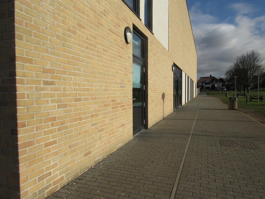
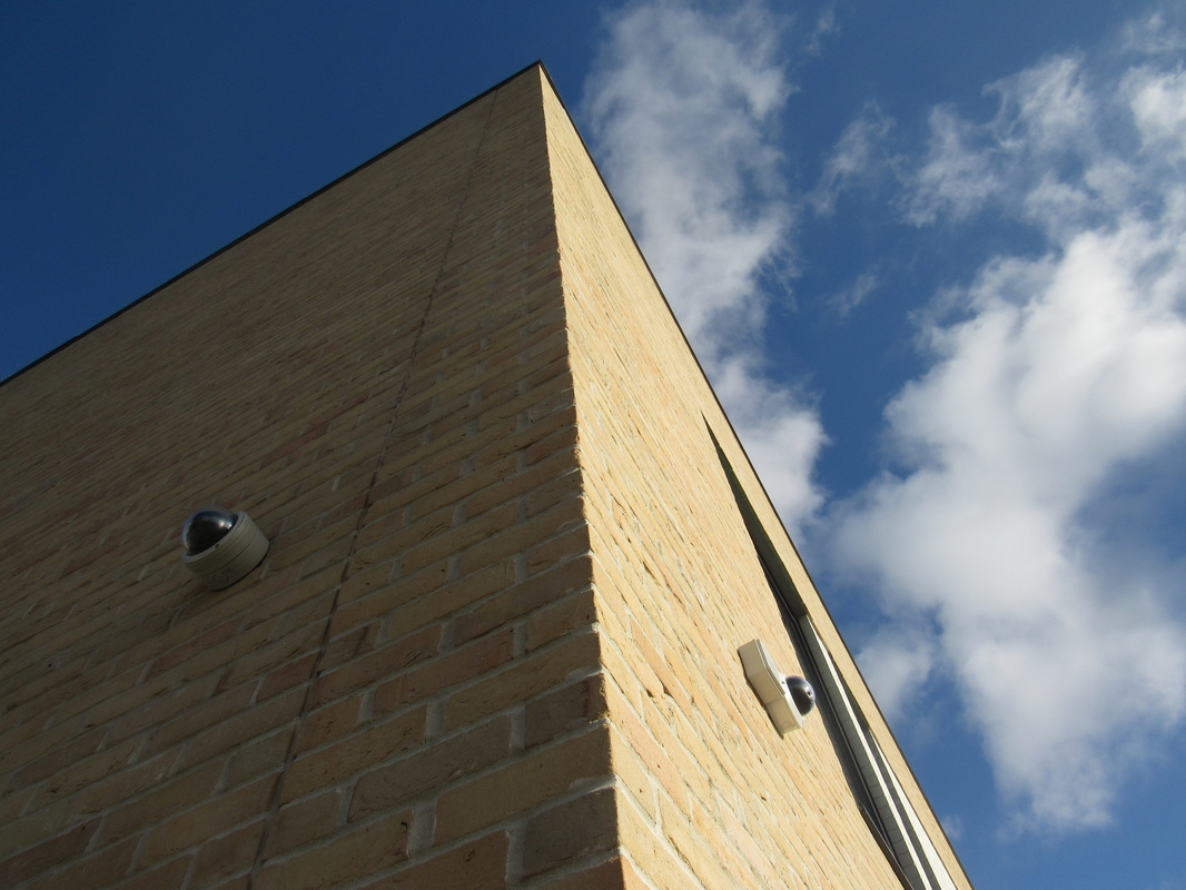
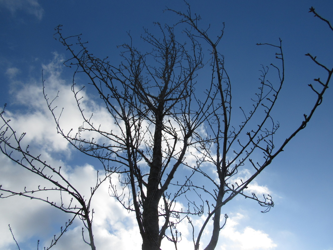
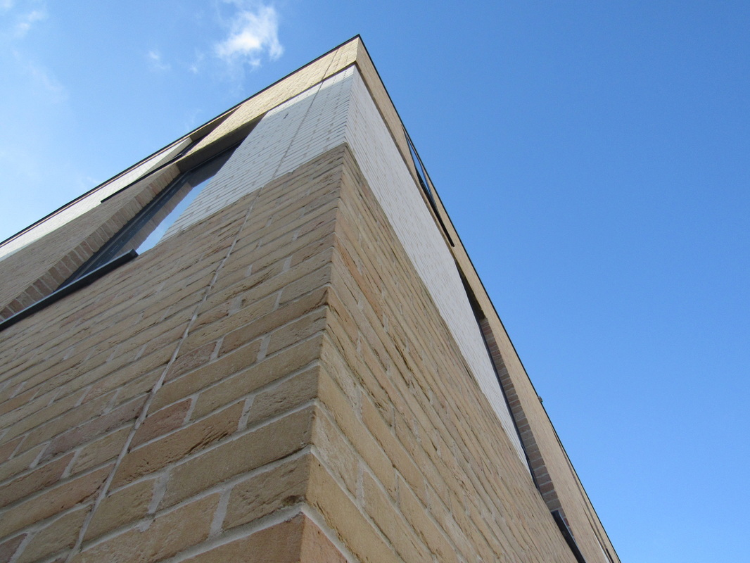
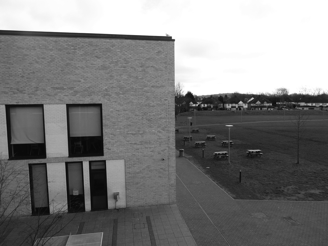
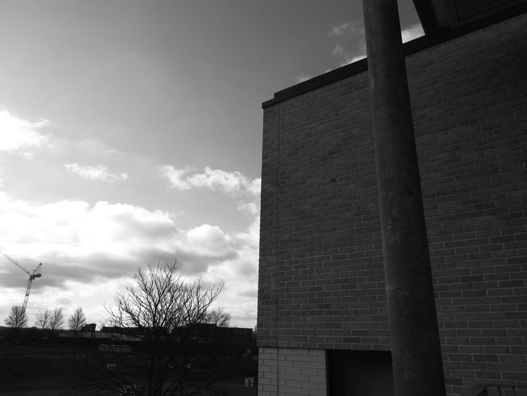
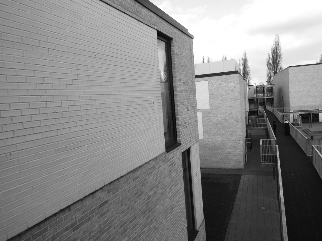
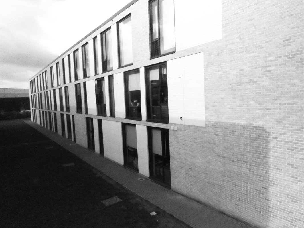
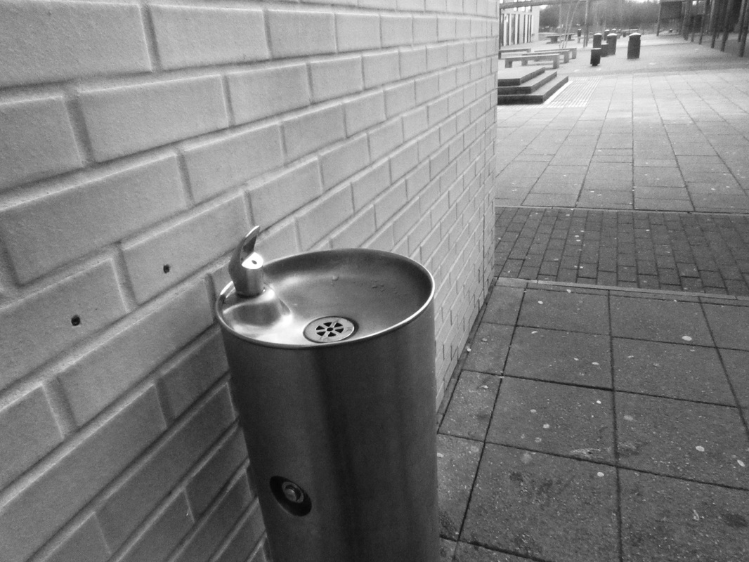
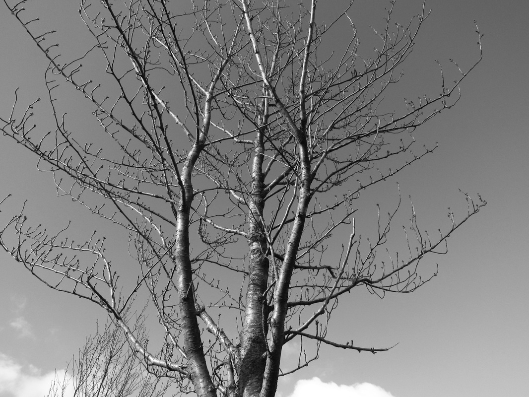
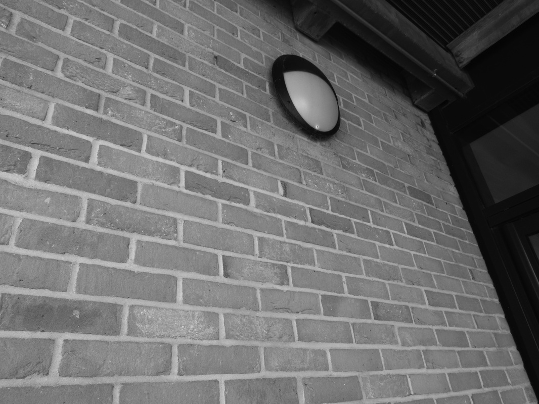
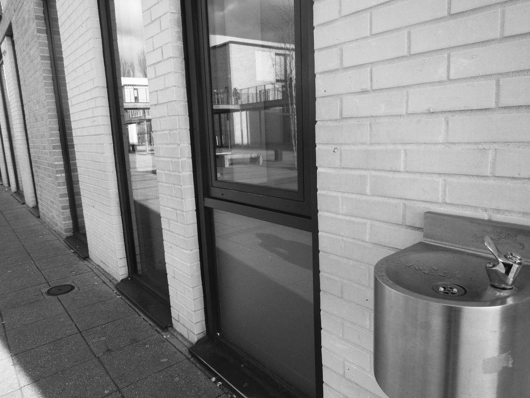
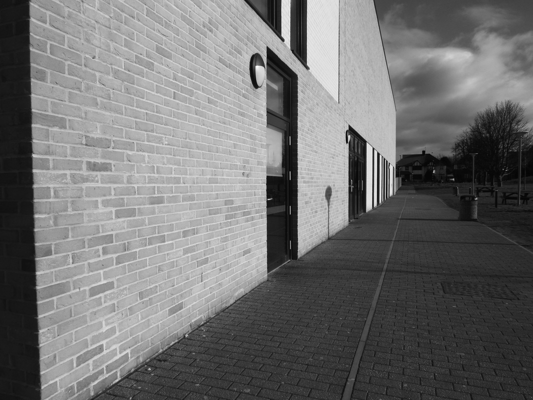
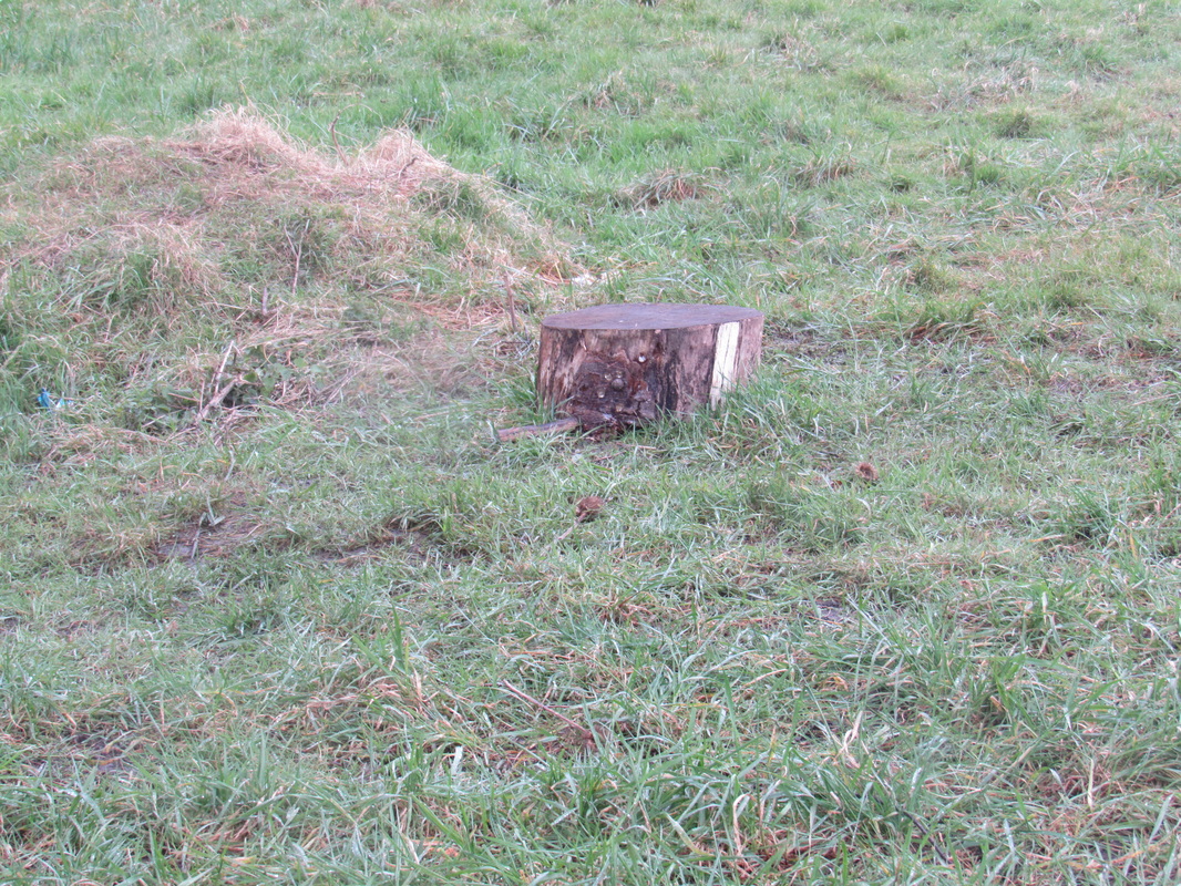
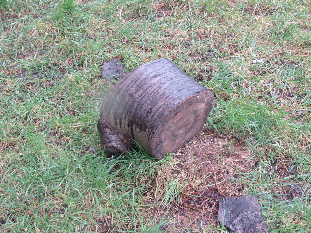
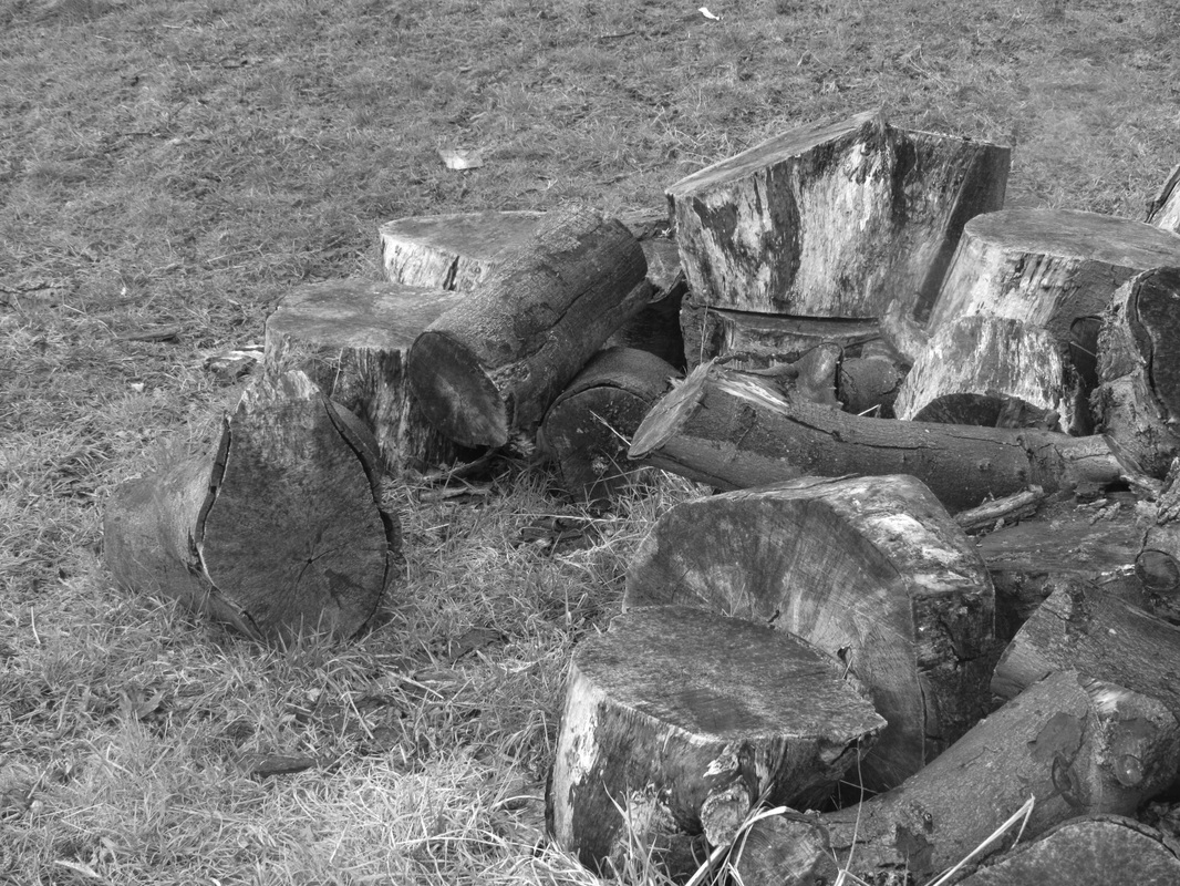
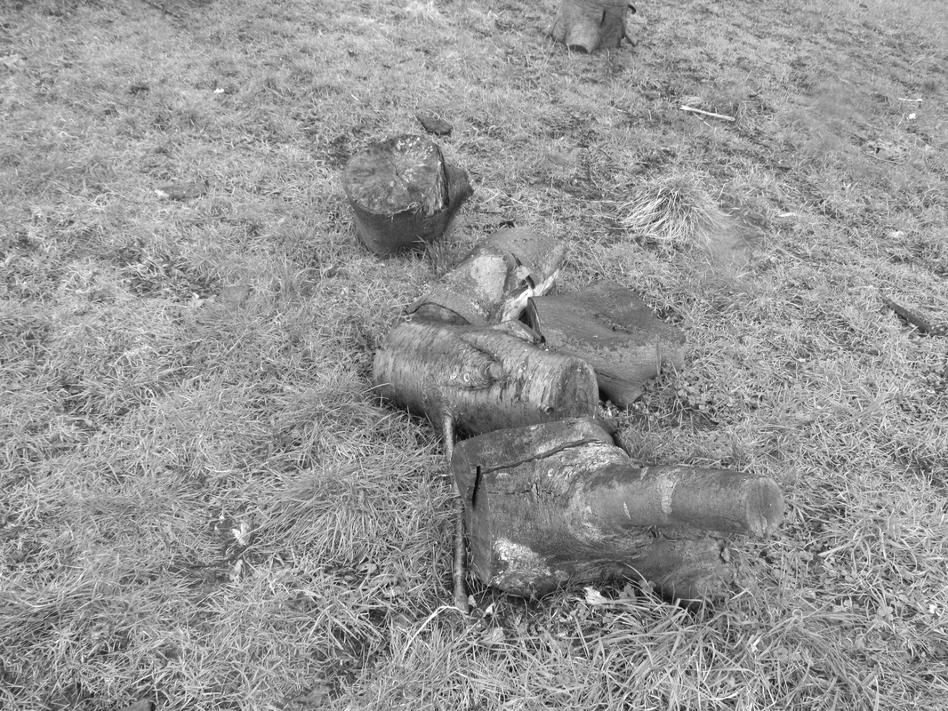
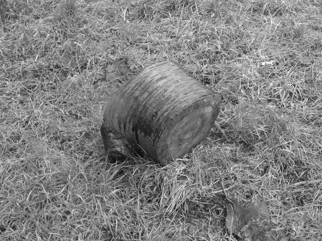
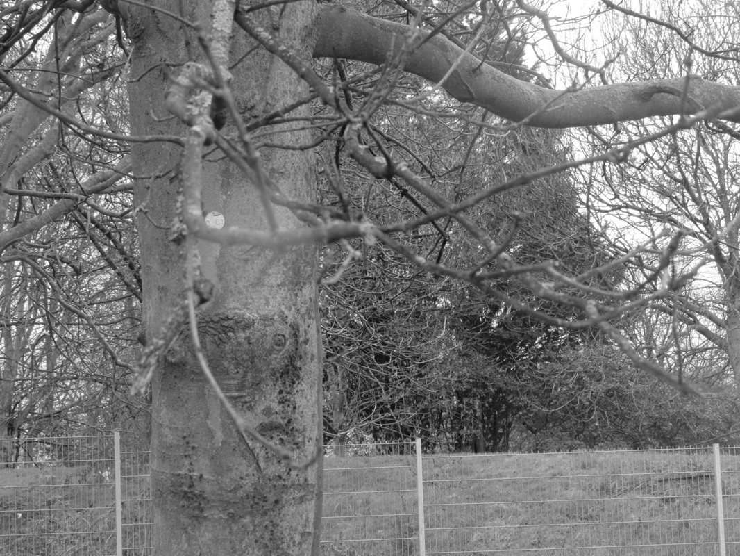
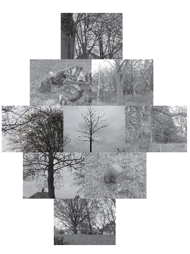
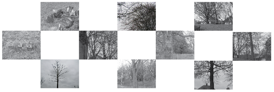
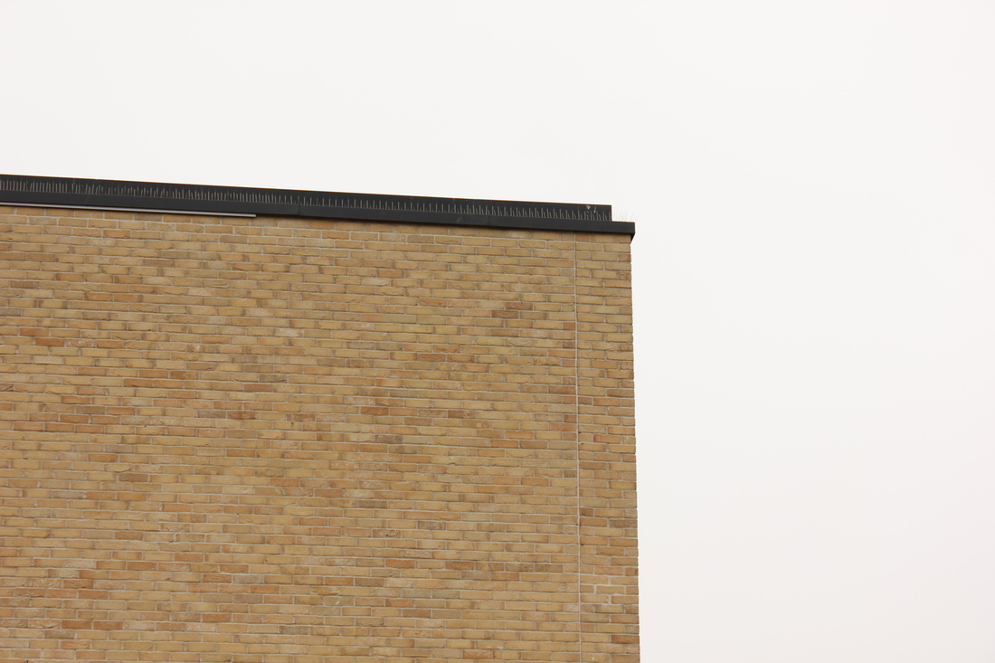
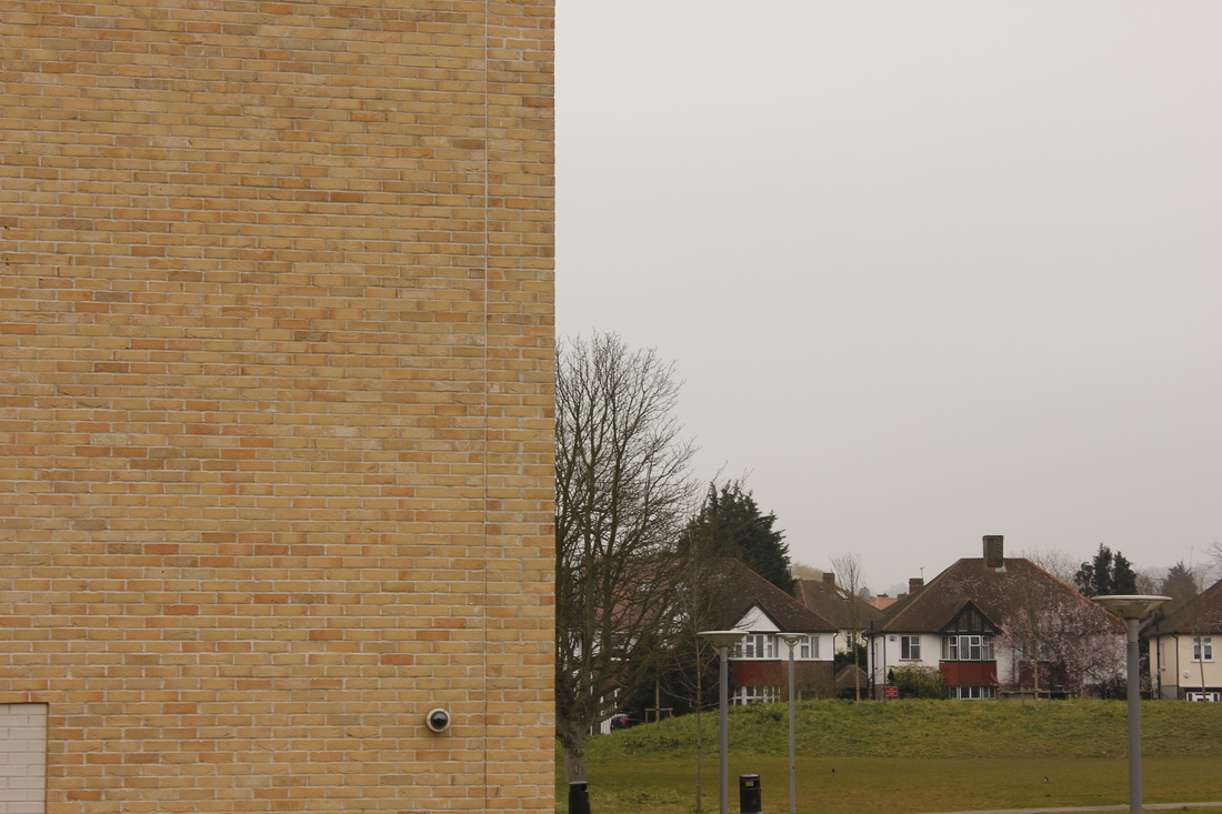
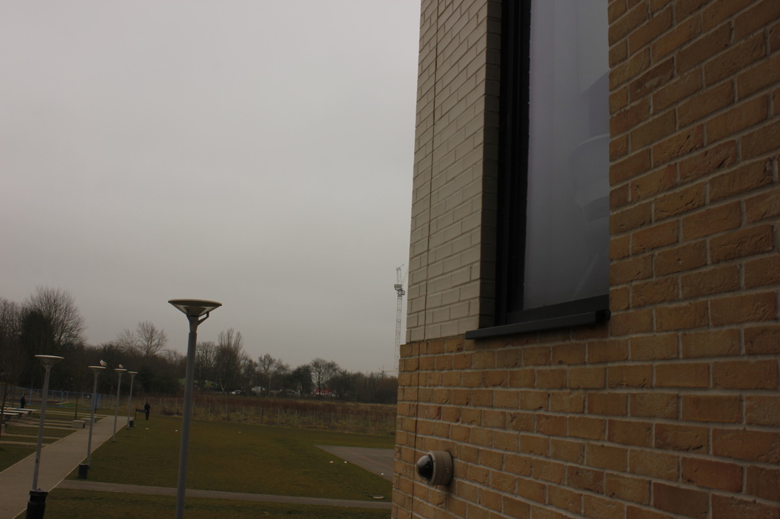
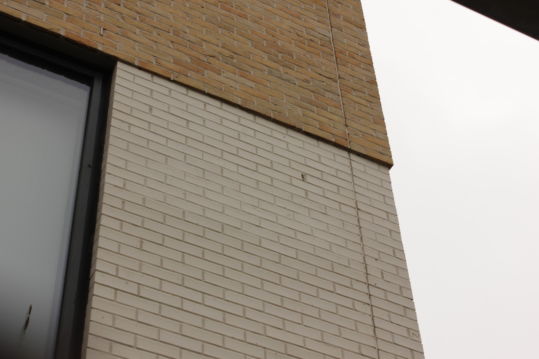
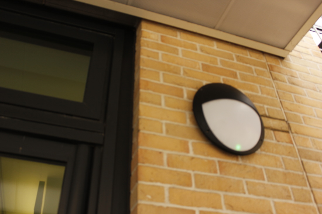
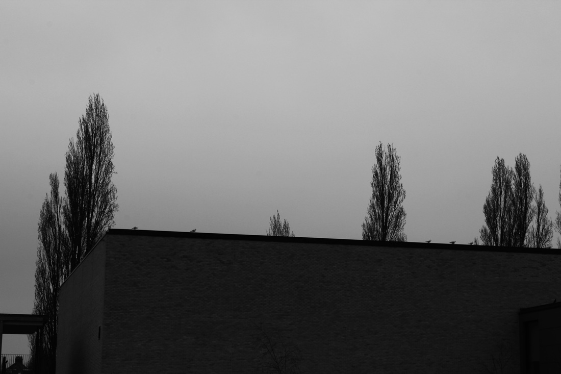
First Set Of Images
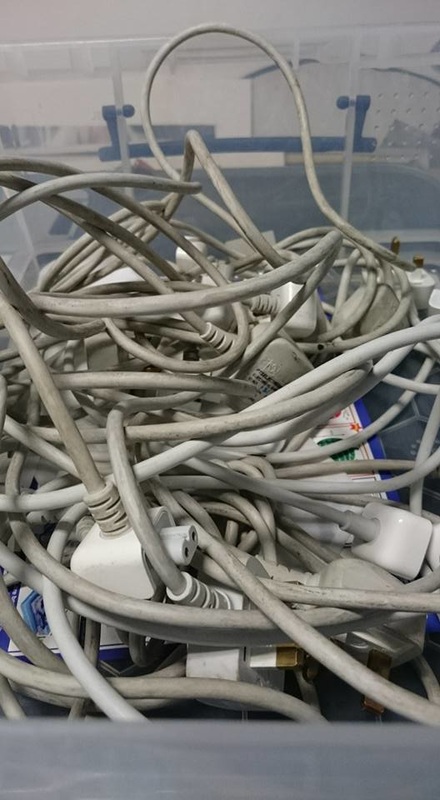
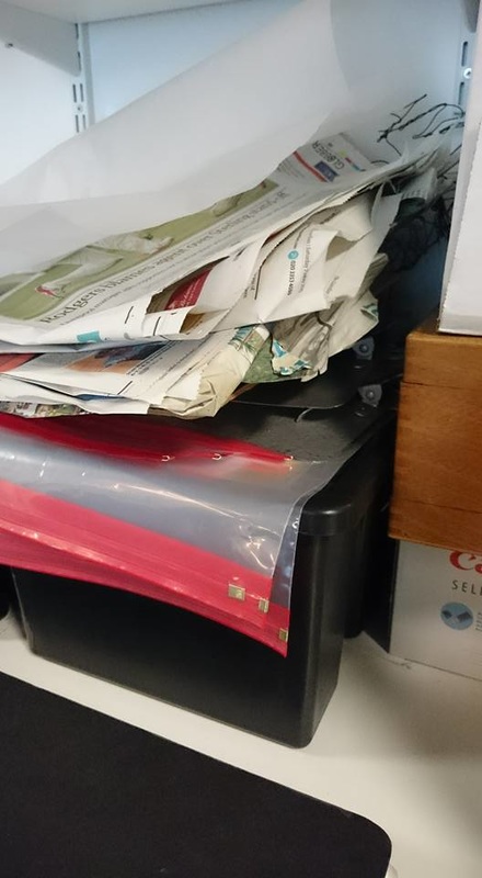

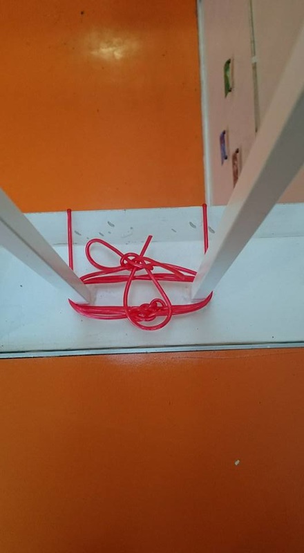
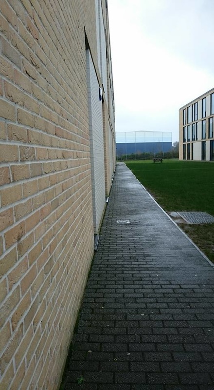
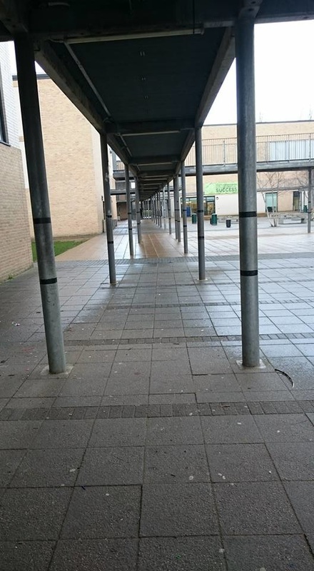
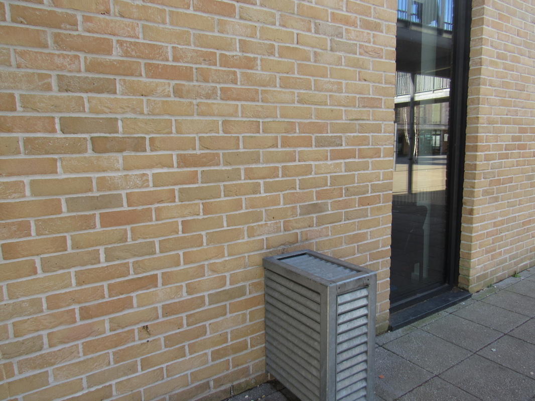
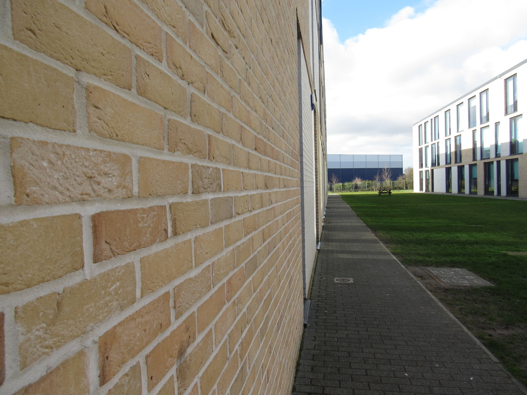
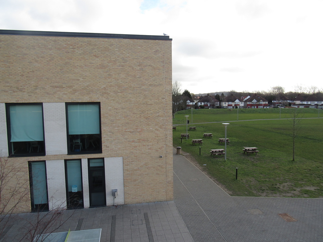
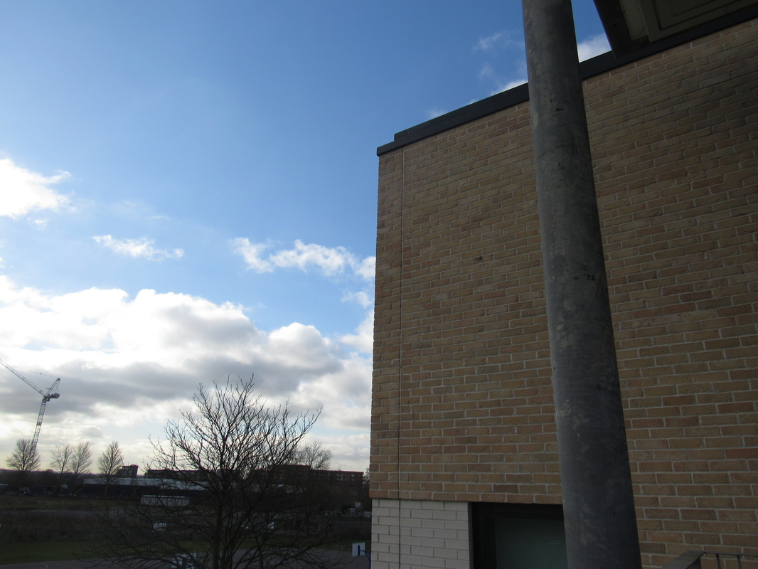
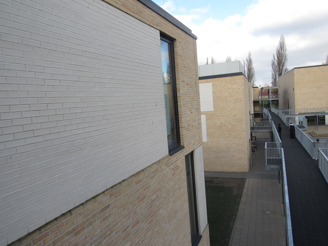
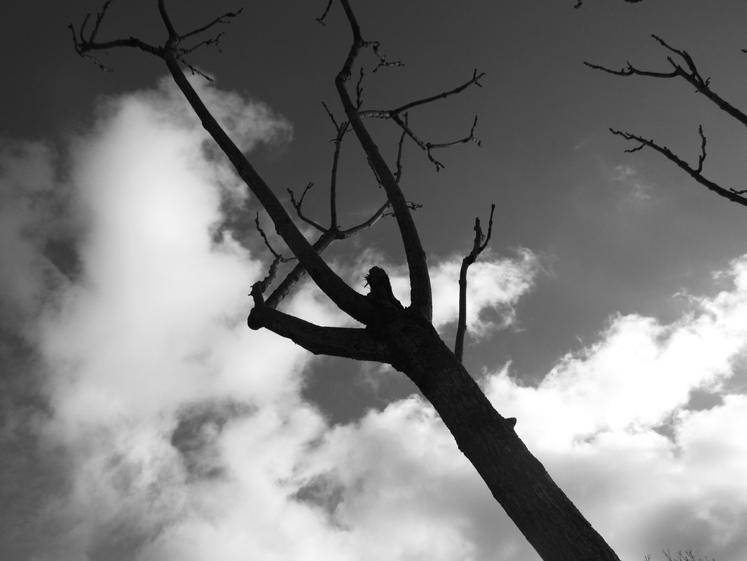
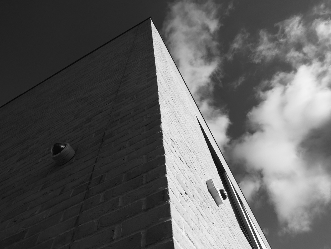
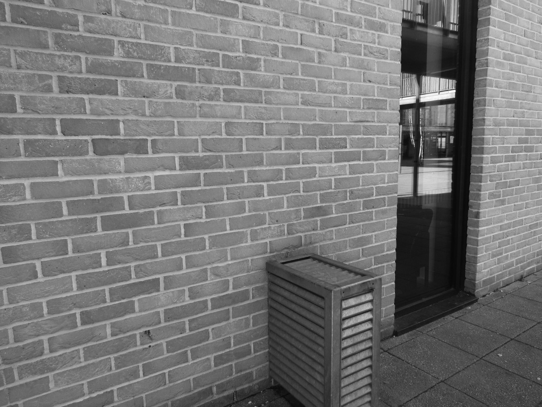
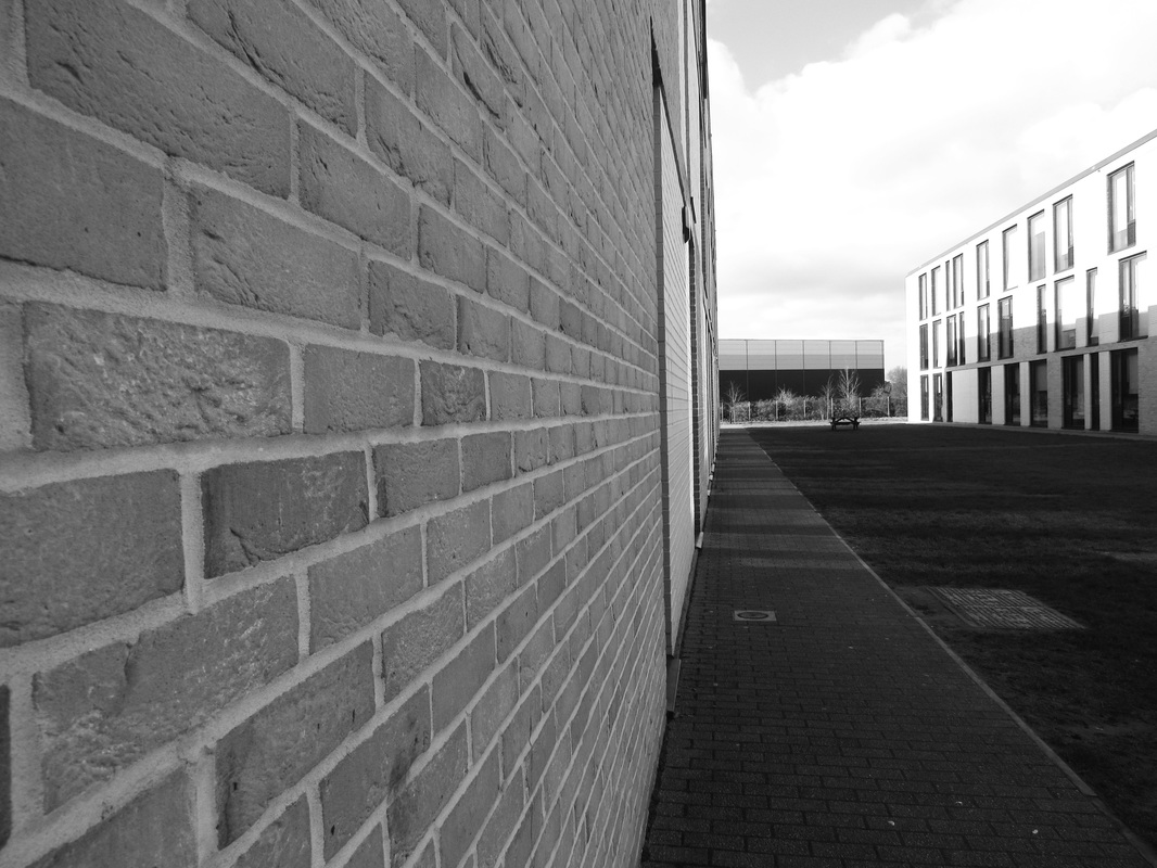
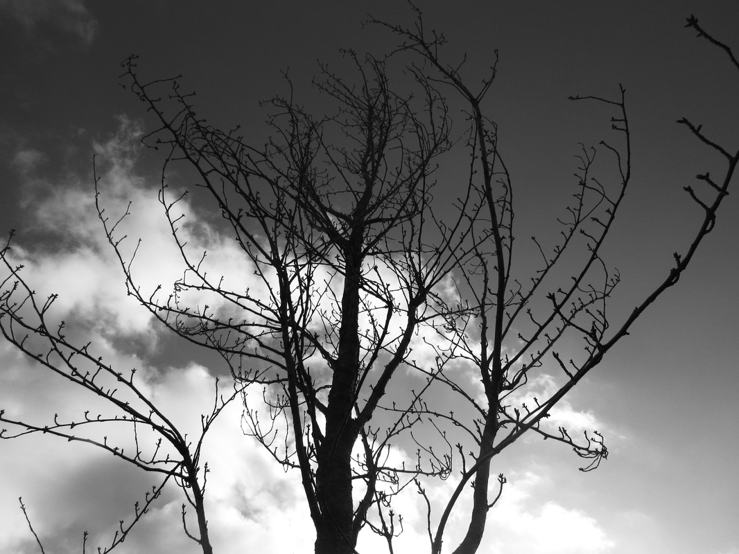
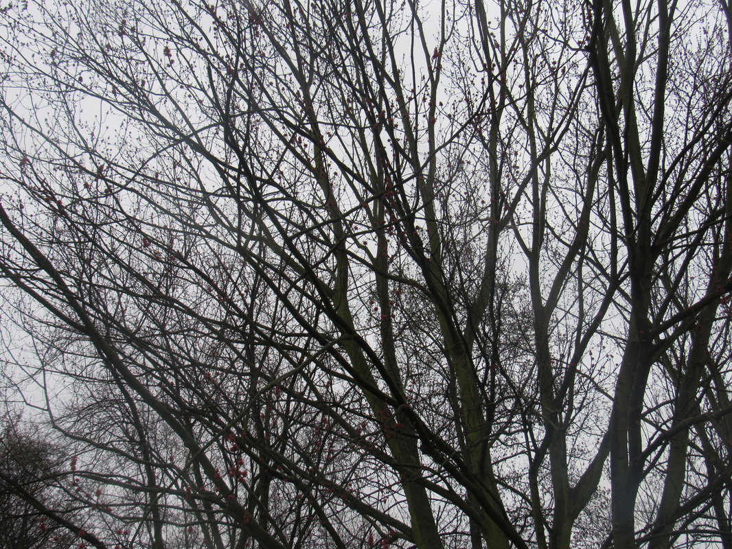
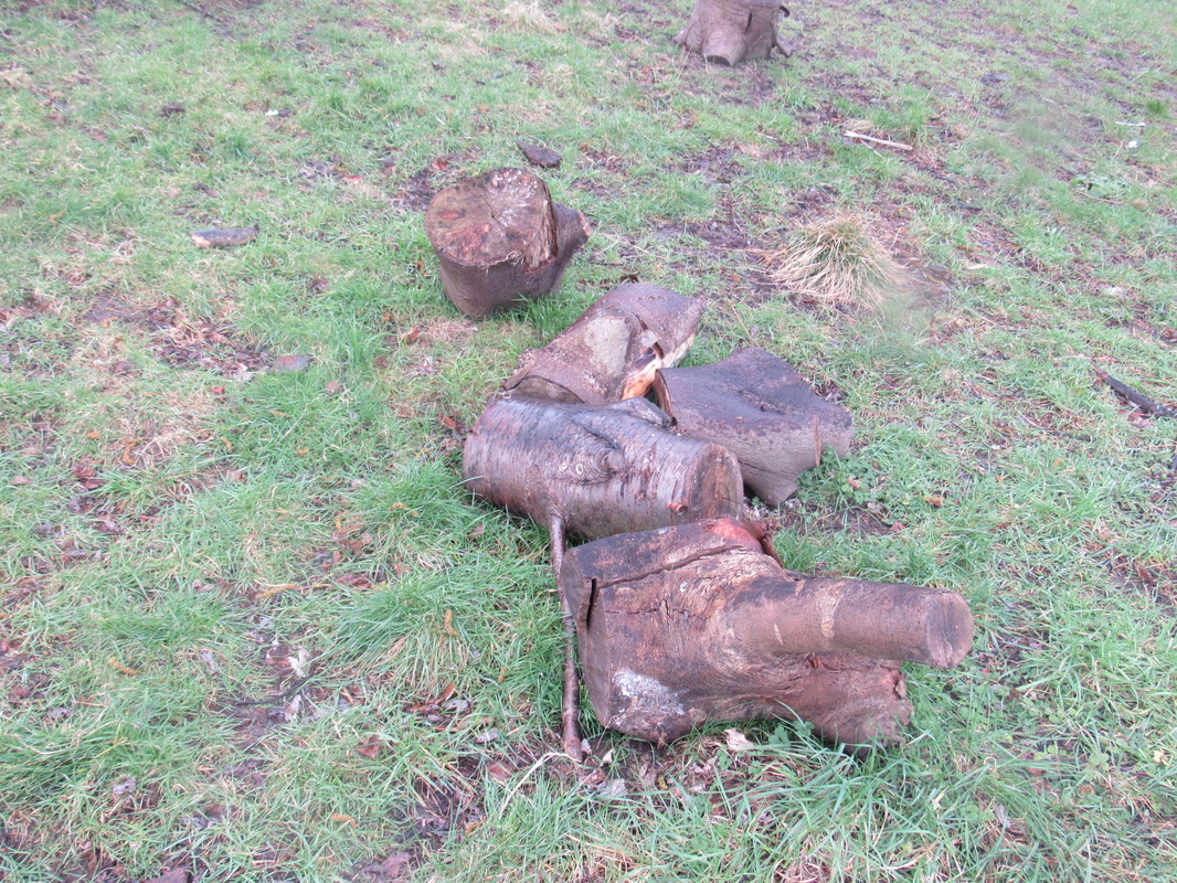
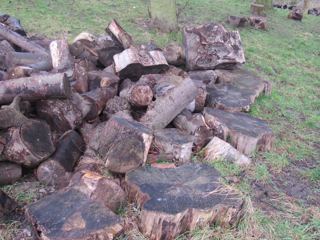
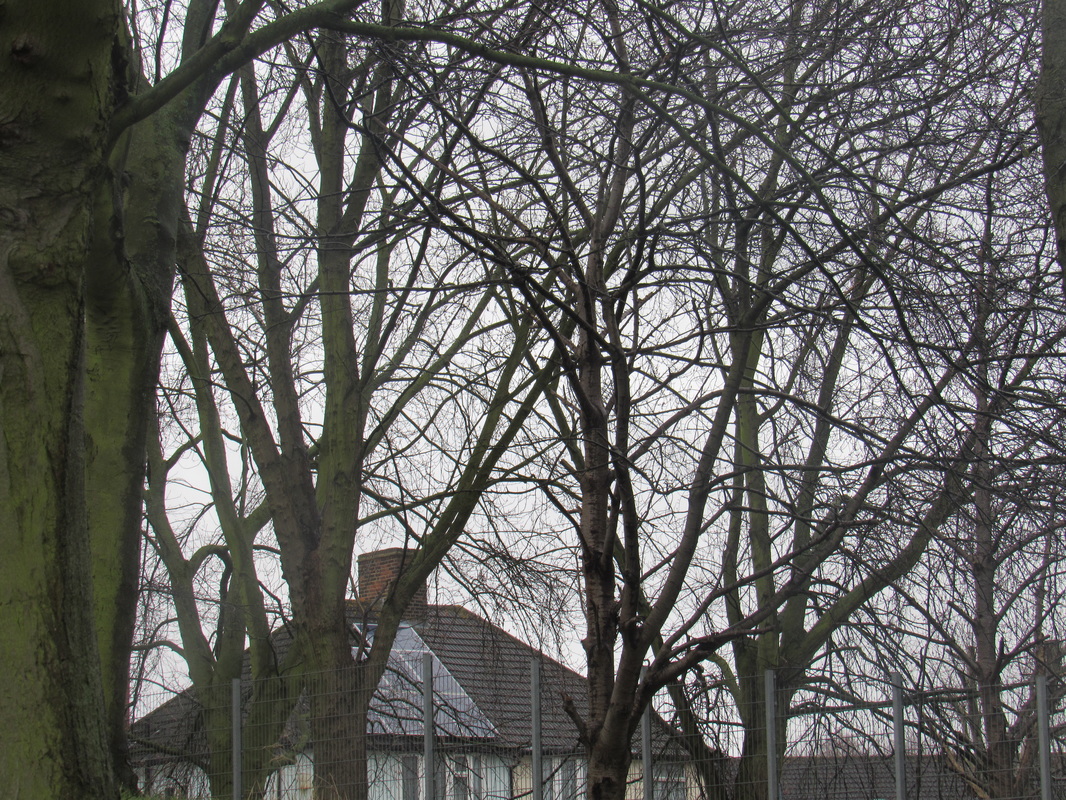
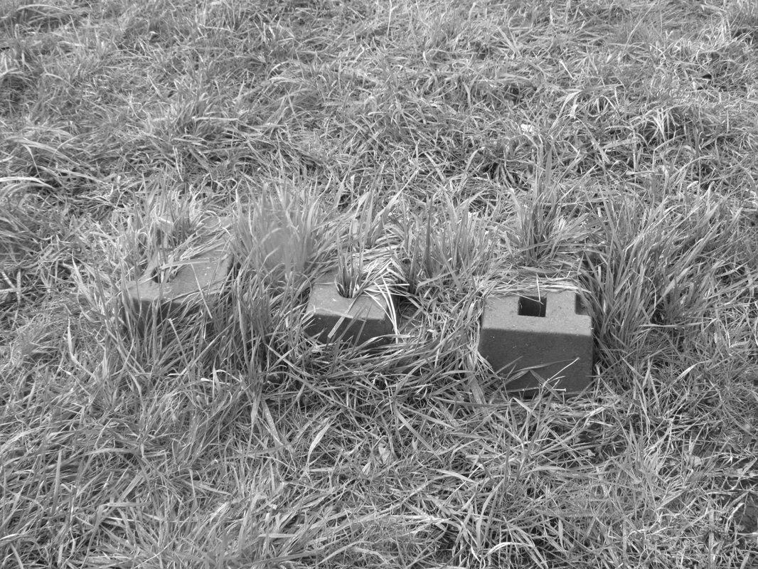
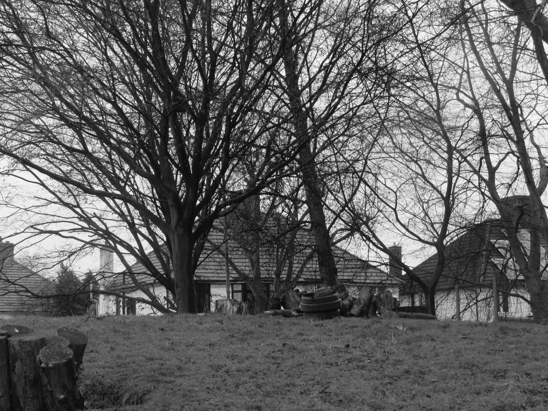
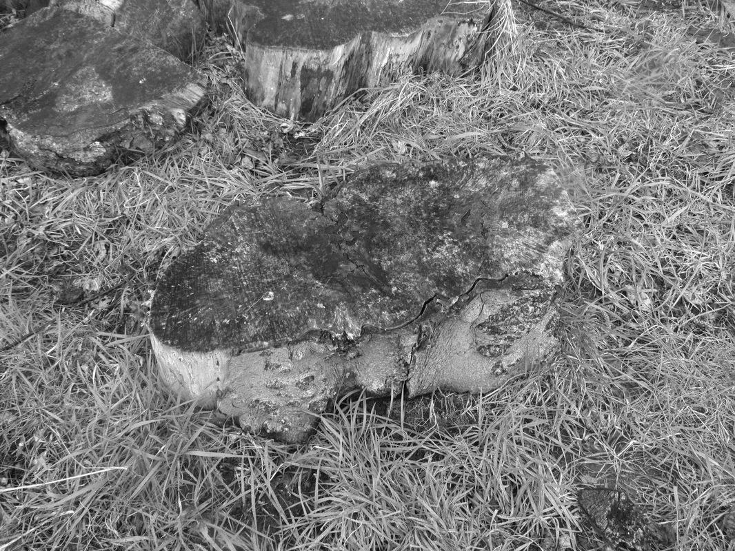
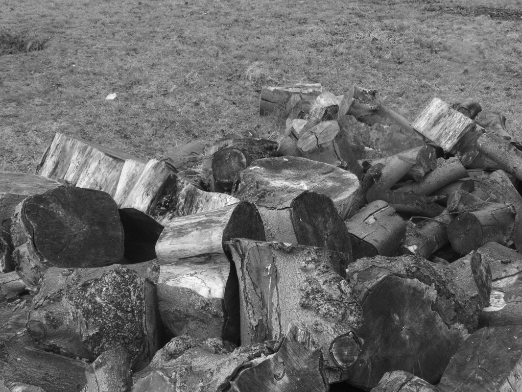
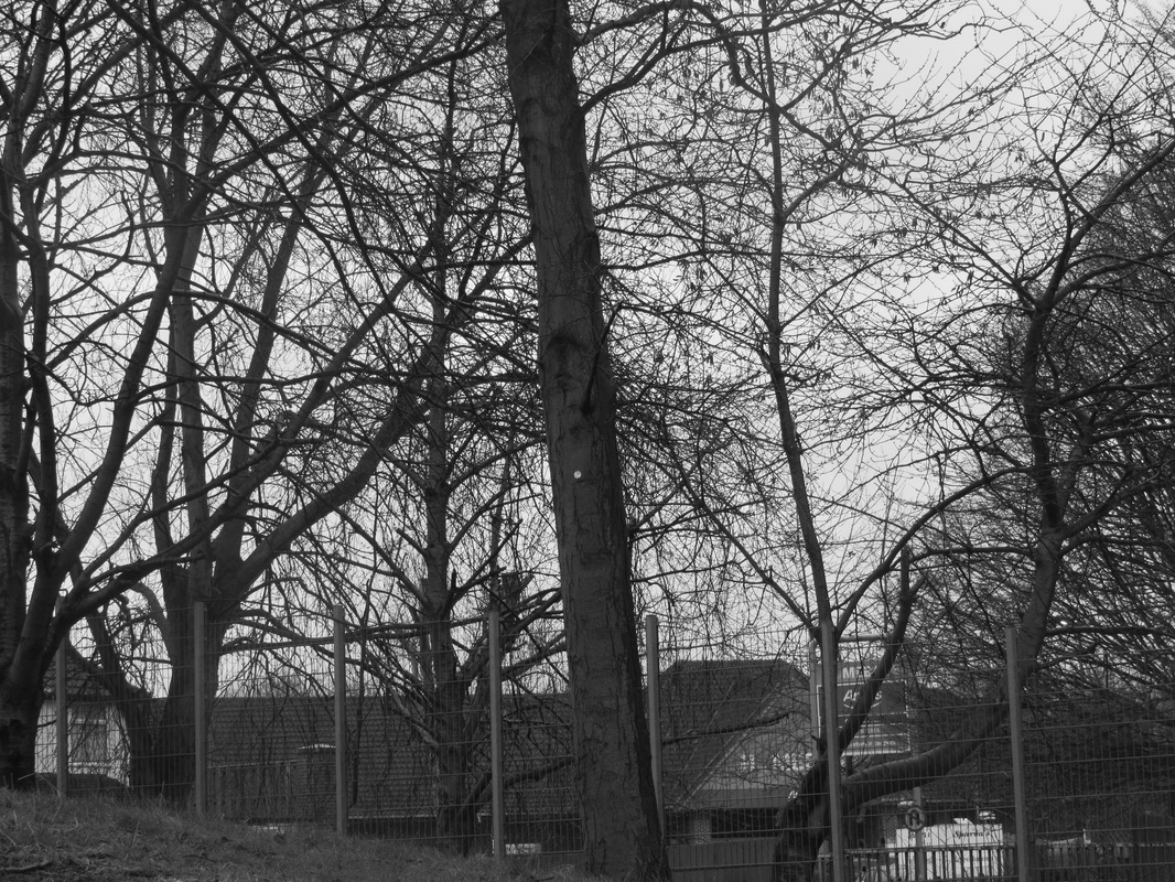
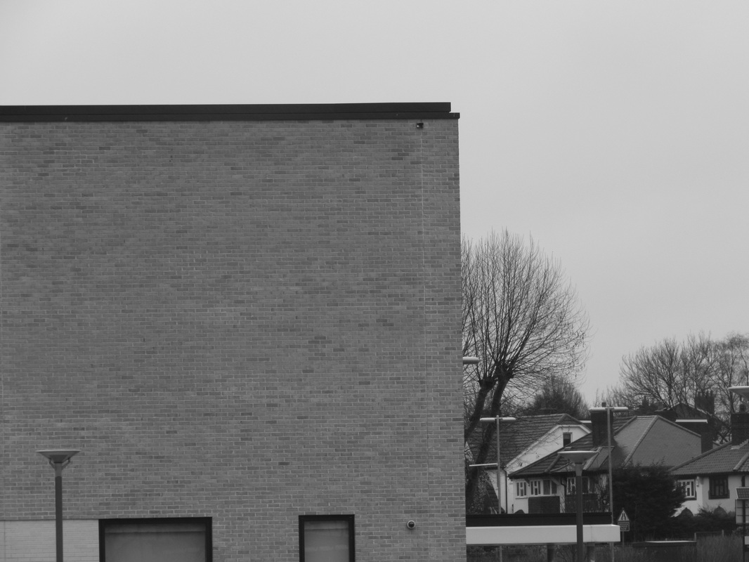
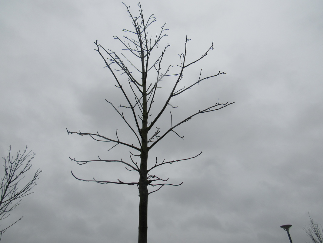
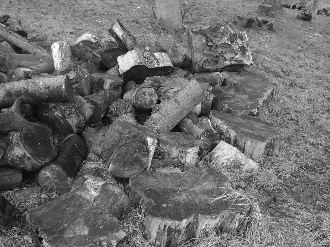
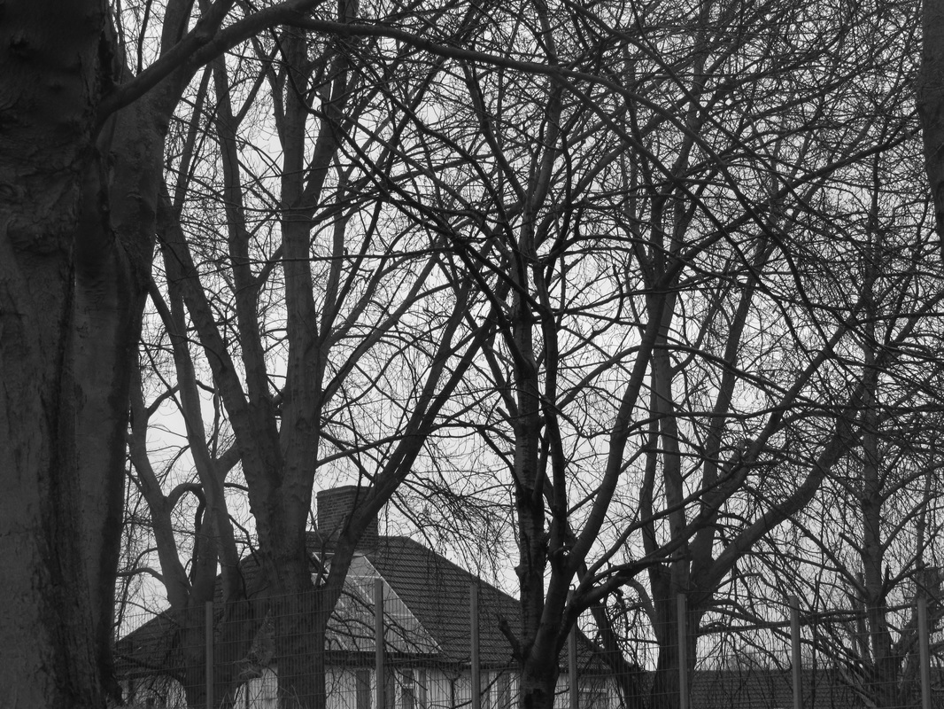
This is a set of images I have taken in and around school that shows repetition. Straight lines are repeated the most in this set of images, although there are some letters and tangled wires involved. These are successful as my first set of images because they mostly show clear repetition of shapes and lines. These images are effective because they have limited wasted space which gives the viewer more things to look at and focus on.
These images could have been better if I had a clear idea of what I generally wanted to take images of because then my images would be more relatable to each other (having a few that look the same/share the same idea but taken differently).
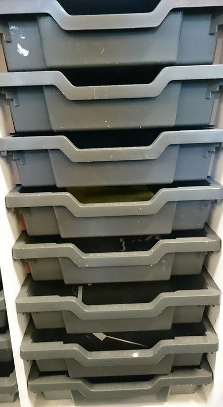
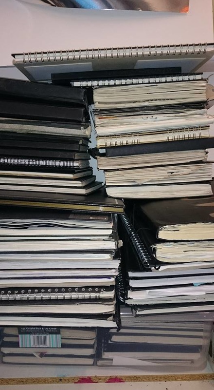
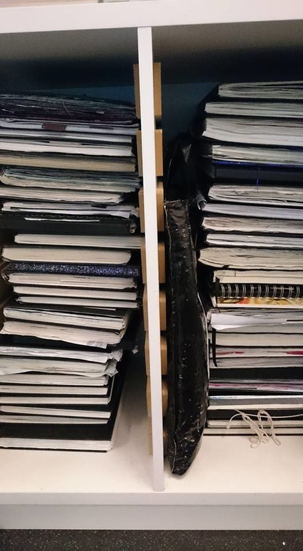
I think the images taken of the piles of sketchbooks look good because they are almost effectively using up all of the space and they show very clear repetition of lines and coils. Although most of the image is filled, I think that there is a space at the top of the image which is blank. I think that I should have properly looked at the screen while I was taking the image to make sure there wasn't much space left above.
These images could have been better if I had a clear idea of what I generally wanted to take images of because then my images would be more relatable to each other (having a few that look the same/share the same idea but taken differently).
I think the images taken of the piles of sketchbooks look good because they are almost effectively using up all of the space and they show very clear repetition of lines and coils. Although most of the image is filled, I think that there is a space at the top of the image which is blank. I think that I should have properly looked at the screen while I was taking the image to make sure there wasn't much space left above.
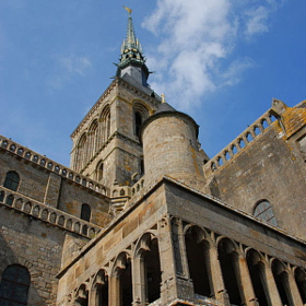
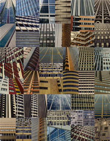
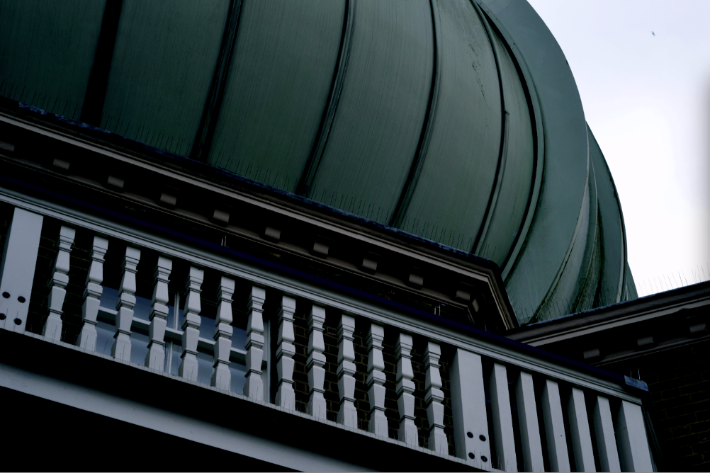
Magda Indigo


These are some images by Magda Indigo who is a professional and passionate photographer. She lives in the UK with her husband and fellow photographer Paul Indigo. She describes herself as a 'versatile photographer, who does not fit into jut one box'. From looking at her website I can notice a theme of repetition, whether or not this is done on purpose is unknown to me but I think that her work relates to this project. Magda uses two cameras; the 'fabulous' Hasselblads and the Nikon D7000, she said on her website that she switches from camera to camera but recently prefers the Nikon D7000 because the quality is much better. Some of the images she has taken have been used as book covers, on TV and for advertising campaigns, for companies including American Express, Samsung, Avon and Hallmark.
|
This is an image by Magda Indigo that is a part of her 'FRANCE' collection. This image relates to this project because it has many repeated patterns within the architecture. The patterns shown in this image aren't necessarily naturalistic because they were made by man but they might not have been intentional.
|
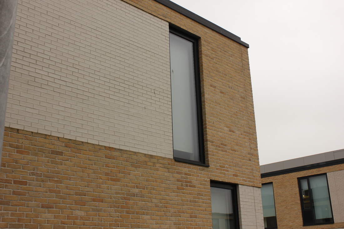
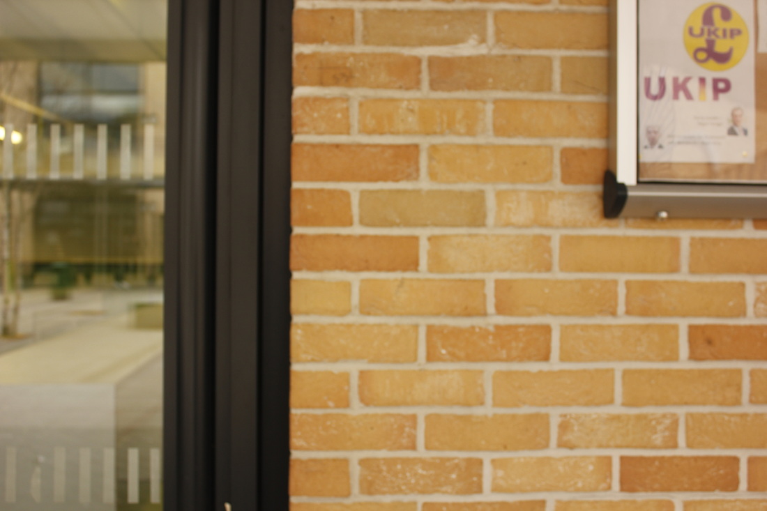
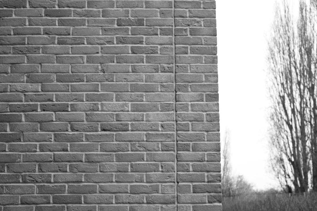
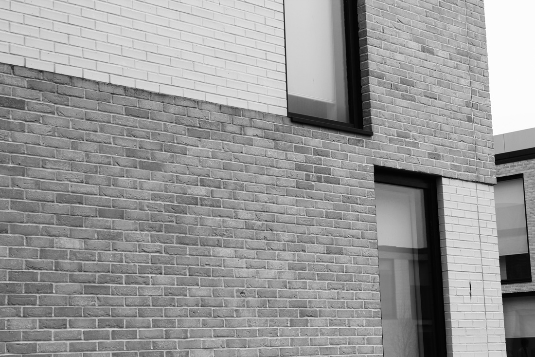
Sharon Elphick
First set
First change in Photoshop

Using Adobe Illustrator
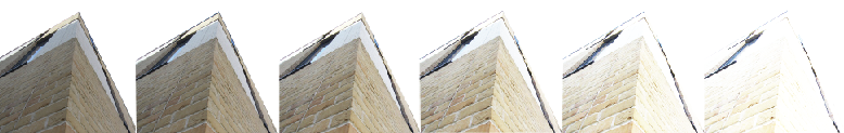
To make this edit, I used adobe illustrator and cut out this part of the building and each time I made the brightness to higher each time to make it more interesting than repeating the same building in exactly the same way each time. If I were to do this again I would make sure I have different angles of the building and maybe have some black and white ones. I could have a row of colour, getting brighter as it goes along and have a row of black and white also getting brighter as it goes along.
Making collages on Pages
|
|
|
|
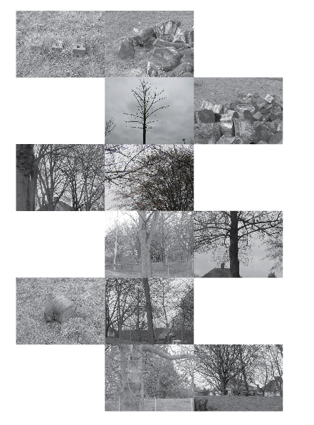
To make these collages I gathered the images I wanted to use and I opened up pages. In pages I opened up the images and made them all the same size. I then began to play around with the images by mixing colours (black and white mixed with colour images) and made different collages. I think that these turned out fairly well for my first time trying to do this. there isn't anything I would change if I were to do this again other than the images.
|
|
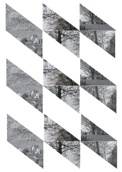
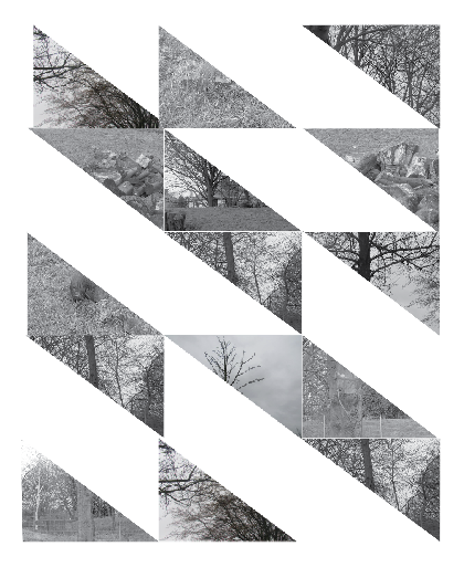
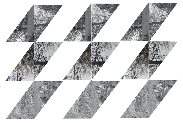
These images are made in nearly the same way as the other collages but I decided to change the shape of the image. I had decided to do this because I thought that my images had looked very boring and needed to be changed somewhat dramatically. These would have been better if i had used colour and black and white images because there would have been a contrast in the different shapes. The only thing I would change if I did this again would be the colour of each image and obviously the images.
|
|
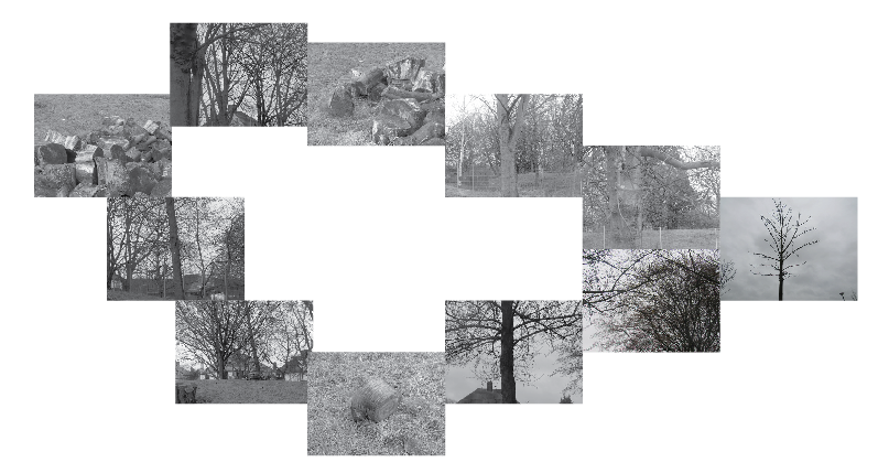
Here I have used different pictures that I thought would go well together and make a picture when they are put together. I think that these experiments had gone well but they look really messy. These experiments could have been better if there were more images that had looked similar because they would have made a better image.
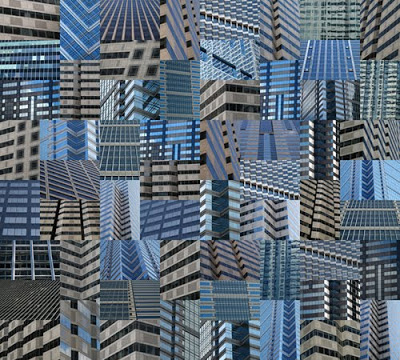
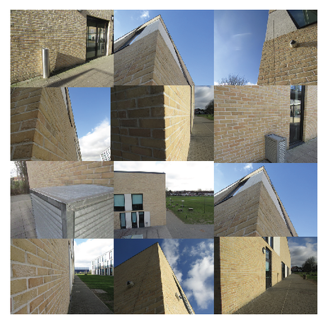
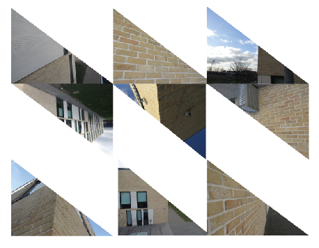
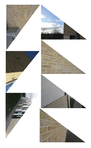
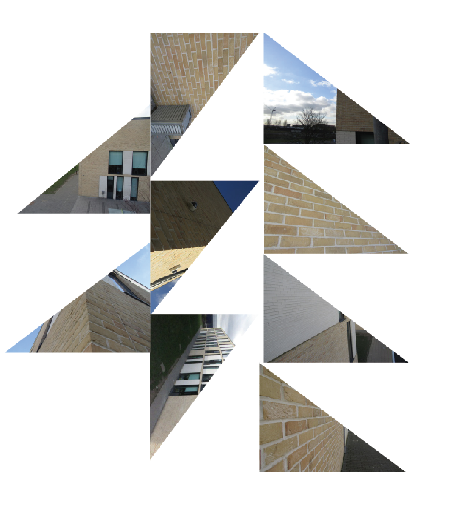
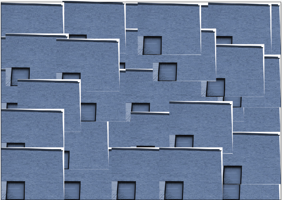
Trying again - buildings
using Illustrator
|
|
|
|
|
|
Here I have tried doing some collages again, but only using buildings. I think that these collages look successful because they are all of the same things and they are all very different (e.g different orientations and direction of shapes).
I think that these images would look better if they had a different colour background as there are parts of the actual image that have white parts that bland in too much. I think that there shouldn't be anything in the background as I think that these images are not just showing buildings but they are showing the areas around the buildings.
I think that these images would look better if they had a different colour background as there are parts of the actual image that have white parts that bland in too much. I think that there shouldn't be anything in the background as I think that these images are not just showing buildings but they are showing the areas around the buildings.
Second set

Second change in Photoshop

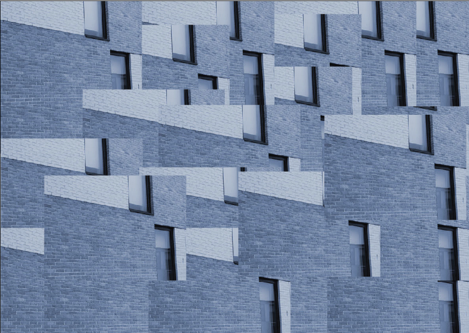
Making collages on Illustrator
|
|
|
|
|
|
|
To make these collages I used the black and white versions of these images and used Illustrator to arrange them in grids and using Photoshop to cut them into shapes. Also when I was creating the grids I decided to change up the way that I had arranged them (e.g having a large space in the middle and not having the images line up completely.
I think that my favourite images are the ones where the image is cut in half because interesting patterns and shapes can be created via putting different shapes in various places and in my opinion it gives the images something to look at.
I think that my favourite images are the ones where the image is cut in half because interesting patterns and shapes can be created via putting different shapes in various places and in my opinion it gives the images something to look at.
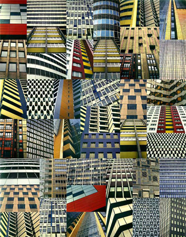
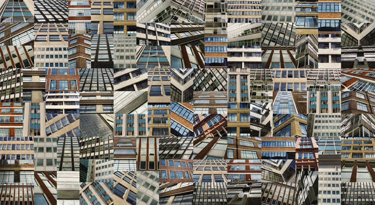
Third set
Third change in Photoshop
Making collages on Illustrator
|
|
Here I have just created a collage on Illustrator using two different types of images (colour and black and white). I like these but the do look a little bit boring as they are just of the same building.
These images could have been better if they were of different buildings and had different things and colours in them. When I re-do some collages I will be using different buildings as I think they will look better. I will also try to make sure that in the images there is no sky showing or any trees as I think that they make the collage look messy. I would like to try to have the images taken not at an angle (for example, not looking down the side of the building).
These images could have been better if they were of different buildings and had different things and colours in them. When I re-do some collages I will be using different buildings as I think they will look better. I will also try to make sure that in the images there is no sky showing or any trees as I think that they make the collage look messy. I would like to try to have the images taken not at an angle (for example, not looking down the side of the building).
Hue: +46 (green)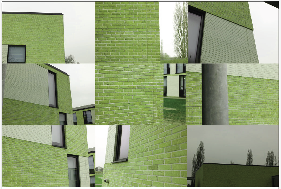
|
Hue: +149 (purple)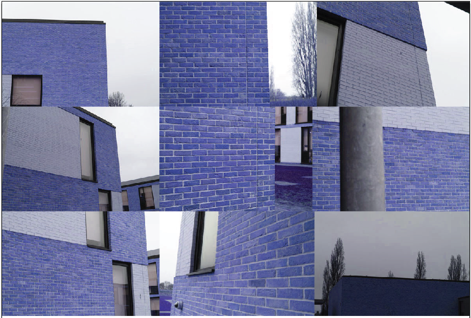
|
Mode: Cyanotype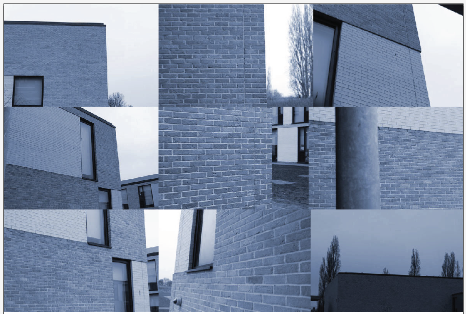
|
Hue: +80 (pink)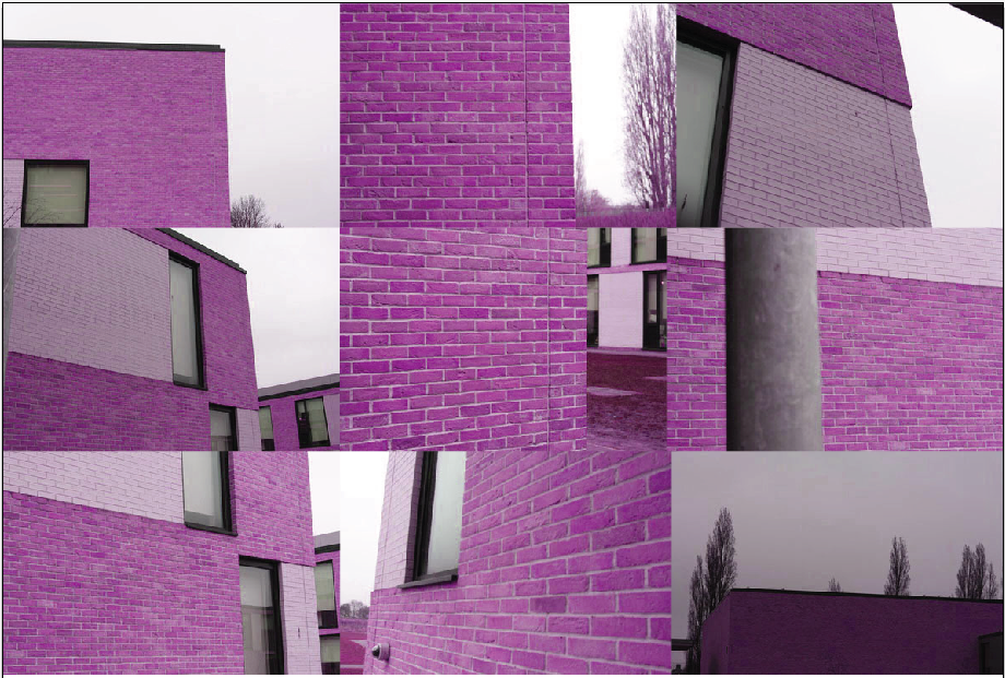
|
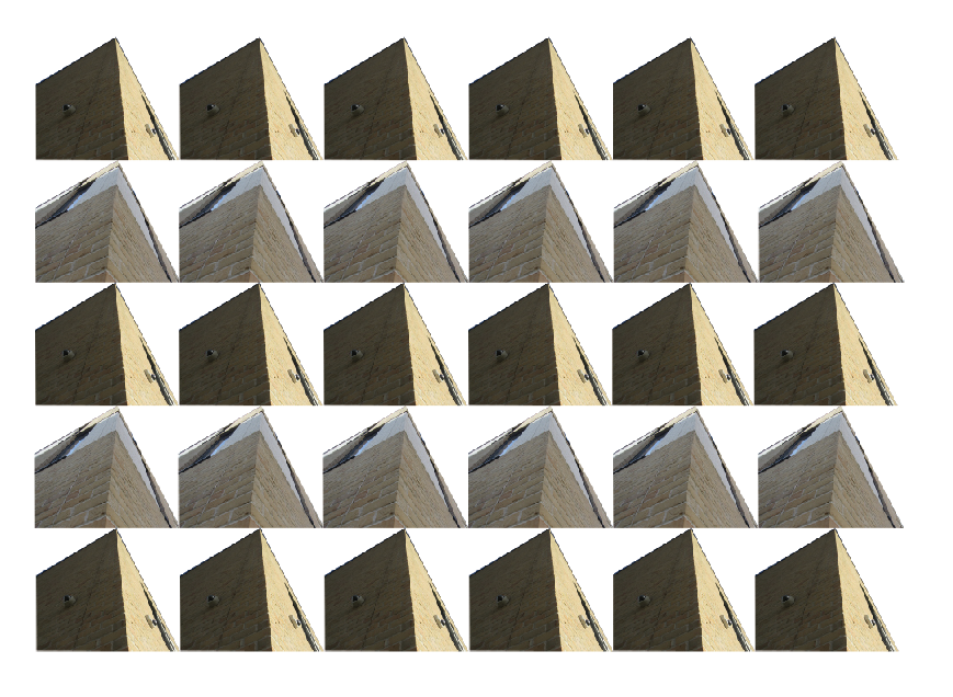
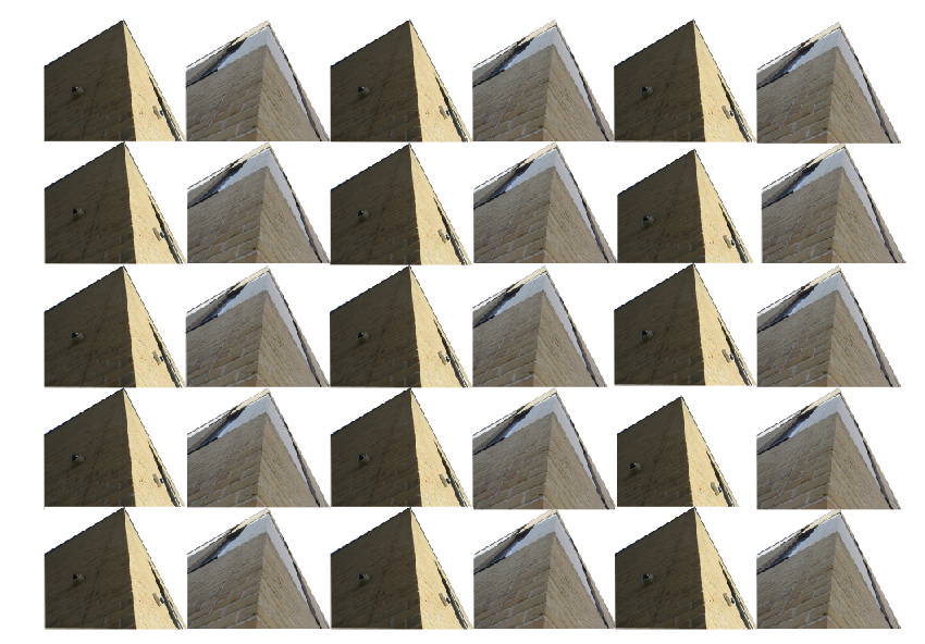
Here I have taken six of the images I have taken before and I have adjusted the hue and mode in order to change the initial colour on the image. I think that these images could've been better if some were darker and if some were lighter. Also I should have made collages using different coloured images put together to make it seem more interesting. I think that the images I had used should have been close ups of the buildings and they shouldn't have the white part of the sky or any trees in it.
|
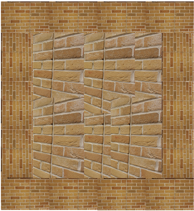
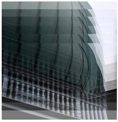
|
To create these two images I opened up the original image in Photoshop and used the 'polygon lasso tool' to crop a part of the image and copy and pasted it into Illustrator many times until I had the whole of the page covered. I like these images but I think they would be better if I had used a building that had loads of windows on it to make the image more interesting.
The first image could have been better if I had cropped the building out better and didn't have the white part hanging around it. This would have made it better because the whole image would juts be the blue building with the tinted window.
The first image could have been better if I had cropped the building out better and didn't have the white part hanging around it. This would have made it better because the whole image would juts be the blue building with the tinted window.
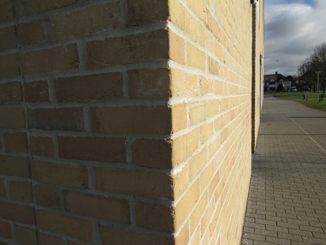
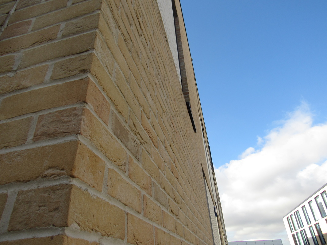
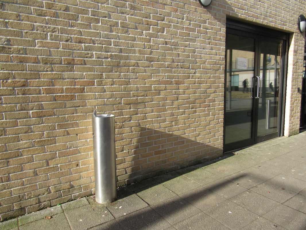
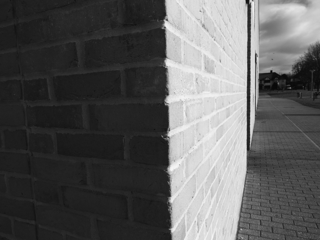
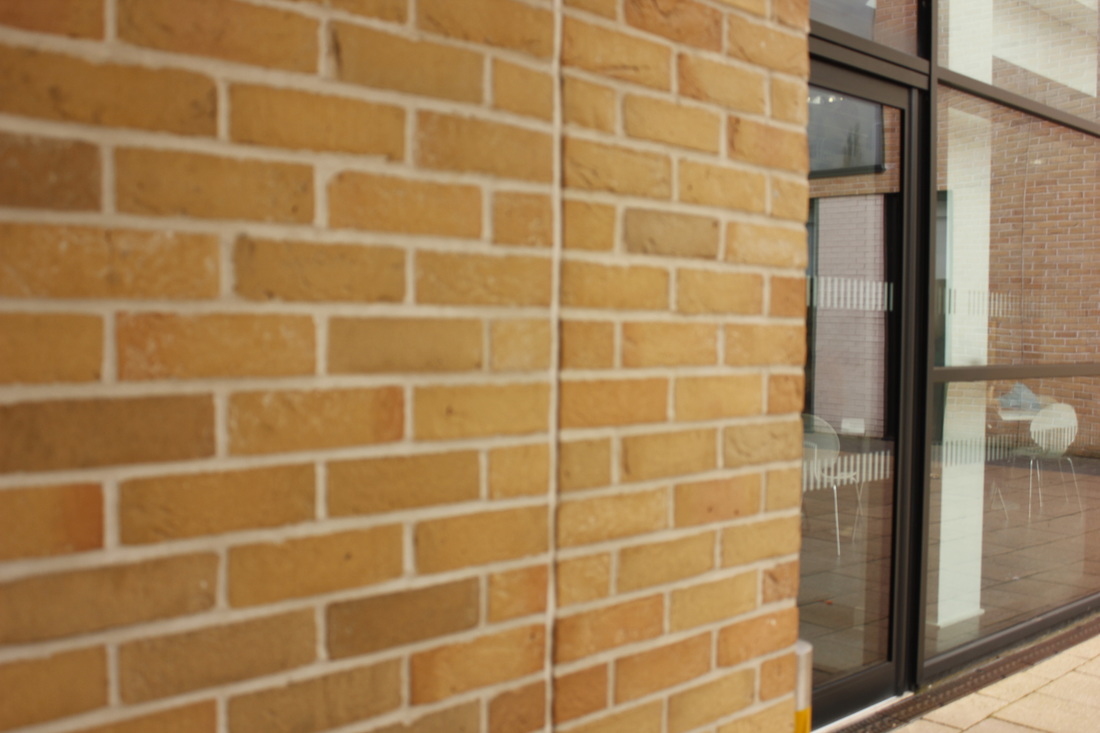
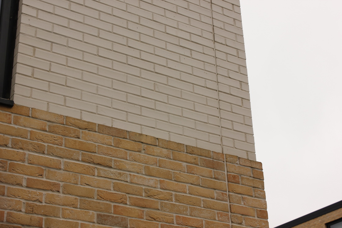
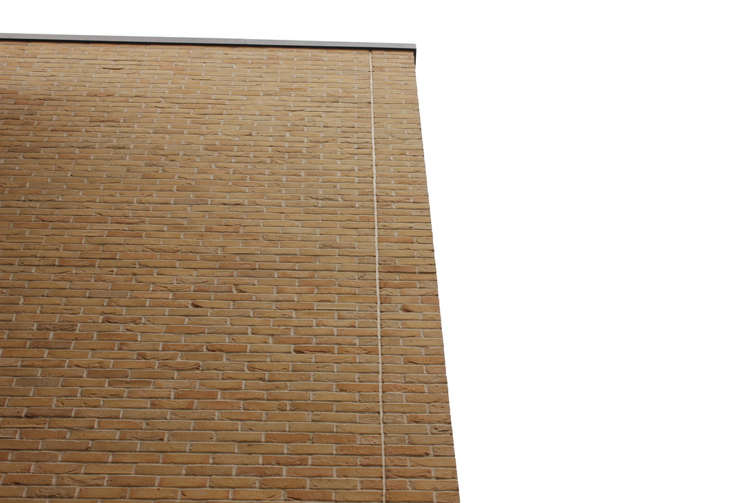
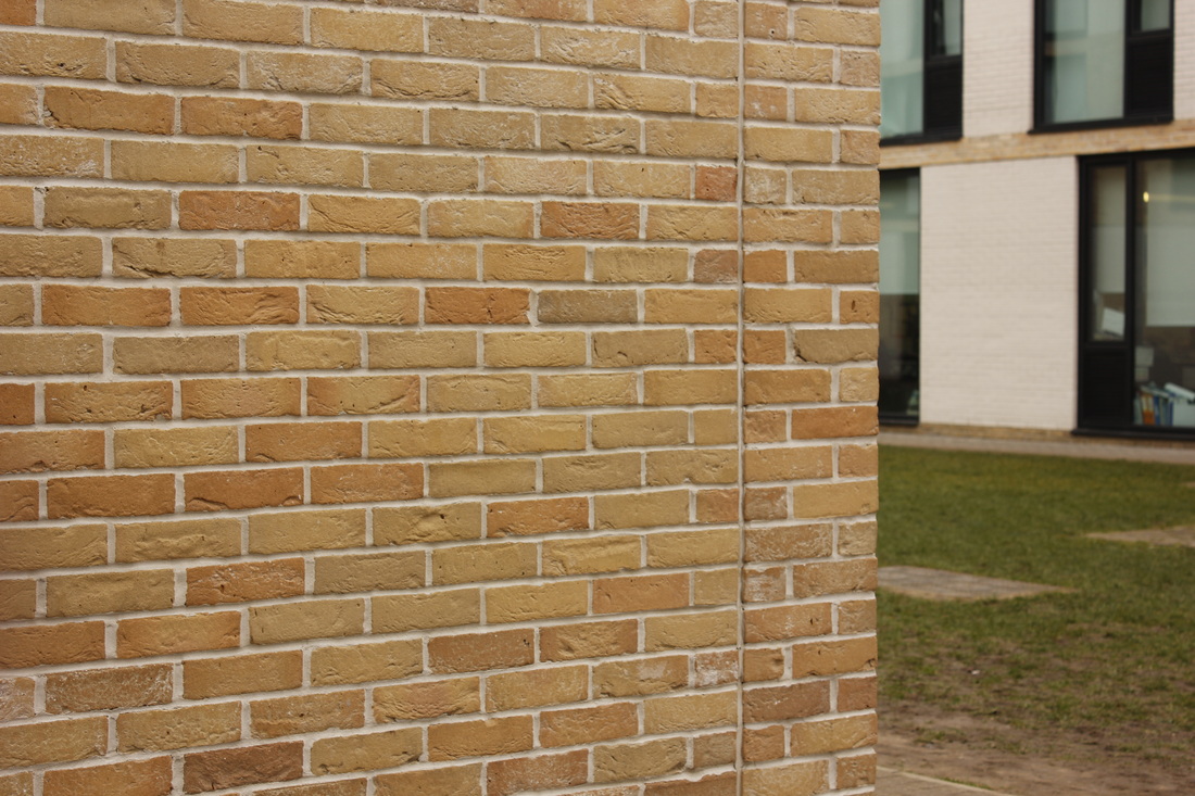
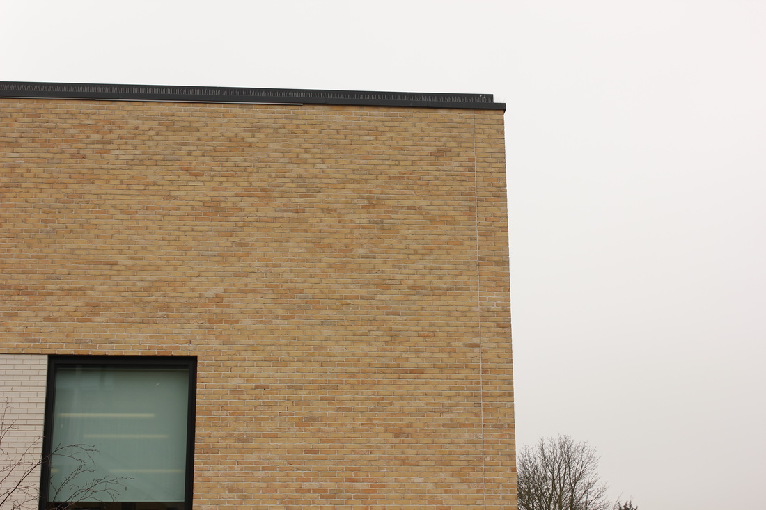
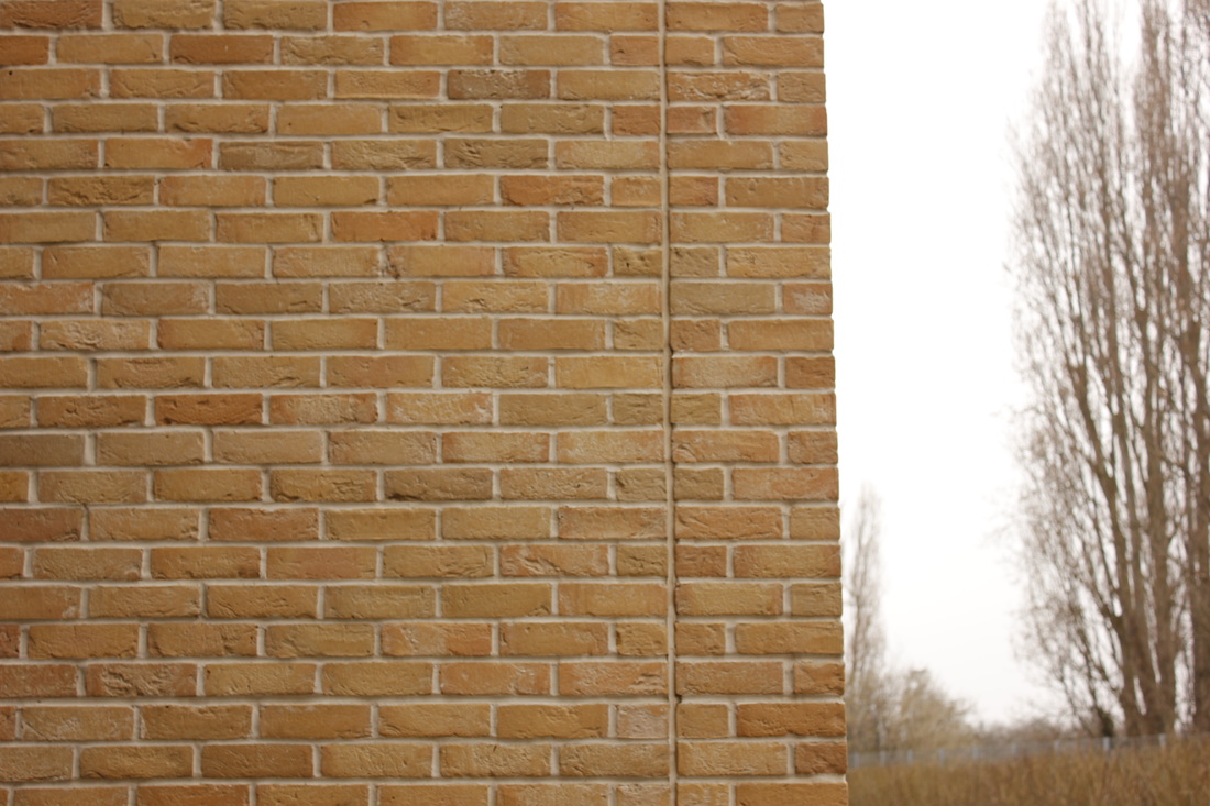
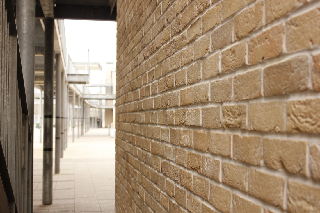
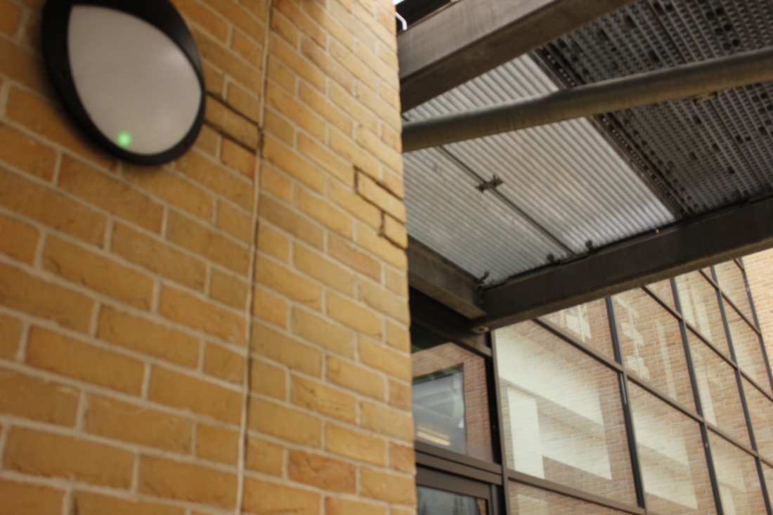
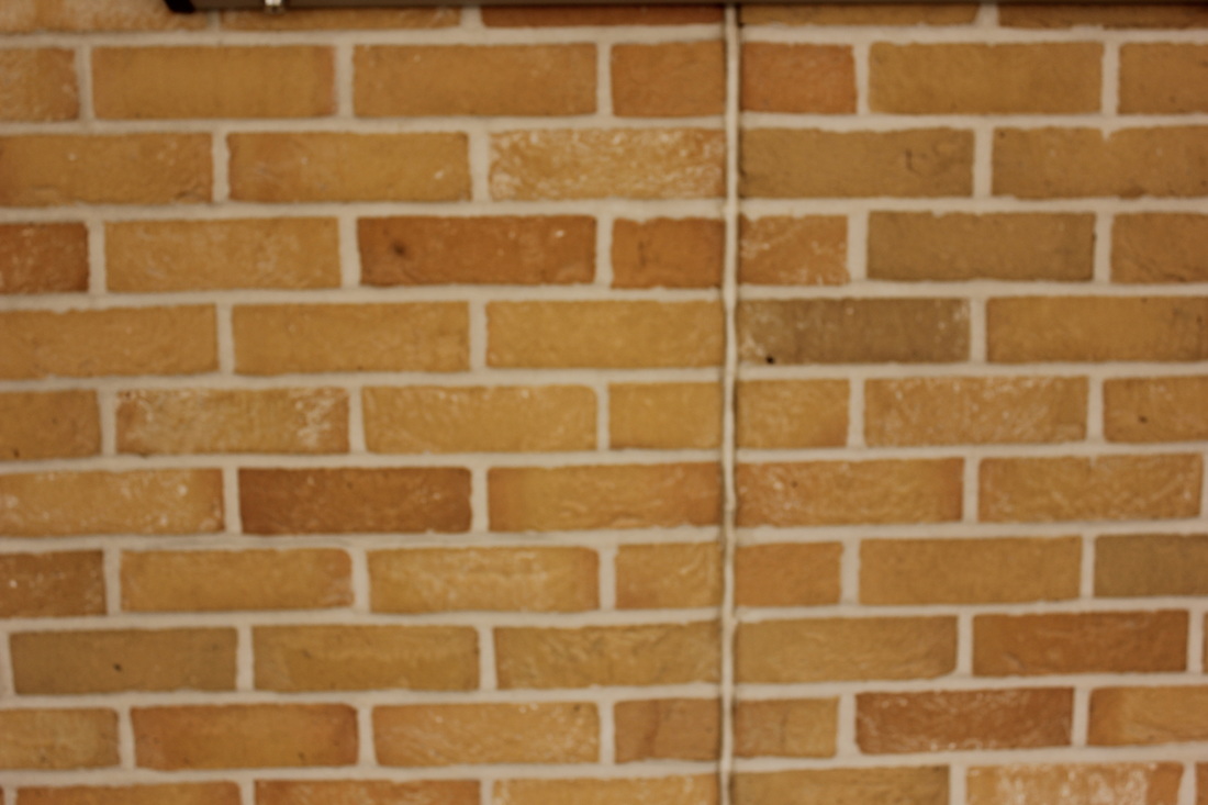
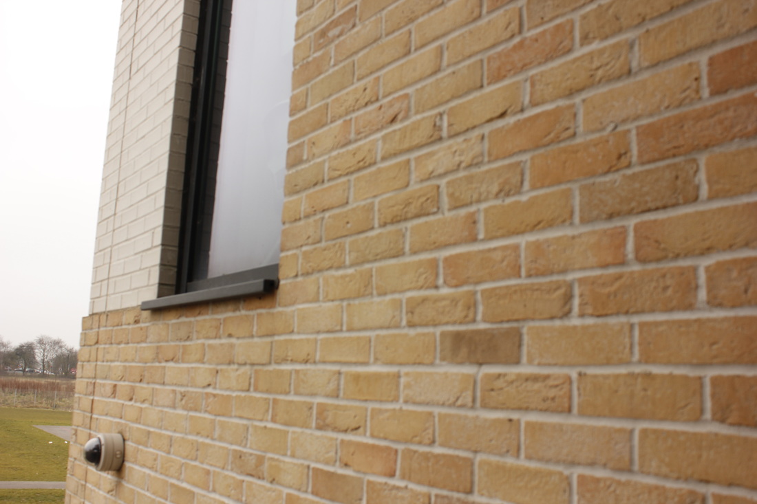
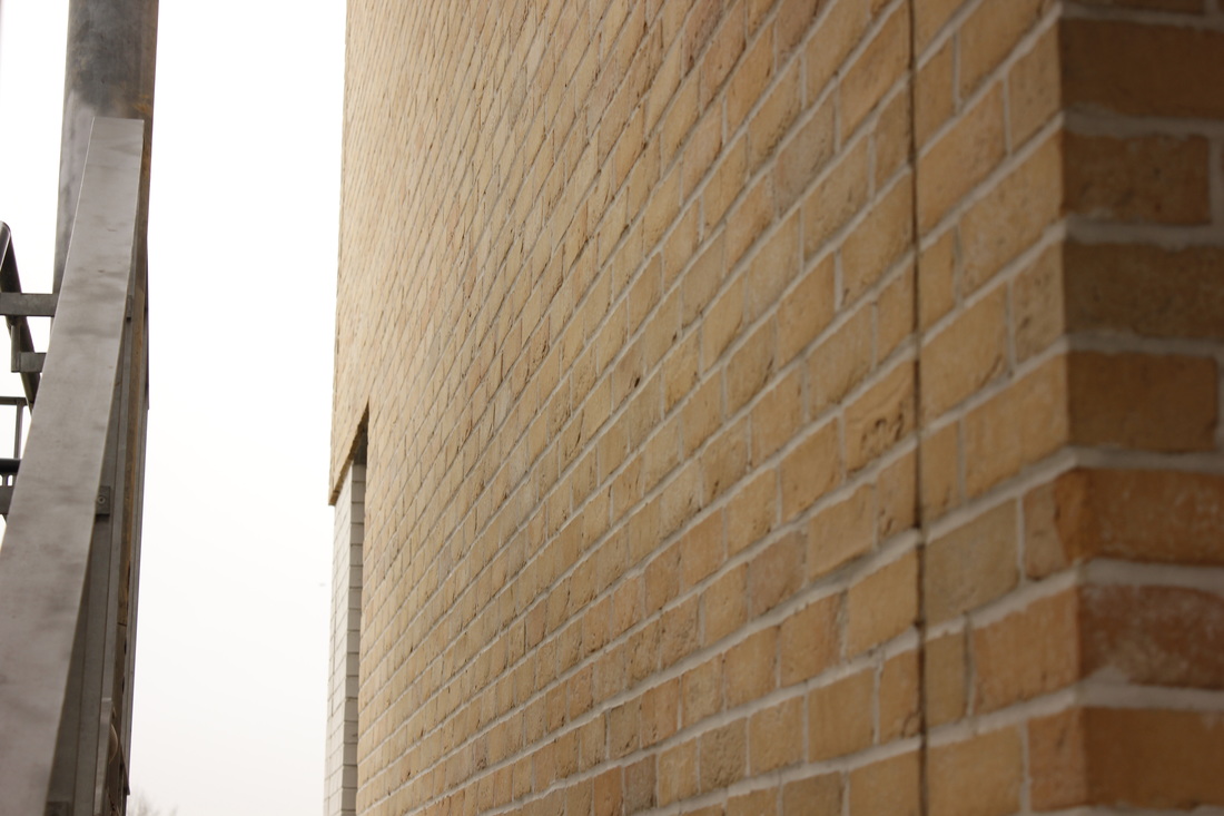
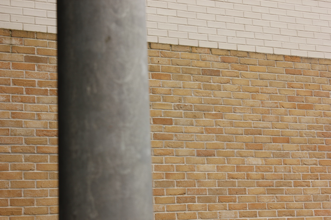
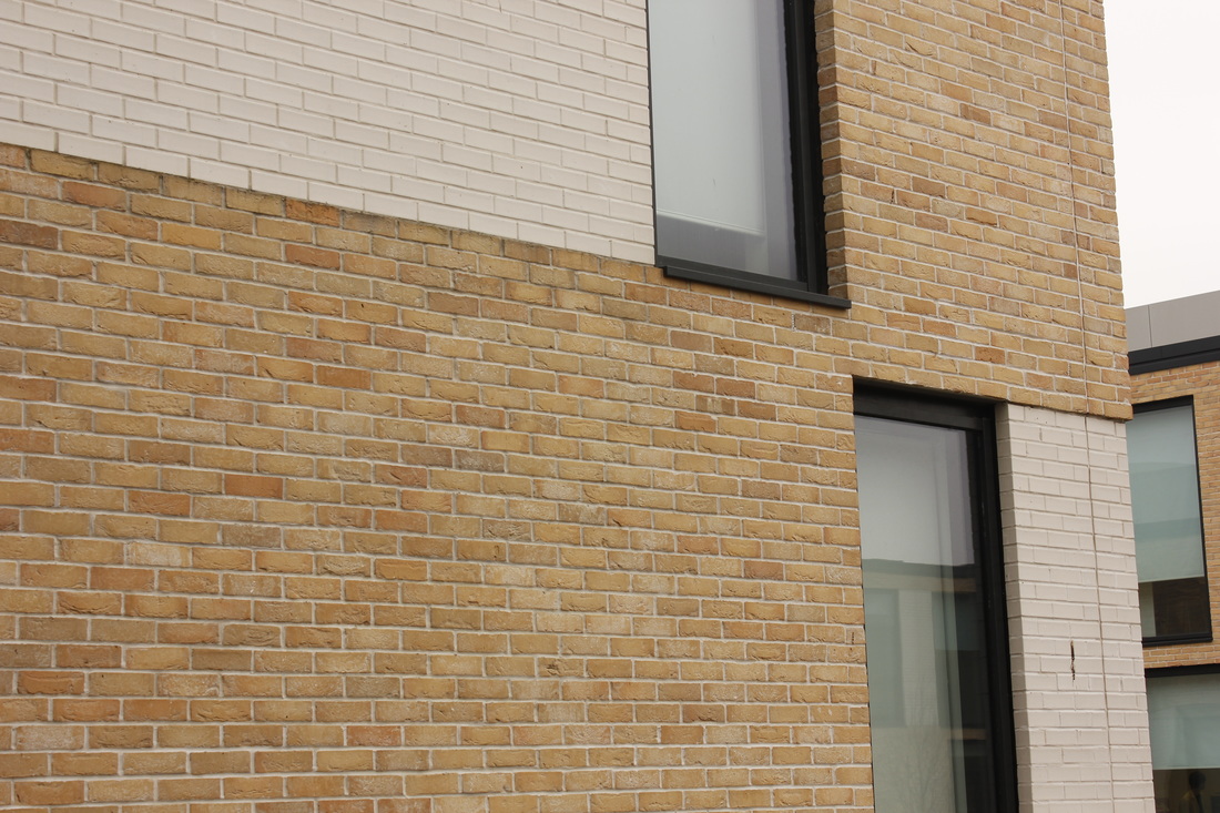
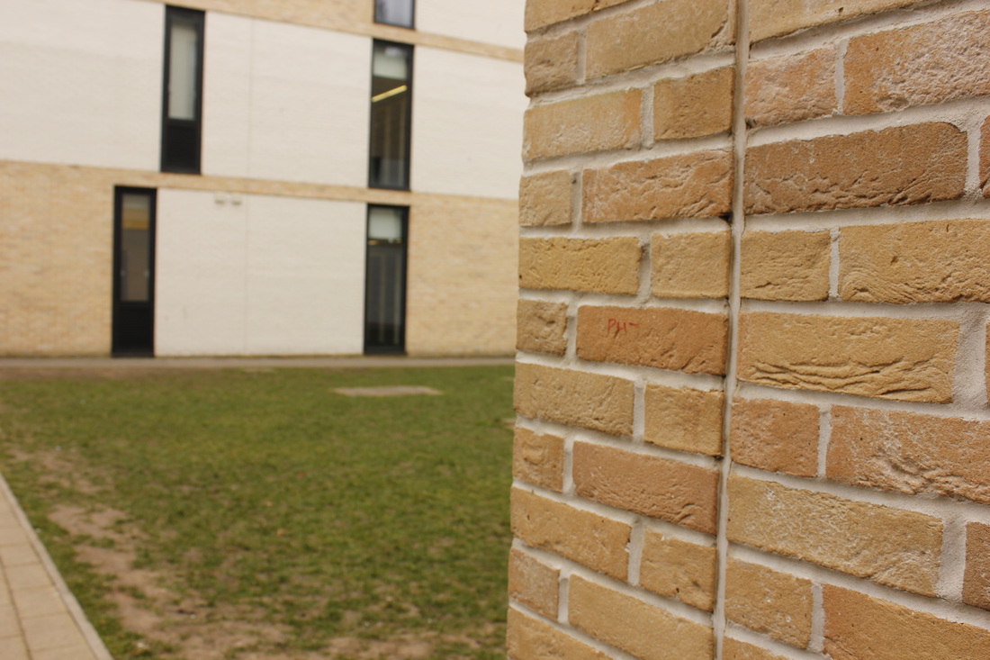
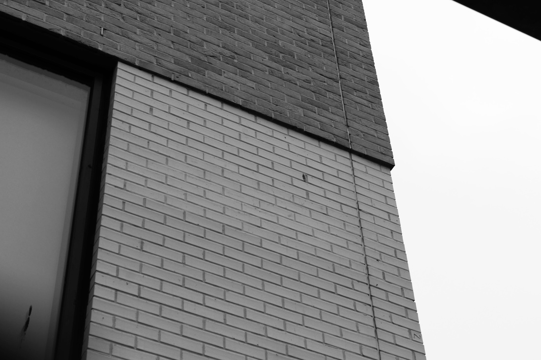
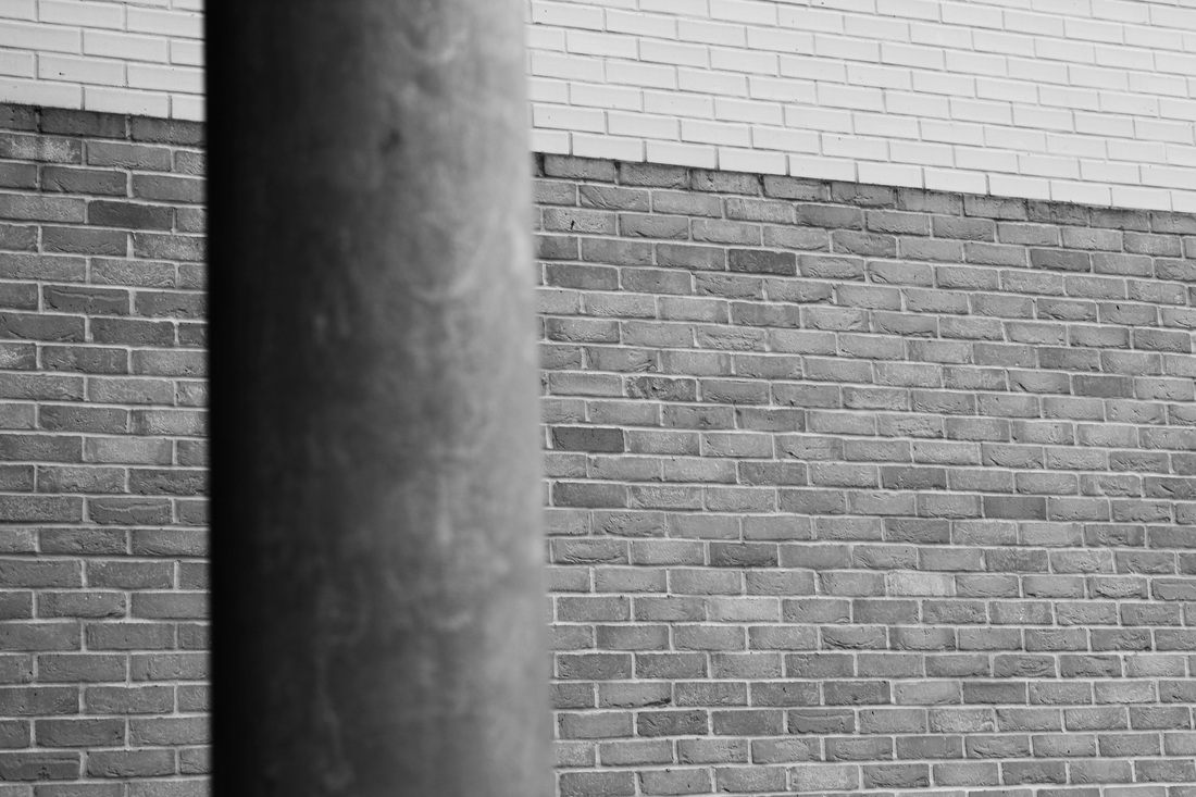
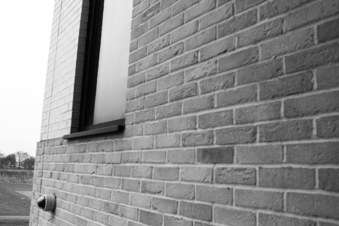
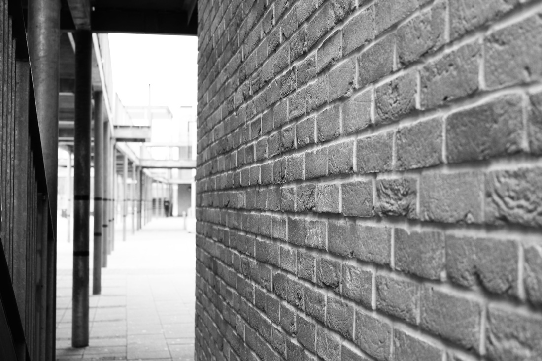
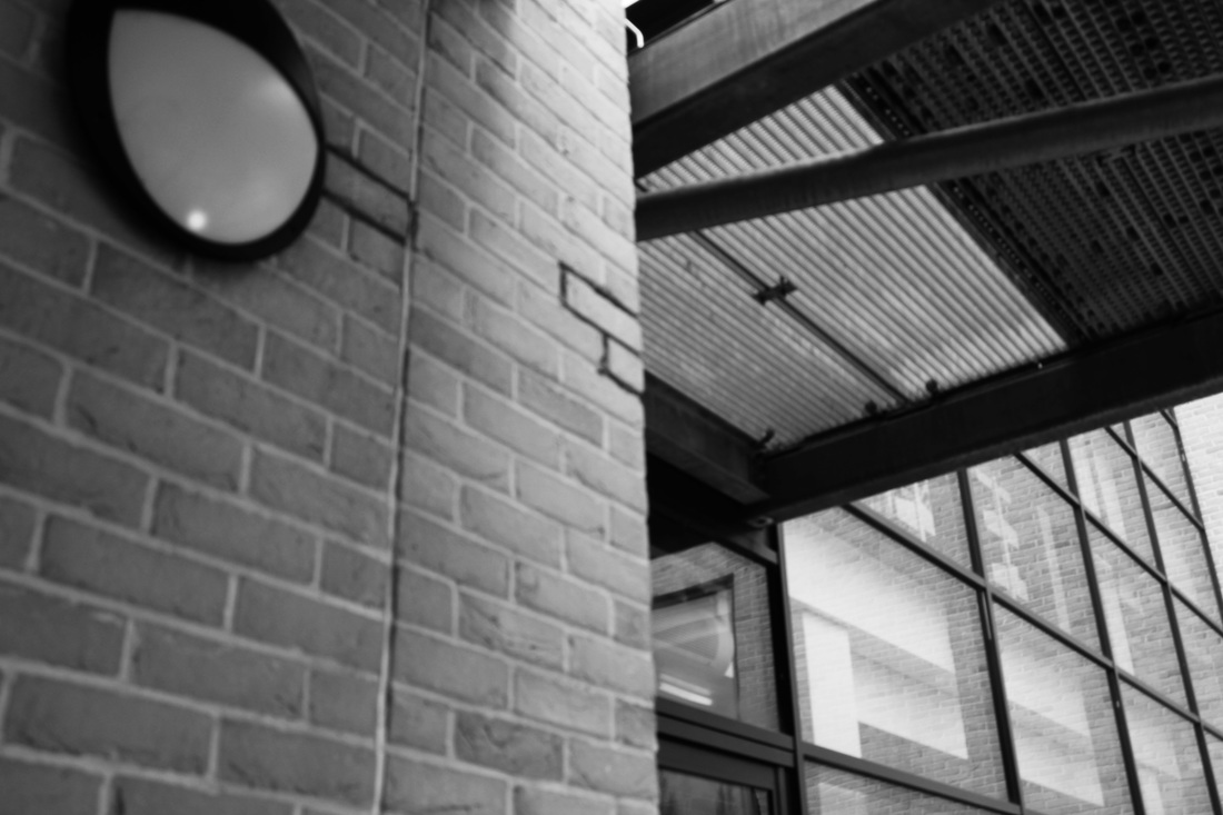
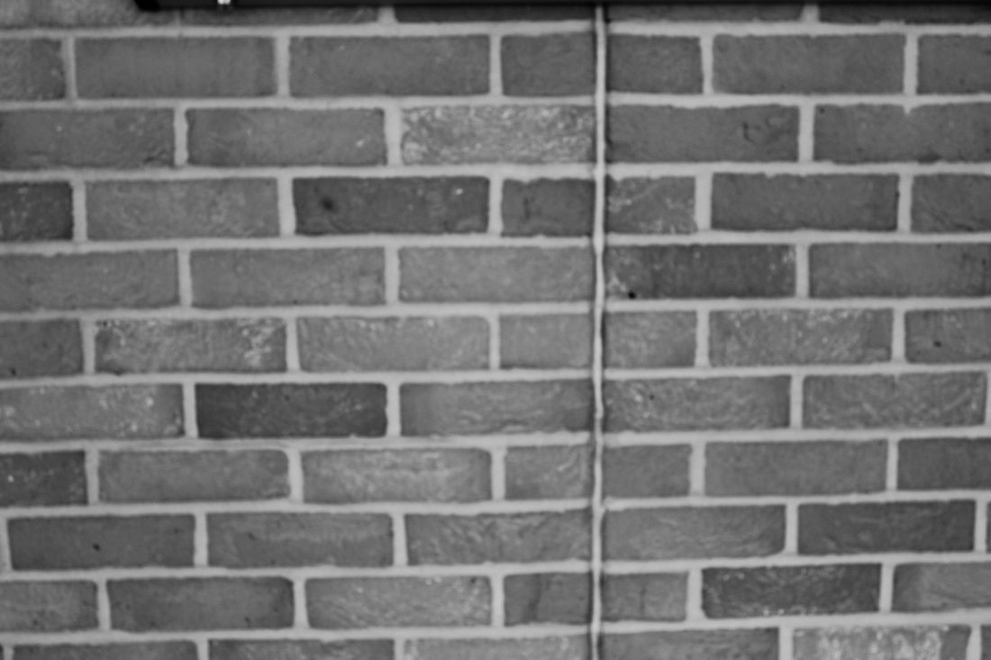
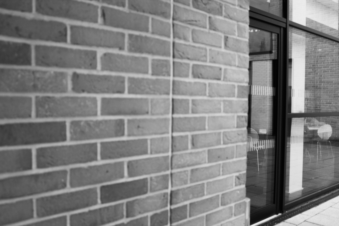
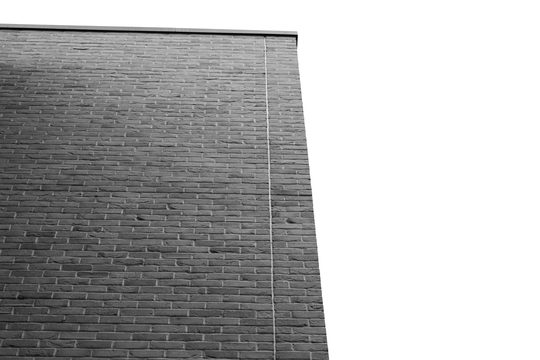
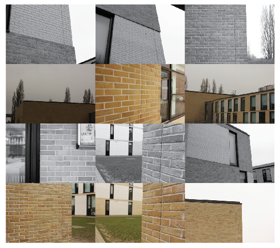
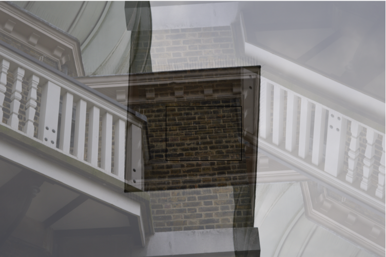
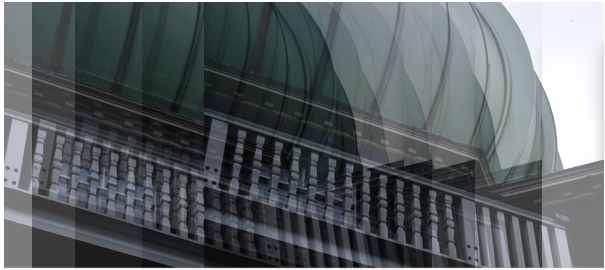
Brickwork
|
|


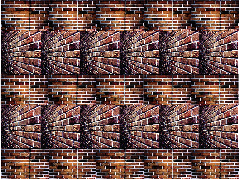
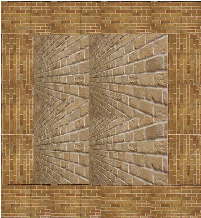
To create these images I have used some images that I had taken of bricks. I made a box and filled the inside of the box with images of bricks from different perspectives. I think that this looks good but it would look better if I had used some different coloured images such as black or white or if I had added more tone and brightness to the images inside the box.
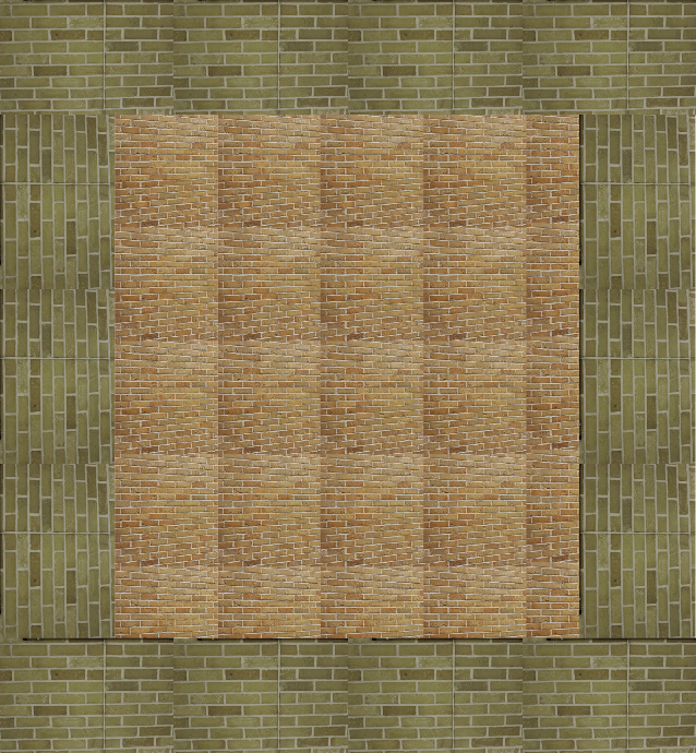
I think that these images look better than the last four because they have colour incorporated into them and you can tell where the box stops and where the inside starts, unlike the other images where it was mainly a large confusing box of bricks.
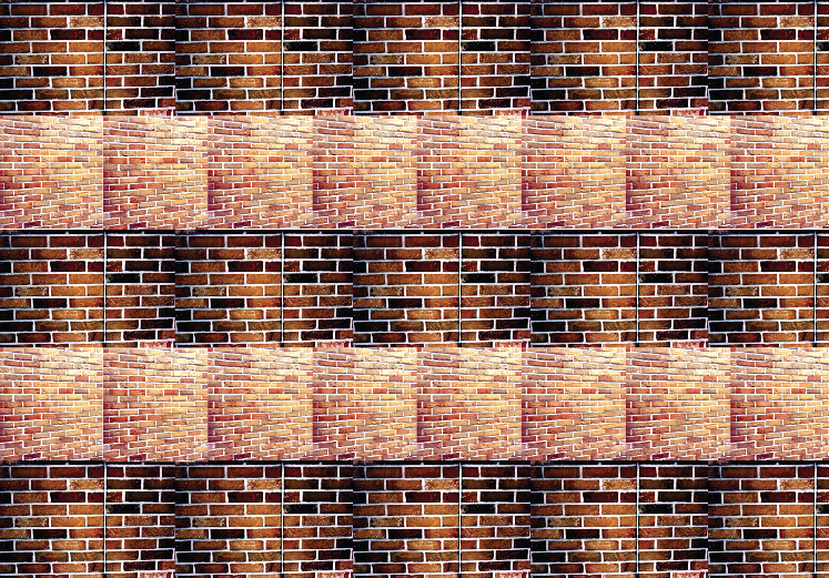
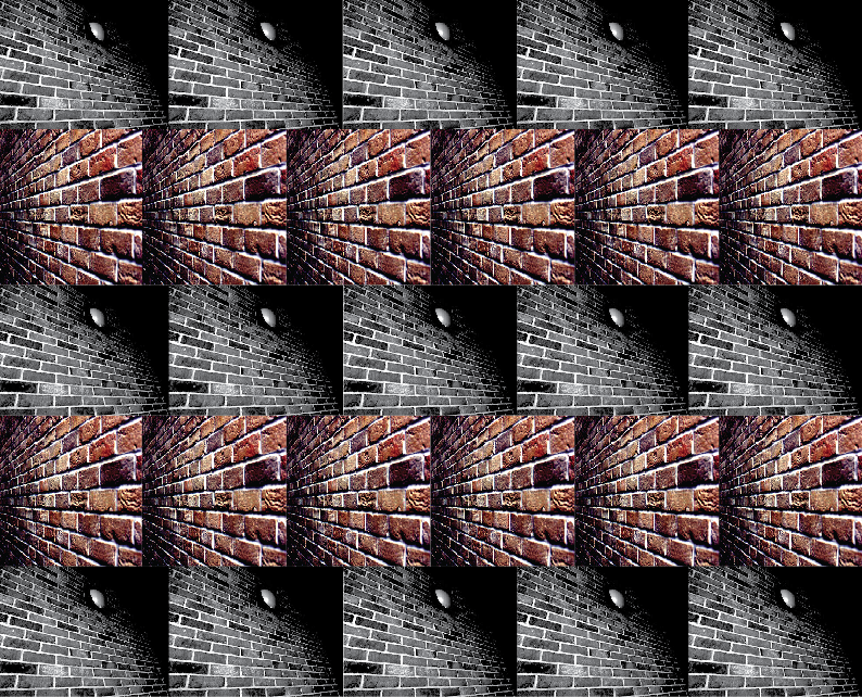
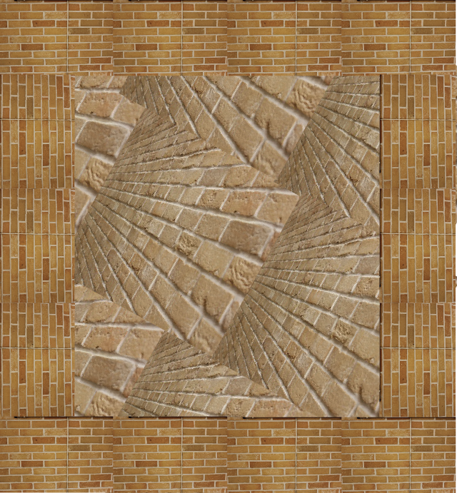
To create these images I first changed the curves and levels of the original image and then I cropped the bricks out of the images. I decided to make the collage like this because I wanted these pieces to have some order as the dark colours seem to be a little confusing to me. I could have made these collages better by using different coloured images and images taken at different angles so there would be more of a variety of things to look at.
|
|
To create these images I have basically done the same thing that I did before but I didn't edit the originals on Photoshop first, I just cut out the buildings and copied and pasted the cut out building shape onto a blank Illustrator file.
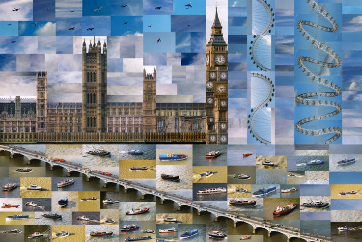
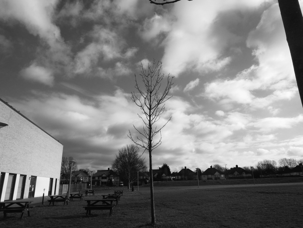
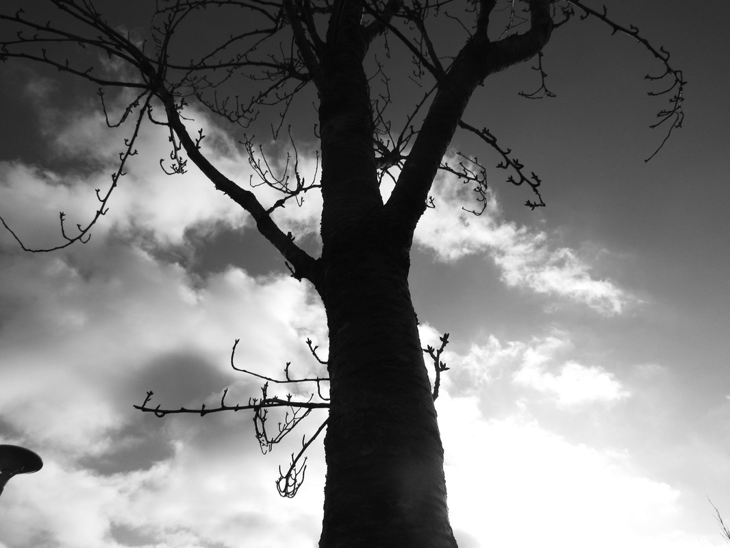
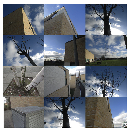
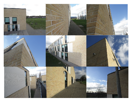
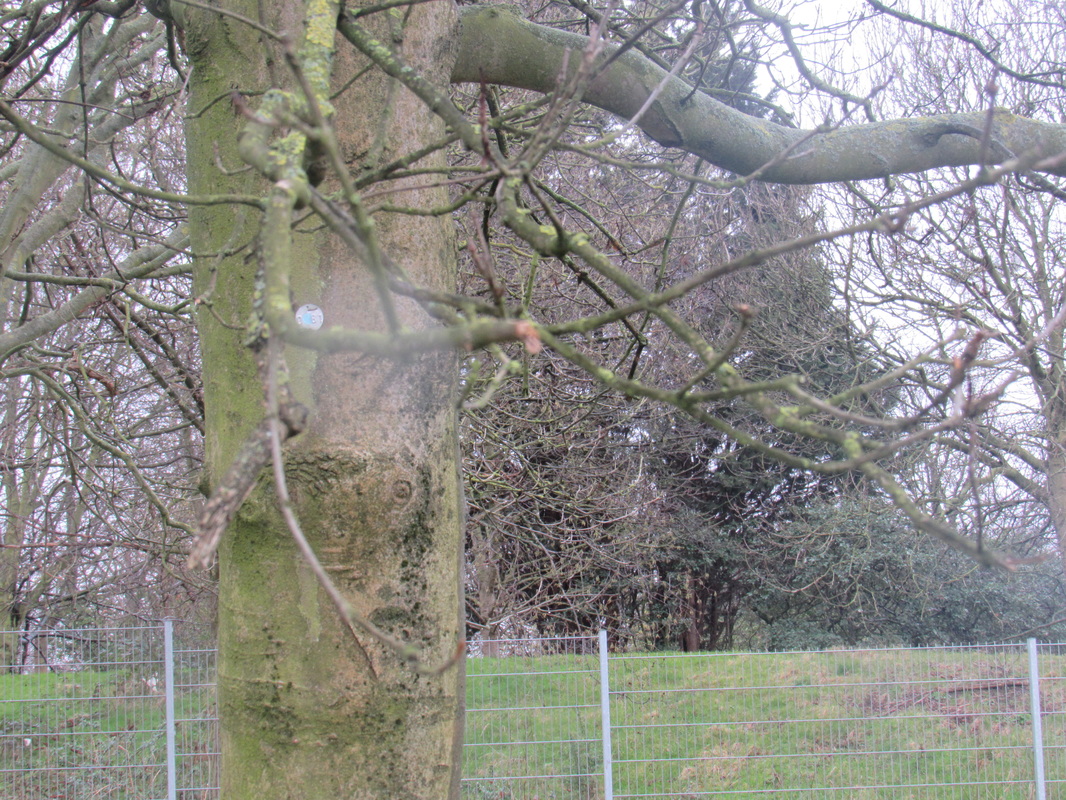
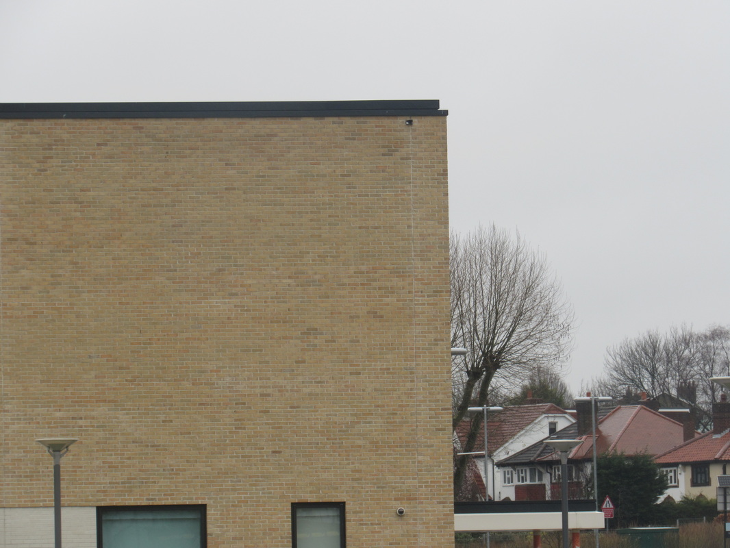
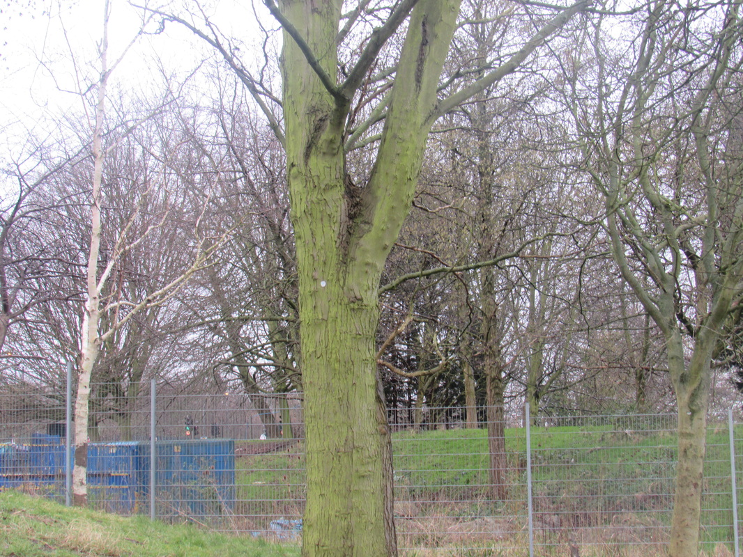
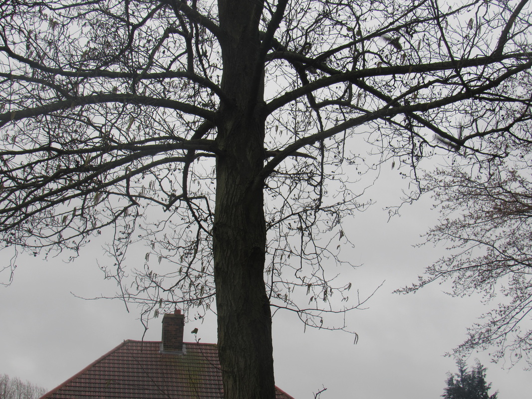
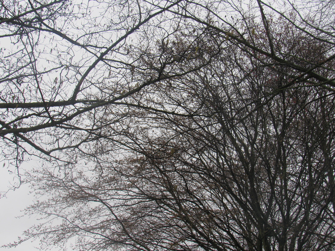
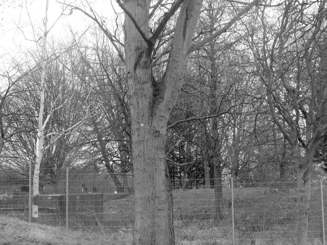
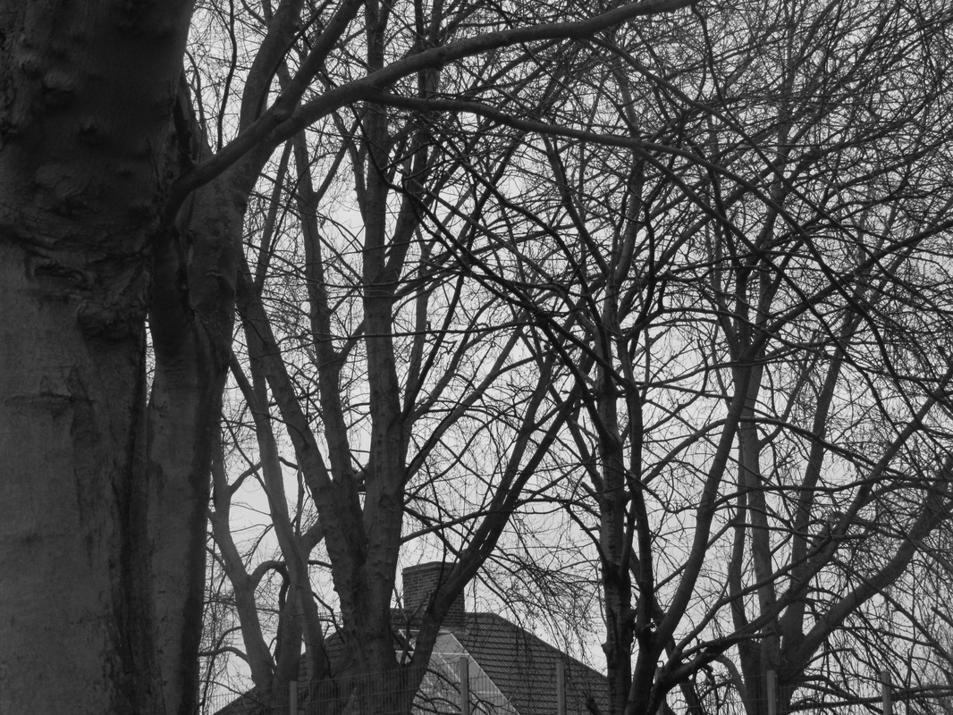
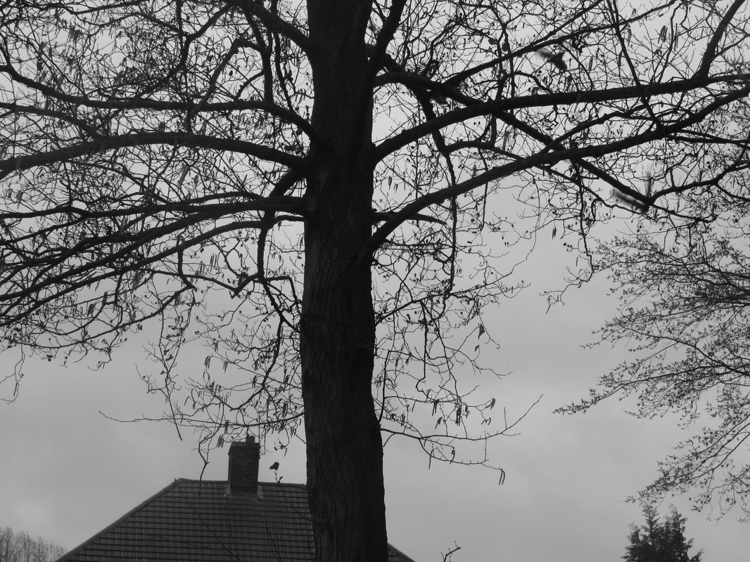
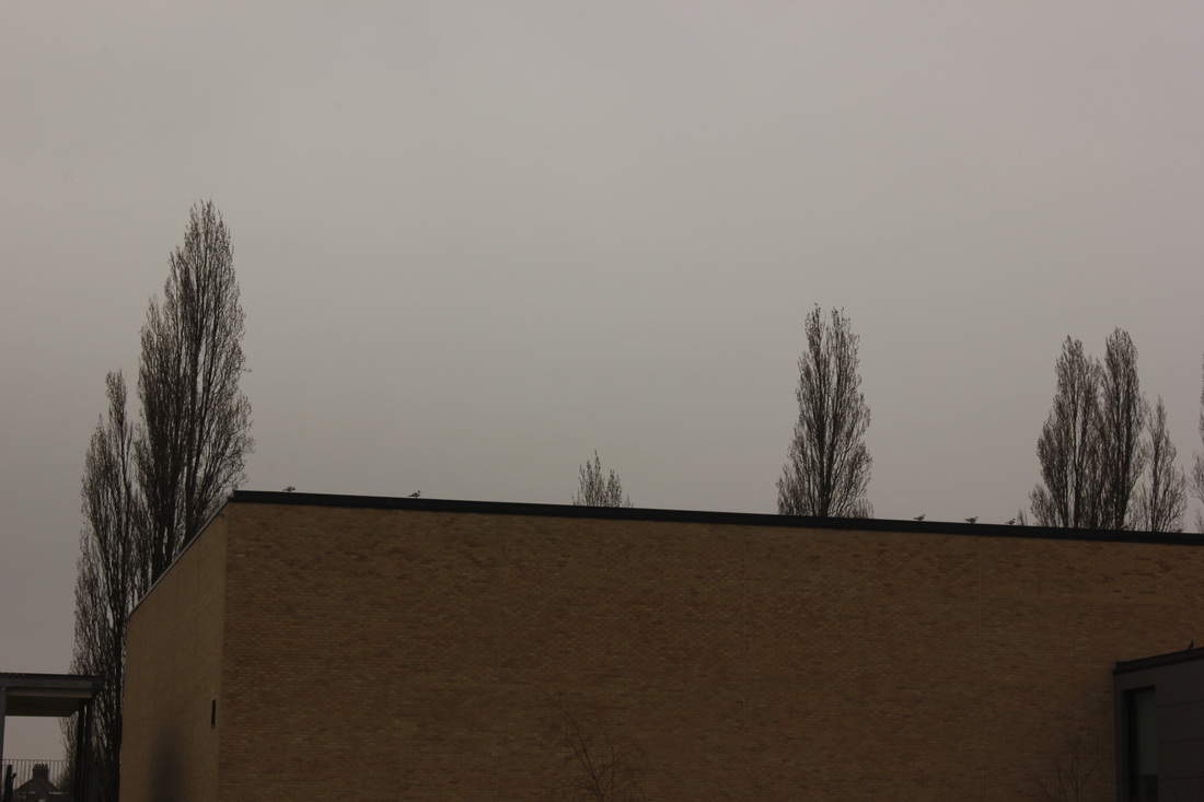
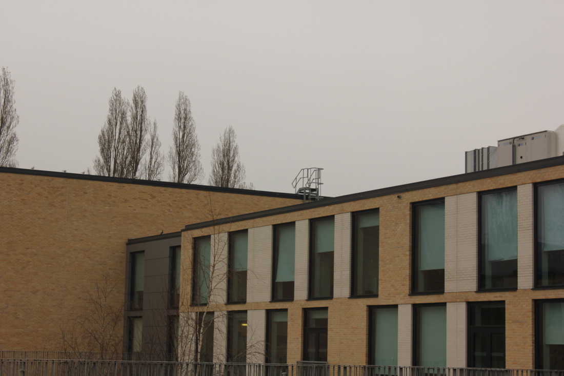
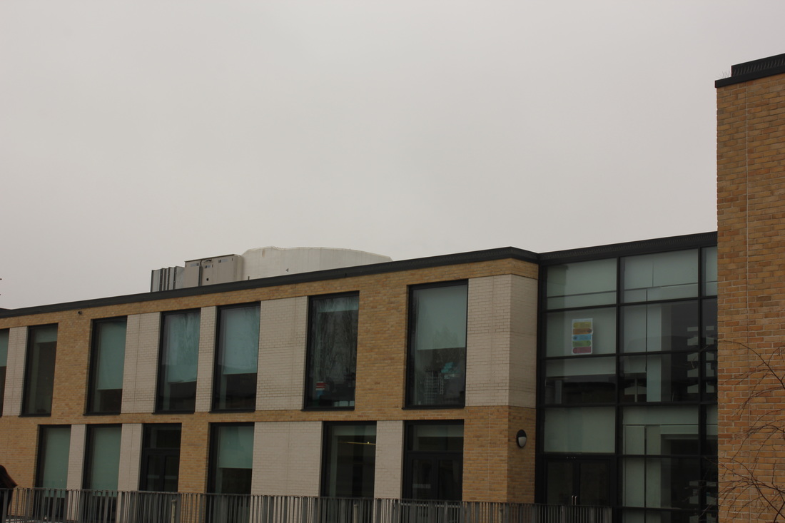
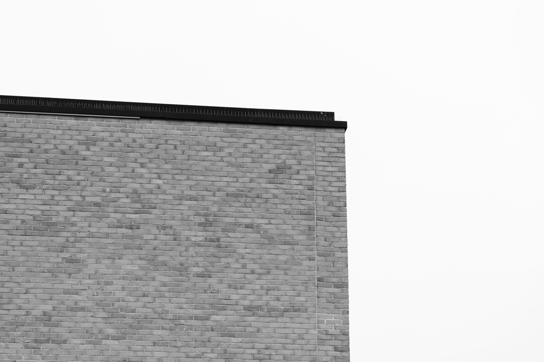
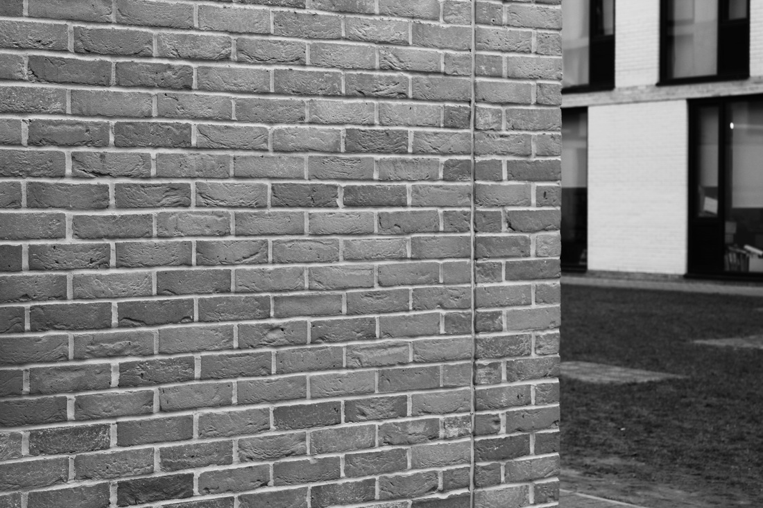
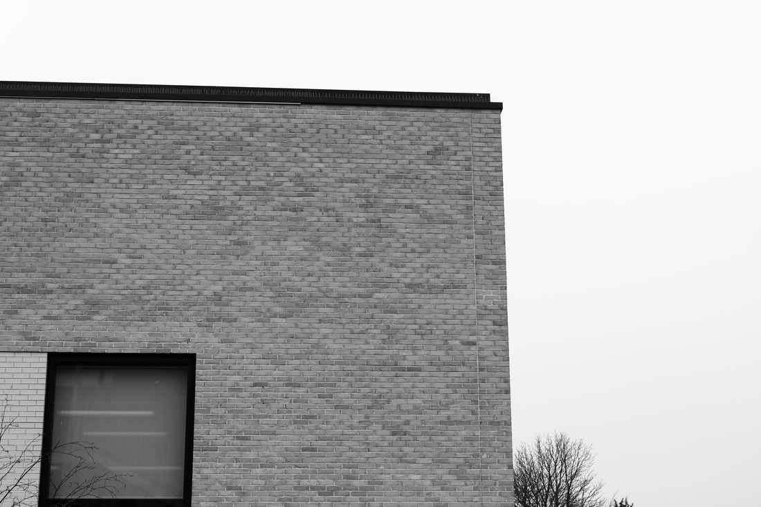
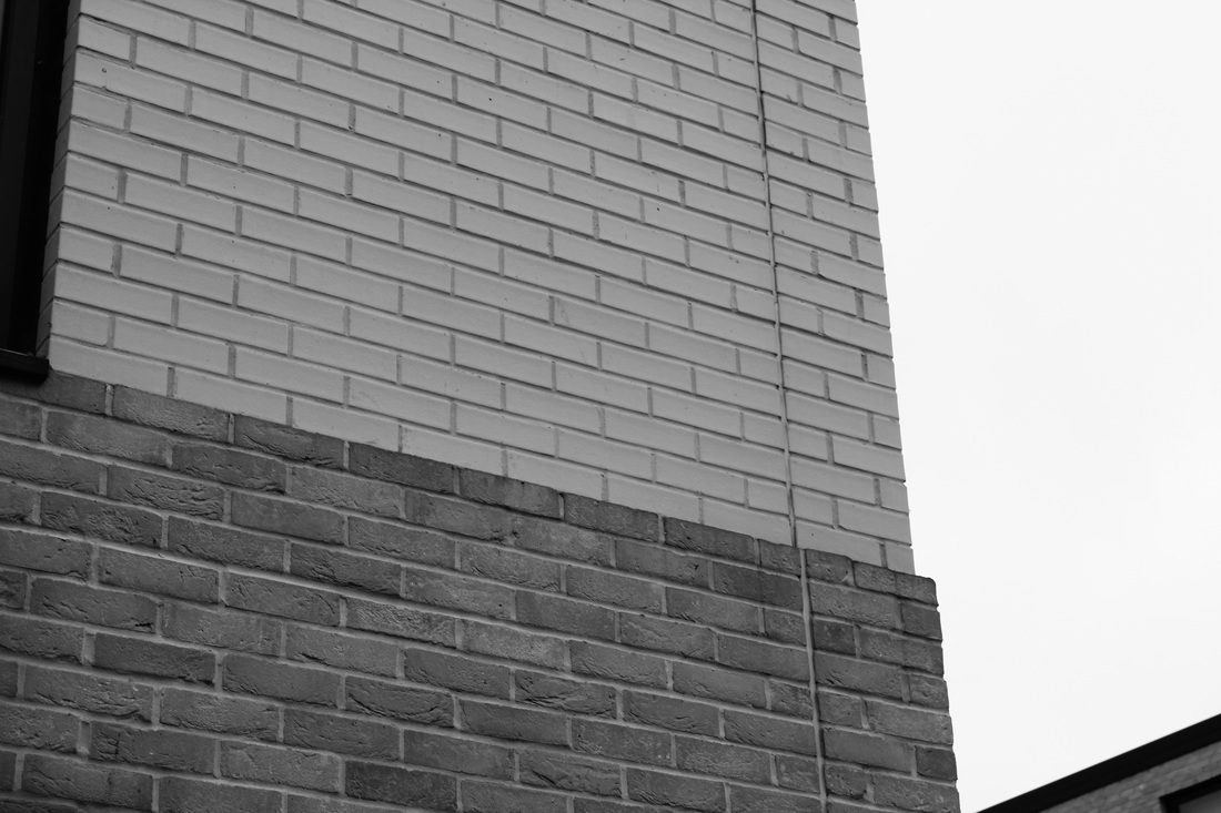
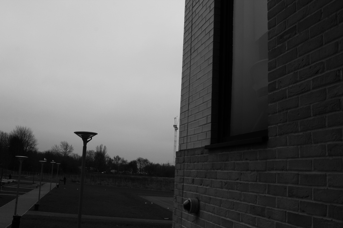
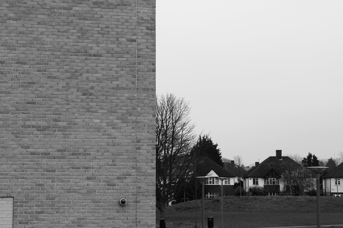
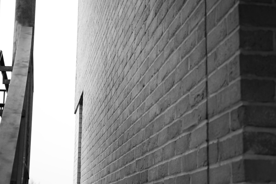
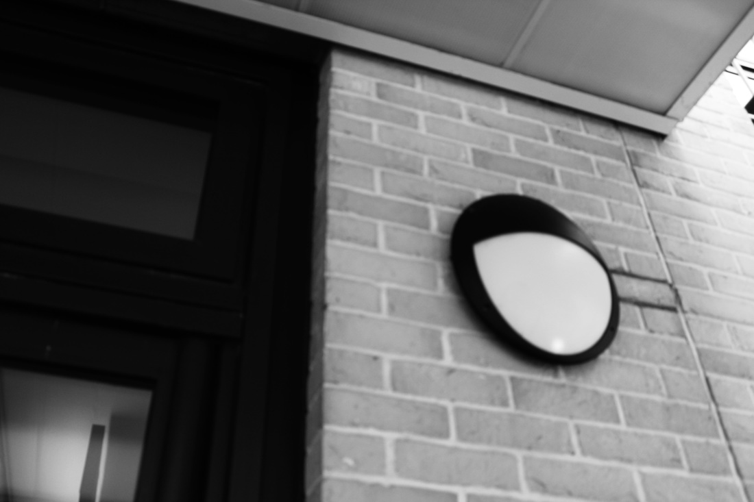
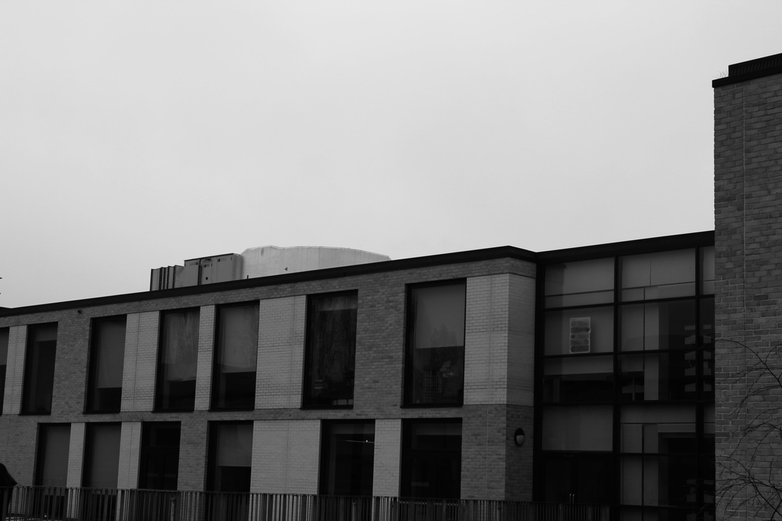
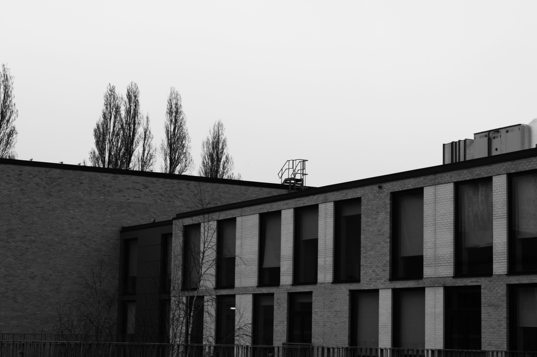
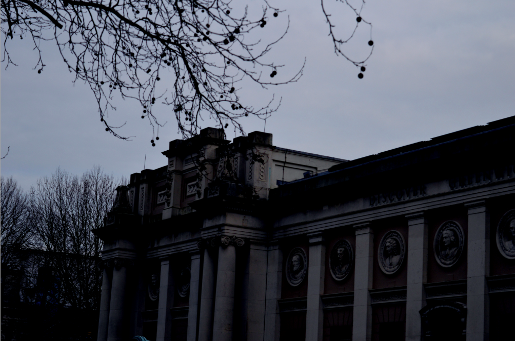
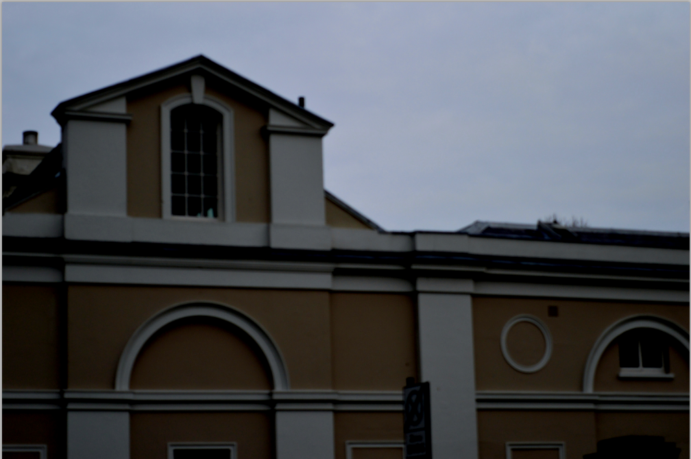
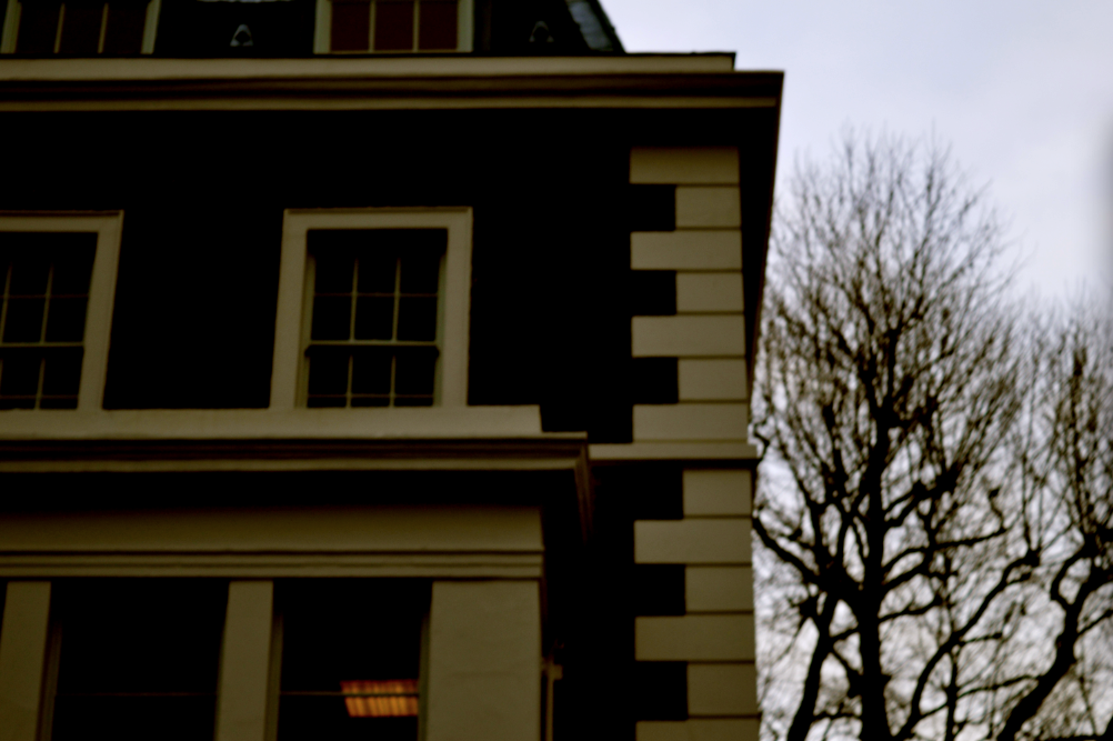
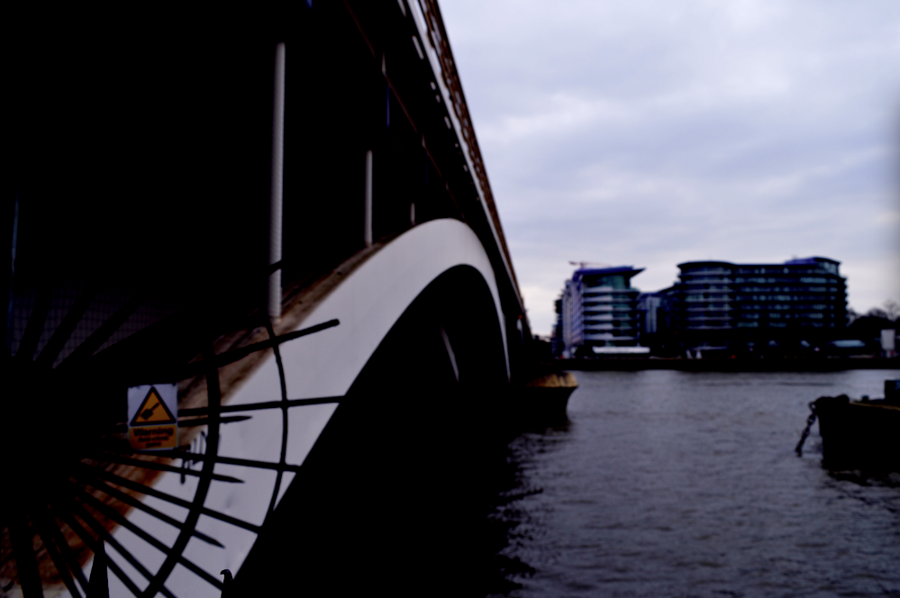
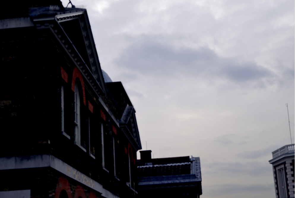
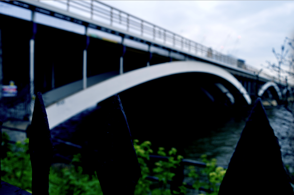
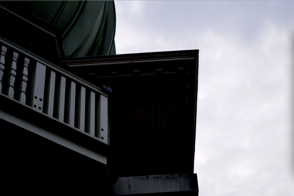
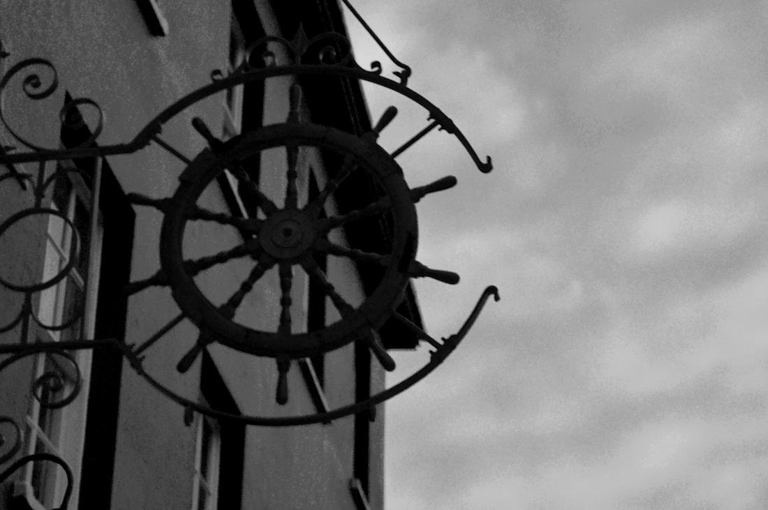
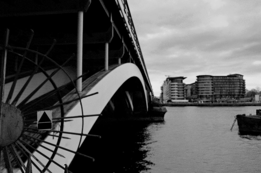
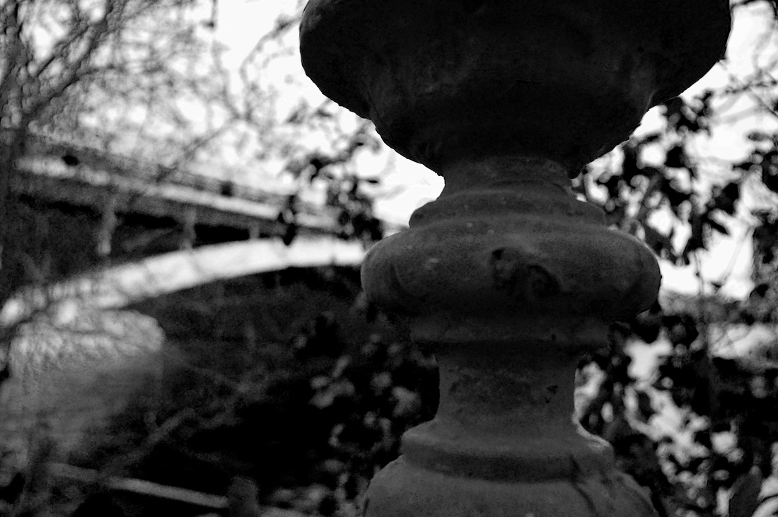
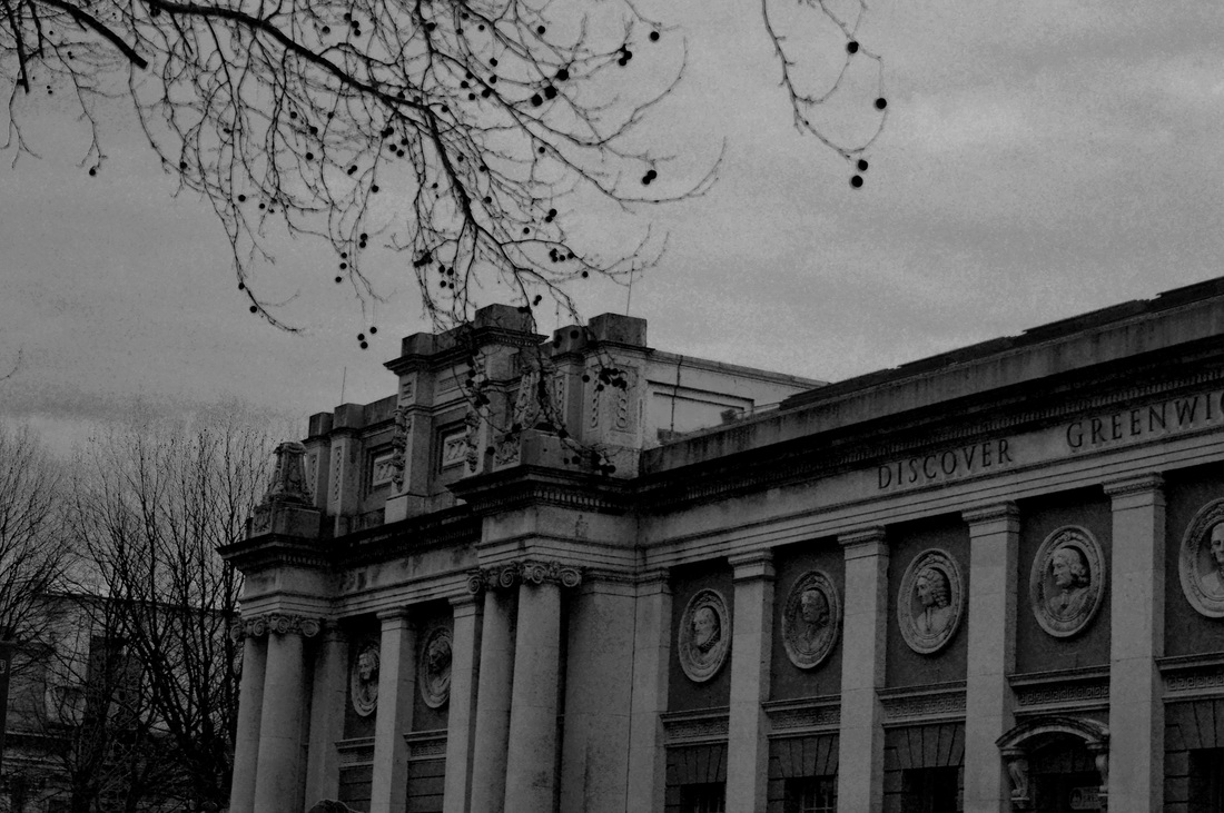
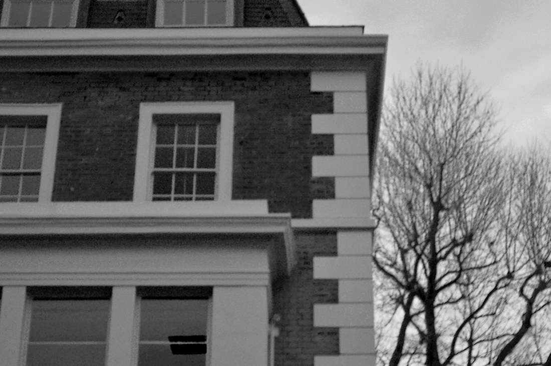
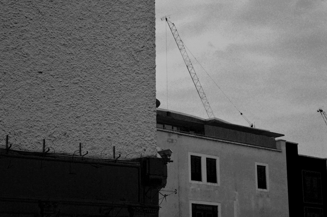
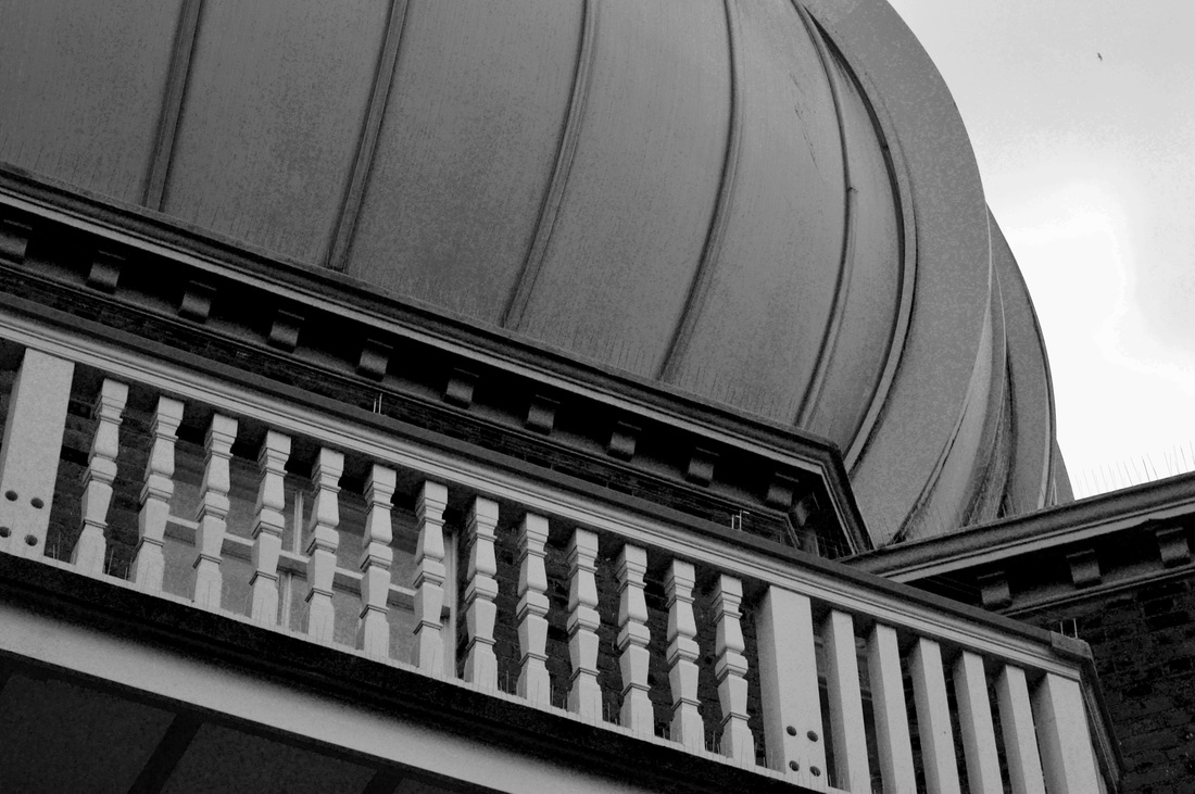
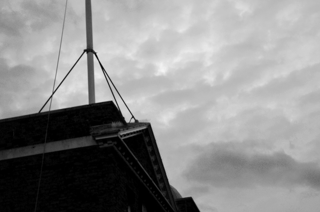
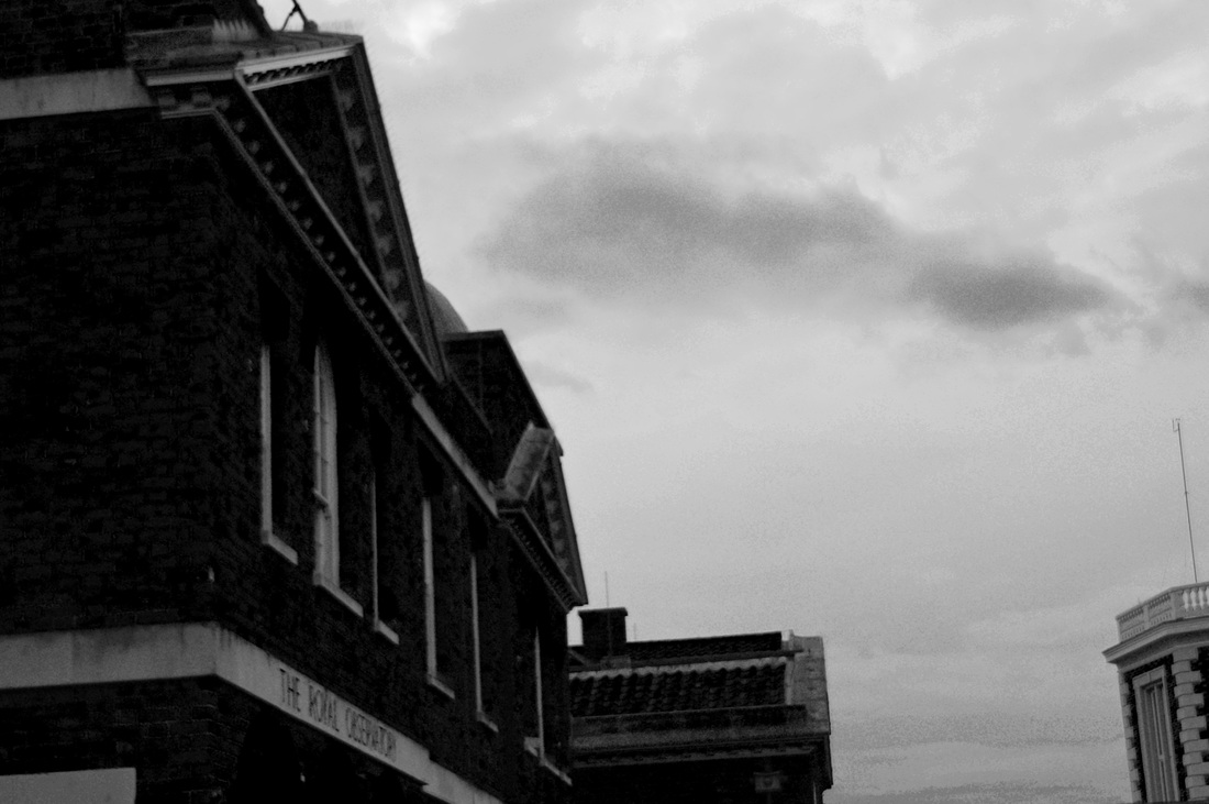
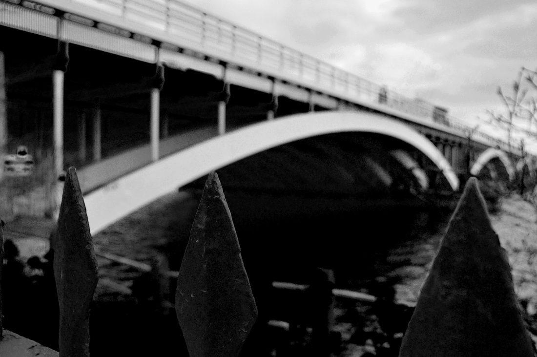
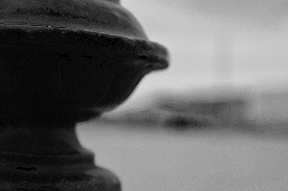
Images taken outside school
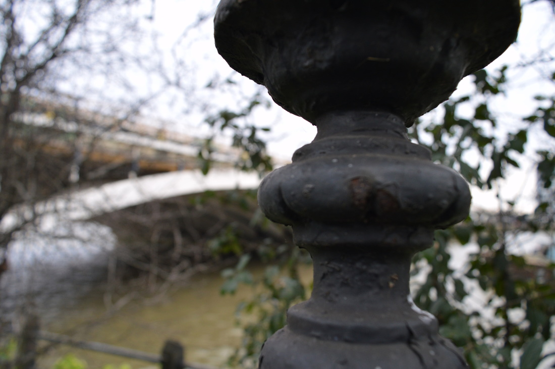
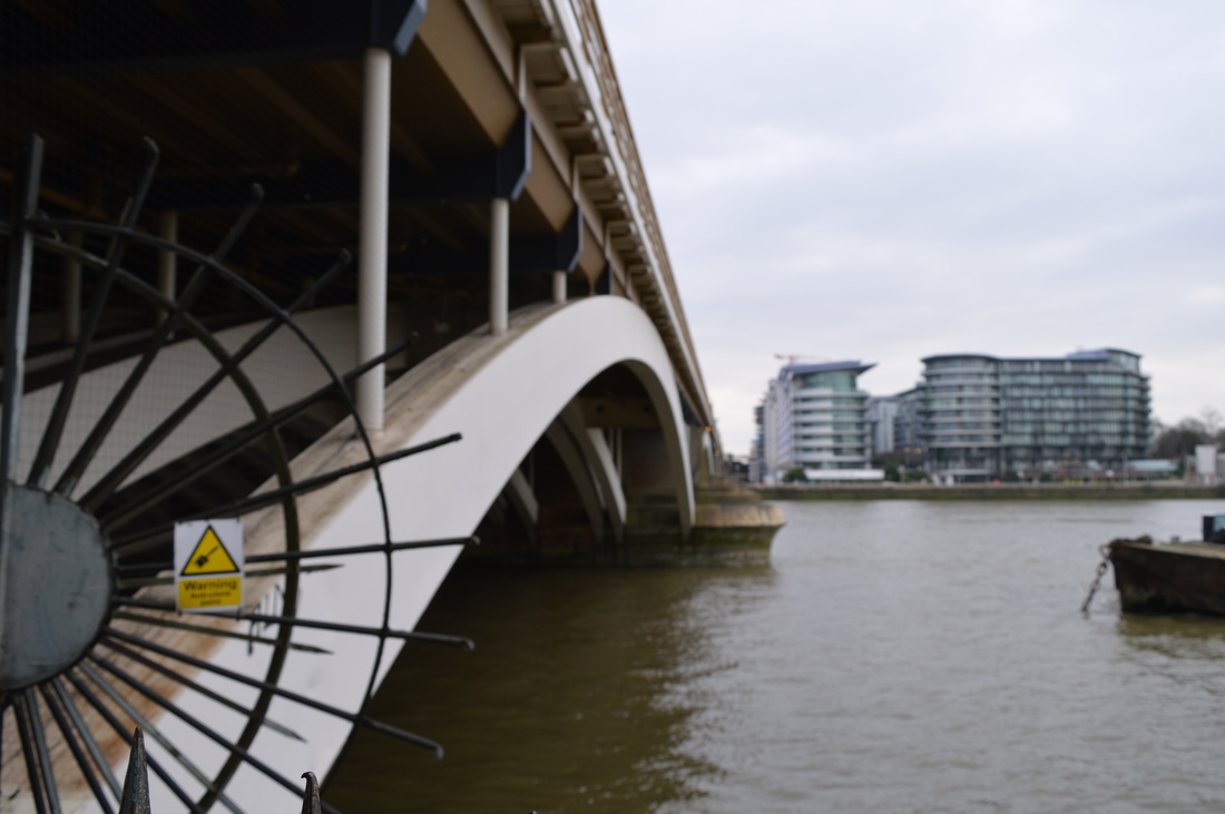
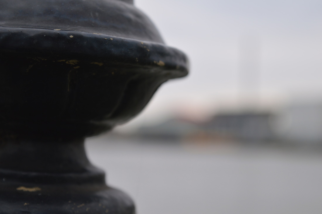
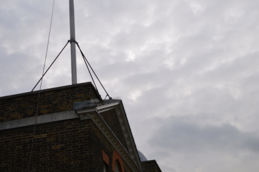
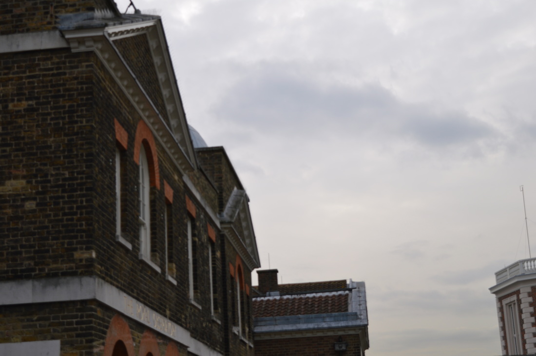
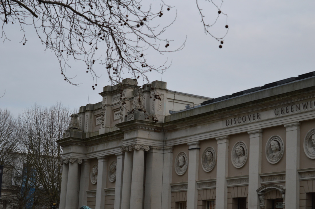
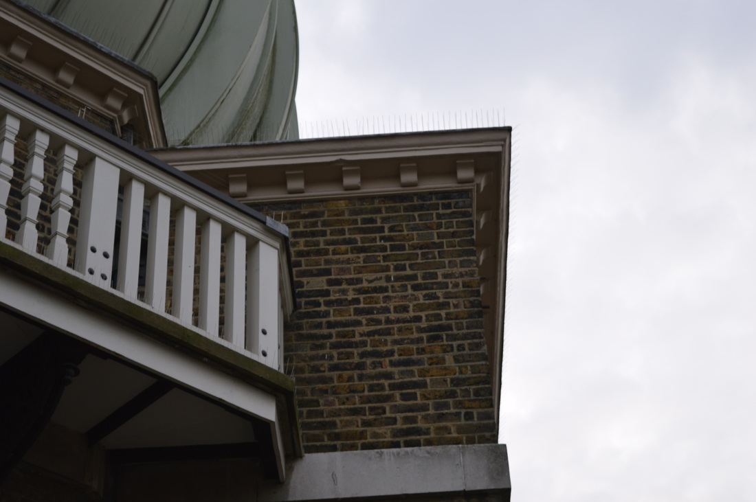
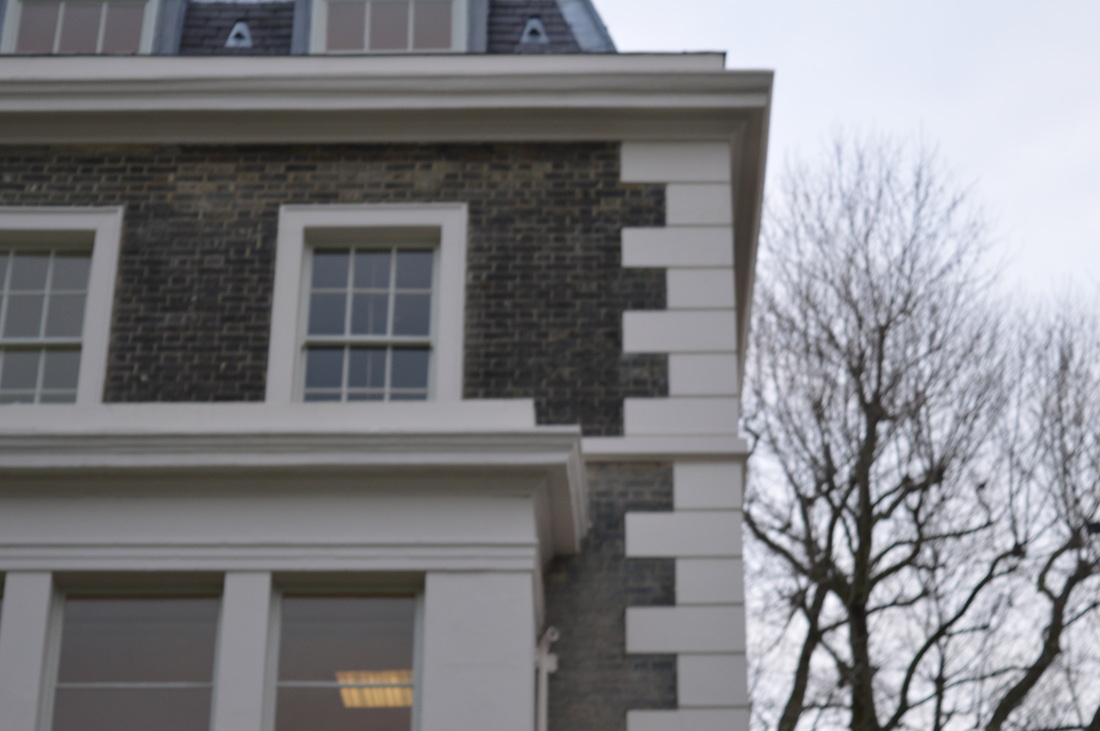
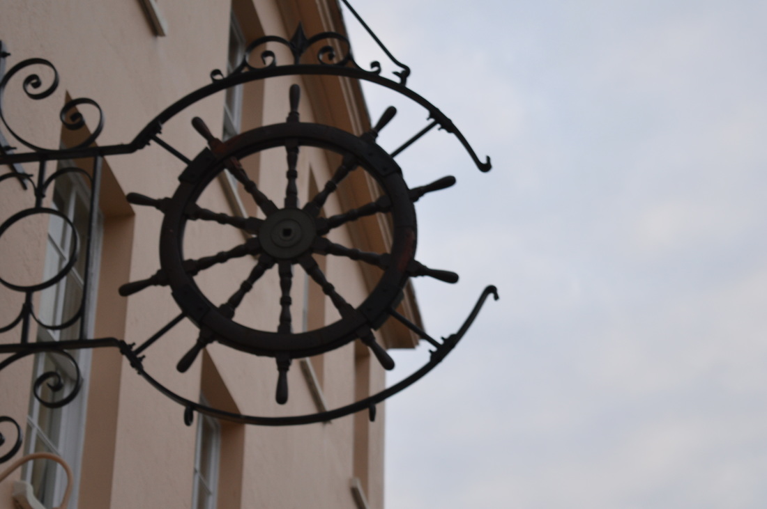
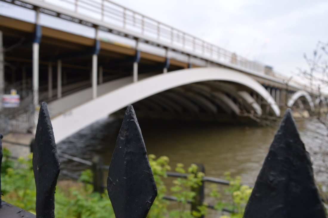
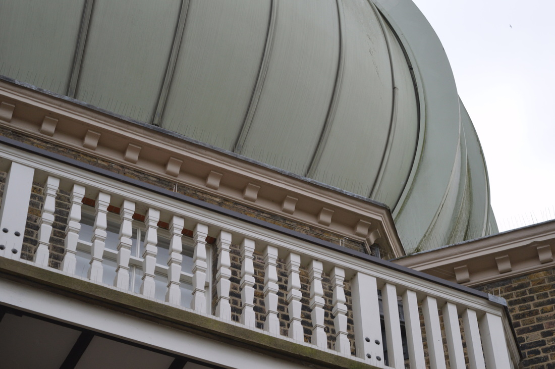
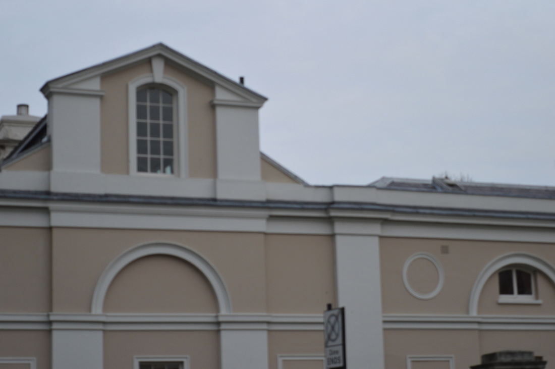
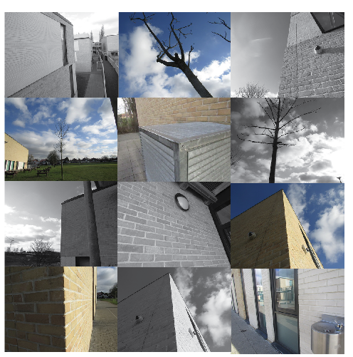
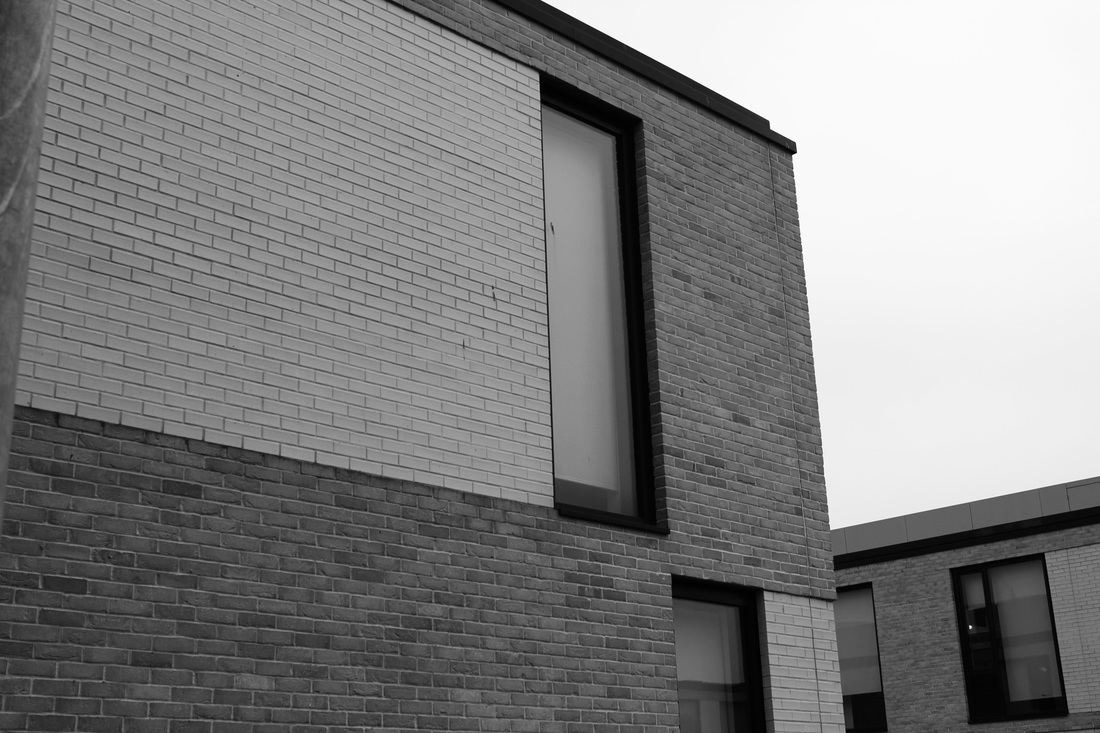
These are some images I have taken outside of school. Some were taken at greenwich and some were taken around london. For these images I mainly focused on buildings. This is because I think that images of buildings are a lot more interesting than images of water or trees.
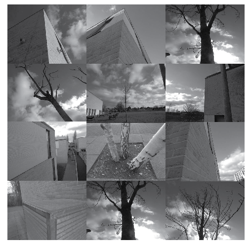
Change in Photoshop
Here I have taken the images that I had taken before and put them into Photoshop to change the way they look. I wanted to make the images darker and I wanted them to have more contrast than they did before. To do this I opened all of the images on Photoshop and went into Image > Adjustments > Curves. When the curves page came up I just clicked around the image to see where it looked the best. For example when I clicked the bottom of each image the whole page went solid black but when I clicked where the subject was it turned out how it has in the images above.
|
|
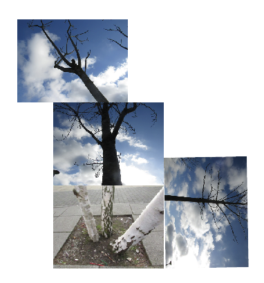
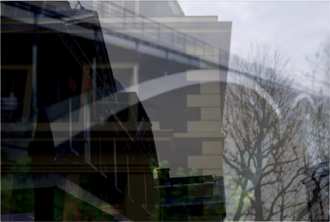
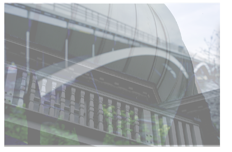
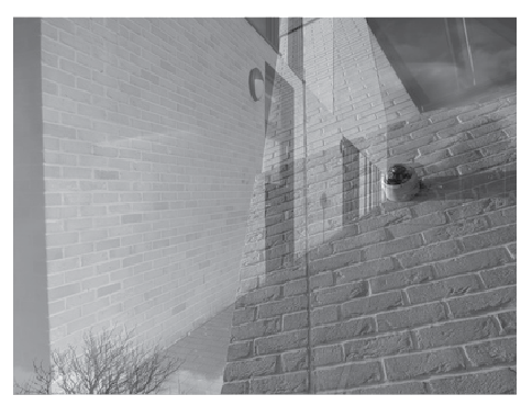
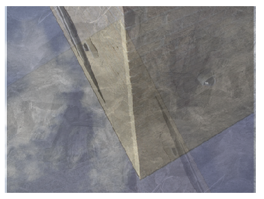
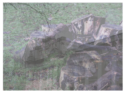
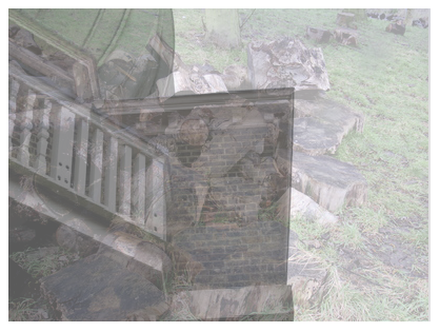
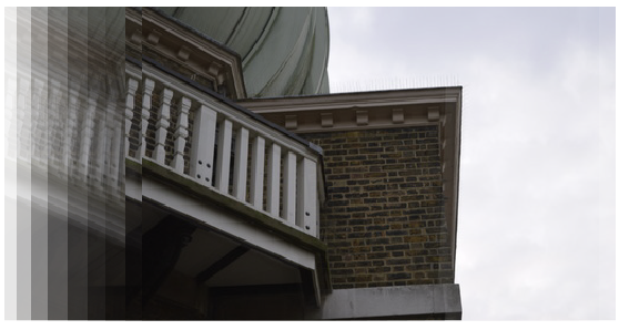
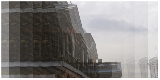
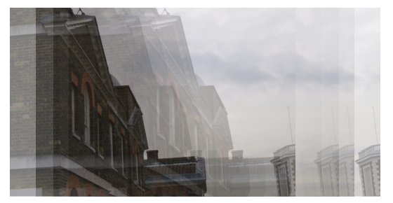
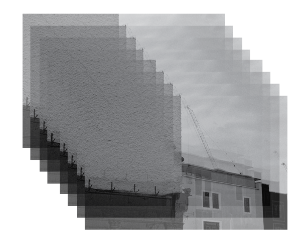
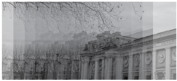
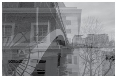
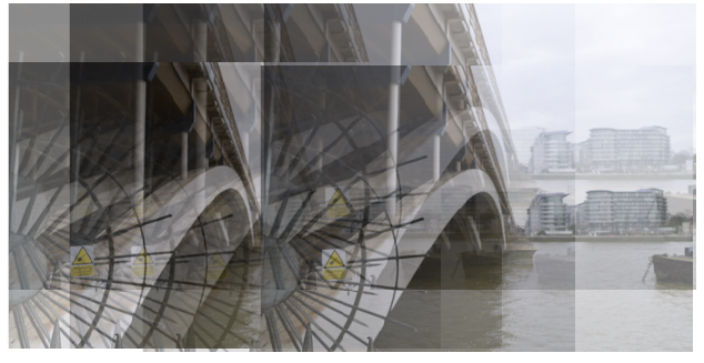
To create these images I took two (sometimes three) of the images I had taken in Greenwich and London and opened them up in Illustrator. When they were in Illustrator, I made both images the same size then changed the opacity of the image that was on top so that the bottom image would show through. I think that these images worked really well and I like the way that they have turned out. When I do this again, I will try using some old and new images mixed in together.
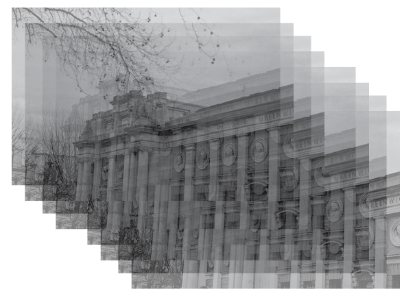
Using previous images
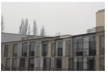
This is my favourite image because as I used a black and white image, it looks like the black and white version is the buildings ghost.
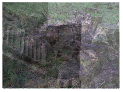
This image has 6 layers ranging from 25%-62% opacity.
|
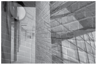
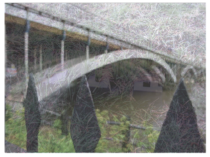
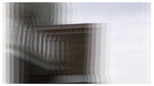
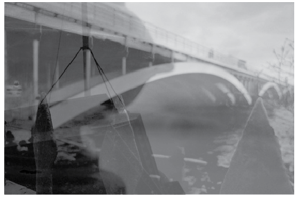
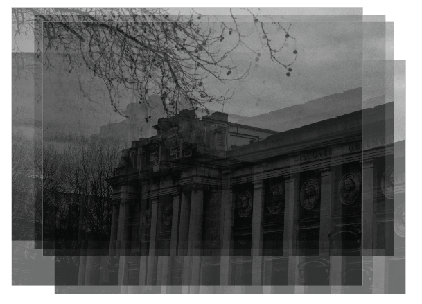
I also really like this image as well because it has the same 'ghost-like' effect that the other one has.
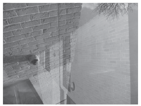
These three images only have 2 layers.
|
layering one image
|
|


|
|
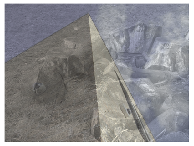
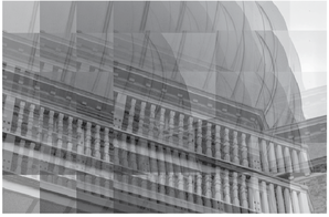
Making images darker
I have decided to make these images darker because I am hoping that when I layer them together, parts of the images will look darker and have more of a noticeable contrast.


Here I have taken the same images but I have changed the brightness to -36 and the contrast to +100, I also put the image into black and white (Image > Adjustments > Black and White and put all of the colour settings to -200).
I think that these edits look better now that they are darker as it allows the final image to look better when many are layered on top of each other. All of these images have mostly the same thing repeated in them which is buildings. |
|
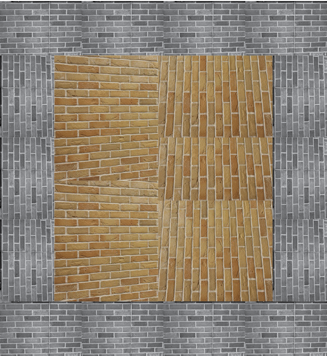
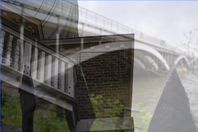
Final Piece 1

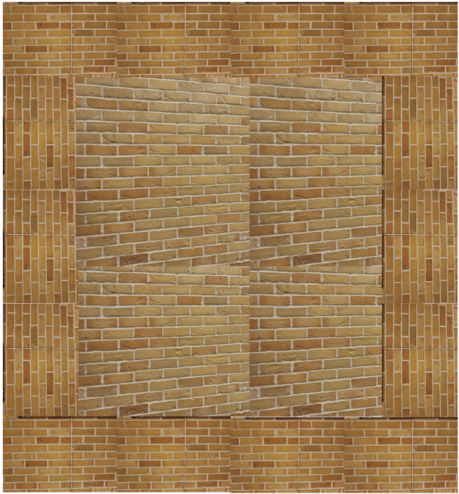
I have chosen to have these four images as my final piece because I think they represent what I initially thought of making when I chose to do repetition. These images can be laid out in any order because they are the same kind of image as they don't show an increase or decrease of bricks, just a change in direction.
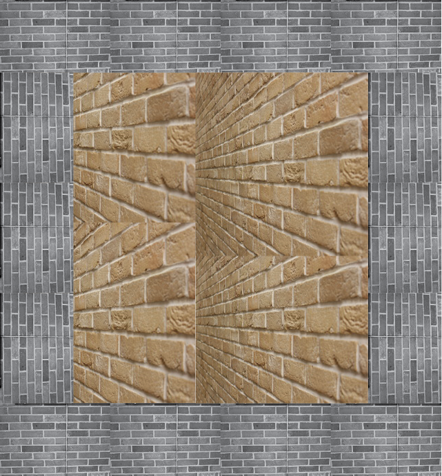
To create this image I used two images I had taken of the bricks from two different perspectives. I decided to use two different perspectives because I thought that it would allow the images to have some depth. I put the images into photoshop and cropped the bricks out of the actual image so I could just have the bricks. Then I opened Adobe Illustrator and made a box out of one of the images of bricks and filled the box with the other perspective image.
To create this image I used two images I had taken of the bricks from two different perspectives. I decided to use two different perspectives because I thought that it would allow the images to have some depth. I put the images into photoshop and cropped the bricks out of the actual image so I could just have the bricks. Then I opened Adobe Illustrator and made a box out of one of the images of bricks and filled the box with the other perspective image.
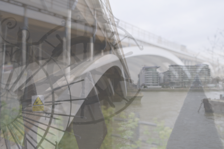
Final Piece 2
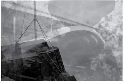

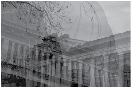
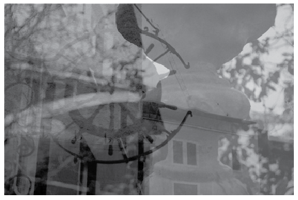
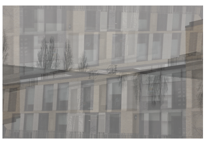
I have chosen these three images as a final piece because they all have three things in common: curves, lines and buildings. I think that these images area suitable final piece for this topic because they show many repeated things (which include lines and curves).
To create these images I first opened two or three images on Photoshop and made them into black and white, so I could begin to build up the black and white layers of the image. I then opened these images in Illustrator and changed the images so that the bottom layer can still be seen through the top layer. I did this for all of these pieces but I obviously changed the combination of pictures in each.
To create these images I first opened two or three images on Photoshop and made them into black and white, so I could begin to build up the black and white layers of the image. I then opened these images in Illustrator and changed the images so that the bottom layer can still be seen through the top layer. I did this for all of these pieces but I obviously changed the combination of pictures in each.
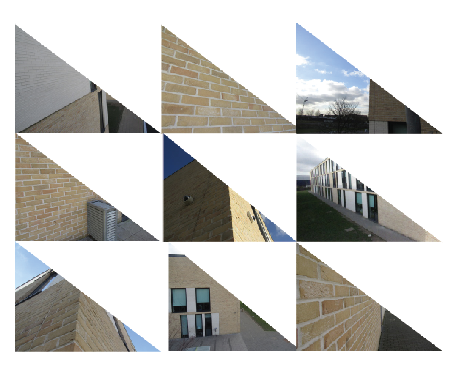
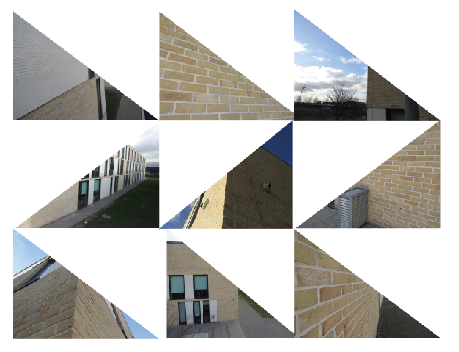
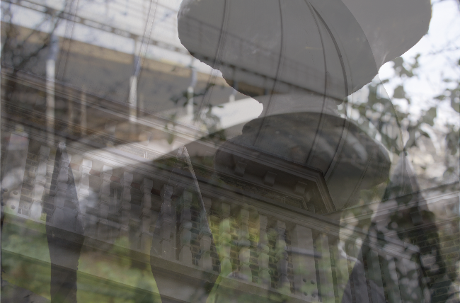
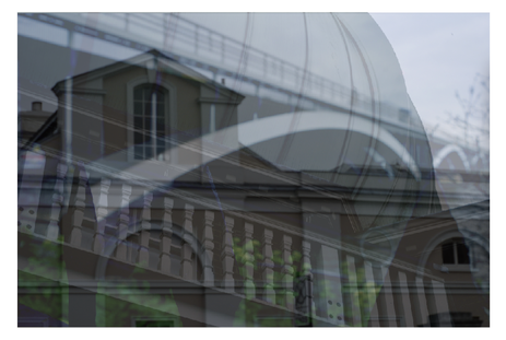
Final Piece 3


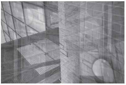
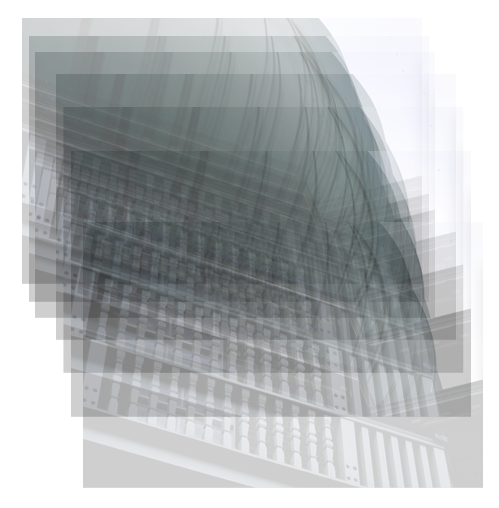
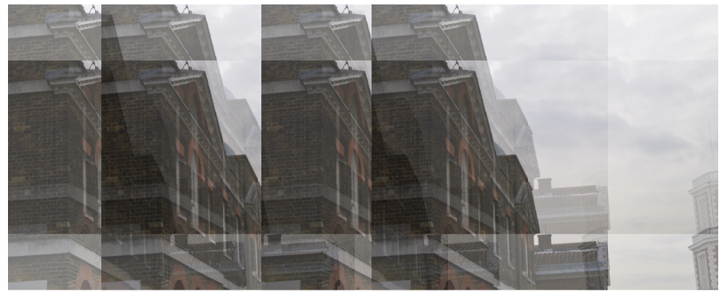
I have chosen these four images as another final piece because they clearly show repetition as there is one image that all of the other images are put around. All of these images include lines and shapes that are repeated.
These images were made in near enough the same way that the previous images were made but instead of having each layer directly on top of each other I put the layers in different places around the main one. I also only used many copies of the same image as i wanted to create an intense repeated pattern.
These images were made in near enough the same way that the previous images were made but instead of having each layer directly on top of each other I put the layers in different places around the main one. I also only used many copies of the same image as i wanted to create an intense repeated pattern.
Final Evaluation
I chose the theme repetition because I thought it would be interesting to create an image that consists of many of the same thing. I also chose repetition because it would give me a chance to use different editing programmes like Illustrator and Photoshop.
I have developed images that were mainly inspired by Sharon Elphick. I had chosen to produce and develop work by her because I felt like it would give me the best chance to use editing programmes. By using these programmes, it gives me the chance to be completely in control of what the images will turn out like and I can change it to make it personal.
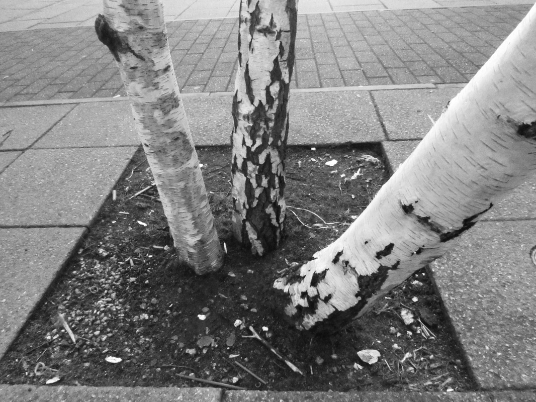
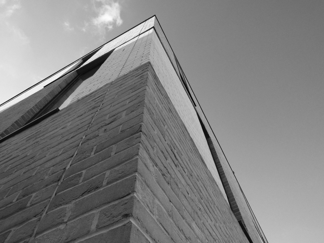
Firstly, I took a series of images of lots of things that were repeated in my classroom and around one of the blocks such as sketchbooks, reading books and the bricks. I didn't develop these images any more because I didn't have a clear idea of what I wanted to do with them. Thinking about what I have done now, I could have developed them more by zooming in on patterns ('man made' ones like bricks on buildings and piles of things) to only have a square of a pattern. This could have been interesting because it would contrast between my other images I have created. After that I had taken images of the school buildings and the trees around them. I then took these images into photoshop and made them black and white. When I had the edits finished, I had taken them into Adobe Illustrator and made collages and grids with them. I cut some images in half and put them together and I left some normally. I carried this on for another three photo shoots and carried on making collages and grids with them. When I finished making the collages I went to greenwich and took more images. With these images I made some double exposures using either three or four different images or many of the same image.
I wish that I had discovered how to make double exposures before the last day of the exam because I really like the way that they look. I think that the images I had created look interesting and clearly show repetition. I would like to have taken more images of London because I think that I would be able to catch some more images of things that would look interesting when repeated or images of things that were already repeated. I also think that I should have used different images or images of buildings from different places and different patterns and colours. This would have allowed me to create more interesting images that would make them look better and relate to the project more.
I have developed images that were mainly inspired by Sharon Elphick. I had chosen to produce and develop work by her because I felt like it would give me the best chance to use editing programmes. By using these programmes, it gives me the chance to be completely in control of what the images will turn out like and I can change it to make it personal.
Firstly, I took a series of images of lots of things that were repeated in my classroom and around one of the blocks such as sketchbooks, reading books and the bricks. I didn't develop these images any more because I didn't have a clear idea of what I wanted to do with them. Thinking about what I have done now, I could have developed them more by zooming in on patterns ('man made' ones like bricks on buildings and piles of things) to only have a square of a pattern. This could have been interesting because it would contrast between my other images I have created. After that I had taken images of the school buildings and the trees around them. I then took these images into photoshop and made them black and white. When I had the edits finished, I had taken them into Adobe Illustrator and made collages and grids with them. I cut some images in half and put them together and I left some normally. I carried this on for another three photo shoots and carried on making collages and grids with them. When I finished making the collages I went to greenwich and took more images. With these images I made some double exposures using either three or four different images or many of the same image.
I wish that I had discovered how to make double exposures before the last day of the exam because I really like the way that they look. I think that the images I had created look interesting and clearly show repetition. I would like to have taken more images of London because I think that I would be able to catch some more images of things that would look interesting when repeated or images of things that were already repeated. I also think that I should have used different images or images of buildings from different places and different patterns and colours. This would have allowed me to create more interesting images that would make them look better and relate to the project more.
